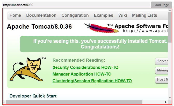

The BROWSER component represents a fully functional browser (a "native" browser) that is embedded into the page.
In the FX client the browser is based on the "WebKit Open Source Project". Because the browser in inherent part of JavaFX, there are no integration problems.
The Swing client references the native Internet Explorer by using an SWT based bridge. The framework stack to include the native browser as consequence is a quite high one. You should test your scenario in a 32 and 64 bit environment!
Alternatives, especially within the Swing client environment, are : the JBROWSER component and the JSHOWURL component.
Typically used attributes
All attributes are
General attributes are
Used inside: ADAPTIVETILECONTAINER, ADAPTIVETOOLBAR, AREASELECTOR, BLOCKABLEAREA, COLSYNCHEDROW, DRAWAREA, FOLDABLEPANEHEADERROW, GRIDCOL, GRIDFOOTER, GRIDHEADER, GRIDHEADERLABEL, GRIDLAYOUTROW, LABELCONTAINER, OVERLAYAREABASEITEM, OVERLAYAREAITEM, PAGEBEANROOT, PAINTAREAITEM, REPEAT, ROW, ROWADAPTIVELINE, ROWFLEXCOLUMNCONTAINER, ROWFLEXLINECONTAINER, ROWFOOTER, ROWHEADER, ROWTITLEBAR, SCHEDULEITEM, SPANGRIDCOL, STABLEAREA, TEXTWITHCONTROLS, TREENODE
Binding to server side method that processes the events coming from this component.
| #{methodBinding} | Method binding |
Special binding to component adapter object instance on server side. The component adapter must be an instance of IComponentAdapterBinding. For some components (e.g. FIXGRID) there is an extended interface (e.g. IFIXGRIDComponentAdapterBinding).
| #{tobedefined} | Binding to IComponentAdapter instance |
Embedded pages (e.g. youtube-videos...) may include the ability to render their content in full screen mode. You may allow this by setting this attributes to true/false.
| false | Full screen request of inner page is blocked. (default) |
| true | Full screen request of inner page is allowed. |
If set to true then changes of the width/height of the component are animated.
| true | With animation |
| false | Without animation (default) |
Name of macro that is used for generating certain attributes of this component. Please pay attention: the value of this attribute is read one time for each control and cannot be changed afterwards.
By default the URL that you pass is encoded, so that special characters are translated into some escape sequence. If you URL is already encoded, then the result would be some double-encoding - which may produce some invalid URL.
| false | URL will be encoded (default) |
| true | URL will NOT be encoded, but will be used exactly the way you pass it. |
Perferred type of browser to be used. This attribute can NOT be changed during the life cycle of the corresponding component.
| default (Windows: Internet Explorer) | |
| mozilla | Mozilla/Firefox - the installation of XUL runner needs to be performed on client side. |
In case the space provided by the container (e.g. gridlayoutcontainer) for the component is wider than the component itself: definition where to place the component
| left | Left (default) |
| center | Center |
| right | Right |
Spanning of columns if used inside a COLSYNCHEDROW or inside a GRIDLAYOUTPANE.
| 1 | Control spans one column (default) |
| 2 | 2 columns |
| 3 | 3 columns |
Comment that can be asigned to any component. The comment is not operationally used.
| Any text | Any text |
Configuration information that is attached to this component. This information is not functionally used by CaptainCasa, but may be used for any application specific purpose.
URL that is currently shown in the browser. While the URL attribute represents the URL that you want the browser top open, the CURRENTURL is writing back the current navigation location within the browser.
Indicator if component is enabled or not.
| true | Component is enabled. |
| false | Component is not enabled. |
Height of the control. Either defined as absolute value or as percentage value. Pay attention when using percentage sizing: the size refers to what is given from the components above. When using percentage sizing then you may define a minimum size in addition, by appending it with a semicolon: "100%;100" means: use 100%, but always keep a minimum size of 100. If using absolute sizes you may append a "+" to define, that the size is extended if required by the component. - Please note: the sizing may be completely taken over by the parent component (e.g. if a component is used in a grid cell), in this case the size definintions on this component level are obsolete.
| 100 | 100 Pixels |
| 120 | 120 Pixels |
| 200 | 200 Pixels |
| 50% | 50 percents |
| 100% | Full available height |
If a new browser is to be opened within the browser then by default, a complete new, separate browser is opened, which runs completely independent from the browser control. If defining true, then new browser instances are managed within the scope of the browser control - they are closed if the browser control is closed, and they take over session cookie information from the browser control.
| true | Own browser instances, running in the scop of the browser control |
| false | New independent browser instances (default) |
Reference to an outside object that is the content behind the component. E.g. a field is representing a certain field of a database table: in this case you could define the value table;column. The reference plays a siginficant role within the attributemacro management.
| ref | One reference |
| ref1;ref2 | Two references |
| ref1;ref2;ref3 | Three references |
Flag that indicated if this component is rendered at all. If set to false then the component is not rendered - there is no component data sent to the client.
| true | Component is rendered (default) |
| false | Component is not rendered |
If more than one component is arranged within one row, then components need to decide how they want to be aligned vertically inside the row - in case the height of the row exceeds the height of the component itself.
| top | Top |
| center | Center (default) |
| bottom | Bottom |
Spanning of rows if used inside a GRIDLAYOUTPANE.
| 1 | Control spans one row (default) |
| 2 | 2 rows |
| 3 | 3 rows |
Shadow of component. The definition is done by several inner values: hoffset, voffset, blur and color.
| hoffset:5;voffset:5;blur:5;color:#C0C0C0 | full shadow definition |
| color:#C0C0C0 | Definition only via color, rest of values is set to default values |
In CaptainCasa you can define styles definitions for components. A style definition is a definition of a set of default attribute values that are applied to the component. In case you want to differenciate between different usage types of the component you can apply multiple styles - and use the stylevariant attribute to select between.
Trigger value: if the value changes then the component's print function is executed on client side. Use class Trigger on server side for implementations of this property.
URL that is loaded. Either an absolute address, or relative to the jsp starting page.
Width of the control. Either defined as absolute value or as percentage value. Pay attention when using percentage sizing: the size refers to what is given from the components above. When using percentage sizing then you may define a minimum size in addition, by appending it with a semicolon: "100%;100" means: use 100%, but always keep a minimum size of 100. If using absolute sizes you may append a "+" to define, that the size is extended if required by the component. - Please note: the sizing may be completely taken over by the parent component (e.g. if a component is used in a grid cell), in this case the size definintions on this component level are obsolete.
| 100 | 100 Pixels |
| 120 | 120 Pixels |
| 200 | 200 Pixels |
| 50% | 50 percents |
| 100% | Full available width |
x-pixel-position: this attribute is only used if the component is directly placed into a PAINTAREA!
y-pixel-position: this attribute is only used if the component is directly placed into a PAINTAREA!