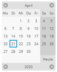
The CALENDAR component represents a calendar that is directly embedded into the page.
Please also check the CALENDARFIELD component - in which the calendar is opens as popup dialog on a field.
Typically used attributes
All attributes are
General attributes are
Used inside: ADAPTIVETILECONTAINER, ADAPTIVETOOLBAR, AREASELECTOR, BLOCKABLEAREA, COLSYNCHEDROW, DRAWAREA, FOLDABLEPANEHEADERROW, GRIDCOL, GRIDFOOTER, GRIDHEADER, GRIDHEADERLABEL, GRIDLAYOUTROW, LABELCONTAINER, OVERLAYAREABASEITEM, OVERLAYAREAITEM, PAGEBEANROOT, PAINTAREAITEM, REPEAT, ROW, ROWADAPTIVELINE, ROWFLEXCOLUMNCONTAINER, ROWFLEXLINECONTAINER, ROWFOOTER, ROWHEADER, ROWTITLEBAR, SCHEDULEITEM, SPANGRIDCOL, STABLEAREA, TEXTWITHCONTROLS, TREENODE
Binding to server side method that processes the events coming from this component.
| #{methodBinding} | Method binding |
Special binding to component adapter object instance on server side. The component adapter must be an instance of IComponentAdapterBinding. For some components (e.g. FIXGRID) there is an extended interface (e.g. IFIXGRIDComponentAdapterBinding).
| #{tobedefined} | Binding to IComponentAdapter instance |
Name of macro that is used for generating certain attributes of this component. Please pay attention: the value of this attribute is read one time for each control and cannot be changed afterwards.
Parameters that define the look and feeld of the calendar. FX client only!
In case the space provided by the container (e.g. gridlayoutcontainer) for the component is wider than the component itself: definition where to place the component
| left | Left (default) |
| center | Center |
| right | Right |
Spanning of columns if used inside a COLSYNCHEDROW or inside a GRIDLAYOUTPANE.
| 1 | Control spans one column (default) |
| 2 | 2 columns |
| 3 | 3 columns |
Comment that can be asigned to any component. The comment is not operationally used.
| Any text | Any text |
Configuration information that is attached to this component. This information is not functionally used by CaptainCasa, but may be used for any application specific purpose.
Indicator if component is enabled or not.
| true | Component is enabled. |
| false | Component is not enabled. |
If set to true, then all date-parts that are not in the scope of the input are set to 0. E.g. if maintaining a date then hour, minute, second and millisecond wil be set to 0.
| true | Exact date/time - set 0 |
| false | (default) - no setting to 0 |
Extended information that is passed into the visual calendar representation. The value is an XML string that is produces by using the Java class ExtCalendarInfos, method toXML().
Indicator if data changed in the component are transferred immediately to the server, causing a normal round trip processing from client to server.
| true | Flush is done on data change. |
| false | No flush. Data is transferred to server with next round trip. |
Reference to an outside object that is the content behind the component. E.g. a field is representing a certain field of a database table: in this case you could define the value table;column. The reference plays a siginficant role within the attributemacro management.
| ref | One reference |
| ref1;ref2 | Two references |
| ref1;ref2;ref3 | Three references |
Flag that indicated if this component is rendered at all. If set to false then the component is not rendered - there is no component data sent to the client.
| true | Component is rendered (default) |
| false | Component is not rendered |
Rounding radius of edges of border/background. This is optical rounding - so has nothing to do with mathematical rounding...
| 0 | Straight edges |
| 5 | Rounding with radius 5 |
| 10 | Rounding with radius 10 |
If more than one component is arranged within one row, then components need to decide how they want to be aligned vertically inside the row - in case the height of the row exceeds the height of the component itself.
| top | Top |
| center | Center (default) |
| bottom | Bottom |
Spanning of rows if used inside a GRIDLAYOUTPANE.
| 1 | Control spans one row (default) |
| 2 | 2 rows |
| 3 | 3 rows |
Shadow of component. The definition is done by several inner values: hoffset, voffset, blur and color.
| hoffset:5;voffset:5;blur:5;color:#C0C0C0 | full shadow definition |
| color:#C0C0C0 | Definition only via color, rest of values is set to default values |
Style class names that are applied to this component.
In CaptainCasa you can define styles definitions for components. A style definition is a definition of a set of default attribute values that are applied to the component. In case you want to differenciate between different usage types of the component you can apply multiple styles - and use the stylevariant attribute to select between.
Timezone that is used for transferring the date input into a time stamp. Values need to correspond to TimeZone.getAvailableIDs().
| LOCAL | To be set if using LocalDate/LocalTime on server side |
| ----- | -------------------- |
| GMT | GMT - Greenwich Mean Time (no daylight saving) |
| UTC | UTC - Coordinated Universal Time (no daylight saving) |
| ----- | -------------------- |
| CET | CET - Central European Time |
| Europe/Paris | Europe/Paris |
| Africa/Harare | Africa/Harare |
| Asia/Tel_Aviv | Asia/Tel_Aviv |
| ... | ... |
Data value that is shown and (dependent from the component type) edited inside the component.
x-pixel-position: this attribute is only used if the component is directly placed into a PAINTAREA!
y-pixel-position: this attribute is only used if the component is directly placed into a PAINTAREA!