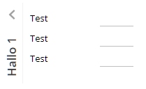
Same component as FOLDABLEPANE but now in vertical direction.
Typically used attributes
All attributes are
General attributes are
Used inside: ADAPTIVETILECONTAINER, ADAPTIVETOOLBAR, AREASELECTOR, BLOCKABLEAREA, BUTTONPOPUP, COLSYNCHEDROW, DRAWAREA, FOLDABLEPANEHEADERROW, GRIDHEADERLABEL, GRIDLAYOUTROW, HIDEABLE, LABELCONTAINER, OVERLAYAREABASEITEM, OVERLAYAREAITEM, PAGEBEANROOT, PAINTAREAITEM, REPEAT, ROW, ROWADAPTIVELINE, ROWFLEXCOLUMNCONTAINER, ROWFLEXLINECONTAINER, ROWFOOTER, ROWHEADER, ROWMATRIXAREA, ROWTITLEBAR, SCALEPANE, SCHEDULEITEM, SHIFTCONTAINER, STABLEAREA, STABLEAREACONFIGAREA, TEXTWITHCONTROLS, TREENODE
Using inside: CAPTUREANIMATOR, IMAGECAPTURE, REPEAT, REPEAT, ROW, ROWADAPTIVEAREA, ROWADAPTIVELINE, ROWBODYPANE, ROWDISTANCE, ROWDYNAMICCONTENT, ROWFLEXCOLUMNCONTAINER, ROWFLEXLINECONTAINER, ROWFOOTER, ROWHEADER, ROWINCLUDE, ROWLINE, ROWMATRIXAREA, ROWPAGEBEANINCLUDE, ROWPAGEBEANINNERPART, ROWSTATUSBAR, ROWTITLEBAR, ROWTLCOCKPIT, ROWWORKPAGECONTAINER, ROWWORKPAGEFAVORITES, ROWWORKPAGEFAVORITESSQUARE, ROWWORKPAGESELECTOR, ROWWORKPLACE, ROWWORKPLACEFUNCTIONS, ROWWORKPLACEFUNCTIONTREE
Text that is passed as control content to the accessible support devices (e.g. screen readers).
Binding to server side method that processes the events coming from this component.
| #{methodBinding} | Method binding |
If set to true then changes of the width/height of the component are animated.
| true | With animation |
| false | Without animation (default) |
Name of macro that is used for generating certain attributes of this component. Please pay attention: the value of this attribute is read one time for each control and cannot be changed afterwards.
Background color of the component. Any RGB value can be chosen using format #rrggbb.
| #FFFFFF | White |
| #000000 | Black |
| #FF0000 | Red |
| #00FF00 | Green |
| #0000FF | Blue |
| #0000FF30 | Blue with a transparency of x30. |
Background paint commands. There is a sequence of paint commands which can be executed one after the other by listing them as semicolon separated list. - By appending certain suffixes to a command you can define that the command is only executed in a certain situation. Available suffixes are: _empty (content of component is empty), _focus, _nofocus, _enabled, _disabled, _mouseover. Multiple suffixes can be used in parallel (e.g. write_empty_focus).
| ----- | ----- bgpaint commands for all clients ----- |
| error() | Component indicates error. |
| mandatory() | Component indicates mandatory input. Only is shown if component does not have any content yet. |
| bgbackground(#FF0000) | Background with one color |
| bgbackground(#FF0000,#0000FF,vertical) | Background as gradient of two colors |
| bgimage(left,/images/xyz.png) | Image at certain position |
| bgwrite(left,...text...) | Text at certain position |
| bgwrite(left,...text...,#800000,12) | Text at certain position with defined color and size |
| ----- | ----- bgpaint commands for Java clients ----- |
| rectangle(0,0,100%,100%,#FF0000) | Red rectangle |
| rectangle(20,20,100,100,#FF0000) | Red rectangle from 20,20 to 120,120 |
| rectangle(20,20,100%-40,100%-40,#FF0000) | Minus absolute values is allowed after percentage definitions |
| rectangle(0,0,100%,100%,#FF0000,#00FF00,vertical) | Rectangle with color changing from red to green in vertical direction |
| roundedrectangle(0,0,100%,100%,10,10,#FF0000,#00FF00,vertical) | Rectangle with color changing from red to green in vertical direction |
| line(0,0,100%,100%,1,#00FF00) | Green line crossing the whole rectangle, from coordinate 0,0 to coordinat 100%,100%, thickness of line is 1 |
| image(0,0,/images/xyz.png,lefttop) | Image output x,y,image,position (lefttop/centermiddle/rightbottom...) |
| image(0,0,200,100,/images/xyz.png,lefttop) | Image output x,y,width,heigh,image,position (lefttop/centermiddle/rightbottom...) |
| scaledimage(0,0,200,100,/images/xyz.png,lefttop) | Scaled image output, the width/height ration is kept while scaling : x,y,width,heigh,image,position (lefttop/centermiddle/rightbottom...) |
| heximage(0,0,08FF40324672849CDFE...,lefttop) | Image output x,y,hexadecimal image,position (lefttop/centermiddle/rightbottom...) |
| heximage(0,0,200,100,08FF40324672849CDFE...,lefttop) | Image output x,y,width,height,hexadecimal image,position (lefttop/centermiddle/rightbottom...) |
| scaledheximage(0,0,200,100,08FF40324672849CDFE...,lefttop) | Scaled image output x,y,width,height,hexadecimal image,position (lefttop/centermiddle/rightbottom...) |
| border(0,0,100%,100%,#C0C0C0,2) | Rectangular border with thickness 2 |
| roundedborder(0,0,100%,100%,10,10,#C0C0C0,2) | Rounded border with thickness 2 |
| write(0,0,Some text,lefttop) | Some text in the left top corner |
| write(50%,50%,Some text,20,#00FF00,centermiddle) | Some text in the left center, font size 20, font color green |
| write(50%,50%,Some text,20,#00FF00,bold,centermiddle) | Some text in the left center, font size 20, font color green,bold |
| write(50%,50%,Some text,20,#00FF00,italic,centermiddle) | Some text in the left center, font size 20, font color green,italic |
| write(50%,50%,Some text,20,#00FF00,normal,centermiddle) | Some text in the left center, font size 20, font color green,normal |
| write(0,100%,Some text,20,#00FF00,default,lefttop,90) | Some text in the left bottom corner, font size 20, font color green, 90 degrees rotated |
| write(20,100%,Some text,20,#00FF00,default,lefttop,90,-1,1) | Some text in the left bottom corner, font size 20, font color green, 90 degrees rotated. x scaling -1, y scaling 1 |
| write(20,100%,Some text,20,#00FF00,bold,lefttop,90,-1,1) | Some text in the left bottom corner, font size 20, font color green, 90 degrees rotated. x scaling -1, y scaling 1 |
| writeifempty(0,0,Some text,lefttop) | Same as write-command, but now only visible if component contains data |
| writeifempty(50%,50%,Some text,20,#00FF00,centermiddle) | Same as write-command, but now only visible if component contains data |
| writemultiline(0,0,100%,100%,Some text) | Some text into the defined rectangle. Only fully supported with FX client, in Swing client the text will be output as one line. |
| writemultiline(0,0,100%,100%,Some text,20,#FF0000,bold) | Some text into the defined rectangle. In additional font size, text color and text style (normal,bold,italic) are passed. Only fully supported with FX client, in Swing client the text will be output as one line. |
| oval(0,0,100%,100%,#FF0000) | Red ellipse |
| oval(0,0,100%,100%,#FF0000,#00FF00,vertical) | Red ellipse with color changing from red to green |
| ovalborder(0,0,100%,100%,#FF0000,2) | Red ellipse border, red, 2 pixels thick |
| grid(100,#00000020) | Grid with line distance 100, black line color - with transparency |
| nodisabled() | Switches off the automated shading of disabled input components |
| background(#FF0000) | Sets the background of the painted area. |
| backgroundnofocus(#FF0000) | Sets the background of the painted area - which is only drawn if the component does not hold the focus. |
| repeatimage(/images/xyz.png) | The image is repeated and drawn all over the available space. |
Defintion of border of control. Either defined as straight color value, with then having a border of 1 pixel. Or: an explicit per-side definition as comma separated list of border definition values.
| #808080 | 1 pixel border in color dark gray. |
| top:1;color:#808080 | top:1;color:#808080 : border only on top, 1 pixel height, color #808080 |
| top:1;bottom:1;left:1;right:1;color:#FF0000 | top:1;bottom:1;left:1;right:1;color:#FF0000 : red border of 1 pixel size |
| top:1;bottom:1;left:1;right:1;color:#FF0000;dashing:5,2 | top:1;bottom:1;left:1;right:1;color:#FF0000 : red border of 1 pixel size, dashed with segments of 5 pixesl and 2 pixels; dashing only supported with FX Client! |
| noborder | Defines that no border is painted - esp. in cases when empty borders are normally added (e.g. in grid cells) |
Name that is assigned to the component at client side: there is no specific function associated with the name - but it can be used on client side to describe the component in a clearer way. The name is e.g. used by UI test tools that replay certain user interaction sequences - and that reference components via their name.
In case the space provided by the container (e.g. gridlayoutcontainer) for the component is wider than the component itself: definition where to place the component
| left | Left (default) |
| center | Center |
| right | Right |
Spanning of columns if used inside a COLSYNCHEDROW or inside a GRIDLAYOUTPANE.
| 1 | Control spans one column (default) |
| 2 | 2 columns |
| 3 | 3 columns |
Comment that can be asigned to any component. The comment is not operationally used.
| Any text | Any text |
Configuration information that is attached to this component. This information is not functionally used by CaptainCasa, but may be used for any application specific purpose.
Color of animated curtain that is shown for a short time and then is fading out.
| #FFFFFF | White |
| #000000 | Black |
| #FF0000 | Red |
| #00FF00 | Green |
| #0000FF | Blue |
| #0000FF30 | Blue with a transparency of x30. |
Height of distance that is arranged below the text.
| 100 | 100 Pixels |
| 120 | 120 Pixels |
| 200 | 200 Pixels |
| 50% | 50 percents |
| 100% | Full available height |
Hieght of distance that is arranged on top of the text.
| 100 | 100 Pixels |
| 120 | 120 Pixels |
| 200 | 200 Pixels |
| 50% | 50 percents |
| 100% | Full available height |
If set to true then an event is triggered on server side when the user starts a drag operation. The event is of type BaseActionEventDragStarted.
| false | No event triggered (default) |
| true | Event triggered |
Description of object that can be dragged from this component. The description consists out of a type and and id. A component may have multiple objects that can be associated.
| article:4711 | Example: article |
| file:harry.txt;content:Hello world! | Example: Multiple object descriptions |
If set to true the dragging of the component is only possible within the title area.
| false | Dragging available in while component (default) |
| true | Dragging available in title area only |
Text that is shown when dragging over the component. The text is only shown if a drop is possible (DROPRECEIVE definition).
| (default) No text shown | |
| pixel(5) Current drop pixel position - in steps of 5 (or any other value) | |
| pixelX(5) Current drop pixel position - only the x-position | |
| pixelY(5) Current drop pixel position - only the y-position | |
| percentage(5) Current drop pixel position as percentage number - in steps of 5 (or any other value) | |
| percentageX(5) Current drop pixel position as percentage number - only the x-position | |
| percentageY(5) Current drop pixel position as percentage number - only the y-position | |
| textX(0,left,25,middle,75,right) Text that is shown depending from percentage x-position |
Semicolon separated list of object types that can be dropped onto this component.
| article | Example: articles can be dropped |
| article;customer | Example: articles and customers can be dropped |
Indicator if component is enabled or not.
| true | Component is enabled. |
| false | Component is not enabled. |
Indicator if data changed in the component are transferred immediately to the server, causing a normal round trip processing from client to server.
| true | Flush is done on data change. |
| false | No flush. Data is transferred to server with next round trip. |
If set to true then data changes within this area will cause a flush-rountrip to the server as soon as the user leaves the area.
| true | Flush is done on data change + leaving the area. |
| false | No flush. Data is transferred to server with next round trip. (Default) |
Defines if the component is focusable. The default depends on the component: typical input components (field, check box, ...) are focusable by default, while typical structure components (pane, label, ...) are not focusable by default.
| true | Focusable |
| false | Not focusable |
Semicolon separated list of font attributes. Valid attributes are: faces (font family), size (integer number), weight (bold), posture (italic)
| family:Arial | family:Arial |
| family:Courier | family:Courier |
| size:12 | size:12 |
| weight:bold | weight:bold |
| size:12;weight:bold | size:12;weight:bold |
| size:12;posture:italic | size:12;posture:italic |
Foreground color of the component. Any RGB value can be chosen using format #rrggbb.
| #FFFFFF | White |
| #000000 | Black |
| #FF0000 | Red |
| #00FF00 | Green |
| #0000FF | Blue |
| #0000FF30 | Blue with a transparency of x30. |
Background color of the inner part of the component.
| #FFFFFF | White |
| #000000 | Black |
| #FF0000 | Red |
| #00FF00 | Green |
| #0000FF | Blue |
| #0000FF30 | Blue with a transparency of x30. |
Background painting of the inner part of the component.
| ----- | ----- bgpaint commands for all clients ----- |
| error() | Component indicates error. |
| mandatory() | Component indicates mandatory input. Only is shown if component does not have any content yet. |
| bgbackground(#FF0000) | Background with one color |
| bgbackground(#FF0000,#0000FF,vertical) | Background as gradient of two colors |
| bgimage(left,/images/xyz.png) | Image at certain position |
| bgwrite(left,...text...) | Text at certain position |
| bgwrite(left,...text...,#800000,12) | Text at certain position with defined color and size |
| ----- | ----- bgpaint commands for Java clients ----- |
| rectangle(0,0,100%,100%,#FF0000) | Red rectangle |
| rectangle(20,20,100,100,#FF0000) | Red rectangle from 20,20 to 120,120 |
| rectangle(20,20,100%-40,100%-40,#FF0000) | Minus absolute values is allowed after percentage definitions |
| rectangle(0,0,100%,100%,#FF0000,#00FF00,vertical) | Rectangle with color changing from red to green in vertical direction |
| roundedrectangle(0,0,100%,100%,10,10,#FF0000,#00FF00,vertical) | Rectangle with color changing from red to green in vertical direction |
| line(0,0,100%,100%,1,#00FF00) | Green line crossing the whole rectangle, from coordinate 0,0 to coordinat 100%,100%, thickness of line is 1 |
| image(0,0,/images/xyz.png,lefttop) | Image output x,y,image,position (lefttop/centermiddle/rightbottom...) |
| image(0,0,200,100,/images/xyz.png,lefttop) | Image output x,y,width,heigh,image,position (lefttop/centermiddle/rightbottom...) |
| scaledimage(0,0,200,100,/images/xyz.png,lefttop) | Scaled image output, the width/height ration is kept while scaling : x,y,width,heigh,image,position (lefttop/centermiddle/rightbottom...) |
| heximage(0,0,08FF40324672849CDFE...,lefttop) | Image output x,y,hexadecimal image,position (lefttop/centermiddle/rightbottom...) |
| heximage(0,0,200,100,08FF40324672849CDFE...,lefttop) | Image output x,y,width,height,hexadecimal image,position (lefttop/centermiddle/rightbottom...) |
| scaledheximage(0,0,200,100,08FF40324672849CDFE...,lefttop) | Scaled image output x,y,width,height,hexadecimal image,position (lefttop/centermiddle/rightbottom...) |
| border(0,0,100%,100%,#C0C0C0,2) | Rectangular border with thickness 2 |
| roundedborder(0,0,100%,100%,10,10,#C0C0C0,2) | Rounded border with thickness 2 |
| write(0,0,Some text,lefttop) | Some text in the left top corner |
| write(50%,50%,Some text,20,#00FF00,centermiddle) | Some text in the left center, font size 20, font color green |
| write(50%,50%,Some text,20,#00FF00,bold,centermiddle) | Some text in the left center, font size 20, font color green,bold |
| write(50%,50%,Some text,20,#00FF00,italic,centermiddle) | Some text in the left center, font size 20, font color green,italic |
| write(50%,50%,Some text,20,#00FF00,normal,centermiddle) | Some text in the left center, font size 20, font color green,normal |
| write(0,100%,Some text,20,#00FF00,default,lefttop,90) | Some text in the left bottom corner, font size 20, font color green, 90 degrees rotated |
| write(20,100%,Some text,20,#00FF00,default,lefttop,90,-1,1) | Some text in the left bottom corner, font size 20, font color green, 90 degrees rotated. x scaling -1, y scaling 1 |
| write(20,100%,Some text,20,#00FF00,bold,lefttop,90,-1,1) | Some text in the left bottom corner, font size 20, font color green, 90 degrees rotated. x scaling -1, y scaling 1 |
| writeifempty(0,0,Some text,lefttop) | Same as write-command, but now only visible if component contains data |
| writeifempty(50%,50%,Some text,20,#00FF00,centermiddle) | Same as write-command, but now only visible if component contains data |
| writemultiline(0,0,100%,100%,Some text) | Some text into the defined rectangle. Only fully supported with FX client, in Swing client the text will be output as one line. |
| writemultiline(0,0,100%,100%,Some text,20,#FF0000,bold) | Some text into the defined rectangle. In additional font size, text color and text style (normal,bold,italic) are passed. Only fully supported with FX client, in Swing client the text will be output as one line. |
| oval(0,0,100%,100%,#FF0000) | Red ellipse |
| oval(0,0,100%,100%,#FF0000,#00FF00,vertical) | Red ellipse with color changing from red to green |
| ovalborder(0,0,100%,100%,#FF0000,2) | Red ellipse border, red, 2 pixels thick |
| grid(100,#00000020) | Grid with line distance 100, black line color - with transparency |
| nodisabled() | Switches off the automated shading of disabled input components |
| background(#FF0000) | Sets the background of the painted area. |
| backgroundnofocus(#FF0000) | Sets the background of the painted area - which is only drawn if the component does not hold the focus. |
| repeatimage(/images/xyz.png) | The image is repeated and drawn all over the available space. |
Height of the control. Either defined as absolute value or as percentage value. Pay attention when using percentage sizing: the size refers to what is given from the components above. When using percentage sizing then you may define a minimum size in addition, by appending it with a semicolon: "100%;100" means: use 100%, but always keep a minimum size of 100. If using absolute sizes you may append a "+" to define, that the size is extended if required by the component. - Please note: the sizing may be completely taken over by the parent component (e.g. if a component is used in a grid cell), in this case the size definintions on this component level are obsolete.
| 100 | 100 Pixels |
| 120 | 120 Pixels |
| 200 | 200 Pixels |
| 50% | 50 percents |
| 100% | Full available height |
Help id that is part of the online help management.
| helpid | Id pointing to a server side online help file. |
| ccnof1help | Explicitly switching off default F1 help. This is sometimes required in case you want to explicitly react on F1-key as hotkey. |
Reference to image within your web application. The image is defined in an absolute way (e.g. /images/abc.png) - the root directory for absolute addressing is the directory of the web application.
| /images/abc.png | Image /images/abc.png |
| /images/svg/def.svg | Image /images/svg/def.svg |
Image that is shown in the animated/second state of the component.
| /images/abc.png | Image /images/abc.png |
| /images/svg/def.svg | Image /images/svg/def.svg |
Background color of the inner part of the component.
| #FFFFFF | White |
| #000000 | Black |
| #FF0000 | Red |
| #00FF00 | Green |
| #0000FF | Blue |
| #0000FF30 | Blue with a transparency of x30. |
Background painting of the inner part of the component.
| ----- | ----- bgpaint commands for all clients ----- |
| error() | Component indicates error. |
| mandatory() | Component indicates mandatory input. Only is shown if component does not have any content yet. |
| bgbackground(#FF0000) | Background with one color |
| bgbackground(#FF0000,#0000FF,vertical) | Background as gradient of two colors |
| bgimage(left,/images/xyz.png) | Image at certain position |
| bgwrite(left,...text...) | Text at certain position |
| bgwrite(left,...text...,#800000,12) | Text at certain position with defined color and size |
| ----- | ----- bgpaint commands for Java clients ----- |
| rectangle(0,0,100%,100%,#FF0000) | Red rectangle |
| rectangle(20,20,100,100,#FF0000) | Red rectangle from 20,20 to 120,120 |
| rectangle(20,20,100%-40,100%-40,#FF0000) | Minus absolute values is allowed after percentage definitions |
| rectangle(0,0,100%,100%,#FF0000,#00FF00,vertical) | Rectangle with color changing from red to green in vertical direction |
| roundedrectangle(0,0,100%,100%,10,10,#FF0000,#00FF00,vertical) | Rectangle with color changing from red to green in vertical direction |
| line(0,0,100%,100%,1,#00FF00) | Green line crossing the whole rectangle, from coordinate 0,0 to coordinat 100%,100%, thickness of line is 1 |
| image(0,0,/images/xyz.png,lefttop) | Image output x,y,image,position (lefttop/centermiddle/rightbottom...) |
| image(0,0,200,100,/images/xyz.png,lefttop) | Image output x,y,width,heigh,image,position (lefttop/centermiddle/rightbottom...) |
| scaledimage(0,0,200,100,/images/xyz.png,lefttop) | Scaled image output, the width/height ration is kept while scaling : x,y,width,heigh,image,position (lefttop/centermiddle/rightbottom...) |
| heximage(0,0,08FF40324672849CDFE...,lefttop) | Image output x,y,hexadecimal image,position (lefttop/centermiddle/rightbottom...) |
| heximage(0,0,200,100,08FF40324672849CDFE...,lefttop) | Image output x,y,width,height,hexadecimal image,position (lefttop/centermiddle/rightbottom...) |
| scaledheximage(0,0,200,100,08FF40324672849CDFE...,lefttop) | Scaled image output x,y,width,height,hexadecimal image,position (lefttop/centermiddle/rightbottom...) |
| border(0,0,100%,100%,#C0C0C0,2) | Rectangular border with thickness 2 |
| roundedborder(0,0,100%,100%,10,10,#C0C0C0,2) | Rounded border with thickness 2 |
| write(0,0,Some text,lefttop) | Some text in the left top corner |
| write(50%,50%,Some text,20,#00FF00,centermiddle) | Some text in the left center, font size 20, font color green |
| write(50%,50%,Some text,20,#00FF00,bold,centermiddle) | Some text in the left center, font size 20, font color green,bold |
| write(50%,50%,Some text,20,#00FF00,italic,centermiddle) | Some text in the left center, font size 20, font color green,italic |
| write(50%,50%,Some text,20,#00FF00,normal,centermiddle) | Some text in the left center, font size 20, font color green,normal |
| write(0,100%,Some text,20,#00FF00,default,lefttop,90) | Some text in the left bottom corner, font size 20, font color green, 90 degrees rotated |
| write(20,100%,Some text,20,#00FF00,default,lefttop,90,-1,1) | Some text in the left bottom corner, font size 20, font color green, 90 degrees rotated. x scaling -1, y scaling 1 |
| write(20,100%,Some text,20,#00FF00,bold,lefttop,90,-1,1) | Some text in the left bottom corner, font size 20, font color green, 90 degrees rotated. x scaling -1, y scaling 1 |
| writeifempty(0,0,Some text,lefttop) | Same as write-command, but now only visible if component contains data |
| writeifempty(50%,50%,Some text,20,#00FF00,centermiddle) | Same as write-command, but now only visible if component contains data |
| writemultiline(0,0,100%,100%,Some text) | Some text into the defined rectangle. Only fully supported with FX client, in Swing client the text will be output as one line. |
| writemultiline(0,0,100%,100%,Some text,20,#FF0000,bold) | Some text into the defined rectangle. In additional font size, text color and text style (normal,bold,italic) are passed. Only fully supported with FX client, in Swing client the text will be output as one line. |
| oval(0,0,100%,100%,#FF0000) | Red ellipse |
| oval(0,0,100%,100%,#FF0000,#00FF00,vertical) | Red ellipse with color changing from red to green |
| ovalborder(0,0,100%,100%,#FF0000,2) | Red ellipse border, red, 2 pixels thick |
| grid(100,#00000020) | Grid with line distance 100, black line color - with transparency |
| nodisabled() | Switches off the automated shading of disabled input components |
| background(#FF0000) | Sets the background of the painted area. |
| backgroundnofocus(#FF0000) | Sets the background of the painted area - which is only drawn if the component does not hold the focus. |
| repeatimage(/images/xyz.png) | The image is repeated and drawn all over the available space. |
Border of inner content part.
| #808080 | 1 pixel border in color dark gray. |
| top:1;color:#808080 | top:1;color:#808080 : border only on top, 1 pixel height, color #808080 |
| top:1;bottom:1;left:1;right:1;color:#FF0000 | top:1;bottom:1;left:1;right:1;color:#FF0000 : red border of 1 pixel size |
| top:1;bottom:1;left:1;right:1;color:#FF0000;dashing:5,2 | top:1;bottom:1;left:1;right:1;color:#FF0000 : red border of 1 pixel size, dashed with segments of 5 pixesl and 2 pixels; dashing only supported with FX Client! |
| noborder | Defines that no border is painted - esp. in cases when empty borders are normally added (e.g. in grid cells) |
The padding of the inner container in wich the content is arranged.
| 1 | One pixel distance on all sides (left, top, right, bottom) |
| 5 | 5 pixels distance on all sides (left, top, right, bottom) |
| left:1;right:1 | Only padding on the left and on the right - no padding on top and bottom. |
Defines the initial rendering status of the component.
| true | Opened (default) |
| false | Closed |
Definition of padding on top level of container. This is the pixel distance between the outer shape of the container and its content. The definition either is a straight integer value or is an explicit per-side definition.
| 1 | One pixel distance on all sides (left, top, right, bottom) |
| 5 | 5 pixels distance on all sides (left, top, right, bottom) |
| left:1;right:1 | Only padding on the left and on the right - no padding on top and bottom. |
Reference to the id of a POPUPMENU definition that is available either in this page or in a page that includes this page.
If set to true, then an explicit roundtrip is triggered when the user presses the right mouse button in order to open a popup menu. As result you can define the popup menu dynamically (using DYNAMICCONTENT) and prepare the popup menu at this point of time when the user want to open it.
| false | Menu is already defined in layout, no roundtrip (default) |
| true | Menu is dynamically created, roundtrip is triggered |
Reference to an outside object that is the content behind the component. E.g. a field is representing a certain field of a database table: in this case you could define the value table;column. The reference plays a siginficant role within the attributemacro management.
| ref | One reference |
| ref1;ref2 | Two references |
| ref1;ref2;ref3 | Three references |
Flag that indicated if this component is rendered at all. If set to false then the component is not rendered - there is no component data sent to the client.
| true | Component is rendered (default) |
| false | Component is not rendered |
Rounding radius of edges of border/background. This is optical rounding - so has nothing to do with mathematical rounding...
| 0 | Straight edges |
| 5 | Rounding with radius 5 |
| 10 | Rounding with radius 10 |
If more than one component is arranged within one row, then components need to decide how they want to be aligned vertically inside the row - in case the height of the row exceeds the height of the component itself.
| top | Top |
| center | Center (default) |
| bottom | Bottom |
Distance that is left between tow rows. Only integer (pixel) values are allowed, no percentage values.
| 0 | No distance (default) |
| 2 | 2 pixels |
| 5 | 5 pixels |
Spanning of rows if used inside a GRIDLAYOUTPANE.
| 1 | Control spans one row (default) |
| 2 | 2 rows |
| 3 | 3 rows |
Shadow of component. The definition is done by several inner values: hoffset, voffset, blur and color.
| hoffset:5;voffset:5;blur:5;color:#C0C0C0 | full shadow definition |
| color:#C0C0C0 | Definition only via color, rest of values is set to default values |
In CaptainCasa you can define styles definitions for components. A style definition is a definition of a set of default attribute values that are applied to the component. In case you want to differenciate between different usage types of the component you can apply multiple styles - and use the stylevariant attribute to select between.
Text that is shown and (dependent from the component type) edited inside the component. The terminator is a decimal byte value.
Image that is drawn in front of the text of the component.
| /images/abc.png | Image /images/abc.png |
| /images/svg/def.svg | Image /images/svg/def.svg |
Number of pixels that are put in front of the title - in addition to the normal padding definition.
| 5 | 5 pixels |
| 10 | 10 pixels |
Text that is shown as hint when the user stays with the mouse on top of the control for a while.
| ...anytext... | Text that is displayed as tooltip. |
| server:true | Indicator that tooltip for the component is managed on server side. The actionListener will be invokde with events BaseActionEventTooltipStarted and BaseActionEventTooltipEnde. On server side you may implement some modeless popup in order to show some more complex tooltip |
| server:true;opendelay:1000 | Duration in milliseconds after which a tooltip event is triggered when the user moves the mouse on top of this component |
Width of the control. Either defined as absolute value or as percentage value. Pay attention when using percentage sizing: the size refers to what is given from the components above. When using percentage sizing then you may define a minimum size in addition, by appending it with a semicolon: "100%;100" means: use 100%, but always keep a minimum size of 100. If using absolute sizes you may append a "+" to define, that the size is extended if required by the component. - Please note: the sizing may be completely taken over by the parent component (e.g. if a component is used in a grid cell), in this case the size definintions on this component level are obsolete.
| 100 | 100 Pixels |
| 120 | 120 Pixels |
| 200 | 200 Pixels |
| 50% | 50 percents |
| 100% | Full available width |
x-pixel-position: this attribute is only used if the component is directly placed into a PAINTAREA!
y-pixel-position: this attribute is only used if the component is directly placed into a PAINTAREA!