The PAINTAREALINEITEM component represents a line item within a PAINTAREA component.
Typically used attributes
All attributes are
General attributes are
Used inside: PAINTAREA
Binding to server side method that processes the events coming from this component.
| #{methodBinding} | Method binding |
Special binding to component adapter object instance on server side. The component adapter must be an instance of IComponentAdapterBinding. For some components (e.g. FIXGRID) there is an extended interface (e.g. IFIXGRIDComponentAdapterBinding).
| #{tobedefined} | Binding to IComponentAdapter instance |
From arrow shape.
| 0 | No arrow (default) |
| 1 | Filled arrow |
| 2 | Filled arrow, double |
| 3 | Lined arrow |
| 4 | Lined arrow, double |
| 5 | Filled lozenge |
| 6 | Filled square |
| 7 | Filled circle |
| 8 | Unfilled arrow |
| 9 | Unfilled arrow, double |
| 10 | Unfilled lozenge |
| 11 | Unfilled square |
| 12 | Unfilled circle |
| 13 | Slash |
| 14 | Backslash |
To arrow shape.
| 0 | No arrow (default) |
| 1 | Filled arrow |
| 2 | Filled arrow, double |
| 3 | Lined arrow |
| 4 | Lined arrow, double |
| 5 | Filled lozenge |
| 6 | Filled square |
| 7 | Filled circle |
| 8 | Unfilled arrow |
| 9 | Unfilled arrow, double |
| 10 | Unfilled lozenge |
| 11 | Unfilled square |
| 12 | Unfilled circle |
| 13 | Slash |
| 14 | Backslash |
Name of macro that is used for generating certain attributes of this component. Please pay attention: the value of this attribute is read one time for each control and cannot be changed afterwards.
Position and size of a component. Format: x;y;width;height;z. Width and height are optional - if undefined then the corresponding value is automatically derived. The z value is optional as well.
| 0;0;100;100 | At 0,0, width 100, height 100 |
| 0;0;100;100;10 | At 0,0, width 100, height 100. The z-position is 10. |
| 0;0 | At 0,0 - width and height are derived from the size of the component. |
Comment that can be asigned to any component. The comment is not operationally used.
| Any text | Any text |
Configuration information that is attached to this component. This information is not functionally used by CaptainCasa, but may be used for any application specific purpose.
Indicator if component is enabled or not.
| true | Component is enabled. |
| false | Component is not enabled. |
Defines that the first interim point can not be edited.
| true | fix point |
| false | normal point (default) |
Defines that the last interim point can not be edited.
| true | fix point |
| false | normal point (default) |
Indicator if data changed in the component are transferred immediately to the server, causing a normal round trip processing from client to server.
| true | Flush is done on data change. |
| false | No flush. Data is transferred to server with next round trip. |
Foreground color of the component. Any RGB value can be chosen using format #rrggbb.
| #FFFFFF | White |
| #000000 | Black |
| #FF0000 | Red |
| #00FF00 | Green |
| #0000FF | Blue |
| #0000FF30 | Blue with a transparency of x30. |
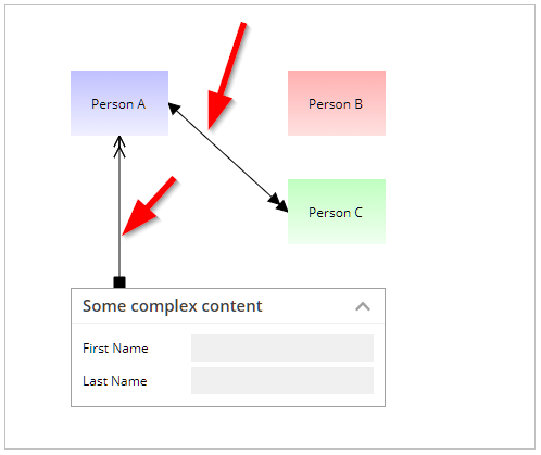
Interim points: the BOUNDS property contains the start and end point. The IMTRIMPOINTS attribute contains additional points that the line will take before reaching to the end point. The value is a semicolon separated string of x- and y-coordinates. The coordinates are relative to the starting point of the line.
| (default) no interim points | |
| 100;50;200;100 | From begin of line move to 100;50 then to 200;100 then to the end of line |
Client side event that triggers a server invoke.
| click | Mouse click (both mouse buttons) |
| leftclick | Mouse click (left mouse button) |
| rightclick | Mouse click (right mouse button) |
| doubleclick | Mouse double click |
| leftanyclick | Both click and double click are transferred, check event BaseActionEventInvoke on server side for click count |
| mousedown | Left mouse button down |
Color of line.
| #FFFFFF | White |
| #000000 | Black |
| #FF0000 | Red |
| #00FF00 | Green |
| #0000FF | Blue |
| #0000FF30 | Blue with a transparency of x30. |
Dashing of line. Semicolon separated string with a series of numbers: 1st number is defining the number of pixels that are dranw, 2nd number is defining the number of spaces that are left. This can be continued by adding additional pairs of numbers.
| Straight line | |
| 1;1 | Fine dotted line |
| 5;2 | Dashed line |
Id of line - which is used to identify the line in the scope of the current PAINTAREA. The LINEID is referenced by PAINTAREAITEM-LINEIDSSTARTING and PAINTAREAITEM-LINEIDSENDING.
Size / thickness of lines in pixels.
| 1 | 1 pixel |
| 2 | 2 pixels |
| 5 | 5 pixels |
Style of drawing the line
| default | (default) The line is drawn is direct line between two points |
| edged | The line is drawn by only using horizontal/vertical lines between two points |
Reference to the id of a POPUPMENU definition that is available either in this page or in a page that includes this page.
If set to true, then an explicit roundtrip is triggered when the user presses the right mouse button in order to open a popup menu. As result you can define the popup menu dynamically (using DYNAMICCONTENT) and prepare the popup menu at this point of time when the user want to open it.
| false | Menu is already defined in layout, no roundtrip (default) |
| true | Menu is dynamically created, roundtrip is triggered |
Reference to an outside object that is the content behind the component. E.g. a field is representing a certain field of a database table: in this case you could define the value table;column. The reference plays a siginficant role within the attributemacro management.
| ref | One reference |
| ref1;ref2 | Two references |
| ref1;ref2;ref3 | Three references |
Flag that indicated if this component is rendered at all. If set to false then the component is not rendered - there is no component data sent to the client.
| true | Component is rendered (default) |
| false | Component is not rendered |
In CaptainCasa you can define styles definitions for components. A style definition is a definition of a set of default attribute values that are applied to the component. In case you want to differenciate between different usage types of the component you can apply multiple styles - and use the stylevariant attribute to select between.
Text that is shown and (dependent from the component type) edited inside the component. The terminator is a decimal byte value.
Text that is shown as hint when the user stays with the mouse on top of the control for a while.
| ...anytext... | Text that is displayed as tooltip. |
| server:true | Indicator that tooltip for the component is managed on server side. The actionListener will be invokde with events BaseActionEventTooltipStarted and BaseActionEventTooltipEnde. On server side you may implement some modeless popup in order to show some more complex tooltip |
| server:true;opendelay:1000 | Duration in milliseconds after which a tooltip event is triggered when the user moves the mouse on top of this component |
When true then the user can define the interim points him/herself. In this case the update of interim points will be written back into the property that is assigned to attribute INTERIMPOINTS.
| false | (default) |
| true | With editing of interim points |