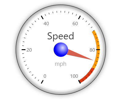
The component RGRAPH shows some graphics using the RGraph-library. Please check details on this library here: http://www.rgraph.net
The graphics is configured by some JSON string that is passed into the original RGraph-processing.
Typically used attributes
All attributes are
General attributes are
Used inside: ADAPTIVETILECONTAINER, ADAPTIVETOOLBAR, AREASELECTOR, BLOCKABLEAREA, COLSYNCHEDROW, DRAWAREA, FOLDABLEPANEHEADERROW, GRIDCOL, GRIDFOOTER, GRIDHEADER, GRIDHEADERLABEL, GRIDLAYOUTROW, LABELCONTAINER, OVERLAYAREABASEITEM, OVERLAYAREAITEM, PAGEBEANROOT, PAINTAREAITEM, REPEAT, ROW, ROWADAPTIVELINE, ROWFLEXCOLUMNCONTAINER, ROWFLEXLINECONTAINER, ROWFOOTER, ROWHEADER, ROWTITLEBAR, SCHEDULEITEM, SPANGRIDCOL, STABLEAREA, TEXTWITHCONTROLS, TREENODE
Binding to server side method that processes the events coming from this component.
| #{methodBinding} | Method binding |
Special binding to component adapter object instance on server side. The component adapter must be an instance of IComponentAdapterBinding. For some components (e.g. FIXGRID) there is an extended interface (e.g. IFIXGRIDComponentAdapterBinding).
| #{tobedefined} | Binding to IComponentAdapter instance |
If set to true then changes of the width/height of the component are animated.
| true | With animation |
| false | Without animation (default) |
Name of macro that is used for generating certain attributes of this component. Please pay attention: the value of this attribute is read one time for each control and cannot be changed afterwards.
Name of the page that is the bridge to the extenal framework. By default the page name is determined automatically, you may explicitly control if e.g. you want to use some older/newer version of the bridged framework.
| newest version (default) | |
| /xxx/yyy.html | Bridge page name, starting with slash, relative to webcontent-directory. |
Comment that can be asigned to any component. The comment is not operationally used.
| Any text | Any text |
Configuration information that is attached to this component. This information is not functionally used by CaptainCasa, but may be used for any application specific purpose.
Height of the control. Either defined as absolute value or as percentage value. Pay attention when using percentage sizing: the size refers to what is given from the components above. When using percentage sizing then you may define a minimum size in addition, by appending it with a semicolon: "100%;100" means: use 100%, but always keep a minimum size of 100. If using absolute sizes you may append a "+" to define, that the size is extended if required by the component. - Please note: the sizing may be completely taken over by the parent component (e.g. if a component is used in a grid cell), in this case the size definintions on this component level are obsolete.
| 100 | 100 Pixels |
| 120 | 120 Pixels |
| 200 | 200 Pixels |
| 50% | 50 percents |
| 100% | Full available height |
Reference to an outside object that is the content behind the component. E.g. a field is representing a certain field of a database table: in this case you could define the value table;column. The reference plays a siginficant role within the attributemacro management.
| ref | One reference |
| ref1;ref2 | Two references |
| ref1;ref2;ref3 | Three references |
Flag that indicated if this component is rendered at all. If set to false then the component is not rendered - there is no component data sent to the client.
| true | Component is rendered (default) |
| false | Component is not rendered |
Shadow of component. The definition is done by several inner values: hoffset, voffset, blur and color.
| hoffset:5;voffset:5;blur:5;color:#C0C0C0 | full shadow definition |
| color:#C0C0C0 | Definition only via color, rest of values is set to default values |
Width of the control. Either defined as absolute value or as percentage value. Pay attention when using percentage sizing: the size refers to what is given from the components above. When using percentage sizing then you may define a minimum size in addition, by appending it with a semicolon: "100%;100" means: use 100%, but always keep a minimum size of 100. If using absolute sizes you may append a "+" to define, that the size is extended if required by the component. - Please note: the sizing may be completely taken over by the parent component (e.g. if a component is used in a grid cell), in this case the size definintions on this component level are obsolete.
| 100 | 100 Pixels |
| 120 | 120 Pixels |
| 200 | 200 Pixels |
| 50% | 50 percents |
| 100% | Full available width |
When true then the component will do a callback to the server and invoke the actionListener after having successfully performed the client operation.
| false | No callback to server (default) |
| true | Callback to server |
When true then the component send an event BaseActionEventFinishedRendering to the server side after having updated its content.
| false | No callback to server (default) |
| true | Callback to server after rendering was finished |