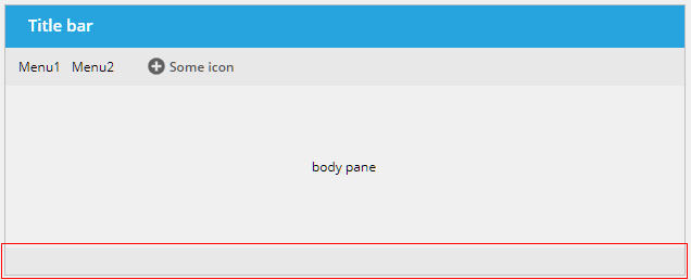
Graphical representation of a status bar. Depending on the severity of the message that is output, a message dialog is opened. The status bar typically is part of the outest page of your application.
By default you just have to embed the component without any configuration into your page.
On server side there is the class "rg.eclnt.jsfserver.defaultscreens.Statusbar" which provides corresponding methods to write messages of different severity into the status bar.
Please note: this is an explicit status bar which is always visible - regardless if it contains some inforamtion or not. When not defining any status bar in your dialog definition, then automatically a status bar will be used which shows up at the bottom of the screen when some output into the status bar is performed.
Typically used attributes
All attributes are
General attributes are
Used inside: ADAPTIVEAREAITEM, ANIMATEDPANE, BOX, FOLDABLEPANE, FOLDABLEVERTICALPANE, MENUITEMCONTAINER, OUTLOOKBARCONTENT, PAGE, PAINTAREAPANEITEM, PANE, PANEWITHSHADE, REPEAT, ROLLINGCONTAINER, ROWBODYPANE, ROWDEMOBODYPANE, SCROLLPANE, SHADOWEDPANE, SIZEABLEPANE, SIZEABLEPANEHORIZONTAL, SPLITPANESPLIT, STACKEDPANEITEM, TABBEDLINECONTAINERTAB, TABBEDPANETAB
Binding to server side method that processes the events coming from this component.
| #{methodBinding} | Method binding |
Name of macro that is used for generating certain attributes of this component. Please pay attention: the value of this attribute is read one time for each control and cannot be changed afterwards.
Background color of the component. Any RGB value can be chosen using format #rrggbb.
| #FFFFFF | White |
| #000000 | Black |
| #FF0000 | Red |
| #00FF00 | Green |
| #0000FF | Blue |
| #0000FF30 | Blue with a transparency of x30. |
Background paint commands. There is a sequence of paint commands which can be executed one after the other by listing them as semicolon separated list. - By appending certain suffixes to a command you can define that the command is only executed in a certain situation. Available suffixes are: _empty (content of component is empty), _focus, _nofocus, _enabled, _disabled, _mouseover. Multiple suffixes can be used in parallel (e.g. write_empty_focus).
| ----- | ----- bgpaint commands for all clients ----- |
| error() | Component indicates error. |
| mandatory() | Component indicates mandatory input. Only is shown if component does not have any content yet. |
| bgbackground(#FF0000) | Background with one color |
| bgbackground(#FF0000,#0000FF,vertical) | Background as gradient of two colors |
| bgimage(left,/images/xyz.png) | Image at certain position |
| bgwrite(left,...text...) | Text at certain position |
| bgwrite(left,...text...,#800000,12) | Text at certain position with defined color and size |
| ----- | ----- bgpaint commands for Java clients ----- |
| rectangle(0,0,100%,100%,#FF0000) | Red rectangle |
| rectangle(20,20,100,100,#FF0000) | Red rectangle from 20,20 to 120,120 |
| rectangle(20,20,100%-40,100%-40,#FF0000) | Minus absolute values is allowed after percentage definitions |
| rectangle(0,0,100%,100%,#FF0000,#00FF00,vertical) | Rectangle with color changing from red to green in vertical direction |
| roundedrectangle(0,0,100%,100%,10,10,#FF0000,#00FF00,vertical) | Rectangle with color changing from red to green in vertical direction |
| line(0,0,100%,100%,1,#00FF00) | Green line crossing the whole rectangle, from coordinate 0,0 to coordinat 100%,100%, thickness of line is 1 |
| image(0,0,/images/xyz.png,lefttop) | Image output x,y,image,position (lefttop/centermiddle/rightbottom...) |
| image(0,0,200,100,/images/xyz.png,lefttop) | Image output x,y,width,heigh,image,position (lefttop/centermiddle/rightbottom...) |
| scaledimage(0,0,200,100,/images/xyz.png,lefttop) | Scaled image output, the width/height ration is kept while scaling : x,y,width,heigh,image,position (lefttop/centermiddle/rightbottom...) |
| heximage(0,0,08FF40324672849CDFE...,lefttop) | Image output x,y,hexadecimal image,position (lefttop/centermiddle/rightbottom...) |
| heximage(0,0,200,100,08FF40324672849CDFE...,lefttop) | Image output x,y,width,height,hexadecimal image,position (lefttop/centermiddle/rightbottom...) |
| scaledheximage(0,0,200,100,08FF40324672849CDFE...,lefttop) | Scaled image output x,y,width,height,hexadecimal image,position (lefttop/centermiddle/rightbottom...) |
| border(0,0,100%,100%,#C0C0C0,2) | Rectangular border with thickness 2 |
| roundedborder(0,0,100%,100%,10,10,#C0C0C0,2) | Rounded border with thickness 2 |
| write(0,0,Some text,lefttop) | Some text in the left top corner |
| write(50%,50%,Some text,20,#00FF00,centermiddle) | Some text in the left center, font size 20, font color green |
| write(50%,50%,Some text,20,#00FF00,bold,centermiddle) | Some text in the left center, font size 20, font color green,bold |
| write(50%,50%,Some text,20,#00FF00,italic,centermiddle) | Some text in the left center, font size 20, font color green,italic |
| write(50%,50%,Some text,20,#00FF00,normal,centermiddle) | Some text in the left center, font size 20, font color green,normal |
| write(0,100%,Some text,20,#00FF00,default,lefttop,90) | Some text in the left bottom corner, font size 20, font color green, 90 degrees rotated |
| write(20,100%,Some text,20,#00FF00,default,lefttop,90,-1,1) | Some text in the left bottom corner, font size 20, font color green, 90 degrees rotated. x scaling -1, y scaling 1 |
| write(20,100%,Some text,20,#00FF00,bold,lefttop,90,-1,1) | Some text in the left bottom corner, font size 20, font color green, 90 degrees rotated. x scaling -1, y scaling 1 |
| writeifempty(0,0,Some text,lefttop) | Same as write-command, but now only visible if component contains data |
| writeifempty(50%,50%,Some text,20,#00FF00,centermiddle) | Same as write-command, but now only visible if component contains data |
| writemultiline(0,0,100%,100%,Some text) | Some text into the defined rectangle. Only fully supported with FX client, in Swing client the text will be output as one line. |
| writemultiline(0,0,100%,100%,Some text,20,#FF0000,bold) | Some text into the defined rectangle. In additional font size, text color and text style (normal,bold,italic) are passed. Only fully supported with FX client, in Swing client the text will be output as one line. |
| oval(0,0,100%,100%,#FF0000) | Red ellipse |
| oval(0,0,100%,100%,#FF0000,#00FF00,vertical) | Red ellipse with color changing from red to green |
| ovalborder(0,0,100%,100%,#FF0000,2) | Red ellipse border, red, 2 pixels thick |
| grid(100,#00000020) | Grid with line distance 100, black line color - with transparency |
| nodisabled() | Switches off the automated shading of disabled input components |
| background(#FF0000) | Sets the background of the painted area. |
| backgroundnofocus(#FF0000) | Sets the background of the painted area - which is only drawn if the component does not hold the focus. |
| repeatimage(/images/xyz.png) | The image is repeated and drawn all over the available space. |
Defintion of border of control. Either defined as straight color value, with then having a border of 1 pixel. Or: an explicit per-side definition as comma separated list of border definition values.
| #808080 | 1 pixel border in color dark gray. |
| top:1;color:#808080 | top:1;color:#808080 : border only on top, 1 pixel height, color #808080 |
| top:1;bottom:1;left:1;right:1;color:#FF0000 | top:1;bottom:1;left:1;right:1;color:#FF0000 : red border of 1 pixel size |
| top:1;bottom:1;left:1;right:1;color:#FF0000;dashing:5,2 | top:1;bottom:1;left:1;right:1;color:#FF0000 : red border of 1 pixel size, dashed with segments of 5 pixesl and 2 pixels; dashing only supported with FX Client! |
| noborder | Defines that no border is painted - esp. in cases when empty borders are normally added (e.g. in grid cells) |
Comment that can be asigned to any component. The comment is not operationally used.
| Any text | Any text |
Configuration information that is attached to this component. This information is not functionally used by CaptainCasa, but may be used for any application specific purpose.
Semicolon separated list of font attributes. Valid attributes are: faces (font family), size (integer number), weight (bold), posture (italic)
| family:Arial | family:Arial |
| family:Courier | family:Courier |
| size:12 | size:12 |
| weight:bold | weight:bold |
| size:12;weight:bold | size:12;weight:bold |
| size:12;posture:italic | size:12;posture:italic |
Foreground color of the component. Any RGB value can be chosen using format #rrggbb.
| #FFFFFF | White |
| #000000 | Black |
| #FF0000 | Red |
| #00FF00 | Green |
| #0000FF | Blue |
| #0000FF30 | Blue with a transparency of x30. |
Height of the control. Either defined as absolute value or as percentage value. Pay attention when using percentage sizing: the size refers to what is given from the components above. When using percentage sizing then you may define a minimum size in addition, by appending it with a semicolon: "100%;100" means: use 100%, but always keep a minimum size of 100. If using absolute sizes you may append a "+" to define, that the size is extended if required by the component. - Please note: the sizing may be completely taken over by the parent component (e.g. if a component is used in a grid cell), in this case the size definintions on this component level are obsolete.
| 100 | 100 Pixels |
| 120 | 120 Pixels |
| 200 | 200 Pixels |
| 50% | 50 percents |
| 100% | Full available height |
Reference to image within your web application. The image is defined in an absolute way (e.g. /images/abc.png) - the root directory for absolute addressing is the directory of the web application.
| /images/abc.png | Image /images/abc.png |
| /images/svg/def.svg | Image /images/svg/def.svg |
Binding to server side object property that represents the component on server side. The type of the property needs to fit to the component type. Example: for FIXGRID components the server side property needs to be of type FIXGRIDListBinding or FIXGRIDTreeBinding.
| #{xyz.xyz} | Binding definition |
Definition of padding on top level of container. This is the pixel distance between the outer shape of the container and its content. The definition either is a straight integer value or is an explicit per-side definition.
| 1 | One pixel distance on all sides (left, top, right, bottom) |
| 5 | 5 pixels distance on all sides (left, top, right, bottom) |
| left:1;right:1 | Only padding on the left and on the right - no padding on top and bottom. |
Image that is shown in information popup. Only uses if POPUPTEXTONCLICK is set to true.
| /images/abc.png | Image /images/abc.png |
| /images/svg/def.svg | Image /images/svg/def.svg |
Reference to the id of a POPUPMENU definition that is available either in this page or in a page that includes this page.
If set to true, then an explicit roundtrip is triggered when the user presses the right mouse button in order to open a popup menu. As result you can define the popup menu dynamically (using DYNAMICCONTENT) and prepare the popup menu at this point of time when the user want to open it.
| false | Menu is already defined in layout, no roundtrip (default) |
| true | Menu is dynamically created, roundtrip is triggered |
Reference to an outside object that is the content behind the component. E.g. a field is representing a certain field of a database table: in this case you could define the value table;column. The reference plays a siginficant role within the attributemacro management.
| ref | One reference |
| ref1;ref2 | Two references |
| ref1;ref2;ref3 | Three references |
Flag that indicated if this component is rendered at all. If set to false then the component is not rendered - there is no component data sent to the client.
| true | Component is rendered (default) |
| false | Component is not rendered |
Rounding radius of edges of border/background. This is optical rounding - so has nothing to do with mathematical rounding...
| 0 | Straight edges |
| 5 | Rounding with radius 5 |
| 10 | Rounding with radius 10 |
Shadow of component. The definition is done by several inner values: hoffset, voffset, blur and color.
| hoffset:5;voffset:5;blur:5;color:#C0C0C0 | full shadow definition |
| color:#C0C0C0 | Definition only via color, rest of values is set to default values |
Link to sound file (.wav) that is loaded. The link is either relative to the page or absolute within the web application.
| /sounds/ding.wav | Absolutely addressed sound file within the web application |
| ding.wav | Relatively addressed sound file |
Style class names that are applied to this component.
In CaptainCasa you can define styles definitions for components. A style definition is a definition of a set of default attribute values that are applied to the component. In case you want to differenciate between different usage types of the component you can apply multiple styles - and use the stylevariant attribute to select between.
Text that is shown and (dependent from the component type) edited inside the component. The terminator is a decimal byte value.