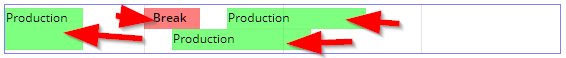
The SCHEDULEITEM component represents one item within the SCHEDULE component.
Each item has a position that is defined by the attributes SCHEDULELEFT and SCHEDULEWIDTH. The position refers to the SCHEDULE-SCHEDULEMAX attribute that is defined in the SCHEDULE component that holds the item.
The SCHEDULEITEM component may be directly used - or it may be used as container for components that you can arrange below.
Typically used attributes
All attributes are
General attributes are
Used inside: SCHEDULE
Using inside: ACTIVEX, ADAPTIVESPLITAREA, ADAPTIVETILECONTAINER, ADAPTIVETOOLBAR, ANIMATEDPANE, ANIMATEICON, AREASELECTOR, ARRAYGRID, AUTOCOMPLETE, AVATARICON, AWESOMEFONTICON, BLOCKABLEAREA, BOX, BROWSER, BUTTON, BUTTONCOPYPASTEACTIVATION, BUTTONMENU, BUTTONPOPUP, BUTTONVERTICAL, CALENDAR, CALENDARFIELD, CAMERA, CHARTJS, CHECKBOX, CLIENTFILEEXPLORER, CLOCK, CODEEDITOR, COLDISTANCE, COLLINE, COLORFIELD, COLORICON, COLSYNCHEDPANE, COMBOBOX, COMBOFIELD, DIRECTHTMLINSERT, DRAWAREA, DYNAMICCONTENT, DYNAMICCONTENT, FIELD, FILECHOOSER, FILEDOWNLOADBUTTON, FILEDOWNLOADLINK, FILEUPLOAD, FILEUPLOADBUTTON, FILEUPLOADBUTTONASYNCHRONOUS, FILEUPLOADLINK, FILEUPLOADLINKASYNCHRONOUS, FIXGRID, FIXGRIDTOUCHBUTTON, FIXGRIDWITHGROUPING, FOLDABLEPANE, FOLDABLEPOPUPINCLUDE, FOLDABLEVERTICALPANE, FONTICON, FORMATTEDFIELD, FULLSCREENBUTTON, FXCHART, GRIDHEADERLABEL, GRIDLAYOUTPANE, HELPICON, HEXIMAGE, HEXIMAGEMAP, HIDEABLE, HYPERLINK, ICON, ICONSEPTEXT, IFRAMEINCLUDE, IMAGE, IMAGEANONYMIZER, IMAGEANONYMIZERDIRECT, IMAGEMAP, IMAGESHAKER, JRVIEWER, KEYBOARDSCANNER, KEYSELECTOR, LABEL, LABELCONTAINER, LABELMULTILINE, LABELVERTICAL, LAYEREDPANE, LINK, LINKVERTICAL, LIST, LONGTEXTFIELD, MEDIAPLAYER, MENUBAR, MULTILABEL, OSMVIEWER, OUTLOOKBAR, OVERLAYAREA, PAGEBEANCOMPONENT, PAGEBEANINCLUDE, PAINTAREA, PANE, PARENTEXIT, PARENTEXIT, PASSWORD, PDFRENDERER, PDFRENDERERVIAURL, PICKLIST, POOLEDBROWSER, PROGRESSBAR, QRCODESCANNERJSQR, RADIAL, RADIOBUTTON, RADIOBUTTONGROUP, REPEAT, REPEAT, REPEAT, RGRAPH, ROLLINGCONTAINERAREA, SCALEPANE, SCENEJS, SCHEDULE, SCROLLANCHOR, SCROLLBAR, SCROLLNOTIFIER, SCROLLPANE, SHIFTCONTAINER, SIMPLEHTMLEDITOR, SIZEABLEPANE, SIZEABLEPANEHORIZONTAL, SLIDECONTAINER, SLIDER, SMARTLABEL, SMARTTEXTAREA, SPANGRID, SPINNER, SPLITPANE, STABLEAREAMANAGER, STABLEAREAPLACEHOLDER, SUBPAGE, SVGVIEWER, SYSTEMICON, TABBEDLINE, TABBEDLINECONTAINER, TABBEDLINEVERTICAL, TABBEDPANE, TEXTAREA, TEXTAREAWITHCOMMENT, TEXTEDITOR, TEXTPANE, TEXTPANEVERTICAL, TEXTWITHCONTROLS, TEXTWITHLINKS, TILEDAREA, TOGGLE, TOUCHFIELD, TOUCHFIELDNUMERIC, TOUCHSELECTOR, TOUCHSIGNATURE, TOUCHVIRTUALKEYBOARD, VIDEO, WINDOWSIZER, WORKPLACEPERSPECTIVESELECTOR
Text that is passed as control content to the accessible support devices (e.g. screen readers).
Binding to server side method that processes the events coming from this component.
| #{methodBinding} | Method binding |
Special binding to component adapter object instance on server side. The component adapter must be an instance of IComponentAdapterBinding. For some components (e.g. FIXGRID) there is an extended interface (e.g. IFIXGRIDComponentAdapterBinding).
| #{tobedefined} | Binding to IComponentAdapter instance |
Horizontal alignment of content.
| left | left (transferred into right when starting client in right to left mode) |
| left! | left (still is left when starting client in right to left mode) |
| center | center |
| right | right (transferred into left when starting client in right to left mode) |
| right! | right! (still is right when starting client in right to left mode) |
| leading | leading |
| trailing | trailing |
Name of macro that is used for generating certain attributes of this component. Please pay attention: the value of this attribute is read one time for each control and cannot be changed afterwards.
Background color of the component. Any RGB value can be chosen using format #rrggbb.
| #FFFFFF | White |
| #000000 | Black |
| #FF0000 | Red |
| #00FF00 | Green |
| #0000FF | Blue |
| #0000FF30 | Blue with a transparency of x30. |
Background paint commands. There is a sequence of paint commands which can be executed one after the other by listing them as semicolon separated list. - By appending certain suffixes to a command you can define that the command is only executed in a certain situation. Available suffixes are: _empty (content of component is empty), _focus, _nofocus, _enabled, _disabled, _mouseover. Multiple suffixes can be used in parallel (e.g. write_empty_focus).
| ----- | ----- bgpaint commands for all clients ----- |
| error() | Component indicates error. |
| mandatory() | Component indicates mandatory input. Only is shown if component does not have any content yet. |
| bgbackground(#FF0000) | Background with one color |
| bgbackground(#FF0000,#0000FF,vertical) | Background as gradient of two colors |
| bgimage(left,/images/xyz.png) | Image at certain position |
| bgwrite(left,...text...) | Text at certain position |
| bgwrite(left,...text...,#800000,12) | Text at certain position with defined color and size |
| ----- | ----- bgpaint commands for Java clients ----- |
| rectangle(0,0,100%,100%,#FF0000) | Red rectangle |
| rectangle(20,20,100,100,#FF0000) | Red rectangle from 20,20 to 120,120 |
| rectangle(20,20,100%-40,100%-40,#FF0000) | Minus absolute values is allowed after percentage definitions |
| rectangle(0,0,100%,100%,#FF0000,#00FF00,vertical) | Rectangle with color changing from red to green in vertical direction |
| roundedrectangle(0,0,100%,100%,10,10,#FF0000,#00FF00,vertical) | Rectangle with color changing from red to green in vertical direction |
| line(0,0,100%,100%,1,#00FF00) | Green line crossing the whole rectangle, from coordinate 0,0 to coordinat 100%,100%, thickness of line is 1 |
| image(0,0,/images/xyz.png,lefttop) | Image output x,y,image,position (lefttop/centermiddle/rightbottom...) |
| image(0,0,200,100,/images/xyz.png,lefttop) | Image output x,y,width,heigh,image,position (lefttop/centermiddle/rightbottom...) |
| scaledimage(0,0,200,100,/images/xyz.png,lefttop) | Scaled image output, the width/height ration is kept while scaling : x,y,width,heigh,image,position (lefttop/centermiddle/rightbottom...) |
| heximage(0,0,08FF40324672849CDFE...,lefttop) | Image output x,y,hexadecimal image,position (lefttop/centermiddle/rightbottom...) |
| heximage(0,0,200,100,08FF40324672849CDFE...,lefttop) | Image output x,y,width,height,hexadecimal image,position (lefttop/centermiddle/rightbottom...) |
| scaledheximage(0,0,200,100,08FF40324672849CDFE...,lefttop) | Scaled image output x,y,width,height,hexadecimal image,position (lefttop/centermiddle/rightbottom...) |
| border(0,0,100%,100%,#C0C0C0,2) | Rectangular border with thickness 2 |
| roundedborder(0,0,100%,100%,10,10,#C0C0C0,2) | Rounded border with thickness 2 |
| write(0,0,Some text,lefttop) | Some text in the left top corner |
| write(50%,50%,Some text,20,#00FF00,centermiddle) | Some text in the left center, font size 20, font color green |
| write(50%,50%,Some text,20,#00FF00,bold,centermiddle) | Some text in the left center, font size 20, font color green,bold |
| write(50%,50%,Some text,20,#00FF00,italic,centermiddle) | Some text in the left center, font size 20, font color green,italic |
| write(50%,50%,Some text,20,#00FF00,normal,centermiddle) | Some text in the left center, font size 20, font color green,normal |
| write(0,100%,Some text,20,#00FF00,default,lefttop,90) | Some text in the left bottom corner, font size 20, font color green, 90 degrees rotated |
| write(20,100%,Some text,20,#00FF00,default,lefttop,90,-1,1) | Some text in the left bottom corner, font size 20, font color green, 90 degrees rotated. x scaling -1, y scaling 1 |
| write(20,100%,Some text,20,#00FF00,bold,lefttop,90,-1,1) | Some text in the left bottom corner, font size 20, font color green, 90 degrees rotated. x scaling -1, y scaling 1 |
| writeifempty(0,0,Some text,lefttop) | Same as write-command, but now only visible if component contains data |
| writeifempty(50%,50%,Some text,20,#00FF00,centermiddle) | Same as write-command, but now only visible if component contains data |
| writemultiline(0,0,100%,100%,Some text) | Some text into the defined rectangle. Only fully supported with FX client, in Swing client the text will be output as one line. |
| writemultiline(0,0,100%,100%,Some text,20,#FF0000,bold) | Some text into the defined rectangle. In additional font size, text color and text style (normal,bold,italic) are passed. Only fully supported with FX client, in Swing client the text will be output as one line. |
| oval(0,0,100%,100%,#FF0000) | Red ellipse |
| oval(0,0,100%,100%,#FF0000,#00FF00,vertical) | Red ellipse with color changing from red to green |
| ovalborder(0,0,100%,100%,#FF0000,2) | Red ellipse border, red, 2 pixels thick |
| grid(100,#00000020) | Grid with line distance 100, black line color - with transparency |
| nodisabled() | Switches off the automated shading of disabled input components |
| background(#FF0000) | Sets the background of the painted area. |
| backgroundnofocus(#FF0000) | Sets the background of the painted area - which is only drawn if the component does not hold the focus. |
| repeatimage(/images/xyz.png) | The image is repeated and drawn all over the available space. |
Defintion of border of control. Either defined as straight color value, with then having a border of 1 pixel. Or: an explicit per-side definition as comma separated list of border definition values.
| #808080 | 1 pixel border in color dark gray. |
| top:1;color:#808080 | top:1;color:#808080 : border only on top, 1 pixel height, color #808080 |
| top:1;bottom:1;left:1;right:1;color:#FF0000 | top:1;bottom:1;left:1;right:1;color:#FF0000 : red border of 1 pixel size |
| top:1;bottom:1;left:1;right:1;color:#FF0000;dashing:5,2 | top:1;bottom:1;left:1;right:1;color:#FF0000 : red border of 1 pixel size, dashed with segments of 5 pixesl and 2 pixels; dashing only supported with FX Client! |
| noborder | Defines that no border is painted - esp. in cases when empty borders are normally added (e.g. in grid cells) |
Name that is assigned to the component at client side: there is no specific function associated with the name - but it can be used on client side to describe the component in a clearer way. The name is e.g. used by UI test tools that replay certain user interaction sequences - and that reference components via their name.
Comment that can be asigned to any component. The comment is not operationally used.
| Any text | Any text |
Configuration information that is attached to this component. This information is not functionally used by CaptainCasa, but may be used for any application specific purpose.
Type of text content that is output.
| text/plain | Unformatted text (default + fastest) |
| text/html | Simple HTML |
If set to true then an event is triggered on server side when the user starts a drag operation. The event is of type BaseActionEventDragStarted.
| false | No event triggered (default) |
| true | Event triggered |
Description of object that can be dragged from this component. The description consists out of a type and and id. A component may have multiple objects that can be associated.
| article:4711 | Example: article |
| file:harry.txt;content:Hello world! | Example: Multiple object descriptions |
Defines if the rectangle that is drawn behind the cursor when executing drag and drop is positioned at its original position, or whether it is moved with its left top coordinate to the cursor position.
| true | Rectangle's left top position is moved to mouse cursor position |
| false | Rectangle is not moved (default) |
Text that is shown when dragging over the component. The text is only shown if a drop is possible (DROPRECEIVE definition).
| (default) No text shown | |
| pixel(5) Current drop pixel position - in steps of 5 (or any other value) | |
| pixelX(5) Current drop pixel position - only the x-position | |
| pixelY(5) Current drop pixel position - only the y-position | |
| percentage(5) Current drop pixel position as percentage number - in steps of 5 (or any other value) | |
| percentageX(5) Current drop pixel position as percentage number - only the x-position | |
| percentageY(5) Current drop pixel position as percentage number - only the y-position | |
| textX(0,left,25,middle,75,right) Text that is shown depending from percentage x-position |
Semicolon separated list of object types that can be dropped onto this component.
| article | Example: articles can be dropped |
| article;customer | Example: articles and customers can be dropped |
Indicator if a notification is sent to the server when the user selects the component.
| true | Flush is done on selection. |
| false | No flush. |
Defines if the component is focusable. The default depends on the component: typical input components (field, check box, ...) are focusable by default, while typical structure components (pane, label, ...) are not focusable by default.
| true | Focusable |
| false | Not focusable |
Hotkey definition that is used als alternative to the tab-key for moving the focus into the next component.
| No keyboard association (default) | |
| ctrl-83 | Control key + s |
| alt-83 | Alt key + s |
| shift-83 | Shift key + s |
| ctrl-shift-83 | Control key + Shift key + s |
| 10 | return |
| 32 | space |
| 37 | cursor left |
| 38 | cursor up |
| 39 | cursor right |
| 40 | cursor down |
| 33 | page up |
| 34 | page down |
| 36 | Begin |
| 35 | End |
| 27 | escape |
| 127 | Del |
| 65 | a |
| 66 | b |
| 67 | c |
| 68 | d |
| 69 | e |
| 70 | f |
| 71 | g |
| 72 | h |
| 73 | i |
| 74 | j |
| 75 | k |
| 76 | l |
| 77 | m |
| 78 | n |
| 79 | o |
| 80 | p |
| 81 | q |
| 82 | r |
| 83 | s |
| 84 | t |
| 85 | u |
| 86 | v |
| 87 | w |
| 88 | x |
| 89 | y |
| 90 | z |
| 48 | 0 |
| 49 | 1 |
| 50 | 2 |
| 51 | 3 |
| 52 | 4 |
| 53 | 5 |
| 54 | 6 |
| 55 | 7 |
| 56 | 8 |
| 57 | 9 |
| 112 | F1 |
| 113 | F2 |
| 114 | F3 |
| 115 | F4 |
| 116 | F5 |
| 117 | F6 |
| 118 | F7 |
| 119 | F8 |
| 120 | F9 |
| 121 | F10 |
| 122 | F11 |
| 123 | F12 |
Hotkey definition that is used als alternative to the tab-key for moving the focus into the previous component.
| No keyboard association (default) | |
| ctrl-83 | Control key + s |
| alt-83 | Alt key + s |
| shift-83 | Shift key + s |
| ctrl-shift-83 | Control key + Shift key + s |
| 10 | return |
| 32 | space |
| 37 | cursor left |
| 38 | cursor up |
| 39 | cursor right |
| 40 | cursor down |
| 33 | page up |
| 34 | page down |
| 36 | Begin |
| 35 | End |
| 27 | escape |
| 127 | Del |
| 65 | a |
| 66 | b |
| 67 | c |
| 68 | d |
| 69 | e |
| 70 | f |
| 71 | g |
| 72 | h |
| 73 | i |
| 74 | j |
| 75 | k |
| 76 | l |
| 77 | m |
| 78 | n |
| 79 | o |
| 80 | p |
| 81 | q |
| 82 | r |
| 83 | s |
| 84 | t |
| 85 | u |
| 86 | v |
| 87 | w |
| 88 | x |
| 89 | y |
| 90 | z |
| 48 | 0 |
| 49 | 1 |
| 50 | 2 |
| 51 | 3 |
| 52 | 4 |
| 53 | 5 |
| 54 | 6 |
| 55 | 7 |
| 56 | 8 |
| 57 | 9 |
| 112 | F1 |
| 113 | F2 |
| 114 | F3 |
| 115 | F4 |
| 116 | F5 |
| 117 | F6 |
| 118 | F7 |
| 119 | F8 |
| 120 | F9 |
| 121 | F10 |
| 122 | F11 |
| 123 | F12 |
Explicit definition of tab sequence. The format of the definition is GROUP/SEQUENCENUMBER. You can define any number of tab-groups within one page. If the user tabs into a component with a FOCUSSEQUENCE definition then the next tab will focus the next component belonging to the same GROUP and holding the next SEQUENCENUMBER. - By default the FOCUSSEQUENCE value is prefixed with some page-id before being sent to the client so that definitions of one page do not affect definitions of another page. You can explicitly avoid this prefixing by using the naming convention ccfix_GROUP/SEQUENCENUMBER.
| ----- | ----- Examples ----- |
| A/1 | Example: group A, sequence 1 |
| A/2 | Example: group A, sequence 2 |
Semicolon separated list of font attributes. Valid attributes are: faces (font family), size (integer number), weight (bold), posture (italic)
| family:Arial | family:Arial |
| family:Courier | family:Courier |
| size:12 | size:12 |
| weight:bold | weight:bold |
| size:12;weight:bold | size:12;weight:bold |
| size:12;posture:italic | size:12;posture:italic |
Foreground color of the component. Any RGB value can be chosen using format #rrggbb.
| #FFFFFF | White |
| #000000 | Black |
| #FF0000 | Red |
| #00FF00 | Green |
| #0000FF | Blue |
| #0000FF30 | Blue with a transparency of x30. |
Client side event that triggers a server invoke.
| click | Mouse click (both mouse buttons) |
| leftclick | Mouse click (left mouse button) |
| rightclick | Mouse click (right mouse button) |
| doubleclick | Mouse double click |
| leftanyclick | Both click and double click are transferred, check event BaseActionEventInvoke on server side for click count |
| mousedown | Left mouse button down |
If set to true then you define that no explicit text component will be rendered into the component. Any text definition you do will consequently not be rendered. - You may use this attribute to explicitly switch off the normal text component and render own text (if required) through BGPAINT definitions.
| true | No text component will be internally built |
| false | Text component will be built (default) |
Reference to the id of a POPUPMENU definition that is available either in this page or in a page that includes this page.
If set to true, then an explicit roundtrip is triggered when the user presses the right mouse button in order to open a popup menu. As result you can define the popup menu dynamically (using DYNAMICCONTENT) and prepare the popup menu at this point of time when the user want to open it.
| false | Menu is already defined in layout, no roundtrip (default) |
| true | Menu is dynamically created, roundtrip is triggered |
Reference to an outside object that is the content behind the component. E.g. a field is representing a certain field of a database table: in this case you could define the value table;column. The reference plays a siginficant role within the attributemacro management.
| ref | One reference |
| ref1;ref2 | Two references |
| ref1;ref2;ref3 | Three references |
Flag that indicated if this component is rendered at all. If set to false then the component is not rendered - there is no component data sent to the client.
| true | Component is rendered (default) |
| false | Component is not rendered |
Indicator, by which you can control the focus to be moved into this component.
| creation | Component requests focus when created. |
| ...int value... | Counter coming from server side. Please check Developers Guide. |
Hotkey definition that is used request the focus for this component. The hotkey is globally available within the corresponding dialog.
| No keyboard association (default) | |
| ctrl-83 | Control key + s |
| alt-83 | Alt key + s |
| shift-83 | Shift key + s |
| ctrl-shift-83 | Control key + Shift key + s |
| 10 | return |
| 32 | space |
| 37 | cursor left |
| 38 | cursor up |
| 39 | cursor right |
| 40 | cursor down |
| 33 | page up |
| 34 | page down |
| 36 | Begin |
| 35 | End |
| 27 | escape |
| 127 | Del |
| 65 | a |
| 66 | b |
| 67 | c |
| 68 | d |
| 69 | e |
| 70 | f |
| 71 | g |
| 72 | h |
| 73 | i |
| 74 | j |
| 75 | k |
| 76 | l |
| 77 | m |
| 78 | n |
| 79 | o |
| 80 | p |
| 81 | q |
| 82 | r |
| 83 | s |
| 84 | t |
| 85 | u |
| 86 | v |
| 87 | w |
| 88 | x |
| 89 | y |
| 90 | z |
| 48 | 0 |
| 49 | 1 |
| 50 | 2 |
| 51 | 3 |
| 52 | 4 |
| 53 | 5 |
| 54 | 6 |
| 55 | 7 |
| 56 | 8 |
| 57 | 9 |
| 112 | F1 |
| 113 | F2 |
| 114 | F3 |
| 115 | F4 |
| 116 | F5 |
| 117 | F6 |
| 118 | F7 |
| 119 | F8 |
| 120 | F9 |
| 121 | F10 |
| 122 | F11 |
| 123 | F12 |
Enables / disables resizing of the component by the user.
| true | Resizing is enabled (default) |
| false | Resizing is disabled |
Rounding radius of edges of border/background. This is optical rounding - so has nothing to do with mathematical rounding...
| 0 | Straight edges |
| 5 | Rounding with radius 5 |
| 10 | Rounding with radius 10 |
Logical left position of schedule item inside its SCHEDULE component. In the SCHEDULE component you need to assign a corresponding SCHEDULEMAX value.
| any positive integer value |
Logical width of schedule item inside SCHEDULE component. In the SCHEDULE component you need to assign a corresponding SCHEDULEMAX value.
| any positive integer value |
Shadow of component. The definition is done by several inner values: hoffset, voffset, blur and color.
| hoffset:5;voffset:5;blur:5;color:#C0C0C0 | full shadow definition |
| color:#C0C0C0 | Definition only via color, rest of values is set to default values |
By default a SCHEDULEITEM component provides a sizer component on its righ (or bottom) side. You can in addition activate a sizer on the left (or top) as well by defining this attribute to be true.
| false | Only sizer on right/bottom side (default) |
| true | Sizer both on lef/top and right/bottom side |
Coloring of sizer at the border of the component. Typically you select some transparent coloring (#rrggbbTT) so that the background shines through. The default is #00000010.
| #FFFFFF | White |
| #000000 | Black |
| #FF0000 | Red |
| #00FF00 | Green |
| #0000FF | Blue |
| #0000FF30 | Blue with a transparency of x30. |
Style class names that are applied to this component.
In CaptainCasa you can define styles definitions for components. A style definition is a definition of a set of default attribute values that are applied to the component. In case you want to differenciate between different usage types of the component you can apply multiple styles - and use the stylevariant attribute to select between.
Text that is shown and (dependent from the component type) edited inside the component. The terminator is a decimal byte value.
Text that is shown as hint when the user stays with the mouse on top of the control for a while.
| ...anytext... | Text that is displayed as tooltip. |
| server:true | Indicator that tooltip for the component is managed on server side. The actionListener will be invokde with events BaseActionEventTooltipStarted and BaseActionEventTooltipEnde. On server side you may implement some modeless popup in order to show some more complex tooltip |
| server:true;opendelay:1000 | Duration in milliseconds after which a tooltip event is triggered when the user moves the mouse on top of this component |
Text that is shown as hint below the component. The text appears when the user steps into the component, i.e. when the component is focussed. It automatically disappears when the user steps into the next component. - Please note: the user hint is only activiated by the user if the component is focusable!
Trigger for showing the user hint. The user hint is shown in the same way as if the user focused the component.
Vertical positioning of the content within the row.
| top | Top |
| middle | Middle (default) |
| bottom | Bottom |
If set then corresponding focus events are triggered if the component gains/looses the focus.
| false | (default) no focus events |
| true | with focus events |
| focusgained | with focus events but only for gaining the focus |
| focuslost | with focus events but only for loosing the focus |
Defines if a word is wrapped when exceeding the width of the componnent.
| false | Word is not wrapped (default) |
| true | Word is wrapped |