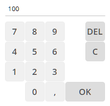
The component TOUCHFIELDNUMERIC renders a virtual numeric keyboard that is bound to one value.
Typically used attributes
All attributes are
General attributes are
Used inside: ADAPTIVETILECONTAINER, ADAPTIVETOOLBAR, AREASELECTOR, BLOCKABLEAREA, COLSYNCHEDROW, DRAWAREA, FOLDABLEPANEHEADERROW, GRIDCOL, GRIDFOOTER, GRIDHEADER, GRIDHEADERLABEL, GRIDLAYOUTROW, LABELCONTAINER, OVERLAYAREABASEITEM, OVERLAYAREAITEM, PAGEBEANROOT, PAINTAREAITEM, REPEAT, ROW, ROWADAPTIVELINE, ROWFLEXCOLUMNCONTAINER, ROWFLEXLINECONTAINER, ROWFOOTER, ROWHEADER, ROWTITLEBAR, SCHEDULEITEM, SPANGRIDCOL, STABLEAREA, TEXTWITHCONTROLS, TREENODE
Binding to server side method that processes the events coming from this component.
| #{methodBinding} | Method binding |
Special binding to component adapter object instance on server side. The component adapter must be an instance of IComponentAdapterBinding. For some components (e.g. FIXGRID) there is an extended interface (e.g. IFIXGRIDComponentAdapterBinding).
| #{tobedefined} | Binding to IComponentAdapter instance |
If set to true then changes of the width/height of the component are animated.
| true | With animation |
| false | Without animation (default) |
Spanning of columns if used inside a COLSYNCHEDROW or inside a GRIDLAYOUTPANE.
| 1 | Control spans one column (default) |
| 2 | 2 columns |
| 3 | 3 columns |
Comment that can be asigned to any component. The comment is not operationally used.
| Any text | Any text |
Configuration information that is attached to this component. This information is not functionally used by CaptainCasa, but may be used for any application specific purpose.
Indicator if component is enabled or not.
| true | Component is enabled. |
| false | Component is not enabled. |
Alignment of the field in which the touch input is shown on top of the touch buttons.
| left | left (transferred into right when starting client in right to left mode) |
| left! | left (still is left when starting client in right to left mode) |
| center | center |
| right | right (transferred into left when starting client in right to left mode) |
| right! | right! (still is right when starting client in right to left mode) |
| leading | leading |
| trailing | trailing |
Indicator if data changed in the component are transferred immediately to the server, causing a normal round trip processing from client to server.
| true | Flush is done on data change. |
| false | No flush. Data is transferred to server with next round trip. |
Height of the control. Either defined as absolute value or as percentage value. Pay attention when using percentage sizing: the size refers to what is given from the components above. When using percentage sizing then you may define a minimum size in addition, by appending it with a semicolon: "100%;100" means: use 100%, but always keep a minimum size of 100. If using absolute sizes you may append a "+" to define, that the size is extended if required by the component. - Please note: the sizing may be completely taken over by the parent component (e.g. if a component is used in a grid cell), in this case the size definintions on this component level are obsolete.
| 100 | 100 Pixels |
| 120 | 120 Pixels |
| 200 | 200 Pixels |
| 50% | 50 percents |
| 100% | Full available height |
If set to true then component will show the input masked as a password.
| true | Output masked as password. |
| false | Normal output (default) |
Flag that indicated if this component is rendered at all. If set to false then the component is not rendered - there is no component data sent to the client.
| true | Component is rendered (default) |
| false | Component is not rendered |
Indicator, by which you can control the focus to be moved into this component.
| creation | Component requests focus when created. |
| ...int value... | Counter coming from server side. Please check Developers Guide. |
Hotkey definition that is used request the focus for this component. The hotkey is globally available within the corresponding dialog.
| No keyboard association (default) | |
| ctrl-83 | Control key + s |
| alt-83 | Alt key + s |
| shift-83 | Shift key + s |
| ctrl-shift-83 | Control key + Shift key + s |
| 10 | return |
| 32 | space |
| 37 | cursor left |
| 38 | cursor up |
| 39 | cursor right |
| 40 | cursor down |
| 33 | page up |
| 34 | page down |
| 36 | Begin |
| 35 | End |
| 27 | escape |
| 127 | Del |
| 65 | a |
| 66 | b |
| 67 | c |
| 68 | d |
| 69 | e |
| 70 | f |
| 71 | g |
| 72 | h |
| 73 | i |
| 74 | j |
| 75 | k |
| 76 | l |
| 77 | m |
| 78 | n |
| 79 | o |
| 80 | p |
| 81 | q |
| 82 | r |
| 83 | s |
| 84 | t |
| 85 | u |
| 86 | v |
| 87 | w |
| 88 | x |
| 89 | y |
| 90 | z |
| 48 | 0 |
| 49 | 1 |
| 50 | 2 |
| 51 | 3 |
| 52 | 4 |
| 53 | 5 |
| 54 | 6 |
| 55 | 7 |
| 56 | 8 |
| 57 | 9 |
| 112 | F1 |
| 113 | F2 |
| 114 | F3 |
| 115 | F4 |
| 116 | F5 |
| 117 | F6 |
| 118 | F7 |
| 119 | F8 |
| 120 | F9 |
| 121 | F10 |
| 122 | F11 |
| 123 | F12 |
Rounding radius of edges of border/background. This is optical rounding - so has nothing to do with mathematical rounding...
| 0 | Straight edges |
| 5 | Rounding with radius 5 |
| 10 | Rounding with radius 10 |
Spanning of rows if used inside a GRIDLAYOUTPANE.
| 1 | Control spans one row (default) |
| 2 | 2 rows |
| 3 | 3 rows |
Shadow of component. The definition is done by several inner values: hoffset, voffset, blur and color.
| hoffset:5;voffset:5;blur:5;color:#C0C0C0 | full shadow definition |
| color:#C0C0C0 | Definition only via color, rest of values is set to default values |
Style class names that are applied to this component.
Key-layout of the touch field.
| qwert | Alphanumeric keyboard |
| abc | Alphanumeric, in alphabeetical order |
| numeric | Numeric |
| numericint | Numeric integer |
| numeric_nook | Numeric - no OK |
| numericint_nook | Numeric integer - no OK |
Data value that is shown and (dependent from the component type) edited inside the component.
Width of the control. Either defined as absolute value or as percentage value. Pay attention when using percentage sizing: the size refers to what is given from the components above. When using percentage sizing then you may define a minimum size in addition, by appending it with a semicolon: "100%;100" means: use 100%, but always keep a minimum size of 100. If using absolute sizes you may append a "+" to define, that the size is extended if required by the component. - Please note: the sizing may be completely taken over by the parent component (e.g. if a component is used in a grid cell), in this case the size definintions on this component level are obsolete.
| 100 | 100 Pixels |
| 120 | 120 Pixels |
| 200 | 200 Pixels |
| 50% | 50 percents |
| 100% | Full available width |
x-pixel-position: this attribute is only used if the component is directly placed into a PAINTAREA!
y-pixel-position: this attribute is only used if the component is directly placed into a PAINTAREA!