Update 20240416 - A client side vulnerability was closed. Users if component TEXTEDITOR should check if their content is sanitized “too much” and should take corresponding activities.
Update 20240206 - The client now comes with external client libraries being outsourced as own artifacts/.jar files. If using component CHARTJS, SIMPLEHTMLEDITOR, CODEEDITOR, RGRAPH, OSMVIEWER, QRCODESCANNERJSQR: you now have to explicitly embed the component's library, it is not part of the “big jar delivery” anymore.
The following controls were updated for preventing the possibility of JS injection in certain cases:
TREENODE
SMARTLABEL
TEXTEDITOR
Detailed information is available by CaptainCasa on request. Please contact info@CaptainCasa.com.
For the TEXTEDITOR the default sanitizing was added that restricts the editing to text formatting only. As with other components (e.g. SIMPLEHTMLEDITOR) the sanitizing can be switched off by a new attribute AVOIDSANITIZING. - If setting this attribute to “true” then you explicitly take responsibility for sanitizing the content before sending it to the client side.
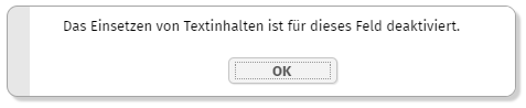
The components FIELD, FORMATTEDFIELD, PASSWORD, COMBOFIELD now provide the attributes AVOIDCOPY and AVOIDPASTE.
In case the user performs a corresponding activity, then the activity will not be executed and a corresponding dialog will be shown:
The texts are translated to en, de, fr at the moment.
The control palette introduced with 20240402 always positioned controls of some extended library at the end of the list of palettes - with name “Library <id>” - if therer was no explicit folder definition in file “controlsarrangement.xml”.
Now you can explicitly move your controls into the top level palette by just assigning “” (empty string) as folder. Example:
<tag name="xxx:yyyy" folder=""/>
By the way: you can (since 20240402) also assign control to several palettes - e.g. you may define:
<tag name="xxx:yyyy" folder="Fields;Super Controls;"/>
Now the control will be part of three palettes: the “Fields”, the “Super Controls” and the “” top palette.
There is a new tab for selecting the color:
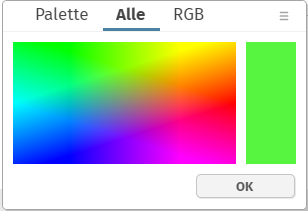
The value is picked from the image that is shown by clicking into the image. The image can also be modified by your style.
The Bean Browser (on the right side of the Layout Editor) showed static method implementations of set/get-properties - but these are not accessed by the runtime. Now they are not shown anymore.
In the Layout Editor you now see the CaptainCasa controls as palette on the left side:

From the palette you can drag and drop the controls into the component tree - as alternative to using the right mouse button menu (popup menu). By clicking onto a control a dialog is opened showing the documentation for this control.
PLEASE: update the CaptainCasa tool set when using 20240402.
The HTML page that is the starting page when calling a “.risc” URL contains some HTML-meta tags:
<html>
<head>
<meta http-equiv="Content-Type" content="text/html;charset=UTF-8"/>
<meta name="apple-mobile-web-app-capable" content="yes"/>
<meta name="mobile-web-app-capable" content="yes"/>
<meta name="viewport" content="width=device-width,height=device-height,user-scalable=no,initial-scale=1,maximum-scale=1,minimum-scale=1"/>
...
...
These tags so far were (partially) part of some inner template page that was managed by the CaptainCasa framework. Now the parameters can be explicitly configured by system.xml configuration file:
<system>
...
<riscclientmetatag name="..." httpequiv="..." content="..."/>
...
</system>
You can either modify the existing 4 parameters by overriding their value or add additional parameters.
Up to now there was a 5th meta tag...
<meta http-equiv="X-UA-Compatible" content="IE=edge"/>
...which caused problems in some Edge-environments and which we now do not set anymore. In case you are using an IE10/11 environment: please check if this causes problems on your side. If so, then explicitly set the parameter in your system.xml:
<system>
...
<riscclientmetatag httpequiv="X-UA-Compatible" content="IE=edge"/>
...
By using FORMATMASK suffix “_adp” with numeric format definitions (e.g. “dec2_adp”), the user is allowed to use both “.” and “,” for separating the decimal digits. (“adp” is the abbreviation for “any decimal point”...).
When using this mask then the input of e.g. “,99” was not accepted as valid value, the user had to explicitly define “0,99”.
The “SecurityFilterGeneral” (please check the documentation “CaptainCasa Security Guide” for details) can - as any other filter - be switched off by deactivating the filter in system.xml. Even though the filter was switched off in the filter chain, there was some left-over - and still some cookie was written into the response (“ccclientcheckidgeneral”). The cookie was not used in any way and did not contain any critical data - but just was visible when observing the communication between browser and server.
Some of the addons that are delivered as Maven artifacts (e.g. “org.eclnt::eclntsjrxml”) did not contain a “META-INF/maven/..../pom.xml” within their “.jar” file. This caused warnings when embedding them into Maven projects.
When opening a popup dialog in the constructor of a page that is opened as work page, then the popup was shown with empty content.
This bug was introduced with update 20240118. In principal it is a serious bug, on the other hand in only occurs in special situations - and if it occurs, it is a such obvious mal function of the system, that he cannot be overseen... This was the reason to not categorize the bug as showstopper-bug for the releases between 20240118 an this update.
The “good old web.xml” does not play a significant role anymore within the CaptainCasa runtime - all registrations (e.g. of servlets) is done by API.
By using the CaptainCasa configuration file “system.xml” you up to now could only deactivate servlets which were part of the (coded) CaptainCasa starting procedure. And new servlets had to be added by overriding the class “CCInitializeServlets”.
Now you can add servlets by corresponding definitions in the system.xml:
<system>
...
<addservlet
classname="...full class name..."
mappings="..def1...;...def2...;...def3..."/>
...
</system>
We updated the client version of JQuery to release 3.7.1.
The TIMER component now provides an attribute to reset the timer on client side so that it starts with counting from the scratch.
Sometimes you like it - sometimes you hate it: the browser's attempts to auto-fill certain fields. We just ran through a customer scenario in which the field for the IBAN number of a form definition was pre-filled by the (Chrome-) browser.
When defining FIELD-BROWSERAUTOFILL as “false” then we now also the the input field's “role” attribute to value “presentation”. This seems to be a reliable way to switch off the auto-filling for Chrome.
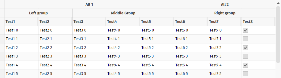
The FIXGRID component draws some borders between the columns. The default definition is done on FIXGRID level:
FIXGRID-BORDERWIDTH: width of border in pixels
FIXGRID-BORDERCOLOR: color of border
Now you can do BORDERWIDTH and BORDERCOLOR definitions on column level as well - using attributes GRIDCOL-BORDERWIDTH and GRIDCOL-BORDERCOLOR. The columns values override the grid values.
Please check the demo in the demo workplace (“News” section).
The new FIXGRID feature about individual border definitions is used within the component FIXGRIDWITHGROUPING, that internally is based on the FIXGRID component. There are two new attributes:
FIXGRIDWITHGROUPING-BORDERCOLORSPERLEVEL
FIXGRIWITHGROUPING-BORDERWIDTHSPERLEVEL
Example: the following grid shows some light borders by default and some more significant borders between the groups of columns:
The definition in the layout is:
<t:fixgridwithgrouping
...
bordercolor="#00000010"
borderheight="1"
borderwidth="1"
bordercolorsperlevel="#00000050;#00000030"
borderwidthsperlevel="1;1"
...
>
<t:gridcolgroup id="g_10" align="center" text="Left group">
<t:gridcol id="g_11" text="Test1" width="100%;100">
<t:label id="g_12" text=".{test1}">
</t:label>
</t:gridcol>
<t:gridcol id="g_13" text="Test2" width="100%;100">
<t:label id="g_14" text=".{test2}">
</t:label>
</t:gridcol>
</t:gridcolgroup>
The grouping consists out of two grouping levels. For each level a border with and a border color is defined.
When starting the server with log level “INFO” then the log contained two NullPointerExceptions - reporting about attempts to read the styles “default” and “defaultfx” (which are not delivered with the RISC client).
The calculation of the size of an SVG image was only taking taking pixel values into considerations. SVG images with a width/height definition by “pt” were not considered and a default size of 16x16 was returned. Now “pt” sizes are correctly read.
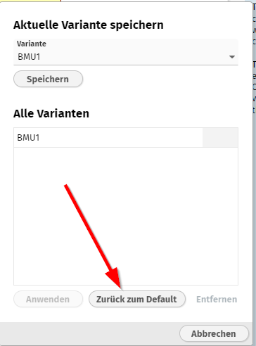
The variant management introduced with 20240122 was improved by now providing the function “back to default”.
By using BufferedContentMgt or TempFileManager you can provide dynamically created content (e.g. some HTML page or PDF document) and make it available as URL, so that the browser can access.
In some, newer Tomcat versions there is/was a problem when passing file names containing a blank space. As result the “;jsessionid” directive was not appended to the URL and the content as result was not available at all, because the content is only available within the scope of the user session for security reasons.
The error only occurs if using URL-encoding based session management. It does not occur with cookie-based session management.
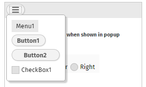
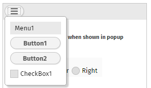
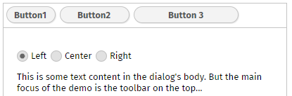
The compoennt ADAPTIVETOOLBAR arranges content inside a horizontal toolbar:
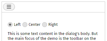
If the horizontal space if not available then the content is automatically packaged behind a dialog which is available by some icon:
By default the original size of the components is kept - also in the dialog. Now you can define attribute EXPANDCOMPONENTSINPOPUP as “true”, as result the dialog now looks like:
When using the variant management (Update 20240122) then there was bug when saving the preferred variant for a certain user. As consequence, it could happen that the wrong variant was proposed as preferred variant.
This information only applies to “very special users” of the FIXGRID!
Some of you do update the grid items outside of the UI processing. i.e. you have some threads running in parallel and the gird is updated (e.g. reloaded) on certain events. It may now happen the following: you open popup menu for a certain grid item - and when executing this popup menu item the grid content might have completely changed.
We now check before executing a popup menu item on a grid item:
...that the item is really selected!
...that the grid was not scrolled by e.g. reloading the items
In case one of the check fails a message is output that tells the user that the grid data was updated “behind the scenes”.
There are three ways to pass client parameters into the client's processing:
By URL query-parameter (“..../xxx.risc?name=value&name=value”)
By CLIENTCONFIG component - this is an invisible component that has the one and only purpose: set client configuration parameters
By Java API: Client.instance().xxx() - Behind this API there is a CLIENTCONFIG component, too - which is added by the framework automatically.
The Client.instance()-API was now extended to contain all the attributes that are also available within the CLIENTCONFIG component.
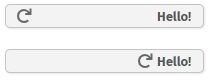
The toolbar now sends a “BaseActionRearrange” event when its content changes from one arrangement into the other. The event is only fired if setting attribute WITHCALLBACK to “true”.
With every request the http-header parameter “eclnt-devicefullscreen” is sent to the server-side: either with value “true” or with value “false”.
Altogether there are now three http-header parameters that tell about the browser size:
eclnt-devicescreenheight
eclnt-devicescreenwidth
eclnt-devicefullscreen
eclnt-devicepixelratio
When a button's width is higher than required and when using alignment “right” then by default the image is drawn on the left side, the text on the right side. Now, defining as attribute KEEPIMAGEATTEXT with value “true”, the image is rendered dircetly at the left side of the text.
When using CALENDARFIELD with format “time”, then the spinners in the value popup were drawn with a too small size.
The component now supports the typical attributes for ROW components:
COLDISTANCE
MINHEIGHT, MINWIDTH
There was a quite special situation in which dialog popups were positioned in a way that some parts were places outside the browser and the dialog was only partially visible. The “quite special situation” was:
The dialog contains adaptive content (e.g. TEXTPANE with width of 100% and no height defined, or ROWFLEXLINECONTAINER).
The dialog was positioned at the bottom of the screen (method setLeftTopScreenBottom())
If using a project configuration in which you only define to store resources in the webcontent, then the “Configuration area” was not available anymore.
The re-drawing of the fix columns caused some flickering during horizontal scrolling on devices which are not 100% up to date from speed point of view. We now found some compromise and show some “overlay image” during horizontal scrolling so that the screen is much more stable. The real fix content then is shown immediately when the user stops scrolling.
Please check within the demo workplace.
With 20240206 we introduced separated libraries/Maven artifacts for the external components of the client part. The pom.xml of the artifacts contained the following dependency...
<dependencies>
<dependency>
<groupId>org.eclnt</groupId>
<artifactId>eclntjsfserverRISC</artifactId>
<version>20240206</version>
</dependency>
</dependencies>
...which was fine if the artifacts were used in a JEE (javax.*) environment - but which was not fine when using them in a Jakarta EE (jakarta.*) environment. We now updated the pom.xml so that it does not contain a dependency anymore - which is not optimal, of course. But: otherwise we would have to deliver two versions of artifacts - with the only difference that the pom-dependency is not the same.
We added some demos for the new feature “fix columns”.
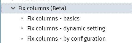
The feature is still “beta”! From functional point of view we added the focus management, so tab-ing through the grid works now finde. Current battle field is the rendering update performance - which sometimes causes a flickering while scrolling.
A PageBeanComponent is a self containing page bean that can be easily distributed and shared across projects. By default it comes with own literals files that are kept in property resource files.
Sometimes you want to override the default texts of the component when using it - because the component's texts/naming is not in sync with the texts/naming of your application.
Now there is a default way to go. By calling...
PageBeanLiteralResolverOverride.addLiteralResolver(Class pageBeanClass, ILiteralResolver literalResolver)
...you register an instance of “ILiteralResolver” for a specific pageBeanClass. The interface (fully name “PageBeanComponentBase.ILiteralResolver”) is simple:
public interface ILiteralResolver
{
public String findLiteral(String key);
}
In case you return “null” then the default text of the PageBeanComponent is used - otherwise the text that you pass is used.
The following chapter contains important information. In case of using one of the components CHARTJS, SIMPLEHTMLEDITOR, CODEEDITOR, RGRAPH, OSMVIEWER, QRCODESCANNERJSQR, you have to update your dependencies!
The client side processing contains external libraries for special controls. Examples:
The SIMPLEHTMLEDITOR components internally uses either the “Quill” editor or the “CKEditor” in its version 4 or in its version 5
The CODEEDITOR component internally uses the “ACE” library
The CHARTJS component internally uses the “chartjs” library
Nowadays people carefully check for vulnerabilities. This means: even if you do not use e.g. the component SIMPLEHTMLEDITOR at all, some vulnerability check will list the corresponding external library as vulnerable because it is (better: it was) part of the default delivery.
As result we did outsource all our client side dependencies to external frameworks into own “.jar” files (Maven artifacts), so that you only need to embed these ones which you actually require.
Take a look into our Maven repository https://www.captaincasa.com/mavenrepository/:
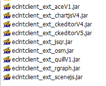
This is the list of new libraries. Add theses ones to your project that are required by your controls.
Example:
<dependency>
<groupId>org.eclnt</groupId>
<artifactId>eclntclient_ext_ckeditorV4</artifactId>
<version>${cc.version}</version>
</dependency>
When not using Maven but using the direct installation of CaptainCasa, then the libraries are contained in the “<installDir>/resources/clientrisc” folder:
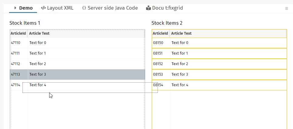
The FIXGRID is now directly able to manage fix columns:
We up to now provided the possibility to define fix columns by defining two grids and connecting them - which was quite complex from definition point of view and which had certain disadvantages (e.g. each of the grids was individually sized, selections of grid rows were synchronized through the server).
Now things are managed within one grid and all sizing issues are managed internally, e.g. including dynamic row heights.
The definition is very simple - you just call...:
FIXGRIDListBinding m_grid = ...;
...
...
m_grid.setNumberOfFixColumns(2);
...
...
You also can leave the configuration to the user. In this case you need to define in your layout...
...
<t:fixgrid ... withfixcolumnsbyuserconfiguration=”true” ...>
...
</t:fixgrid>
...
As consequence the dialog for configuring the column layout will also show a field “number of fix columns”:
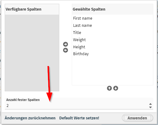
The number of fix columns is part of the column configuration of the grid - it is persisted (when the attribute FIXGRID-PERSISTID is defined) and it is part of the the variant management introduced in update 20240122.
We currently publish this new function as “Beta” function. It is working nicely, one issue (focus management, tabbing through the grid) is still in development. But you may already use the functions for your development.
Restarting the server is one of the painful aspects of server-side development - because it may take some time in big projects. We up to now followed two strategies:
The “hot deployment strategy” - by separating your classes into the UI classes and logical classes you are able to exchange the UI classes by restarting a hot-deploy-classloader.
The “magic strategy” - by using the tool JRebel code changes are directly brought over into the running virtual machine.
The “hot deployment strategy” is working fine but requires a high level of discipline when it comes to structuring your project. The “magic strategy” in many cases was not executed because of license cost...
Now there is a new candidate in the “magic strategy” area - “HotSwapAgent” - http://hotswapagent.org/. We now tested the version 17 of this framework and found that it is very useful. We believe it's a good point of time to share our experiences - together with an agent library that we developed in order to refresh internal caches when getting notified about class changed.
Please check the document https://www.captaincasa.com/docu/eclnt_risc_hotswap/ for detailed information.
Please pay attention:
Only use the Java 17 based version of HotSwapAgent - this is the only one we will internally use!
Usage of HotSwapAgent is a super-interesting issue - but it is not an official part of CaptainCasa's delivery! So there is no warranty or guaranteed support.
The welcome screen configuration contains a duration - which is the number of milliseconds it will always show up. Well, this configuration was ignored... - the welcome screen always showed up for 2.500 ms.
After 16 years the ROW component received two new attributes! - You now can define a minimum height and a minimum width. Both values are pixel values, no percentage values!
The “Deploy”-menu in the tools shows some new menu item:
Invoking the menu item will just initiate the copying of artifacts from the project into the runtime - without any further activity.
The Master-Detail component (TPBC:MASTERDETAIL) now shows two buttons in its side area:
The big button on the top is the one that you already know: it brings back the master- or detail-area, so that both master and detail area are shown. Now there is a smaller button below which completely switches the view either to the full master- or the full detail-area.
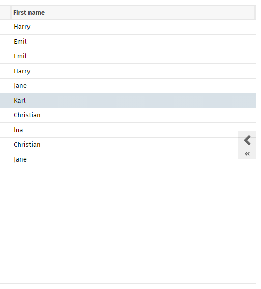
There were rare situations in which the user still was able to remove files from the list of selected files during upload.
Now all the remove links (“Entfernen” in the German screenshot) are explicitly disabled when starting the upload.
The literals that you might define for a page bean component are buffered in order to only read once during a session. The buffering was so far done in a way that did not recognize changes of the session's language. This means: if the user changed the language the new language was not applied to page bean components that were already opened.
A NullPointer sometimes was logged:
2024:01:30 13:03:12:303 | 46 | INFO | Problem when accessing pagebeanbinding: java.lang.NullPointerException
java.lang.NullPointerException at org.eclnt.jsfserver.pagebean.PageBean.setActualRootExpression(PageBean.java:95)
at org.eclnt.jsfserver.elements.impl.ROWPAGEBEANINCLUDEComponent.encodeBegin(ROWPAGEBEANINCLUDEComponent.java:306)
...
...
There was no other bug caused by this. The cause was some change that camed with update 20240118 (“IPageBean.onBeforeRendering(...)”.
...we finally start the “7.0” naming! ;-)
It's now very simple to add a “Usage variant management” to grids! Well, what's behind? - At runtime the user can configure certain aspects of a grid. In the pure FIXGRID implementation, the user can:
rearrange the column sequence
remove certain columns
change the widths of columns
sort the data by multiple columns
In the extended version of the grid (add-on-component “CCGridDataView2”) the user can in addition:
Define filter data for each column
The user can now store multiple variants of this runtime configuration data, so that certain configurations can be re-applied to the grid processing later on. Among the variants one variant can be selected as the default variant which should be applied when starting the grid.
The implementation is very simple – you basically have to add a new add-on-component USAGEVARIANTSBUTTON and connect it to the corresponding grid. Please take a look into the demos of the demo workplace (“News” section).
The internal implementation is a nice one – there is an interface IExtractApplyData that can be applied to any component that can be configured by the user. The variant management is built on top of this interface, so that any type of configure-able component can be managed by the variant management.
There are two default style variants for the BUTTON component that are quite useful:
“ccasicon” renders a BUTTON component in the same way as an ICON component
“ccaslink” renders a BUTTON component in the same way as a LINK component
In the BGPAING attribute you can arrange multiple drawing commands as sequence separated by a semicolon. We now check if “error()” and “mandatory()” definitions occur multiple times within this sequence – and only render them once.
...still this update is delivered as “6.0” version (see 20240108 info). The name change will be done with the next update. Technical issues are done...
When including a page bean e.g. by using the ROWPAGEBEANINCLUDE component, then the method “onBeforeRendering()” is called for the page bean when it is accessed by the corresponding layout (.jsp/.xml definition). In this method you may take over configuration parameters from the page bean definition within the page.
So far this method was not called for the “outest” pages (start pages) – now the method is called as well. If implementing “onBeforeRendering” you now can be sure that the method is not only processed within the context of a (ROW)PAGEBAENINCLUDE component, but that the method is always callled.
When providing dynamic download content, then you may use the “getContentType()” method to tell the browser how to deal with the content (e.g. “application/octet” tells the browser that the content is to be downloaded). The content type that was passed with DefaultBufferesStreanContent-extensions was not respected – now it is.
The HTML editors of CaptainCasa are components embedding 3rd party editors into the CaptainCasa client-processing. We so far supported CK-Editor version 4 and the Quill editor. Now we also support version 5 of CK-Editor. Check the examples in the demo workplace in order to see how to select the editor you want to use.
You now can define the text pane that is internally shown in the OK- and the Yes/No-popup-dialog to be HTML content:
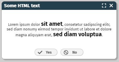
Just call method “setTextContentType(...)”:
String html = “...”;
YESNOPopup ynp = YESNOPopup.createInstance("Some HTML text",html,new IYesNoListener()
{
public void reactOnYes() { ... }
public void reactOnNo() { ... }
});
ynp.setTextContentType(ICCServerConstants.TEXTPANE_CONTENTTYPE_HTML);
The configuration of the project was moved within the toolset. All the configuration functions are now summarized in an own tab-page:
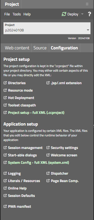
(Before the functions were available in some popup dialog only.)
We added a new configuration dialog for configuring the session management:
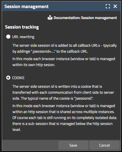
The selection in this dialog will both update system.xml and web.xml configuration files.
When starting the “demos” application and the toolset's “editor” application then some error message was logged in tomcat/logs/localhost_xxx.log – informing about the missing servlet “AppletStarter”. Well, this servlet belongs to the “good old” Java Swing/FX client – and has nothing to do with the RISC-HTML-client at all.
The message was only logged, there were no runtime-implications.
The page bean component renders a grid of data – the data being accessed from the database by the DOFW-framework, which is part of the ccee-library.
The number of items, that are queried from the database is now limited, so that a full table query will not blow up memory. By default the limit is set to 1.000 items. You can set per grid or for all grids:
CCDataGridView2DOFW m_dataGrid = ...;
Default value for all:
CCDataGridView2.initMaxNumberOfItemsToLoad(...);
For instance:
m_dataGrid.setMaxNumberOfItemsToLoad(...);
If during a query the number of items in the database is higher then this limit, then a corresponding message is overlayed into the grid.
CaptainCasa by default logs its log messages into:
tomcat/work/Catalina/localhost/<app>
Well, this info is documented, highlighted, available in the forum – but guess: how many times do we experience the situation that the location of the logs is not known at all? - Quite often...! ;-)
So we now write information files at this place, where “everyone” checks first: tomcat/logs. Example:
tomcat/
logs/
CaptainCasaLogInfo_demos.txt
The content of the file is:
----------------------------------------------------------------
CaptainCasa - Application : /demos
Logging is done into directory: C:/temp/20240108_17/server/tomcat/work/Catalina/localhost/demos/
Name of log files : log_eclntjsfserver.txt.*
Name of performance log files : log_performance.txt.*
----------------------------------------------------------------
Let's see if this is the right piece of information at the right location...!
This is the last update with the name “Version 6”. We will update to “Version 7” with the next update. Version 7 is a pure continuation of the normal updates – with certain changes, that do not affect exsting projects:
The default platform for starting CaptainCasa projects will be “Jakarta” (and not “JEE”). There is NO change to the existing delivery – in which we both deliver for “JEE” and “Jakarta”. There is NO change to your code or environment. - The only change: in the documentation (Developer's Guide) we up to date referred to a JEE project, now we will refer to a Jakarta project.
New projects will be automatically configured to use COOKIE based session tracking. The documentation now assumes that COOKIE based session tracking is now used by default.
The JavaDoc is generated both for the JEE and the Jakarta version – the default one will be the Jakarta-version.
Sources are packaged to the Maven artifacts – including the eclntjsfserver_xxx.jar.
The TEXTWITHLINKS component renders some HTML text with embedded links. By default the “href” definition of the link is interpreted as id – when the user presses the link then a server side action listener is called, receiving the corresponding id.
You now in addition can define “href” values starting with “url:”. In this case the starting of the page will be done immediately within the client processing – without loop back to the server.
Example for text content to be passed inisid TEXTWITHLINKS:
...abc abc <a href=”AAA”>Press here!</a>. abc abc <a href=”url:https://www.CaptainCasa.com”>CaptainCasa</a>... abc abc <a href=”url:https://www.CaptainCasaDemo.com;target:CCDemo”>Demos</a> abc abc...
As you see in the example, you can mix “normal” links with “url:”-links. And there is some additional “target:” definition that you might optionally define.
When opening the component CCMultiValueSelection as popup and having the filter field activated, then you may in addition set the focus into the filter field:
CCMultiValueSelection mvs = CCMultiValueSelection.openAsPopup(this,250,300);
mvs.setAvailableFilterBar(true); mvs.setFilterFieldRequestFocus(RequestFocusManager.REQFOCUS_CREATION_LONG);
The LIKE operator within conditions can now also be used for numeric columns (e.g. integer, number, float, ...). We internally update the corresponding property within the condition – dependent on the database dialect.
List<DOPerson> ps = DOFWSQL.query(DOPerson.class,”weight”,LIKE,”%7%”);
If e.g. using PostgreSQL then the actual query statement automatically is transferred into:
SELECT * FROM PERSON WHERE weight::text LIKE '%7%'
The TEXTAREA component is only able to edit “super-plain-text”. The SIMPLEHTMLEDITOR component is too heavy for some cases – internally opening up a complete HTML editor within an IFRAME. So we introduce a light weight editor component for editing simple texts and providing the following functions:
ability to render HTML content (e.g. bold parts, images, ...) - that is tpyically mixed in by server side processing
ability to flexibly adapt its size according to its content.
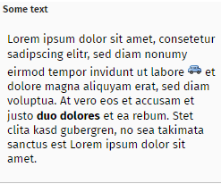
The new component's name is TEXTEDITOR. We currently publish with the tag “beta” - so please keep close contact to us when using it!
Thanks to a community member we now can provide translations for these three languages (Ukraine, Russia, Azerbaijan).
Labels with just the text content “1” or text content “true” were not correctly sized and as result drawn with a width of 1 pixel. WE published some interim version (see forum information on 2023112) – this is the official update containing the fix.
By setting attributes PAINTARAREAITEM-MOVINGWITHCROSSHAIR and PAINTAREAITEM-REIZINGWITHCROSSHAIR to true some helper lines are now drawn around the control during drag & drop operations.
This significantly improves the exact positioning of items.
When triggering a LONGPOLLING component then the client has some default waiting duration of 1000ms before starting the serve-side round trip. Now the client immediately reacts (if not DURATION is explicitly defined).
In the Edge-browser you can define a minimum font size as part of the settings:
You may for example define a minimum font size of 13px. If now a dialog contained text with a font size lower than 13px, then the text was abbreviated with “...”.
We now calculate the width of text content with explicitly checking against the actual size of the font. The actual size of the font is tested using browser functions, so that the minimum font size is respected.
In Chrome browsers there is the feature...
...which re-opens all pages within a newly started browsers which you had opened when you left Chrome before. If you had opened a CaptainCasa dialog in one of the browser-tabs which are hidden when the browser re-starts, then the sizing was not properly executed for certain components. (Reason behind...: the browser tells to the sizing algorith, that its browser size currently is “0x0” pixels...).
Now the sizing is re-done when the user opens the corresponding tab – so the problem is solved.
The “x-frame-options” tell the browser if a page can be embedded as IFRAME into another page. There are internal pages that CaptainCasa embeds by IFRAME:
bridge pages to other frameworks
Chart.js
Quill-editor or CK-editor
Open street map OSM
and in general CaptainCasa provides featured to provide URLs that can be embedded as IFRAME:
BufferedContent
TempFileContent
Up to now the default “x-frame-options” that was passed back as http-header-attribute for these internal pages was “sameorigin”. This was perfectly fine for use cases, in which the outer page was a CaptainCasa page and the inner page was an included page from the same server.
When now embedding a CaptainCasa page itself into an other – external! - HTML page by IFRAME, then there is a two level hierarchy. In this case the browser forbids the internal IFRAME to be shown – because the “sameorigin” is not valid in the relationship between the outest page (external page) and the most inner page (internal page).
As result we updated the default x-frame-options of internal page to show up in any scenario (no restrictions).
We added some configuration option in system.xml:
<!--
**************************************************************************
security settings for embedded pages
xframeoptions - undefined/"" no setting of "x-frame-options"
"sameorigin" setting of "x-frame-options" to "sameorigin"
"deny" setting of "x-frame-options" to "deny"
**************************************************************************
-->
<ccembeddedcontent>
<bridgepages xframeoptions=""/>
<tempfilecontent xframeoptions=""/>
<bufferedcontent xframeoptions=""/>
</ccembeddedcontent>
You only have to adapt if you want to override the default.
If you define SCROLLPANE-SCROLLBYDRAGDROP to “true” then the user can scroll the content of the SCROLLPANE by clicking into the content and my moving the mouse. (When using touch devices then this mode is activated by default – so that touching the content and moving the finger will scroll accordingly.)
When now switch this mode to “false” and then again to “true” - then the scrolling did not work correctly anymore.
With 20231132 we updated the Chart.js bridge pages to new versions of Chart.js. We did not include an optional dependency to moment.js which is required for rendering chargs showing date information. Now moment.js is part of the imports.
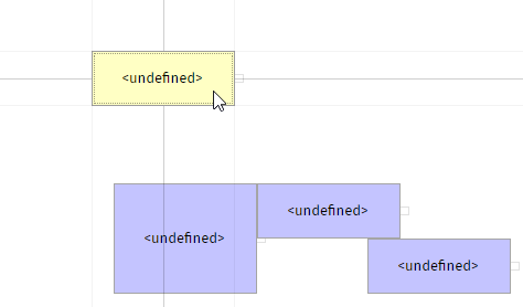
When starting drag&drop then the client now highlights all potential drop targets – so that the user clearly can see where at all is makes sense to drop:
In the example that is shown in the screenshot items are moved from the left grid into the right one. The user can either drop items onto the other items or onto the full grid.
Once moving the mouse over a drop target, then the user will see the normal roll-over drop coloring (by default: red border).
There are two style variables that you may use:
<var n="@dropreceive_rollover@" v="rgba(255,0,0,1)"/>
<var n="@dropreceive_highlight@" v="rgba(255,192,0,1)"/>
<var n="@dropreceive_highlightTargets@" v="true"/>
By setting “@dropreceive_highlightTargets@” to “false”, the new feature can be switched off.
The chart.js libraries behind the CHARTJS component were updated from version 2.9 to version 4.4 (which is the newest). We can experience one difference to the previous rendering: pie charts are rendered left-aligned with the 4.4 version whereas they were rendered center-aligned with the previous version.
Despite this little difference we decided to roll out the new version – because 2.9 is listed with several security flaws. In the documentation “Developer's Guide – RISC Addons” we added a new chapter telling how to continue to use the previous version.
Looking into the bridge-page which integrated the chart.js library into the client processing (internally being called via IFRAME), you will see that we are now using an npm-based creation of this bridge pag. The big advantage: all up to date libraries are automatically selected. The disadvantage: it's not “Notepad-enabled” HTML/JavaScript anymore, but you need to be familiar with npm (node package manager). The npm-projects are part of the GIT repository, of course.
When starting a “.risc”-page with a certain style “?ccstyle=xxx” and immediately changing the style on server-side (“HttpSessionAccess.setCurrentStyle()”) then it could happen that texts were abbreviated with “...” - due to the fact that the size calculation was still based on the previous style settings.
The setup.exe file for the Windows-RISC-Installation was not correctly produced. The file did not provide the correct version number “20231113” but “20231113_INT1”. This is the reason for delivering 20231114 immediately after... From functional point of view there is no difference.
For these ones of you who download per Maven: 2023113 is fine and official! You do not have to update to 2023114.
The moving between items can now be done with keyboard as well. Before it was mouse-click only.
By using the “BufferedContent” (BufferedContentMgr, DefaultBufferedContent, ...) you provided dynamic content which can be accessed by the browser via URL. You use it for example when creating dynamic images/ texts/ pdfs that should be shown on client side by accessing a URL.
In this processing you define the content-type of the content (e.g. “text/html”, “image/png”) by overriding “DefaultBufferedContent.getContentType()”. This content-type was accessed before the content was accessed. Now the sequence is changed, so first the content is accessed and then the content type.
Background: if you plan to e.g. provide the content of an image (“image/png”) then there might appear an error in your creation of the image. In this case you may switch the content to be an error text (“text/html”). This was not possible before.
The change in 20231030 based the internal literal processing onto the normal literal resolution that is used for application literals as well.
There was a problem when having defined an own literal management by implement the interface “IResourceAccess”. Now the literals that are internally required by CaptainCasa's functions were also passed to your “IResourceAccess”-implementation.
For interested readers: by default literals are kept in resource files (“xxxx.properties”). You may implement an own resolution if you e.g. keep your application literals in the database.
The constellation...
Using a REPEAT...
...to render various dynamic content areas via (ROW)DYNAMICCONTENTAREA...
...to contain dynamically created FIXGRID components
...did not properly work. The internal processing did manage the “.{xxx}” expressions within the FIXGRID as if they were part of the REPEAT processing.
In the processing of the performance log (class “PLog”) it could happen that a NullPointerException was thrown. There are no consequences – but the exception is logged in the “real” server log as INFO-message.
The component allows to set the timezone – but did not update its internal rendering properly. As consequence the component only worked properly if using the current server's default timezone.
The “clientName” is the attribute that is available with all graphical components which identifies the component with some “long term name” on client side. The typical usage is the one for test-frameworks (detailed information is available inside the Developer's Guide). When applying the “clientName” to an include component (e.g. ROWPAGEBEANINCLUDE) then the “clientName” of the include component is prepended to all the “clientNames” of the contained components.
The workplace management implicitly opens up dialogs inside its container(s) and of course uses CaptainCasa's include components to do this. By setting the clientName in the “WorkpageStartInfo” you now can explicitly define this name, so that it is prepended to the page's components.
With 20231030 we provided the possibility to add application information for a certain round trip processing into the performance log. Once having passed the information, this information was re-applied with subsequent round trips – you had to explicitly clean up. Now the clean up is done internally, so you do not have to do.
We now included the creation of an XML schema for the XML dialog definitions into our build processing. So the schema...
org/eclnt/xsdresources/eclnt.xsd
...is part of eclntjsfserver<_version>.jar and contains the control definitions for the default component library “t:” – You can set up your editing environment correspondingly.
Demo “General > Workplace Management > Export/Import current workplace” shows how to export the current workplace setup (including the currently opened pages) and how to import it later on.
The functions that are used to do this (class “WorkplaceExporter”) were not working correctly for some exported pages – which were not imported into their correct workpage container.
Up to now the definition of classes / files which are hot deployed was done by defining a “positive list” of packages.
Example: having the following packages...
org
xxx
view1
view2
view3
view4
servlets
...and the view packages being the ones that are hot deployed, you had to configure in your project:
<hotdeploymentpackage name="org.xxx.view1"/>
<hotdeploymentpackage name="org.xxx.view2"/>
<hotdeploymentpackage name="org.xxx.view3"/>
<hotdeploymentpackage name="org.xxx.view4"/>
Now you can simplify many scenarios by adding using exlude definitions.
<hotdeploymentpackage name="*"/>
<hotdeploymentpackageexclude name="org.xxx.servlets"/>
Please pay attention: the exclude definitions refer to the positive definitions! So the positive definitions open up some range of files, which is the base for the exclude-definitions.
In the Layout Tools the corresponding dialog was adapted to:
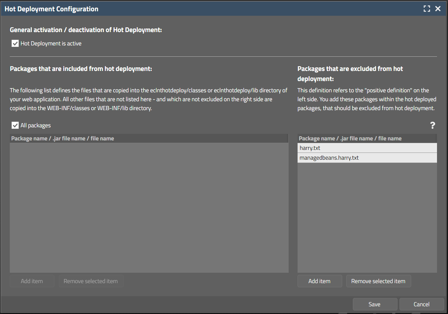
The left list of packages represents the “positive list”, the right list the “exclude list”.
CaptainCasa literals on server side are kept in resource bundle “org.eclnt.jsfserver.i18n.resources.Literals”. Up to now they were read by own mechanisms – now they are read by using the classical “ResourceManager” (org.eclnt.jsfserver.resources.ResourceManager).
They can be accessed by resource key “cci18n”.
Example, the title of the download of the grid export dialog may be read by:
ResourceManager.findLiteral(“cci18n”,”GRID_wholegrid”);
The ResourceManager itself can be extended using interface “IResourceManagerPreProcessor”:
package org.eclnt.jsfserver.resources;
import java.util.Locale;
/**
* This interface is called first - before any other internal processing is called in {@link ResourceManager}. You may
* take over the reading of a property value completely on your own.<br><br>
* The interface implementation is registered in system.xml configuration file, element "resourcemanager", attribute "resourcemanagerpreprocessorclassname".
*/
public interface IResourceManagerPreProcessor
{
/**
* @return If null is returned then the normal processing of the {@link ResourceManager} is started - if you return
* some value then this value is used and no internal value resolution is started.
*/
public String readPropertyValue(String resourceName, String property, Locale locale);
}
By using this interface you can take over the property resolution completely on your own. If you return null then the normal processing for resolving a property value is done – otherwise the value you return is used.
You implementation needs to be registered in system.xml:
<system>
...
<resourcemanager
...
resourcemanagerpreprocessorclassname="...implementation class of IResourceManagerPreProcessor..."
...
/>
...
</system>
Concrete use case: you want to override the literals of the export dialog of grids. From the grid's page “gridexportfunctions.jsp” you see the literals that are used internally and can now override the default language resolution by returning back own literals.
When using the default export dialog and when selecting one or more rows of a grid then the user can decide if to export the whole grid or the selected lines only:
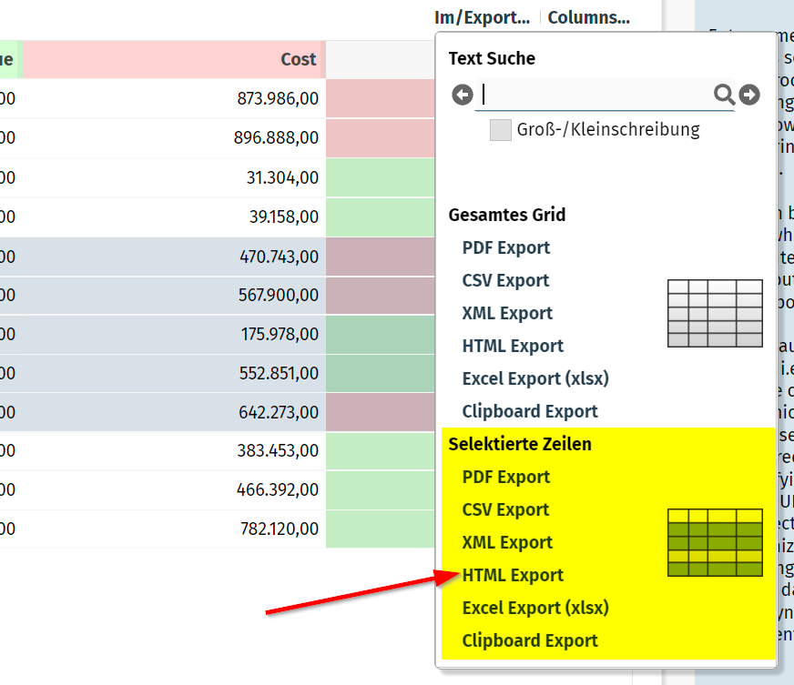
You now can avoid the appearance of the “selected lines”-section by calling API:
GridDetails.initRowFunctionsAvailable(false);
The performance log records per request important performance figures (e.g. processing time of request, action which was called, ...). It is by default stored at:
tomcat
webapps
work
Catalina
localhost
<yourapp>
log_performance.txt.*
Within the server side request processing you now can add own information which is appended to the line written per request:
PLog.setCurrentRequestApplicationInfo(...text...);
The log then contains the information as follows:
2023:10:30 15:18:15:838 | 60 | INFO | REQUEST : RequestId: 1698674768968, ClientId: undefined, Session: 86C00B88E42A0FC9597AD4A3F8EDED2A, Total: 19ms, Invoke: 0ms, Expression: #{d.workpageContainer.onTabbedLineTabAction}, ClientStart: 15:18:15:817, ServerStart: 15:18:15:819, ServerEndResponse:15:18:15:838, ApplicationInfo: ...text...
Simple tooltips are now supported for PAINTAREALINEITEM components as well. Complex tooltips (“HTML-tooltips”, “serer-side tooltips”) are not allowed, still.
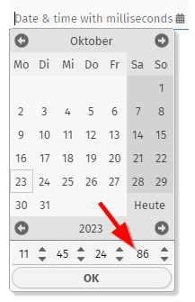
Millseconds could so far be output but there was no possibility to input by a calendar popup. If the CALENDARFIELD is set to FORMAT “time” or “daytime” and if the FORMATMASK is a flexible one including milliseconds (e.g. “yyyy-MM-dd HH:mm:ss:SSS”) then now the internal formatting and the calendar-dialog are reacting correspondingly.
When using an ARRAYGRID with attribute USEMULTILABEL switched to “true”, then the content of the grid rows was not immediately redrawn after the user changing the columns widhts. There was one additional scrolling required.
There were some minor bugs which are now solved:
When a PAINTAREA was positioned inside a SCALEPANE then the selection of multiple items by range selection did not follow the current scale.
When one or more items were moved and when positioning the mouse on top of the scroll-sensitive areas of a SCROLLPANE then the moved items were not in line with the mouse cursor anymore.
The attribute WITHRANGESIZING was not properly supported, you still could resize multiple items when switching off this attribute
Thanks for receiving feedback on the new component CAMERARECORDER – the general feedback was: it works – both on desktop and on mobile devices! Things we updated are:
The list of sound devices was empty when accessing the component first time and not having corresponding client rights available. The sound was recorded, but the list was only refreshed when starting the component a second time – then with granted rights. We now refresh the list directly after rights were granted.
There is a new attribute VIDEOMIMETYPE preference, by which you can yourself define the sequence in which within the client processing the support for certain video formats is checked. The default is “video/mp4;video/webm”.
There is a new attribute WITHSOUNDRECORDING which is by default “true”, and which you can set to “false” if you want to only record video content – and no sound content. The client rights that are to be granted by the user are reduced correspondingly when not using sound.
We added a small, animated waiting cursor to the welcome screen which is shown at the center bottom. The design is very neutral and both fits to light and dark screens, so we decided to not add further configuration options to edit the style... Remember: the welcome screen is loaded without any style reference in order to reduce the loading time to a minimum.
This is something special... - there was the requirement that any input of a decimal separator, regardless if it's a “,” or a “.” should be interpreted as decimal separator. By default only the decimal separator is recognized that fits to your client language settings.
Example: if language settings are defined to “de” (German) and FORMAT is “bigdecimal” and FORMATMASK is “dec2” then a user input of “200,345” is interpreted as 200.34, whereas an input of “200.345” is intepreted as 200345.
When defining FORMATMASK “dec2_adp” then both “200,345” and “200.345” are interpreted as 200.345.
...what does “adp” stand for?... It's “any decimal point”.
There was a bug that in special constellations (including the dynamic rendering of columns by your application) the width of columns was stored as “-100%” - resulting in a visible column width of “0”. We corrected this – both for writing data to the persistence and for reading wrong data from existing persisted data.
The component CAMERARECORDER allows to record videos from the user client's camera:
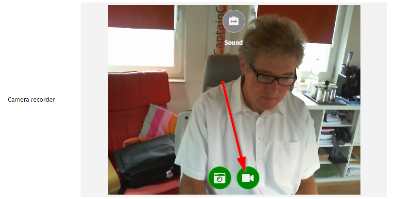
The component provides a “video record button”: by pressing the button the content of the camera is recorded. Pressing the stop button will then stop the recording – the content is sent to the server-side. Of course: the camera component requires https-security!
On server side the recorded data is received either as “.webm” or as “.mp4” file – dependent on the client's operating system. The upload is done in the same way as big file uploads in the area of the upload components.
There are many use cases to use this component in the context of business applications! Example: recording a movie about problems with a machine within a manufacturing application. Or the one, that triggered us to build this component: in some applications end users can sign a contract (e.g. an insurance contract) by recording their “yes!” as video.
The component is published first time today. We tested on Windows, iOS, Android. Please contact us in case of experiencing potencial problems in your environments.
These aspects of security configuration which are most commonly used are now directly editable in a separate dialog. Open the project settings...
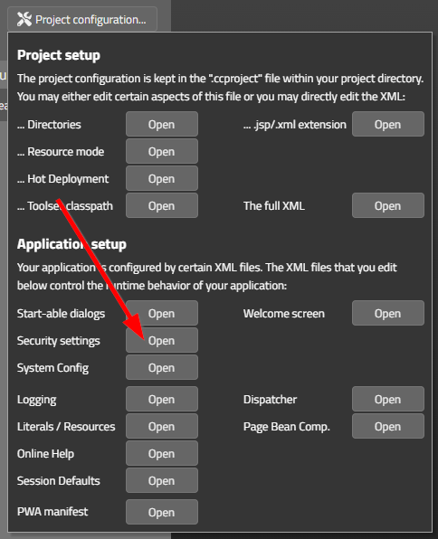
...and select “Security settings”:
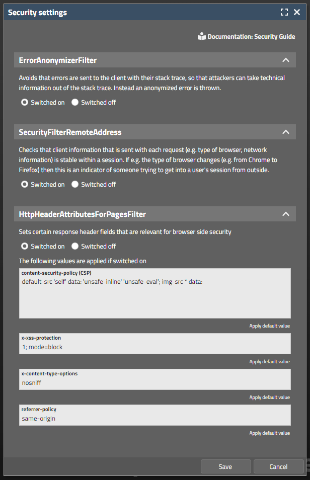
The dialog will maintain corresponding settings in system.xml configuration file. You can of course still use the direct editing of this file.
In a FIXGRID lines can be optically separated by enabling an odd-even-background management. The same you now do for normal PANE content:
PANE
ODDEVENPAINTER
ROW
...
ROW
...
ROW
...
The ODDEVENPAINTER is arranged as functional component into the PANE. The color values are derived from the style by default, but can be explicitly set by attributes, too.
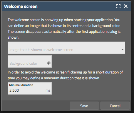
The welcome-screen settings (see 20230925) can now be edited from the CaptainCasa toolset:
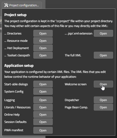
Clicking on “Welcome screen”-open will open a corresponding dialog:
The welcome-screen is “phantatstic!” for start scenarios. When embedding dialogs by using an HTML-IFRAME then it might be annoying to always see this screen.
As result there is a new URL-parameter “ccnowelcome=true”.
Example:
http://localhost:50000/demos/workplace.workplaceRisc.risc?ccnowelcome=true
Since update 20230913 there is a proble with page bean properties of type “java.sql.Timestmap” and “java.sql.Time”. Values from the client side are not correctly mapped into the corresponding properties.
If you use java.sql.Timstamp or Time: do not use 20230913, 20230918, 20230925.
According to our knowledge these data types are rarely used in existing scenarios, but nevertheless we publish some formal release fast after yesterday's to solve this problem.
This is something that should be “immediately used!” by all of you! ;-)
Take a look at the updated demo workplace. During start up first a welcome-screen is shown...

...which after the server responded fades out into the actual first screen of the application:
Defining this welcome screen is extremely simple. There are three new configuration parameters in system.xml:
<system>
...
<riscstarter
...
welcomeimage="images/pictures/welcome.jpg"
welcomebackgroundcolor="#457b9d"
welcomeduration="2500"
...>
The parameter “welcomduration” defines a minimum time that the welcome-screen is visible. In general the welcome-screen stays active until the first application response is received from server-side. If the server responds fast (e.g. within 200ms) then the welcome-screen shows up - ...and immediately closes. To avoid this flickering you define the parameter “welcomeduration”.
By the way: you may wonder why theser parameters are not part of the style. The reason: also loading and interpretation of the CSS takes time! So the parameters are directly set into the HTML page which is passed back for the “.risc”-URL and as consequence are immediately applied when the page is shown.
The TOGGLE component is an extended variant of the CHECKBOX component. There were some attribute definitions of the CHECKBOX component which were not available for the TOGGLE (e.g. LABELTEXT and others). We now updated the corresponding control defintion.
We werer confronted with situations in which the URL which was created by the TempFileManager was updated by environment components (e.g. proxy in front of the application server). E.g. UTF-8 characters within the URL were replaced by formally incorrect “%xx” strings.
To avoid this we now only rely on the unique name (UUID) to identify a TempFileManager content. The file name that you pass still is part of the URL but is only used for e.g. properly proposing the download name for the file.
This is a changed which takes place completely behind the scenes – there is no action required on your side.
For checking if a communication is just going on there is a new attribute that you can access by e.g. Selenium. Accessing this attribute from Selenium is done in the following way:
private static boolean checkIfCommunicatingToServer(WebDriver driver)
{
WebElement formOutest = driver.findElement(By.cssSelector("div[data-riscclientname='riscform_outest']"));
String text = formOutest.getAttribute("data-riscclientcommunicatingtoserver");
if ("true".equals(text))
return true;
else
return false;
}
When the timezone is set to “LOCAL” (which means you are using LocalDate/ LocalTime classes on server-side) and when a date inside the CALENDARFIELD component is null, then the date is proposed with the “now-value” when opening the calendar popup dialog.
The “now-value” was up to now the UTC-now value. We now use the time-shift that is available by the browser settings to calculate the now-value as the one that is the one of the user's timezone.
The NOTIFICATION component that was introduced with 20230905 now sends notifications that react on mouse clicks. A click into the message area will bring back the user to the browser screen that triggered the notification.
You now can explicitly open or close the popup that is managed by the BUTTONPOPUP component. Use attributes CLOSETRIGGER and OPENTRIGGER.
An example is contained in the demo workplace (Components > Straight Controls > Menus > Button Popup – explicit opening/closing).
The PAINTAREA component can be used to easily build graphical editors in which content is position at x,y-positions by the user. When two (or more) content items overlap, then up to now the user could only select the one that is on the top from z-index point of view.
Now there is a feature PAINTAREA-LAYERESELECTION: if switched to “true” then the user can continuously click an item – and all the items below or on top will be selected one after the next. As result it is possible to select content items which are arranged behind other items.
There is a corresponding demo in the demo workplace (Components > Animation & Graphics & Sound > Paint Area > Layered Selection).
When calling IWorkpageContainer.close() then a request is internally processed to close a workpage. But: the workpage processing can veto (e.g. when finding unsaved data), so that the closing is not executed.
The method now returns, if the workpage really was closed or if the closing was not performed.
Up to now “java.util.Date” and “java.sql.Date” were directly treated as simple data type properties. Now any extension of “java.util.Date” can be directly used as property of an entity. You do not have to add some own simple data type extension anymore.
We received some updated Veracode analysis about potencial vulnerabilities. Changes ere done in the following areas:
Writing cookie information (CLIENTCOOKIE component) – we updated the sanitizing of cookie content (CWE-Id 113)
Centralizing of all access to our internal SAX-parsing (CWE-Id 611)
When calling...
TenantAccessMgr.initializeInfoProvider(IInfoProvider);
...then the actual instance of ITenantAccess (which is managed by the IInfoProvider-instance) was not re-initialized. And the old instance was kept.
FYI: this is a method which is “nearly never called” because the IInfoProvider by default is passed during the start up of the server environment... Corresponding problem was coming up in a scenario in which the tenant access management was already used within the IBootstrap-execution which allows you to execute code before the start up of the server environment.
Most browsers in the meantime support so called notifications. Notifications are small message windows that are managed by the operating system:
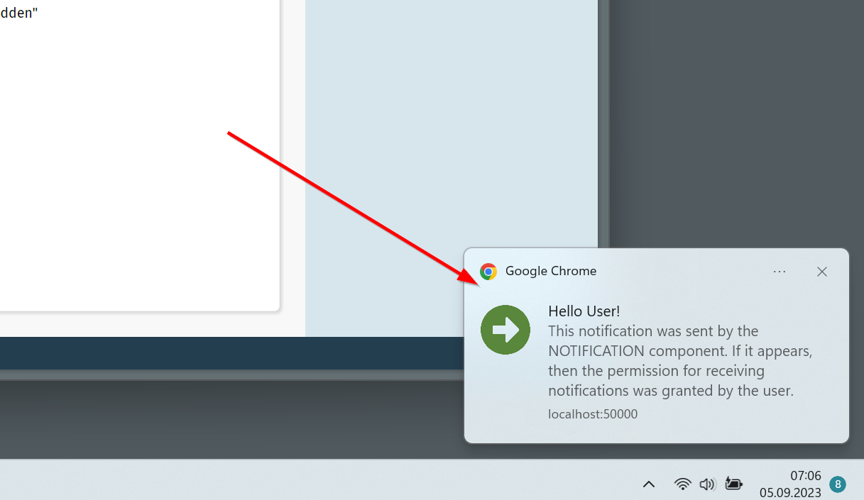
Notifications can also be sent by browser applications which are currently hidden – e.g. because the browser is minimized and/or the corresponding browser tab is not the one which is on top.
Notifications in principle are simple to use: there is a new NOTIFICATION component which is arranged below BEANPROCESSING in a layout:
<t:beanprocessing ...>
<t:notification ...
image="..."
onlysendifhidden="false"
requireinteraction="false"
text="..."
title="..."
trigger="#{d.DemoNotification.notificationTrigger}">
</t:notification>
</t:beanprocessing>
There are a couple of attributes to define title, body text and image. And some further attributes to controls when and how the notification shows up. - The notification itself is activated by a trigger.
The challenging part is the security:
The user must explicitly agree to receive notifications. To do so the permission must be requested within the browser – and this permission request must be executed within the direct context of a user interaction (click/touch).
Browsers can be configured to not allow notifications in general. So in this case notifications will not be enabled at all, of course.
Last but not least – notifications are heavily depending on the type of browser and the operating system! Test you concrete scenarios that you want to support...!
Please check the demo workplace (“News” section) for more information and to see how to explicitly request permission by using the SYSTEMICON component.
We added an additional style variable (please check 20230829 for details):
<class n="riscfieldcontainer">
...
<risc n="_unittextdistance" v="-4"/>
<risc n="_unittextshift" v="0"/>
....
This pixel value shifts the unit text to the right (if value is positive) or to the left (if value is negative).
If a dialog communicates to the server-side then its content is overlayed with some shading and the waiting-image appears in the center. Any user input (e.g. click with mouse, or keyboard input) will then by default cause a “beep”-sound to be played in order to inform the user that input is blocked.
You can now switch off this beep sound. There are two ways:
Invoke the following API:
Client.instance().setBeepwhenblocked(false);
Or explicitly use the CLIENTCONFIG component with its new attribute “beepwhenblocked”
Since Java 14 there are so called “records” which are some short way to define read-only data objects. We internally supported records since mid of 2022 – and now updated the support:
Record fields are also visible within the “Bean Browser”
The performance of accessing record-fields was significantly improved.
The minimum distance between the value text and the unit text of a FIELD-component is now defined by a style parameter:
The style XML definition is kept in style “riscfieldcontainer” which is the base for all FIELD-type components.
...
<class n="riscfieldcontainer">
...
<risc n="_unittextdistance" v="-4"/>
...
...
The component executes a server call after a certain duration of user inactivity.
(It was already part of the former Swing client, but was not transferred to RISC-HTML yet...)
By default the literals of page bean components are read from their own property files. By adding an instance of “ILiteralResolver” to the Page Bean Component you can take over the literal management on your own and replace or add literals and languages that you might miss with a concrete implementation of a Page Bean Component.
When invoking the interface there was a bug preventing that texts that were passed back from the interface implementation were not really used within the component.
The client-side timezone is now passed by http header parameter “eclnt-timezone”.
Please note: there is an already existing parameter “eclnt-timezoneoffset”, which in parallel transfers the distance of the client's timezone to the UTC time.
The CSV export within the FIXGRID component now is outsourced in an own class implementing interface:
package org.eclnt.jsfserver.elements.impl;
import org.eclnt.jsfserver.elements.util.FIXGRIDCsvExporter;
public interface IFIXGRIDCsvExporter
{
public String exportGrid(FIXGRIDBinding fixgrid, boolean selectedItemsOnly);
}
This interface and the default implementation class is internally designed to be extended by you. Your extension class must be registered in system.xml configuration file:
...
<fixgrid
...
csvexport="org.eclnt.jsfserver.elements.util.FIXGRIDCsvExporter"
csvexportdelimiter=";"
...
/>
The default implementation of interface “IFIXGRIDCsvExporter” is “FIXGRIDCsvExporter”. Please check the code of this class to see how and where to extend.
There is also a new configuration parameter “csvexportdelimiter”, where you either can pass “,” (comma) or “;” (semicolon).
When using a FIXGRID directly within a PARENTEXTIT-area then it could happen, that actionListeners which were called on grid item level were not called. Example: BUTTON-invoke-actions of buttons inside of a grid item were not processed.
The grab area of a SLIDER was not perfectly arranged. There was a 1pixel distance between the position of the grabber and the optimal position it should be.
Up to now invalid values were only highlighted with some error background during user input. Now you can also define, that FIELD components show invalid values permanently – i.e. also outside the context of user input.
In addition you can now define that the user receives an info message by popup dialog – but the value is not reset to the previous one.
As result there are now 6 values that you can assign to the attribute FIELD-REGEXMODE:
0 (default) – invalid user input is kept, no popup dialog, highlighting during input
1 – invalid user input is reset if invalid, popup dialog, highlighting during input
2 (new) – invalid user input is kept, popup dialog, highlighting during input
10 (new) – as 0, but: highlighting always
11 (new) – as 1, but: highlighting always
12 (new) – as 2, but: highlighting always
Please check the demo in the Demo Workpalce (section “News”).
With this attribute you can define the length of the password that is shown to the user, if the password is already available:
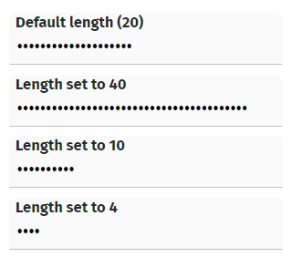
This length is independent from the actual password, of course.
Just to make sure that you know about: existing passwords (i.e. passwords that are already transferred to the server-side) are never sent to the client side in general! In any case a password that is the value behind some bean property is always sent to the client as anonymous string (“*****”).
A LABEL opens up a normal tooltip if the width is not sufficient to show its full text. If now there was an additional tooltip defined by the control and if this tooltip as an HTML-tooltip...
<t:label ... tooltip=”<html>....</html>”
...then there were two tooltips shown as result. Now only the HTML tooltip is shown anymore.
When opening a BROWSER component in a dialog popup and when resizing the popup, then the content was not reachable anymore. Reason: during resizing the client arranges some invisible glass-pane component in front of the internal IFRAME-element – and this glass-pane was not removed.
Same happened with other components using IFRAME-elements, e.g. IFRAMEINCLUDE component.
...what's the PARENTEXIT component? It's an area within a page bean's layout definition, associated with an id (EXITID). The area by default is not visible. - An “outer” page bean can define the content of this area – up to now by defining a PANE below the (ROW)PAGEBEANINCLUDE and assigning the EXITID within the PANE.
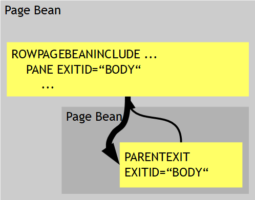
The PARENTEXIT is a very strong mechanism because it allows to define page beans with one or more “content areas” where the content is defined by the using page bean.
Now we added some next level by seeing that in many cases there is not one page bean using an inner bean only – but that there might be a cascade of page beans: one page bean using the next page beans, this one using the next page bean, etc. - And now you want to access a PARENTEXIT area of a contained page bean from an outer page bean which is not the direct owner.
The PARENTEXITDELEGATE solves this problem because it allows a page bean to delegate the PARENTEXIT area(s) of its contained page beans to the next level:
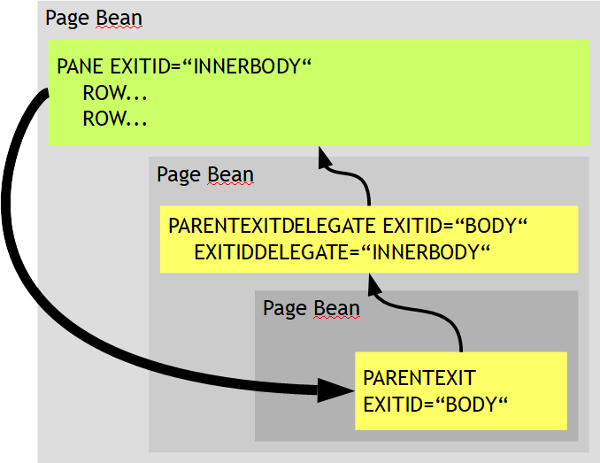
A page bean can “republish” some or all of the PARENTEXIT areas of its contained page bean to the next level. The definition can either be one in a very specific was (“this area with EXITID “xxx” is re-published with the new EXITIDDELEGATE “yyy”) - or it can be done in a generic way by using wildcard definitions (“all areas with EXITID ”*” are republished with prefix “yyy.”).
Please read more details in the Developer's Guide, section “Page Beans with Parent Content Areas”.
The FIELD-UNITTEXT is a general purpose text that is embedded into a field on the right side:
The typical use case it to place a unit text – but it can also be used for any other purpose.
The unit text automatically takes space from the input area on its left. By default the input area is automatically cut by the size of the unit text. In order to always have some sufficient space to do some text input, there is a limitation that the maximum width that is internally blocked by the unit-text is 75% of the field's width. The unit text in this case is cut – showing “...” at its end:
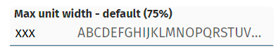
Now there is an explicit control about this: by using attribute UNITTEXTMAXWIDTH you can explicitly size the maximum width of the unit text:
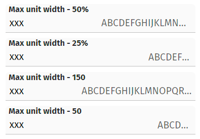
You may either pass a percentage definition or a pixel definition (... as usual “pixel” is a “scaled pixel”...). Please check the examples in the demo workplace: “Components > Straight Controls > Field Control > Additional Info in field”.
A POPUPMENU-instance contains MENUITEM-instances. A MENUITEM-instance typically is visible as menu item – but you can define the menu item to be used as hotkey only – using attribute HOTKEYONLY. If now a POPUPMENU-instance only contained items which are defined as “hotkey only”, then the menu still was drawn as empty menu when pressing the right mouse button.
The UPPERCASE attribute and LOWERCASE attribute was not available for these FIEDL variants. Now it is. - You may ask why FORMATTEDFIELD requires some uppercase/lowercase: the reason is, that is not defining a FORMAT at all, then the FORMATTEDFIELD should behave just like a normal FIELD...
If a LABEL contains “long content” (e.g. 100 characters) then the FontMetrics-function inside Firefox returned a too short result when calculating the with of a LABEL. Consequence the LABEL was cut by one or two pixels only – but enough to cut the text and as consequence to show the text ending with “...”.
In file “eclntjsfserver/config/logging.xml” you can define the “logcount” of the default logging. By default the value is 5 – so that there are 5 files that are used for keeping logs. If changing the “logcount” then due to a bux the value of the “logcount” was internally also used for the “loglimit” - which defined the maximum size of a log file...
In some scenarios it is important to know the client timestamp of a user action. The http request of each roundtrip from the client side now contains the header field “eclnt-timestamp” in which the “long-value” (milliseconds since 1970) is passed.
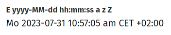
When using FOMRATTEDFIELD with FORMAT “date”, “time”, “datetime” then you can use a FORMATMASK-value which is close to the “SimpleDateFormat”-processing you may know from Java-side. With 20230724 we provided the possibility to output the timezone via placeholder “z” - now you can add extended information about the timezone with placeholder “Z”:
The background painting of ROWPODYPANE did not properly work – you could not see the corresponding colors when using the default style.
For the workplace you may use different renderer-implementations – which define how the workplace content is arranged. One of them is “WorkpageContainerRendererViaHideablePane”, which keeps pages in the client as hidden pane so that a re-showing of a previously opened page is faster. This renderer was defined with some type of event isolation that was “too hard”: events coming from popups sometimes did not refresh the page below.
FYI: this renderer is not active by default – it must be explicitly set by calling:
getWorkpageContainer().setRendererClassName(WorkpageContainerRendererViaHideablePane.class.getName());
When not assigning a FORMAT-value to the FORMATTEDFIELD then this component behaves like a normal text field. We now took over the attributes of FIELD (with exception “TEXTSELECTION*”) in the FORMATTEDFIELD. E.g. UPPERCASE and LOWERCASE are now available on FIELD-level as well.
The improvement of 20230717 contained some bug, which ALWAYS occurs when using the PARENTEXIT feature of page bean components: events within the PANE-component that is integrated into the PARENTEXIT-component are always processed twice.
This bug is a significant bug, so we decided to provide a short term update.
By default a popup dialog only sees its own hotkey definitions – and is isolated from the hotkey definitions of the parent. You now can override this behavior by calling:
ModalPopup p;
p = openModalPopup(...);
p.setParentHotkeysEnabled(true);
The same method is available for ModelessPopup as well.
Please check the demo in the demo workplace (“News” section).
The improvement of 20230717 contained some bug, which might occur when using page bean includes (ROWPAGEBEANINLCUDE, PAGEBEANINCLUDE, ...) inside the exit-definition of the outer page bean. The bug only occurred in quite special situations.
The method returns the original-URL (the “.risc” URL) that started the client side processing.
When using FORMAT “time” or “datetime” and when using a FORMATMASK which uses the “SimpleDataType”-like format definition, then you now can also use the “z” which is the placeholder for the timezone.

We updated the timezone-data-file of “moment.js” to release “0.5.43”.
This method is called either explicitly or implicitly, e.g. if changing a style. Up to now the reloading did only rebuild the client side, now it also rebuilds the controls structure on server side. Reason: when changing the style, then some of the style parameters are transferred into the server-side control tree. Up to now these parameters where not replaced when changing the style – now they are.
When defining a Page Bean (Component) then you can open up areas in which the user of the component can directly insert any layout definition.
Example: if Page Bean Component may open up some area in its HEADER:
...
<t:rowheader id="g_5" >
...
<t:parentexit id="g_3" exitid="HEADER" />
...
</t:rowheader>
...
A using Page Bean may now define...
...
<t:rowpagebeaninclude id="g_6" pagebeanbinding="#{d.M39_outUI.pb}">
<t:pane id="g_8" exitid="HEADER" height="600" width="1200" >
<t:row id="g_9" >
<t:button id="g_10" actionListener="#{d.M39_outUI.onButtonAction}" text="Button" width="100" />
</t:row>
</t:pane>
</t:rowpagebeaninclude>
...
...and as result the content of the PANE with exitid=”HEADER” will be inserted into the Page Bean (Component).
Up to now it was only possible that a Page Bean (Component) could only up one exit-definition per id. Now is is allowed to also open multiple exit areas, e.g. when there are RENDERED-conditions to either use the one or the other:
...
<t:rowheader id="g_5" rendered=”...” >
...
<t:parentexit id="g_3" exitid="HEADER" />
...
</t:rowheader>
<t:rowheader id="g_20" rendered=”...”>
...
<t:parentexit id="g_3" exitid="HEADER" />
...
</t:rowheader>
...
...under normal conditions the grid scroll bar was rendered correctly – but not within the preview of the Layout Editor.
The management of the attribute LABELTEXT was updated.
With normal definitions any HTML formatting will be removed.
You may pass HTML text by embedding it into “<html>...</html>” in this case the text is output “as is”.
The TempFileManager allows to pass a dedicated session value “TempFileManager.CROSS_SESSION_SESSIONID” - in this case the information is not only visible for the current session for the user but also for other sessions.
There was one problem that we found: the URL which is returned to show the content on browser client side still containes the “;jsessionid=...” encoding. This caused conflicts with our mechanism to check the hijacking of sessions and resulted in corresponding errors.
(For users of COOKIE based session management: there was no problem, because the URL is not encoded correspondingly.)
When uploading a file with containing a comma in its name, then the file name was not correctly communicated – it was cut before the comma. The content was correctly transferred.
When exporting a grid into certain formats then you up to now could only define the character set which is used for the export. Now you can also define a hex-byte-definition which serves as “BOM”-prologue for the exported data.
The definition is done in system.xml:
<fixgrid
exportcharactersetcsv="UTF-8"
exporthexbomcsv="EFBBBF"
exportcharactersetxml="UTF-8"
exporthexbomxml="EFBBBF"
/>
As result the export file will be create with the corresponding prefix, so that BOM-aware editors can directly interpret the character set to be used from the prologue.
By defining a FIELD-INPUTMASK (“___.___-___”) you can define some input pattern that will be shown when the user edits the corresponding data field.
Up to now the value that was transferred to the server side always included the pattern. Now there is a new attribute FIELD-INPUTMASKVALUEMODE – if you set the value to “withoutMask” then only the “net value” (without any characters from the pattern) is transferred into the server-side processing.
The code generator tool did also show private set/get-methods as properties of classes – which cannot be accessed by expressions, of course.
Thanks to contribution from the community the client side literals are now also translated into the Azerbaijan language (ISO code “az”).
The PAINTAREAITEM can be switched to be size-able (attribute RESIZINGENABLED). As result some sensitive areas are switched on at the borders of the component which the user can use in order to change the size by drag and drop.
The size of this border areas up to now was fix (4 pixels). Consequence: if a PAINTAREAITEM instance only had some own height of e.g. 10 pixels, then user had to carefully hit the space of 2 pixels between the border areas in order to move the component. - Now we calculate the size of the sensitive border areas dynamically so that it decreases when the component size decreases. There is one sensitive area any way at the bottom right of the component which is always shown with a sufficient size to be easily hit by the user.
This is some long story... - When nesting scroll-able area into scroll-able areas, then there is a certain depth of nesting which causes Safari on iOS devices to suddenly crash: Safari then may exit and restart the currently loaded page – which for single page applications means: the user starts from the beginning. To overcome we by default do not use the browser's scrolling but use own scrolling that is managed on a JavaScript level.
Disadvantage up to now: there were no scroll indicators shown to the user. Now we also draw these indicators, so that users know if there is additional content to scroll to – or not.
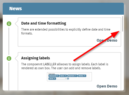
There is (ans always has been) a flag “cctouchdesktop=true” which you can append to the “.risc”-start-URL. As result the desktop screen will behave like a touch screen. Which means:
You can scroll through e.g. grids by swipe-gesture.
Double-click is replaced by long-click.
Well, the double-click replacement was not correctly working.
Btw, please note: there is another flag which is “ccusetouchevents=true”. Using this flag tells the browser to use touch events internally – and not mouse-events. This flag is important when using touch devices with both touch- and mouse-usage (e.g. Microsoft Surface devices) to indicate what type of input the user is doing.
We extended the FORMATMASK management for date/time/datetime-formats: in addition to the three pre-configured masks “short”, “medium”, “long” you can define some own pattern using dedicated characters as placeholders. There is a strong analogy to the Java-SimpleDataFormat – but please remember: our client is a JavaScript client and so there is not a 1:1 functional mapping!
In the mask definition you up to now could use the following characters:
y for year
M for month
d for day
H for hour (0-23)
m for minute
s for second
S for millisecond
We now added:
h for hour (0-12)
a for am/pm indicator
E for name of weekday
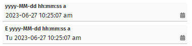
Please check the demo page in the demo workplace (“News” area) for details.
The interface IBootstrap was extended:
public interface IBootstrap
{
public void startUp(ServletContext servletContext);
}
We added the parameter “servletContext”.
Please pay attention: this change is incompatible with existing code. We only allow ourselves to do this, because the interface was introduced short time before and is not in production usage currently. For those one already using the interface: please adapt your implementation!
The detail popup for arranging grid columns...
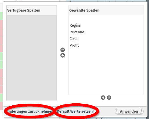
...contains two links for resetting changes and for re-applying the default (coming from the layout definition). Both links can now be switched off by using the two public static variables:
package org.eclnt.jsfserver.defaultscreens;
...
public class GridDetails
{
...
/** Default visibility of revert-changes link. */
public static boolean RENDERED_revertChanges = true;
/** Default visibility of back-to-default link. */
public static boolean RENDERED_backToDefault = true;
...
You may set these values e.g. by implementing interface “org.eclnt.jsfserver.util.IStartUp” - or by adding corresponding code to your Dispatcher class. - The changes are applied for all users.
When opening some value help dialog, using COMBOFIELD and IdTextSelection-dialogs, and when pre-selecting items...
IdTextSelection idts = IdTextSelection.createInstance();
...
...
idts.sortItemsById();
idts.preselect(m_...);
Then the focus was not correctly requested by the IdTextSelection dialog – if the selected item was not positioned within the first visible rows of the grid.
A certain reading of complex event-information was done with any selection within the control tree. This caused some performance issue – sometimes the reading of corresponding data took > 300ms. Now the information is buffered.
The addons-library now contains a new component LABELLER. This component represents a semicolon separated String value and transfers it into a list of label items. You can add new items either by direct text input or by selecting from a list:
The addons-library now contains a MAPPER component – which allows to map items “on the left” with items “on the right”:
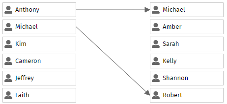
You define the mapping rules (1:1, 1:n, n:1, n:n) and you define the Page Bean items for each side – the rest is done by the component. For each item you can freely select any page bean you desire – so the content of each box is up to you, and is not restricted to image and text as shown in the example.
In the Layout Editor you can now directly configure a PWA manifest file for your application. PWA is the abbreviation for “progressive web application” - which (among other issues) means that the application is start-able as “App” from the start panel of the underlying operating system. More concrete: in mobile operating systems you can invoke a browser function “Install on start screen” and the application will be directly available as click-able icon.
The setup is as follows:
In the manifest file you can define the entrance point of your application together with additional information as JSON definition:
{
"short_name": "Your short name",
"name": "Your name",
"icons":
[
{
"src": "eclntjsfserver/images/cc_192x192.png",
"type": "image/png",
"sizes": "192x192"
},
{
"src": "eclntjsfserver/images/cc_512x512.png",
"type": "image/png",
"sizes": "512x512"
}
],
"start_url": "...yourPage....risc?ccconfirmexit=true",
"background_color": "#36596d",
"display": "standalone",
"theme_color": "#36596d",
"description": "your description"
}
The html page that is sent to the client when invoking a “.risc” URL now will contain a corresponding advice...
...
<link rel=”manifest” href=”ccmanifest.json”/>
...
...that contains the link to the manifest file.
Example: we use the manifest file inside the demo workplace: https://captaincasademo.com/ccdemos/workplace.workplaceRisc.risc. Open it in a browser (including e.g. Chrome browser on Windows) and you can select a browser option...:
After installing the “Demo Workplace” it is started in own window – without browser frame around:
And is now start-able from the normal lauch pad as well:

The advantage for mobile scenarios is: your page is started as full screen app – there is no space occupied by the browser frame. And: there is no back-button, no refresh-button.
Please search in the Web for more information on “manifest.json” if this is a new topic for you.
With 20230605 we introduces the concept of having an own class for configuring the preview of Page Bean within the Layout Editor.
Now this class can be easily generated using the Code Generator in the Layout Editor:
Just press the corresponding button.
This is a combination which not everyone experiences... - but there was a bug: when using own PageBeanComponent-controls and using them in a FIXGRID item and using ADAPTRBINDING to set the attributes of the control – then a certain bug occurred: the attributes that are maintained by the adapter binding are not set correctly.
The page bean component CCDataTree (addon package) now also can calculate the average of tree items.
With Spring 6 the Spring framework supports “Jakarta” - the successor of “JEE”. - We now updated our pre-configured Spring-integration, so that now both the “old” JEE-version and the new Jakarta-version of Spring are supported.
This means: there are new corresponding Maven-artifacts within our Maven repository at https://www.CaptainCasa.com/mavenrepository :
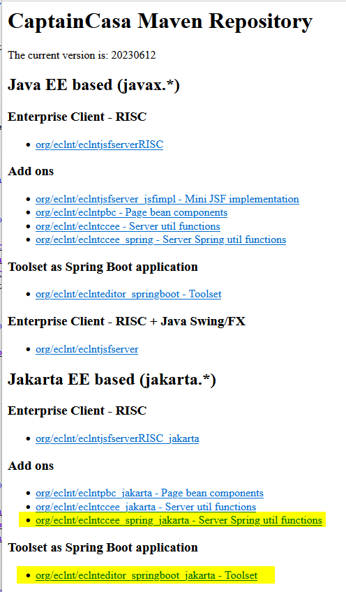
org.eclnt.eclntccee_spring_jakarta contains the Spring integration into the CaptainCasa dispatcher managenebt
org.eclnt.eclnteditor_springboot_jakarta contains the SpringBoot version of our toolset
Inside the Layout Editor the selection of base projects for creating a Maven-based or Gradle-base project now includes two new items:
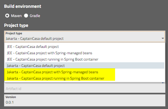
The project types are:
Default project with a dispatcher that requests page beans from diverse levels of Spring contexts.
Plain CaptainCasa project that directly runs as Sprin Boot application.
Please pay attention: Spring 6 requires a Java runtime of version 17! We added a corresponding new environment installation to your download page:
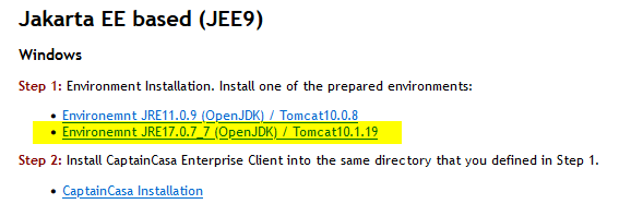
Whenever an image is resolved on client side, for which the size cannot be interpreted from the image name, the server side is asked to calculate the size.
This calculation up to now used plain Java-”ImageIO” functions – which correctly calculate sized for normal e.g. JPEGs, but which do not consider EXIF data within the JPEG. Inside the EXIF data there may be the information that the image is rotated. - Consequence: the calculation did return wrong results – height and width were mixed.
Now we read the EXIF data and interpret the information correspondingly.
The reading is done by an Apache “commons-imaging” library. If using the JEE version of CaptainCasa with Maven or Gradle you have to include this library into your dependencies:
<!-- EXIF reading of images -->
<dependency>
<groupId>org.apache.commons</groupId>
<artifactId>commons-imaging</artifactId>
<version>1.0-alpha3</version>
</dependency>
If using the Jakarta-version, the library is contained in the dependencies automatically. If using neither Maven nor Gradle: the library comes with the CaptainCasa update of your project. ...and: the system will not fail, if the library is not present.
There was an log output with “.ccsvg” images when the SVG XML-code contained an “<!DOCTYPE ...>” definition. The SVG image was still correctly created. Now we remove the DOCTYPE definition before starting the parsing. (All XML parsing inside the CaptainCasa runtime is done in a way, that following DOCTYPE definitions is not allowed for security reasons.)
We saw...: when asking Chrome for the current zoom factor by reading the resolution, then the zoom factor both contained the browser's zoom level and the operating system's zoom level. Result: the sizing of FIXGRID scroll bars was sometimes a bit too small.
When previewing a page within the Layout Editor then the page runs “directly on its own” - and is not part of some chronology of user navigation that embeds the page -processing into a certain context.
Up to now there was one way to add this context: you can check, if the current session is started in the Layout Editor's preview and then create this context:
package managedbeans;
public class XyzUI extends PageBean
{
public XyzUI()
{
if (HttpSessionAccess.checkIfInLayoutEditorPreview())
{
...
... prepare some preview context ...
...
prepare(...);
}
}
public void prepare(...)
{
...
}
}
This is already a nice approach – but there are two disadvantages:
You pollute your page bean with “preview code”.
In case of nesting beans (one page bean is embedded into another page bean) the “preview code” was executed also for the nested beans – and not only for the original bean that is the one that is previewed in the Layout Editor.
We now added an alternative:
Page bean class:
package managedbeans;
public class XyzUI extends PageBean
{
public XyzUI()
{
}
public void prepare(...)
{
...
}
}
Preview configuration class:
package managedbeans.preview;
public class XyzUI_PREV implements IPreviewInstanceConfigurator<XyzUI>
{
@Override
public void configureForPreview(String beanName, XyzUI bean)
{
bean.prepare(...);
}
}
You can add an extra class “<pageBeanClassName>_PREV” in the package “<pageBeanPackage>.preview”. This class implements interface “IPreviewInstanceConfigurator”. At runtime and if running in the Layout Editor preview an instance of this class will be created and called.
As result the preview-configuration is moved into some external processing and is not part of the page bean implementation anymore.
You may configure the class name settings by editing the system.xml configuration file:
<system>
...
<previewconfiguration instanceconfiguratorprefix=""
instanceconfiguratorsuffix="_PREV"
instanceconfiguratorsubpackage="preview"/>
...
<system>
All configuration files are read by a consistent procedure in which you may dynamically replace placeholders by corresponding values.
Example: in system.xml you may place a statement like:
<system>
...
<streamstore
name="org.eclnt.jsfserver.streamstore.StreamStoreFile"
rootdir="${env.streamstoredir}"
/>
...
</system>
At rutime the placeholder “${env. ... }” is then replaced by the value of the operating system variable “streamstoredir”.
Up to now there were two types of placeholders:
${env. ... } ==> operating system variable
${sys. ... } ==> Java system variable
Now there is a third one:
${ccparam. ... } ==> dynamic picking the value by interface ICCConfigParams
The interface is:
package org.eclnt.util.configparams;
public interface ICCConfigParams
{
public String getConfigParam(String name);
}
This means you can now resolve the placeholder values by an explicit Java program – which significantly increases the flexibility of configuration. Please check the Developer#s Guide, chapter “Appendix – Reading of configuration files” for more details.
When using COOKIE-based session tracking then the file name that you can set when working with “BufferedContent” was not correctly passed. When e.g. downloading content from the client then the file name was defaulted to “ccbufferedcontent...” instead of using the file name that you did set.
The URL that is internally used for previewing a page in the Layout Editor could contain a double slash (“//”). This caused problems if having added a security filter that checked incoming URLs not to contain double slashes...
This feature is designed to serve certain mobile scenarios. Only full columns are shown in a grid – there is not horizontal scrolling in case of insufficient screen space. Per column you can assign a priority – the (optical) removal of columns that do not fit is done according to this priority.
Please check the demo in the demo workplace (“News”-section):
We received requests to make it possible to add own functions into the layout editor's deploy process. You may e.g. execute certain file operations before or after the “clean” - e.g. you want to save certain information before and re-apply afterwards.
Now you can do so by implementing interface “IEmbeddedFunctions”:
public interface IEmbeddedFunctions
{
public void beforeClean(ProjectInfo pi);
public void afterClean(ProjectInfo pi);
public void beforeDeployCopy(ProjectInfo pi, boolean asHotDeploy);
public void afterDeployCopy(ProjectInfo pi, boolean asHotDeploy);
}
The registration of you implementation is done inside the project definition (“.ccproject” file):
<project ...>
...
<embeddedfunctions class="...class name of extension..."
errorifnotavailable="true"/>
...
</project>
Please note: even though the class implementation is part of your project it is executed from the editor! This means: the class loader environment is not the one, in which your application normally runs – but is the class loader environment of the editor toolset. Your code is executed “from the editor”.
This means: only use basic functions within your implementation! Do not use functions which require your normal application environment to be up and running.
The FIXGRID (same with ARRAYGRID, SPANGRID, ...) by default only renders “full rows”. The available vertical space is always completely filled. Internally this is done by stretching the individual rows so that there is no empty space between the bottom row and the grid border itself.
Now you can define attribute FIXGRID-AVOIDROWSTRETCHING to be “true”:
Consequence: rows will not be stretched, the bottom row is shown with its partial content.
Use case: if you render grids with dynamic height sizing, then each row may have its individual height. Especially when a row has a “quite high” height (e.g. < 100 pixels) then the strategy to always have full rows does lead into sometimes confusing rendering results.
With the TEXTWIDTH you can define the with of the text area of a grid columns. By default it is “100%”, but you may override – in case of using an additional grid column header control.
The TEXTWIDTH was not applied in scenarios, in which FIXGRID-DYNAMICHEIGHTSIZING was defined as “true”.
In the CALENDAR component you now can restrict the selection of days by passing a from and a to date:
The Layout Editor's messages sometimes showed the message “2 programs are referenced within this page.” - also when there was a good reason to do so (e.g. directly picking properties from the d-Dispatcher). Now the Layout Editor checks these “good reasons” and does not output this message anymore...
Since update 20230130 there is a little blur effect with pages that are started in a work page container. The effect only shows up if changing the scale e.g. by adding “ccscale=1.1” as parameter to the “.risc” URL. The effect is not visible when using normal 100% scaling.
CCDATAGRIDVIEW2 internally manages a normal FIXGRID. Many of the FIXGRID attributes (e.g. AUTOEXECUTE, SINGLECLICKEXECUTE) were now also taken over into the definition of the CCDATAGRIDVIEW2.
We introduced a new KANBANBOARD component which allows to define KANBAN boards in a simple but flexible way.
Each item represents an individual page bean – so the content can be any content that you assign as item. Also the header of each column is a page bean on its own.
Default functions like moving items and moving columns are already implemented.
The DATAGRIDVIEW2 component is a grid component to simply render a grid of beans. Not there is an extension of this component that renders the content of each bean item into one single cell:
The configuration is simple: you just need to name the bean properties and how they are arranged in the rows of the cell. A full text search and the possibility to add an AVATARICON on the left is included.
If triggering an animation, then by default the animation is NOT executed when a control is newly rendered. Now there is a flag to enforce the animation also during the creation of the control.
The TempFileManager is a server-side class which stores content (byte-Array) in the temporary file system in order to make it available as download-URL. The mime type of files was not correctly managed when using file names containing “strange” characters (like “äöü” but also with spaces).
The WEBSOCKETKETLONGPOLLING component up to now did not reaction on closing-connections properly. The closing of a connection was not treated internally as error, as consequence the component did not try to re-initiate a new web socket connection to the server. This could have the consequence of connections being closed and not re-opened.
The property “setCloseonclickoutside(true/false)” up to now only could be set when starting popup. Now you can change also at runtime.
Use case: take a look into the demo workplace's “Launachpad” function:
By default the popup is closed by clicking outside. Once the user changes the launchpad to edit-mode you can click outside – in order to drag/drop items from the menu tree into the launchpad.
During the deployment (reload / hot-deploy) files are copied from the project into the runtime environment. This copying up to now compared file size and file timestamp between the runtime and the project – if different then the copying was executed.
Now: the copying is only executed if the timestamp of the runtime is older than the timestamp of the project. So only “newer” files are copied.
The reason is: when working with Maven- or Gradle-projects then the typical sequence of copying is to first copy the target-directory (containing the compilation results of the last Maven- / Gradle-build) and then to copy afterwards the compilation directory content of the IDE. By doing so, the runtime is always based on the “target” but contains all “fresh- compiled” files of the IDE. - Up to no, during deployment .class-files where first replaced by their target-version and directly afterwards were replaced by their IDE-compiled version. Which means: quite some effort for copying - “for nothing”...
There is now a protocol written for each deployment – containing exact information which directories were analyzed and which files were copied.
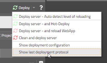
If using the component ROWADAPTIVELINE (the row that breaks into two rows in case of insufficient screen space) with DYNAMICONTENT then it could happen that the content was not properly sized after changing the content.
In an OVERLAYAREA you can define OVERLAYREAITEM components – each one representing a certain area with a x,y-position and a z-index. With an OVERLAYAREAITEM you can define attribute SHOWAREAONMOUSEOVERONLY as “true” - in this case the corresponding area is only visible when the user moves the mouse over the OVERLAYAREA. - This existing function was enhanced by some nice fading effect – so that the area does not “flash up” when moving the mouse up, but shows up in a much softer way...
Please check the demo in the demo workplace (section “News”).
In the simple pivot grid (page bean component “CCSimplePivot”) you now can hide values below a defined value:
“Hiding” means that these values are output with a certain transparency – so that they are still read-able, but are clearly positioned in the background.
When using hot deployment and/or when using session tracking mode “COOKIE” then the dispatcher root instance “{d}” is always created by the CaptainCasa expression resolver – by checking the definition within the “faces-config.xml” configuration file.
Up to now the instance was created by a simple “Class.forName(...)” and then “clazz.newInstance()” - so it was not possible to e.g. create this instance through some context (Spring, EJB, ...) that applied dependency injection onto the instance that is created.
Now the actual creation of the instance can be outsourced by using the already existing interface...
public interface IConfigurationObjectLoader
{
public Object loadInstance(String className, boolean withError);
}
Your implementation of this interface is registered in system.xml:
...
<configurationObjectLoader
class="org.eclnt.jsfserver.util.CCDefaultConfigurationObjectLoader"
/>
...
The default implementation is contained in class “CCDefaultConfigurationObjectLoader” - we recommend to extend this class and then within method “loadInstance” only implement these instances that you really want to control on your own.
The attribute up to now was defined as pixel value (“5”) or as percentage value (“50%”). The value was applied to all corners of the corresponding component.
Now you in addition can define the value as a semicolon separated value, containing information for each individual corner:
“10;5;5;10”
definition “around the clock”, which means:
value 1: left top
value 2: right top
value 3: right bottom
value 4: left bottom
The new component SIZEANIMATIONAREA is a container that starts up with a certain “initial size” and which automatically changes to a “long term” size after a certain duration.
A typical use case is to provide an area which in normally hidden (“long term” size is e.g. “0”) and which should show up for a certain time.
The component can be used in a very flexible way – any component can be used inside and around. Please check the example in the demo workplace (“News” section).
When opening modal/modeless dialog popups then you can define that they are closed automatically when there is some user activity around the popup by calling “Modeless/ModalPopup.setCloseOnClickOutside(true)”.
When nesting these popups (i.e. calling one popup, from there the next popup, from there the next popup) and when mixing modal and modeless popups, then it could happen that in certain arrangements too many dialogs were closed.
We added a demo/test szenario to the demo workplace (“General > Arranging content > Popup dialogs > Test/Demo page for nesting popups”):
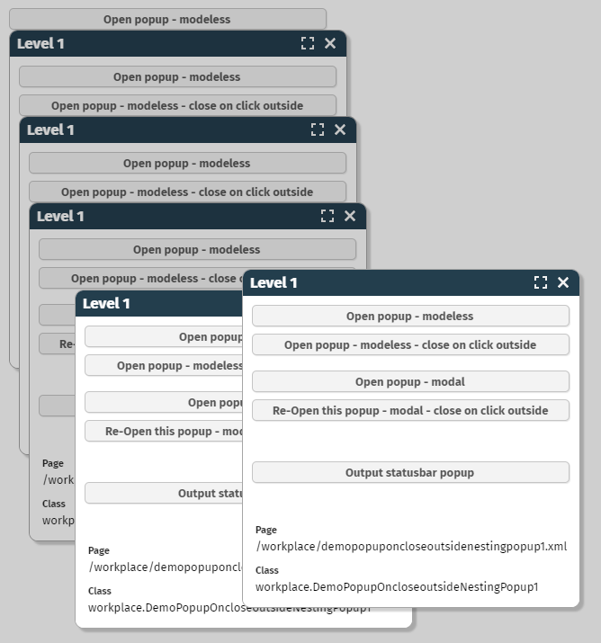
When implementing own, server-side components (implementations of “PageBeanComponentAsControl”) then you now can also use the attribute ADAPTERBINDING. If the user decides to use the ADAPTERBINDING then AttributeReference-instances will be implicitly passed into the component references that access the adapter binding that is assigned. - There is nothing more to do from your side than adding the attribute ADAPTERBINDING to the list of valid attributes in your “cccontrollibrary.xml” definition.
When the user clicks into a grid row then the corresponding cell component is focused.
What did happen up to now if the cell component was disabled, e.g. the cell component was a FIELD with ENABLED=”false”? - In this case the focus was moved up to the whole grid. - Consequence: a component which is focused is moved by the browser so that the browser shows (if possible) the whole component. This means: if the grid was e.g. scrolled and only parts of the grid were visible, then as reaction the whole grid was moved by the browser.
Now the cell component will correctly accept the focus even though it is not enabled. The focus is NOT moved up to the whole grid component anymore. Situations, in which the whole grid is scrolled due to clicking into a cell are not possible anymore.
A new style variant was introduced for the TABBEDLINE component:
The design follows the design of a button, the marked button is highlighted.
When using the addon library...
<dependency>
<groupId>org.eclnt</groupId>
<artifactId>eclntpbc</artifactId>
<version>${cc.version}</version>
</dependency>
...then there is a new component “tpbc:moveablearea”. The component allows to position any content in a move-able area which is placed on top of some base content:
Is is very useful to arrange e.g. buttons and icons on top of the area they affect. The user can move the move-able area either by the button (toggling between to preferred positions) and/or by directly dragging/dropping it to a new position.
The hot key management was showing e.g. tooltip “ctrl-s” instead of “cmd-s” on MacOS (where the commnad-key in general is treated as the control-key).
We also changed the hotkey inside COMBOFIELDs for MacOS from “cmd-space” to “ctrl-space” (here in MacOS the “real” control key is used...).
When using “IdTextAssignment” popups in the value help processing then the user can input a character and the list of items automatically positions on the corresponding item. This did not work with “-” and “_” characters.
Imagine the following situation: in a server request processing you first output a Statsubar-message (internally using the OKPopup) and then you open a modal dialog.
In this case the OKPopup of the status bar was shown behind the modal dialog. - Technically this is OK: there are two modal popups “fighting” for the top position and the last one wins. Nevertheless the expectation is that the message is shown on top so that the user is notified.
We now set both the OKPopup and the YESNOPopup to be opened as last popup in general. The internal method is “ModalPopup.showAsTopPopup()” - a method you can also use for own implementations. Of course: if there are two modal popups, both being defined to be placed as top popup, then the “fighting” against starts... So only use this method for extraordinary situations.
It could happen that the icons of a TREENODE were drawn in the area of the next component of the grid when the width TREENODE-column was shrinked to a very small size.
When setting attribute WITHFOCUSEVENT to “true” then the component sends an event to the server side after a certain duration being focused (the event is NOT fired immediately!). The corresponding event “BaseActionEventFocusGained” now provides two new properties “getWidth()” and “getHeight()” of the focused component.
Typical use case: you want to start some value help dialog and want to size the dialog according to the size of the component.
Since update 20230206 the column header labels of grids where cut at their defined width – even if the user increased the column size. This was “only” happening with direct pixel definitions like GRICOL-WIDTH=”100”. There was no problem with percentage definitions or mixtures (“100+” or “100%;300”).
The dynamic transfer of flat SVG-icons into color- and size-variants did not work for icons of the library behind https://www.streamlinehq.com/.
The component tree “on the left” can now be scrolled horizontally if tree nodes are taking too much horizontal space.
We added a new control library in which we added a quite special new component: XCSAML:SAMLLOGOUT. - This component performs...
...the closing of the current session
...the sending of a post-request to the SAML identity provider that invalidates the SAML token
...the redirection to a follow on page
We added this component to a new library that is available via our Maven repository:
<dependency>
<groupId>org.eclnt</groupId>
<artifactId>eclntxcsamllogout</artifactId>
<version>${cc.version}</version>
</dependency>
The component is an invisible component. In the layout you may position the component inside the BEANPROCESSING element.
The new component allows to define a time in a comfortable way:
As usual it can be bound to any representation of a Date in server side: LocalDate, Date, SQL-Date, long, ...
When adding own components in some own control library you now can define that within the Layout Editor...
...attributes are defaulted with defined values
...sub-components are automatically created
The definition is done in file “controltemplates.xml” which is kept as resource in the same package as the “other” files like “controlsarrangement.xml”, “controlattributeusage.xml”, etc.
The format is:
<?xml version="1.0" encoding="UTF-8" standalone="yes"?>
<templates>
...
<control name="t:outlookbar">
<attribute name="width" value="200"/>
<attribute name="height" value="100%;300"/>
<child name="t:outlookbarcontent"/>
<child name="t:outlookbaritem"/>
<child name="t:outlookbaritem"/>
</control>
<control name="t:outlookbaritem">
<attribute name="text" value="Item"/>
</control>
...
</templates>
If in the Layout Editor a new OUTLOOKBAR component is created then it will receive a corresponding width and height – and sub-components will be automatically placed below. The sub-components again will be defaulted by the definitions in the “controltemplates.xml” file.
When creating a new control library via the Layout Editor then the file will be created automatically.
There is an interface with class “ComponentNode” (the parent class of all XXXXNode classes that are generated for all components) that allows the adding of multiple attribute values:
ComponentNode node = ...;
List<IComponentAttributeValueProvider> values = ...
node.addAttributeValues(providedValues);
The interface definition is:
public interface IComponentAttributeValueProvider
{
public String getName();
}
public interface IComponentAttributeStringProvider extends IComponentAttributeValueProvider
{
public String getValue();
}
public interface IComponentAttributeBindingProvider extends IComponentAttributeValueProvider
{
public IDynamicContentBindingObject getValue();
}
...the warning does not occur anymore...
In a PageBeanComponent implementation you can define PARENTEXITS that allow to open up areas which are defined in the page that uses the component.
Example: the MASTERDETAIL component (“tpbc” library) opens up two PARENTEXITS:
one with exit-id “MASTER”
one with exit-id “DETAIL”
So far the using page had to define PANE-components:
...
<t:row>
<tpbc:masterdetail ...>
<t:pane ... exitid=”MASTER” ...>
</t:pane>
<t:pane ... exitid=”DETAIL” ...>
</t:pane>
</tpbc:masterdetail>
</t:row>
...
The component now provides two sub-components: MASTERDETAILMASTER and MASTERDETAILDETAIL, that simplify the page definition:
...
<t:row>
<tpbc:masterdetail ...>
<tpbc:masterdetailmaster ...>
</tpbc:masterdetailmaster>
<tpbc:masterdetaildetail ... >
</tpbc:masterdetaildetail>
</tpbc:masterdetail>
</t:row>
...
The component implementations are as follows:
Component Tag class:
package org.eclnt.ccaddons.pbc.ccpbc;
import org.eclnt.jsfserver.elements.impl.PANEComponentTag;
public class MASTERDETAILMASTERComponentTag extends PANEComponentTag
{
@Override
protected void presetDefaults()
{
super.presetDefaults();
presetPropertyIfNull("exitid","MASTER");
}
}
Component class:
package org.eclnt.ccaddons.pbc.ccpbc;
import org.eclnt.jsfserver.elements.impl.PANEComponent;
public class MASTERDETAILMASTERComponent extends PANEComponent
{
@Override
public String getClientTagName() { return "pane"; }
}
Component registration (cccontrolibrary.xml) and definition is the same as with any other component.
The TOUCHSIGNATURE component allows to draw a signature by touch operations:
So far the user always had to press e.g. some additional button to process the signature. Now there is also a FLUSH and a FLUSHTIMER management. After a certain time of milliseconds (2000ms by default) the trigger for transferring the signature is started automatically.
In addition to ARROWFROM and ARROWTO there now is also an attribute ARROWCENTRAL:
The nice issue: if the line is not one straight line but is containing interim points then the arrows is still drawn properly.
There are additional minor improvements in this area:
The TEXT of the line is properly drawn at the central position even if the line contains interim points.
There are a couple of new arrow types.
Please check the corresponding demo in the “News” section of the demo workplace.
When developing own components you take use of “AttributeReference” instances. When inside your component there is dynamic content then you now can bind the AttributeReference-instances directly into the corresponding “bind*”-methods of the ComponentNode of the generated content.
AttirbuteReference-instances are now implementing the interface “IValueDelegation” which is the base for the “bind*”-methods of a ComponentNode-class.
When using grids (FIXGRID and variants) and using “drag&drop” within the grid items then the “drag&drop” always had priority. This means: on touch devices scrolling by “touch-swiping” was not possible anymore if “drag&drop” was used on grid item level.
We now updated this behavior for touch devices: by default the “drag&drop” waits after the first touching with the finger for a certain duration (400ms) until it is activated. This means: on an item which allows both “drag&drop” and “swiping”, the user by default can swipe through the grid items with normal touch operations – if the user wants to execute “drag&drop” then the user has to touch, then wait a certain while and then continue the touch-gesture.
Sounds complex... - but at the end is a very natural behavior. You may test out in the demo workplace, e.g. starting it on a tablet. In the function tree on the left the leaf-nodes support drag&drop. You see that scrolling is much easier now – while drag&drop of the leaf-nodes still si possible.
Multiple selection of items in a grid (and other operations requiring the “ctrl”-key) was not working properly on MacOS devices, because here the meta-key is used. We updated this, so that now also “meta”-selections properly work.
The CaptainCasa runtime provides a lot of API-exits and API-extensions which you can use. By default you register a corresponding class in the “system.xml” configuration file and the runtime loads this class – either at startup time or when being touched the first time.
The runtime already knew that the implementation of the class may be located within the classes that are hot-deployed (i.e. the ones being located in “WEB-INF/eclnthotdeploy/classes”). What the runtime did not do yet in a consistent way: when doing hot deployment then these configuration classes require a reload that were loaded from the hot deployment class loader. Result: after hot deployment the runtime was still working with the old classes, which it registered during first startup.
Now we better observe this – and reload the corresponding classes during hot deployment, so that consistency is kept.
There is also an interface that you may implement for own activities:
package org.eclnt.jsfserver.managedbean;
public interface IHotDeployListener
{
/**
* When a hot deployment is done then the first event that is sent out is this
* method. Reactors should internally prepare to update internally with the new
* class loader but not immediately so do! Reason: there might be sequence-dependencies
* between reactors!
*/
public void onClassLoaderUpdate(ClassLoader newClassLoader);
/**
* This is the second event: after all listeners were called with {@link #onClassLoaderUpdate(ClassLoader)}
* the listeners are called now with this method. They may use this method to immediately re-initialize.
* Listeners do not have to implement this method but can leave it empty! In most cases the initialization
* is executed by lazy initialization.
*/
public void onClassLoaderUpdateFinished(ClassLoader newClassLoader);
}
Use class “HotDeployNotifier” to register:
HotDeployNotifier.addListener(...);
HotDeployNotifier.removeListener(...);
The improvement of 20230227 in the area of scrolling during “drag&drop” operations is now also activated for range selections inside the PAINTAREA component.
When selecting a component instance within the component tree “on the left”, then the corresponding component in the preview is highlighted in the preview “on the right”. This function did not properly work when selecting page bean components – highlighted items were not de-highlighted after selecting an other component.
When using Java system properties inside configuration files by using “${sys.<propName}” then the resolution was not correctly working. (Indeed you had to write “${env.<propName>}” - which is the syntax for environment variables...).
The design of the scroll bars for FIXGRIDs and for SCROLLPANEs are now explicitly defined – and are harmonized so that they look the same. - ...at least for Chrome-based browsers... (Firefox is doing some own management of appearing/dis-appearing scroll bars which cannot be influenced by CSS styling)
When executing drag&drop operations then up to now you could only reach these components that were directly shown within a dialog. If some target was positioned in an invisible part of a SCROLLPANE or of a FIXGRID then you could not reach.
Now each scroll-able component (i.e. SCROLLPANE and FIXGRID) provides an explicit area at the top/ bottom/ left/ right: if the user moves the mouse over this area during drag&drop then after a certain waiting duration corresponding scrolling is triggered:
The “sensitive area” is positioned on top of the existing content – the user can see it when moving with the mouse over the area.
The CLIENTCONFIG component transfers configuration information from the server into the client. Most common example: you want to explicitly define the localization of the client and/or you want to explicitly define the time zone for the client.
There is one central CLIENTCONFIG component which is always sent to the client side automatically. The counter-part of this central component is the class “Client” - providing all relevant attributes of CLIENTCONFIG as set/get-methods.
Client.instance().setCountry(...);
Client.instance().setLanguage(...);
...
In principal you do not need own definitions of then CLIENTCONFIG component at all in your layout – but can just use the central instance by its “Client”-Java-API. (And of course you still can use own instances!)
In some situations we saw a NullPointerException being thrown during the destroy-process of a dialog session. The exception was thrown in class “WorkpageDispatcher”. There was no negative effect due to this, but some ugly log output.
When using the animation for increase the button size when the user moves with the mouse over the control (Style variants “cchoverresize*”) then a JavaScript error internally was thrown. Result: the rendering for the component was stopped.
Example: you apply one of the style variants to a button – and the button text is not displayed.
The error has no other side-effects. You only need to pay attention to this “fast-update” if you use this type of animation.
...sorry: we did not find a better name! But actually the purpose of the component is that changed content of an area “flies in” from a point of the dialog:
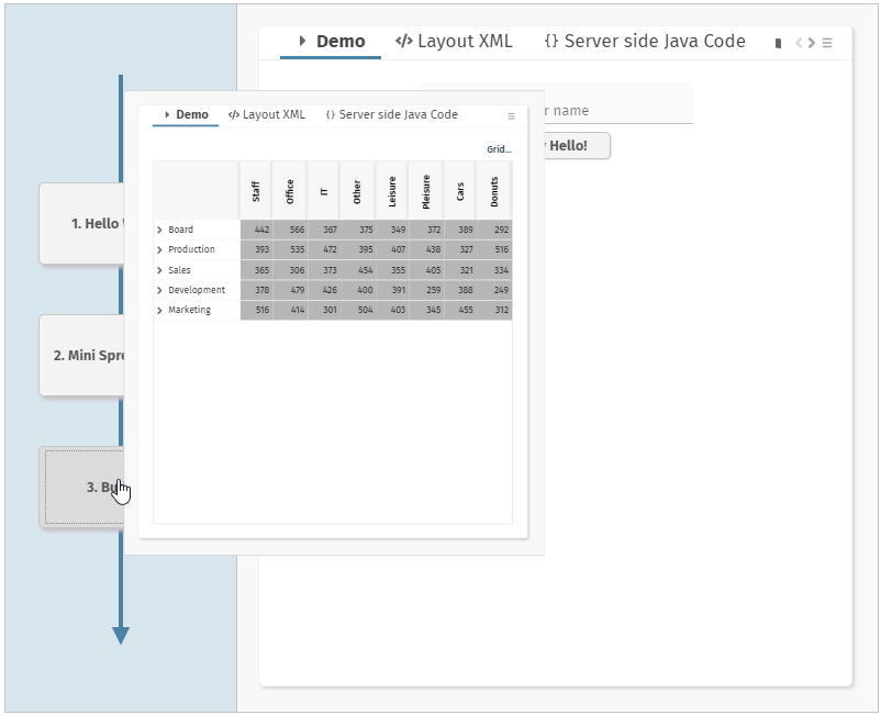
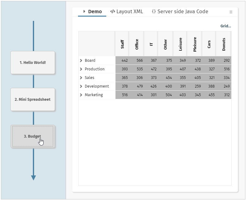
Take a look into the demo within the “News” section of the demo workplace. Once pressing a button on the left the corresponding content is flying in from this button into the content area.
From development point of view the control is extremely simple to use. You just have to indicate the change of content – and everything else is automatically done. You in particular do not have to manage two contents – the new one and the old one!
We believe that this component is an excellent way to show the user from where a change of content is initiated. Areas of usage would be wizard-like dialogs – or dialogs that tell the user some workflow-like sequence of steps, each step being associated with a dialog on its own.
We so far used version 2.8.0 of chart.js and now did update to 2.9.3. Reason: there are certain security vulnerabilities which are indicated for the 2.8.0 version.
All the CaptainCasa bridge pages were updated accordingly and are compatible of course. If having developed own bridging pages for the control, then please also adapt to 2.9.3 – version 2.8.0 is not part of the delivery anymore.
Up to now the accessibility information for the scroll bar of FIXGRID instances was quite rudimentary – just telling the user that the scroll bar consists out of button-sub-elements. Now the scroll bar contains the proper information about the actual scroll status (“1 to 30 of 200”).
In 20230213 and 20230206 a bug was added to the system: if defining grid columns with a percentage size (e.g. GRIDCOL-WIDTH=”20%”) then the label text of the column was cut at 20% of its available space as well.
This annoying issue was the reason for delivering update 20230216 as official version solving this problem. The fix is of course part of next week's update as well.
The component allows to select a range by a slider selection:
The user can drag/drop the individual end-points or can drag/drop the whole range between the end points. On server side two values are updated: a from- and a to-value.
The component CLIENTCONFIG so far allowed to update the text of the browser's title text – now you can also update the image at runtime.
There are two ways of updating the title:
You may use the CLIENTCONFIG component that is implicitly added to any page and that is reach-able via the “Client” class:
Client.instance().setTitle(“...text...”);
Client.instance().setTItleimage(“/.....xyz.png”);
You may define an own CLIENTCONFIG component inside your page and use the attributes CLIENTCONFIG-TITLE and CLIENTCONFIG-TITLEIMAGE.
When using own components then it could happen that selecting the component within the preview area did select no or a wrong component in the component tree.
When having opened a layout then the first thing the Layout Editor was doing was to save the document... Now saving really waits for the user to press the save button...
Our software is part of security audits using Veracode static code analysis. Part of this analysis is the check for suppression of carriage return / line feed characters for certain API calls (e.g. setting http header parameters). Veracode only trusts certain libraries for doing so – as result we have to embed them into the runtime.
For users of the classical CaptainCasa project structure: there's a new liberar “owasp-encoder.jar” which is part of “/webcontentcc/WEB-INF/lib”.
For users of Maven: the library is already included in the dependencies of the eapi library (org.owaps.esapi.esapi – artifact). So there is no action to take.
In any case: should this library be missing in your environment (e.g. due to exclusions), then the artifact data is:
<dependency>
<groupId>org.owasp.encoder</groupId>
<artifactId>encoder</artifactId>
<version>1.2.3</version>
</dependency>
Up to now you could size a component instance using the following percentage definitions:
xx% e.g. “100%”
xx%;<min> e.g. “100%;100” - takes 100% but minimum 100
Now you also can define a maximum size which will not be exceeded:
xx%;<min>;<max> e.g. “100%;100;500” - minimum 100, maximum 500
e.g. “100%”;;500 – maximum 500
You see: in case of only passing the maximum size you just define no minimum size – but still need to write the corresponding semicolon.
Example:
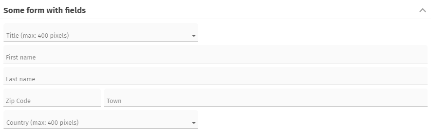
The “Title” and the “Country” field are defined with a maximum size so that they do not span the whole width that is made available by their container.
There are two example in the “News” section of the demo workplace – please take a look!
The height of the headline now can automatically adapt to its content:
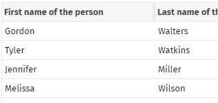
Please check the demo in the “News” section of the demo workplace.
There is a new component GRIDLAYOUTROWDISTANCE by which you can directly define distances in the arrangement of GRIDLAYOUTPANE and ADAPTIVEGRIDLAYOUTPANE.
The minimum sizing of the component ADAPTIVEGRIDLAYOUTPANE always calculated a minimum width of “0” - which was not sufficient in certain situations... ;-)
There was a JavaScript error coming up – preventing such menus to be displayed.
Take a look onto the demo workplace – here you see how the 3D-transformations that were introduced last week look like when being applied to the workplace.
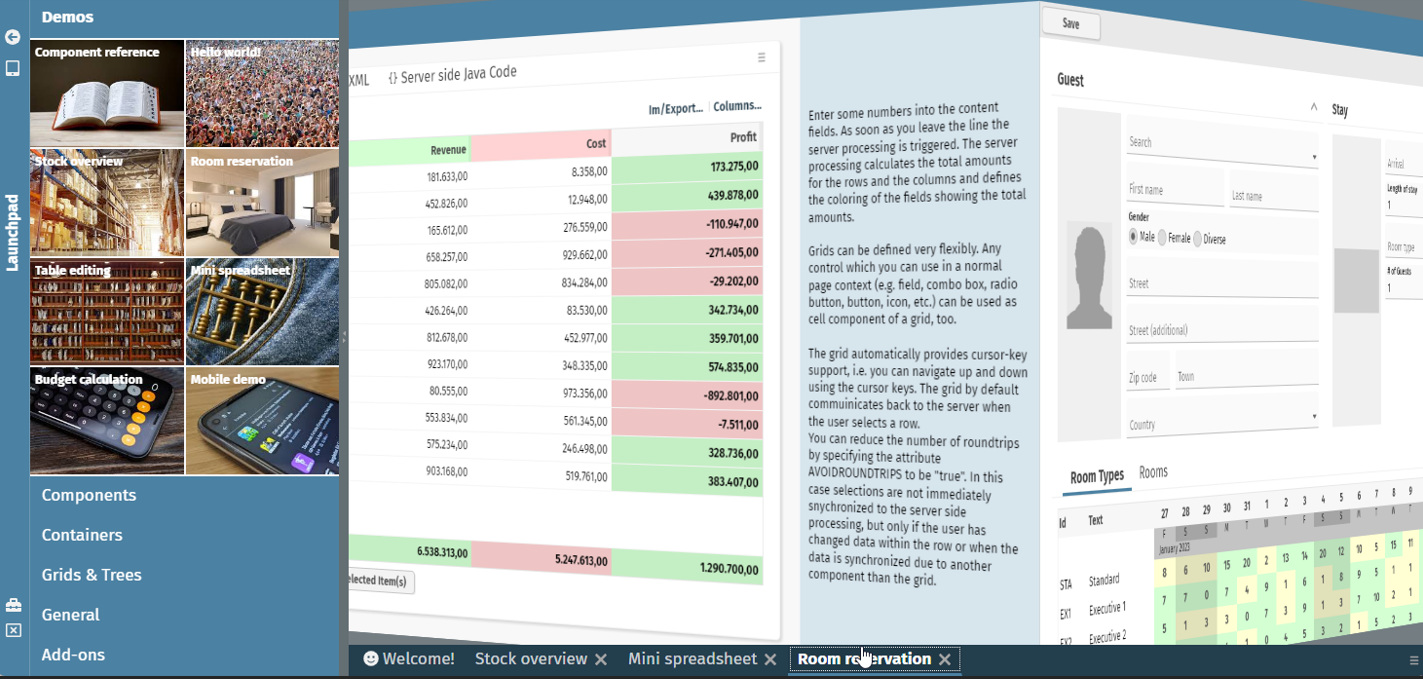
You can check this for your workplace as well by just calling the method:
IWorkpageContainer.setWithCubeRotation(true/false);
You may do this within the constructor of your main dispatcher:
public Dispatcher()
{
super();
...
getWorkpageContainer().setWithCubeRotation(true);
...
}
The component CUBEROTATOR provides 3D-cube rotations which are very simple to implement! Any page that is updated internally can be upgraded to use this component and add more visibility when switching from one content to the next.
Please check our example from the “News”-section, in which we show how a 3D-oriented navigation within a typical filter-list-detail-scenario could look like:
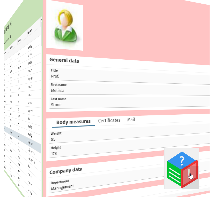
The component ROTATECONTENTAREA provides the possibility to rotate a certain area of the layout to the background, so that it's still available but does not take a lot of screen space.
We provide an example in the “News”-section of the demo workplace, in which we demonstrate how to use the component in a typical list-detail-scenario:
While navigating in the list, the detail area is rotated into the back. Once selecting a list item, then the list will be rotated into the back and the detail will become fully visible.
By using interface “ILogOutput” you can delegate all log messages of CaptainCasa into your own logging. Up to now there were two default implementations to delegate the log output to log4j-based logging. We now added...
eclnt.util.log.Log4JLogOutputPlainText and
eclnt.util.log.Log4JLogOutputV2PlainText
The difference to the existing delegator implementations: now special HTML characters are transferred into plain text before being sent to log4j-logging. So “<” will be transferred to “<”.
This is a rather difficult issue: during http-processing within the servlet engine one can re-dispatch the request:
...
RequestDispatcher dispatcher = servletContext.getRequestDispatcher(forwardURI);
dispatcher.forward(request,response);
...
The current request processing will be interrupted and a new, “internal” request processing will be executed. Internally each request has a “dispatch type”, which is “REQUEST” for normal requests and “FORWARD” for internally created requests.
Any filter is by default only processed for “REQUEST” type of requests. When a request is forwarded then filters are not processed.
You now can define per filter class which types of requests should be processed by the filter. In the extension of “CCInitializeServlets” you can override the method “createDispatcherEnumSetForFilter”, which be default returns null:
protected EnumSet<DispatcherType> createDispatcherTypeEnumSetForFilter(Class filterClass)
{
return null;
}
Your implementation might e.g. look like:
EnumSet<DispatcherType> es = EnumSet.of
(
DispatcherType.REQUEST,
DispatcherType.FORWARD
);
return es;
Why all this? - You normally do not require to think about!
Only of if you add own filters to the standard set of filters, and when these filters perform and internally forwarding of requests – then you might be astonished, that CaptainCasa filters are not processed! ...and you will receive corresponding log messages that the filters are not processed as required.
The creation of classes in the Layout Editor now only shows the radio buttons that are adequate for the selected layout.
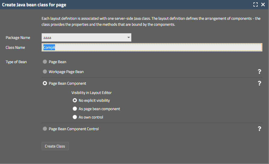
When selecting page bean type “Page Bean Component” then the current visibility options are select-able. And there are documentation icons on the right...
If the value behind the AUTOCOMPLETE was updated by the server side program after input and if selecting a new value from the list of proposed items and with a certain timing of clicking the selected item and using flush=”true”, then it could happen that the item selection was not represented by the value shown in the control. The value was set internally in a correct way.
Certain addons (e.g. the “old”, extensive Pivot table management) were up to now delivered as extra .zip file (“ccaddons.zip”) that came with the installation. Background: in this .zip file there was still the separation between resources kept in the webcontent and classes kept in the .jar file. Now we moved everything into the .jar file and as result there is a self-containing Maven artifact:
<dependency>
<groupId>org.eclnt</groupId>
<artifactId>eclntccaddons</artifactId>
<version>${cc.version}</version>
</dependency>
There is a version “eclntccaddond_jakarta”, too. - Of course the “ccaddons.zip” is still part of the delivery.
With an IMAGE component you can set attribute WITHHOVER to “true”. In this case the image (or a special image defined with attribute HOVERIMAGE) is shown as info popup when the user moves the mouse on top of the image.
The positioning and sizing of this hover image was not too nice, when the screen size was not sufficient. We now adapted accordingly.
When “sliding” in the SLIDECONTAINER (i.e. swiping with the mouse on desktop devices or the finger on touch devices) then the corresponding move-event was sometimes not trasnferred to the server-side.
As part of the “Deploy”-menu there is now a function to show the current deploy situation for the selected project:
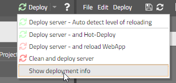
The dialog exactly tells which data is copied from the design time into the runtime in which sequence:
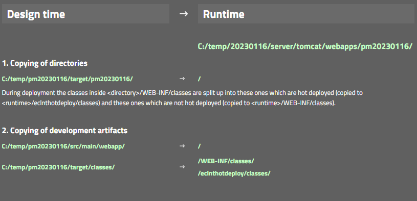
When a drag&drop operation was started by the user and when the component, where the drag started, was a component showing hover-effects (e.g. grid item), then it could happen that the hover-effect (e.g. applying a mouse-over-color) was not removed after having finished the drag&drop.
When changing the project – e.g. changing the code of page beans – then you need to transfer these changes from the project into the server runtime. Up to now there were two explicit functions to do do:
“Hot Deploy” transferred the files into the server runtime and reloaded the application in a smart way, so that only part of the classes are reloaded
“Reload” transferred the files into the server runtime and re-started the whole web application
Up to now you had to know your own when to select “Reload” or “Hot-Deploy”.
Now things were simplified: there is one “Deploy” button:

When pressing the button (i.e. the button's image/text - not the menu-icon on the right) then files are copied as usual. During copying changes are detected and the triggering of either the “Hot Deploy” or of the “Reload” is automatically executed – depending on the level of changes.
In other words: pressing “Deploy” will do the right restart after copying – you do not have to know on our own anymore.
When pressing the menu icon of the “Deploy” button, then all the options are shown – and you can manually advise the system what to do.
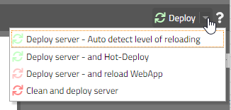
The “SecurityFilterGeneral is responsible for protecting against session-id-hijacking. There were two functions that are included:
Generation of a “security-id-cookie” that is kept in the (http-) session and that is checked with every request from a client to the server. This function is important to use when running in the “session-management-by-URL” scenarion – because here the session-id is encoded into the URLs that are sent from the client to the server.
And: the client ip-address (or at least the ip-address that comes with the http-request) is stored in the (http-)session. Every request coming to the server is checked if the ip-address of the request is the same as the one stored with the session.
The second function (ip-address-checking) was now moved into a filter on its own – so that both functions can be individually switched on/off by system.xml configuration. The name of the new filter is:
org.eclnt.jsfserver.util.SecurityFilterRemoteAddress
The “SecurityFilterGeneral” does not include the checking of the ip-address anymore.
The width and the height of the menu icon on the very right of a TABBEDLINE can now be explicitly set in the style.
<class n="risctabbedline">
...
<risc n="_menuIconWidth" v="16"/>
<risc n="_menuIconHeight" v="16"/>
...
...
The style class “risctabbedline” is referenced at many places, e.g. it is part of the style definitions for TABBEDPANE-containers as well.
There was an attribute KEYSENSITIVE in the “good old” Swing client that was not transferred into the RISC client yet. Thanks to these ones – who found out!
When defining KEYSENSITIVE to “true” (e.g. on PANE-level) then the component will react on keyboard input in the following way: it will collect all characters coming from the keyboard until no further input is done (the waiting time is 500ms) and then send the collected sequence of characters to the server side (event “BaseActionEventKeySequence”).
The function is used e.g. in FIXGRID scenarios to search for certain items when navigating through the grid. The keyboard input should not be in competition with other keyboard input (e.g. within a FIELD component).
The function is used within the default “IdTextSelection” processing – which is a default way to open value help popups for the COMBOFIELD component. Within the grid that is part of the value popup you can navigate by keyboard input now.
When opening a popup (Modal/ModelessPopup) you can define the popup's location as reference to another component by using the methods ”setLeftTopReferenceComponentId*(...)”.
You up to now could “only” pass the id that represents the “id” attribute in your layout definition. - Now you can also reference the component by the actual id that it receives when being sent to the client. The actual id is an extension of the “id”-attribute-value – because the value of the “id”-attribute is only unique within the scope of a layout definition.
(This improvement is a quite special one... because it is not trivial to find out the actual id of the component... So this message is only relevant for very generic functions that directly access the server side component tree.)
With “Modal/ModelessPopup” there is a method “maximize(...)” - so that the popup dialog is occupying all available space within the client. This method was not working when being called immediately when creating a new popup dialog. It was only working once a popup was already opened.
In the recent weeks we took care about changing the way ids are assigned to the client side controls. The purpose was – especially in dynamic scenarios – to keep control ids as stable as possible: the client re-uses controls if the control id is kept – so when re-rendering a certain dynamic area (ROWDYNAMICCONTENT) it makes sense to not remove and recreate components but to use the existing one – and update their attributes.
Now we found out that we did this in a “too stable” way and sometimes even re-used components that belong to different pages and that have the same id. E.g. if two pages both have a ROWBODYPANE with id “g_7” and then switching from the first to the second page then the ROWBODYPANE was re-used. The problem: some of the attributes of components can only be set once and cannot be changed anymore. And as consequence they were not properly updated when switching between pages.
The problem is a serious one though it rarely shows up. So we recommend to update to 20221212 if using a version from 20221128 on.
The IMAGE control provides a property WITHHOVER: in this case the image itself or a different image (e.g. with some higher resolution) is shown when the user moves the mouse over the image. Up to now the hovered image was shown in its original size now you can explicitly the pixel size be defining HOVERIMAGEWIDTH and HOVERIMAGEHEIGHT.
The simple data type management which was introduced in 20221205 was extended to the persistence management of the CCEE add-on. You can now define own simple data types also when reading and writing data from the database. Please check the new interface:
public interface ISimpleDataTypeExtensionDOFW
extends ISimpleDataTypeExtension
{
public Object convertResultSetValueIntoSimpleDataTypeValue(Object value, DOFWProperty property, ResultSet rs, int columnIndex, Class propType);
public boolean passSimpleDataTypeValueIntoPreparedStatement(Object value, DOFWProperty property, PreparedStatement ps, int columnIndex) throws SQLException;
}
The template management is now part of the the general dialog for creating new pages and not some own menu item anymore:
In system.xml you now configure the pages that are used behind the default dialogs (OK-Popup, Yes-No-Popup, ...). Please check the section:
<!--
<defaultpopups
okpopup="/eclntjsfserver/popups/ok.jsp"
yesnopopup="/eclntjsfserver/popups/yesno.jsp"
idtextselection="/eclntjsfserver/popups/idvalueselection.jsp"
idtextselectionwithexplanation="/eclntjsfserver/popups/idvalueselectionwithexplanation.jsp"
idvalueimageselection="/eclntjsfserver/popups/idvalueimageselection.jsp"
idattributeselection="/eclntjsfserver/popups/idattributesselection.jsp"
/>
-->
Only define the values that you want to override with some own layout – the other ones will be set to their default.
When...
using Page Bean Components and
the name of the Page Bean Component class including the package name is longer than 30 characters and
using the JSF Reference implementation (and not the Mini-JSF-implementation of CaptainCasa)
...then an error occurred on server-side:
java.lang.IllegalArgumentException: ...<id of component>....
at javax.faces.component.UIComponentBase.validateId(UIComponentBase.java:611)
at javax.faces.component.UIComponentBase.setId(UIComponentBase.java:422)
at org.eclnt.jsfserver.elements.BaseComponentTag.createBaseComponent(BaseComponentTag.java:471)
This was the reason for us publishing an official “+1 day update” - even though the probability of problems is very low in concrete scenarios is very low.
New layouts can now be created by using templates that contain pre-configured layout definitions and Java-code – together with resources (e.g. images).
The function is called by selecting popup menu “New layout by template...”...
...within the project view of the tools. A dialog will show up, in which you can select the template and – if you want – update the name of the generated layout file and Java file:
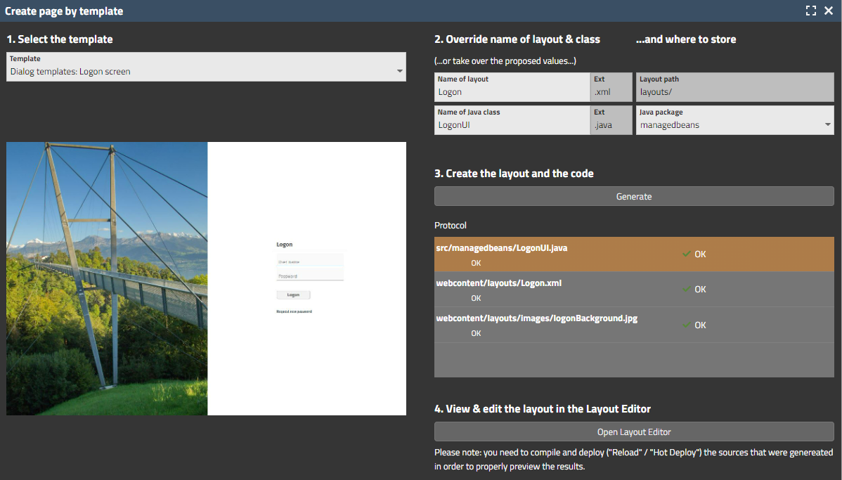
Currently there are 4 templates to start with.
Behind the scenes there is an open way to add templates by XML definition. The template content is read from the class loader – which means: templates can be added by adding corresponding “.jar” files, either to the editor or to the project.
First the simple issue:
The data types...
java.sql.Date
java.sql.Time
java.sql.Timestamp
...were added to the list of supported simple data types. This means: an e.g. CALENDARFIELD can directly bind to a corresponding Java-property – and will create corresponding value objects to set into the property.
Then the second issue:
The list of simple data types can be extended by implementing an interface:
public interface ISimpleDataTypeExtension
{
public boolean checkIfClassIsSimpleDataType(Class c);
public Object convertStringIntoSimpleDataTypeObject(String value, Class c);
public String convertSimpleDataTypeObjectIntoString(Object o);
}
The interface implementation needs to be added to system.xml:
<system>
....
<simpledatatypeextension classname="...className..."/>
...
</system>
Result: you now can add own classes to be treated as simple data type – i.e. data types which can be directly bound to control processing. We e.g. know that there are diverse own implementations in the are of Date and Time management – typically embedding or extending existing Java-Date-classes (java.util.Date / java.time.LocalDate).
And the third issue:
When a component (e.g. a FIELD) binds to a property with unknown data type (e.g. property of data type “Object”, or: Map-implementation that is used for binding), then there are certain ways to let CaptainCasa know how to convert a user input into an adequate simple value type object. A new way is to directly use the attribute DATATYPEINFO which is available for input components (FIELD, CALENDARFIELD, CHECKBOX, RADIOUBUTTON, ...). Here you can define the class of the simple data type object that CaptainCasa will create.
There is a demo showing the resolution of data types – please check in the “News” section of the demo workplace.
In case a tough Error happens within the server side processing, an error screen was shown – showing the stack trace of the error. From security perspective there is some risk – because of showing inner details of the server-side implementation.
There is a new filter “ErrorAnonymizerFilter” which now catches these errors and only presents an anonymous stack trace:
As usual: if you want to switch off this new filter you can do so in system.xml:
...
<filterconfiguration
active="false"
classname="org.eclnt.jsfserver.util.ErrorAnonymizerFilter"/>
...
The styling of the FIXGRID-scroll-bar can be updated using style class “riscscrollbarbase”. Up to now the insets were still hard-coded – and now have moved into the style definition.
We now found the reason for ESAPI removing log handlers when being started... - and wrote some own ESAPI log factory to overcome the problem. Corrsponding changed were made in the ESAPI.property files that come with CaptainCasa.
If a SLIDER value was updated “from outside” (i.e. not by the SLIDE itself, but by some component/ activity around) then it could happen that the slide did not property select the value that it was showing before the update.
In some scenarios – especially when exporting lists with > 1.000 items some exported cells were not filled with data. The problem behind was multi-threaded access to internal data of the grid. This multi-threaded access was (to our astonishment...) caused by ourselves: the download component sent a notification to the server that the download was started and this notification arrived on server side while – for grids with many items – the creation of the export was still going on.
Now the export is synchronized with the action processing – internally using exactly the interface we added with update 20221031.
This bug is weird: if clicking into the preview of the Layout Editor then the editor ran into some infinite loop. The bug was the reason for providing a new version just after 20221128.
The bug is “tool only” - it does not affect the runtime of your application. Nevertheless we recommend to not use 20221128. Sorry for the inconvenience.
After having delivered ESAPI version 2.5 since some weeks we now also updated the default esapi/ESAPI.properties file. In theory this file is not required at all because we pre-configure ESAPI explicitly with some own property file – but in some application server scenarios it was still selected (GlassFish).
We slightly change the gradle.build for new projects. We now extract the “.war” file that is built by gradle into a directory “build/unpacked” and then use this unpacked files for reloading/hot deploying the editor. Before we accessed the zip-file and had to extract it as part of our reload/hot deploy process.
The changes are only applied to new gradle projects. Existing projects are treated the same way as before.
When building up dynamic content (ROWDYNAMICCONTENT component) you can explicitly pass ids into the generated components so that they are kept stable on client side during re-rendering the content. As result: there is no flickering of the components (cause by removing and rebuilding them) and rendering is significantly faster.
Up to now stable ids were not drilled down into page beans that were part of the generated content. Now they are, so that the stable ids are also kept for each individual page bean.
The ESAPI library update of 20221017 was still causing some problems in specific environments:
on GlassFish severs the configuration was not properly loaded
the loggers for connecting the CaptainCasa logging to slf4j-logging got lost due to the initialization of ESAPI – so we need to re-initialize them...
The FIXGRID processing provides functions to export the FIXGRID content into various formats – e.g. PDF, XLSX, CSV. Data within the FIXGRID now potentially could affect the systems that process the exported data – e.g. you might add some script into cell values that may be executed when importing a CSV file into Excel.
To avoid this we now have added interface “IFIXGRIDExportSanitizer”:
public interface IFIXGRIDExportSanitizer
{
public void sanitizeStringDataBeforeExport(ENUMExportType exportType, List<List<String>> data);
public void sanitizeValueDataBeforeExport(ENUMExportType exportType, List<List<FormattedValue>> data);
}
The interface implementation is registered in system.xml:
...
<fixgrid
...
exportsanitizer="...className of implementation..."
...
/>
...
You now can use the “writevertical” command for writing text in vertical direction. The usage is the same as the normal “write” command.
If the minimum width of the popup was 1 pixel smaller than the width of the COMBOBOX-field then the popup was sized by 1 pixel too small – resulting in ugly scroll bars.
When double-clicking a component with having the ctrl- and alt-key pressed then a dialoge will show technical information for the selected component:
In the list the component is shown with all its parent components, including the information:
the page it is defined in
the component id within the page
the style class of the component
The dialog is especially useful for a quick information about which dialogs are assembled in which way within the concrete scenario. Btw.: if there is no page is shown then the component is created by some dynamic content (e.g. ROWDYNAMICCONTENT component).
We published the base class that we internally use for all situations when we parse an XML layout definition. The corresponding class is:
org.eclnt.jsfserver.util.pageparsing.PageParser
The following dependency is obsolete for the RISC client, but still was part of the pom.xml and build.gradle files:
<dependency>
<groupId>javax.servlet.jsp.jstl</groupId>
<artifactId>jstl-api</artifactId>
<version>1.2</version>
<scope>provided</scope>
</dependency>
Because this artifact is liste as vulnerable artifacts we recommend to also remove it within your projects' pom.xml/build.gradle definitions.
There was a problem when saving literals within the translation tool: when literal ids contained a “.” and the default language was not input then saving threw an exception.
The creation of “real controls” out of Page Bean Components is now simplified significantly:
All required files are generated automatically when selecting the “Page Bean Component Control” template during the creation of a layout.
Annotations can be used to transfer the initialization parameters into corresponding attribute references.
And: a documentation on all this is available through www.CaptainCasa.org
For these ones how have not heard yet about “Page Bean Component Controls”: you now can easily create “real controls” (which are use-able in the editor like “t:field”...) out of Page Bean implementations. These real controls can be easily distributed by jar-file/Maven-dependency.
There was a bug in 20221109 – when explicitly setting an own “IWorkplageStarter” instance by calling “WorkpageStarterFactory.setWorkpageStarter()”, then this was ignored – and the default “IWorkpageStarter” implementation was used.
Calling the method caused some infinite looping.
Up to now the Maven-artifacts were provided together with “.md5” checksum files. Now they are coming with additional “.sha1” files. Background: during normal Maven builds there were warnings showing up, when “.sha1” files were missing when downloading the artifacts from the repository.
When using an expression “.{x}” within a REPEAT constellation then the expression was not correctly resolved – because there was a problem when resolving expressions containing one character only. “.{xx}” was correctly resolved, “.{x}” not...
With TABBEDLINETAB components you can define a width for the “tab”-control instance. When defining a percentage width then the tab-control actually was sized with its minimum width.
When using the SIMPLEHTMLEDITOR component together with the editor “CKEditor” then the initial passing of HTML text content sometimes was not properly executed – the editor showed no content internally. The problem did not exist with the alternatively used Quill-Editor.
By setting the new attribute COMBOBOX-OPENONFOCUS to “true”, the list of valid values will immediately show up when moving the focus into the component.
If you start own threads from the normal UI processing and if you access e.g. FIXGRIDListBinding object directly from the other thread then you have to pay attention that the access to the object is synchronized.
For this purpose you now can access the object that is used for synchronization within the CaptainCasa processing by API:
public void onExportAction(javax.faces.event.ActionEvent event)
{
// start thread and inject it with current context info
ISessionAbstraction dialogSession = HttpSessionAccess.getCurrentDialogSession();
Object synchObject = ThreadingSynchronization.instance().getSynchObject(dialogSession);
MyThread t = new MyThread(synchObject);
ThreadData.injectExtThread(t);
t.start();
...
}
This object is later on in the Thread-processing:
public class MyThread extends Thread
{
Object i_synchObject;
public MyThread(Object synchObject)
{
i_synchObject = synchObject;
}
@Override
public void run()
{
synchronized (i_synchObject)
{
...
}
}
}
You should (and must) use this synchronization only if there is good reason! If your decoupled thread does not access data that is same time accessed by normal UI processing then you do not have to synchronize at all!
There is an example on this topic within the demo workplace: please check “Demo > Asynchronous Processing > Thread synchronization”.
We updated libraries:
commons-fileupload to version 1.3.3
commons-io.jar to version 2.2
Both libraries are only used in the context of control HTFILEUPLOAD which is a very old control that is part of the native-HTML-conrtrols, that once upon a time were part of CaptainCasa to support HTML – when not having the RISC-client in place...).
We did upgrade because of vulnerability issues being reported on the version that were used up to now.
Due to internally preparing CaptainCasa for being able to process Java records there is a bug that prevents CaptainCasa 20221024 to work with Java versions >= Java 16. This is the reason why we publish a second version within this week.
This is an interesting control because it combines the flexibility of the GRIDLAYOUTPANE with a very nice adaptive behavior...!
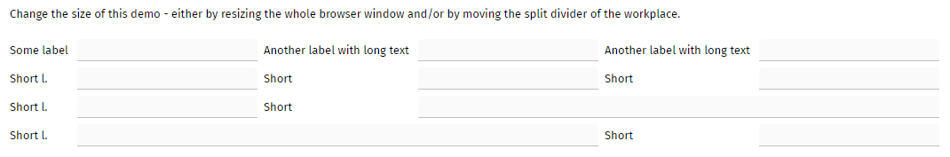
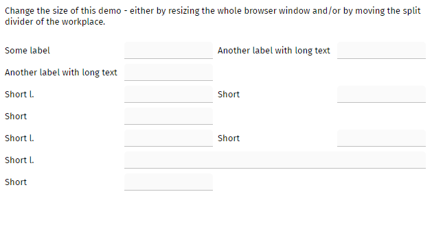
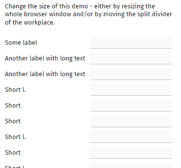
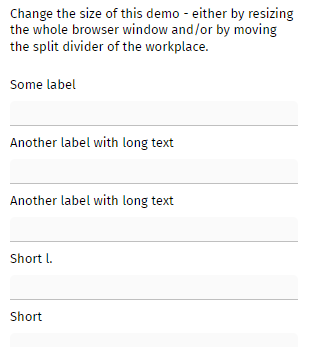
Take a look into the demo within the “News” section.
For each “tab” you can define WITHCLOSEIMAGE to be true. The close icon was rendered without any image – so you could click but did not see it...
The attribute TEXTTRANSFORM which is available with nearly all controls that output text now has a third value: in addition to “uppercase” and “lowercase”, you now can now define “capitalize”. “capitalize” transfers the text “this is a feature” into “This Is A Feature”.
The simple HTML editor is implemented by using an integration of either the quill- or the CKEditor-framework. The integration is done through some IFRAME. This means that the editor was so far not embed-able into the normal tab-processing.
You now can set SIMPLEHTMLEDITOR-FOCUSABLE to “true”. Result if tabbing into the editor then the tab will be passed into the corresponding iframe-processing.
Please note: this is only implemented for “tabbing in”. “Tabbing out” is not implemented – because the editor anyway interprets the “tab” internally and adds the “tab” to the text that is just edited.
There is a new filter “HttpHeaderAttributesForPagesFilter” which sets the following http header attributes for the response of “.risc” and “.html” pages:
"x-xss-protection" to "1; mode=block"
"x-content-type-options" to “nosniff”
"content-security-policy" to "default-src 'self' data: 'unsafe-inline' 'unsafe-eval'; img-src * data:"
If your application's client processing is including and using resources that are not part of its own webcontent, then we recommend to test the usage of these resources!
The corresponding header attributes were recommended to be set during security audits that we currently process. There is a couple of documentation available in the Internet, so we ask you to check for this in case of deeper interest.
The “content-security-policy” is a quite generic attribute by which you can pass what the browser is allowed to do and from where the browser is allowed to pick resources for its processing. The bid default there is the “self”-definition – meaning that in general resources are picked from the origin of the application. We made some exception for images (e.g. if using Open Streem Map with the OSM-component then images are also picked from other locations).
The values of the three parameters can be configured in system.xml:
<system>
...
<!--
**************************************************************************
Information that is used for filter HttpHeaderAttributesForPagesFilter.
Each attribute that is used in this filter can be overridden here.
Define "" if you do not want to set the attribute within the filter.
**************************************************************************
→
<httpheaderattributesforpages
x-xss-protection="1; mode=block"
x-content-type-options="nosniff"
content-security-policy="default-src 'self' data: 'unsafe-inline' 'unsafe-eval'; image-src * data:"
referrer-policy="no-referrer"
/>
...
</system>
And as with any other filter or servlet you can completely take out the filter out of the server processing, by using system.xml:
<system>
...
<filterconfiguration
active="false"
classname="org.eclnt.jsfserver.util.HttpHeaderAttributesForPagesFilter”/>
...
</system>
A couple of new attributes with PAINTAREALINEITEM:
MOVINGENABLED => a box will be drawn at the start of the line by which the user can move the whole line
RESIZINGENABLED => a box will be drawn at the end of the line by which the user can change the end point
FILLCOLOR => the line will be drawn as filled polygone
Most components edit one value – e.g. a FIELD edits its TEXT attribute. Some components edit multiple values, e.g. in case of a PAINTAREAITEM both the BOUNDS attribute and the SELECTED attributes are edited – and flushed.
There is a new property “BaseActionEventFlush.getFlushAttributeInfo(), that you now can check for the name of the attribute that was changed. Please pay attention: null is returned for the default attribute of the update!
The pom.xml behind artifact org.eclnt.eclntjsfserverRISC was updated and now includes the following reference:
<dependency>
<groupId>javax.servlet.jsp</groupId>
<artifactId>javax.servlet.jsp-api</artifactId>
<version>2.3.1</version>
<scope>provided</scope>
</dependency>
When using the page bean component in workplace scenarios and when setting parameters through the UI attributes (PAGEBEANINITDATA) then it could happen that filter values that the user did input were lost when switching between workplace pages. The grid content itself was not affected.
You now can directly define 2D-transformations by the new attribute TRANSFORM which is provided for “nearly all” controls.
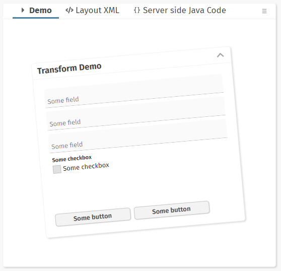
Please check the corresponding demos within the Demo Workplace (“News”).
We now updated the ESAPI library to version 2.5.0.0 internally. The proper configuration is selected automatically. The update was done because of security flaws that were registered for the ESAP 2.0 version that was so far used.
Field components may be configured to show a remove-text-icon. This icon was defined in two sizes internally – so that you by default saw a size which was a bit too big. When moving the mouse over the icon, then the correct size was shown. (There is only a 2 pixel size difference between the sizes, so only some of you registered this issue...)
Firefox changed its scroll bar style for scroll-able DIVs:
We internally changed our way to measure the size of the scroll bar (which is “0” for Firefox, because the scroll-bar is now layed over) and to adapt the content correspondingly.
We did update the moment.js that we internally use to version 2.29.4. We no also updated the moment.js that is used within the Chart.js extension.
When referencing expression “.{}” e.g. within a component placed inside a REPEAT- or a FIXGRID-component then the object that was resolved was “null” - and not the item object itself.
This is a continuation of the “ESAPI-issue”: due to a bug in the ESAPI library (https://github.com/ESAPI/esapi-java-legacy/discussions/745) the dynamic configuration of ESAP-directories for holding the ESAPI.properties file is not correctly working for ESAPI-releases >= 2.1. (As you might see in the discussion: the reaction of ESAPI-developers was very fast!)
We now found a way to dynamically configure ESAPI by directly passing properties into the ESAP configuration. So we now pass a different properties-configuration into ESAP <= 2.1 than we pass into ESAP >= 2.2.
Why all this? Because the configuration of ESAPI-properties changed from 2.1 to 2.2:
<= 2.1
ESAPI.Logger=org.owasp.esapi.reference.JavaLogFactory
>= 2.2
ESAPI.Logger=org.owasp.esapi.logging.java.JavaLogFactory
To make the long story short: by default you do not have to take care about ESAPI configuration anymore – and e.g. you do not have to place ESAPI.properties into the root of your application when using an own ESAPI version.
Double clicking labels inside a FIXGRID sometimes produced some strange text selection within the browser:
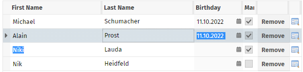
We now (again) take over double-click selection of labels on our own, so that double-click selects the whole text. For fields we trust the browser processing, so that the 1-, 2-, 3-click processing is not influenced by own logic.
When clicking the right mouse button for a long time (> 500ms) before releasing it, then the system popup menu will be opened – and not the CaptainCasa popup menu.
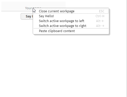
Compare the two screen shots: the left is the normal popup that opens up with a “normal” right mouse button click. The right is the system popup that opens up with a “long” right mouse button click.
CaptainCasa automatically adds a “Copy to clipboard” menu item to all popup menus by setting CLIENTCONFIG-POPUPMENUCOPYCLIPBOARD to “true”.
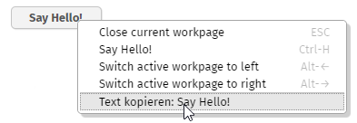
In addition to this you now can define the parameter CLIENTCONFIG-POPUPMENUPASTECLIPBOARD to “true”. This will add a corresponding menu item to popup menus that are opened on top of field components:
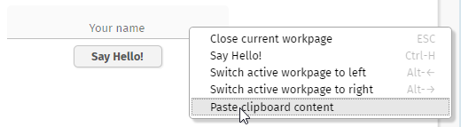
For security reasons there is only limited access to the clipboard content in the client-processing. This means that we do not at point of time when opening the popup menu if there is actually content contained in the clipboard or not. - And: the function is not supported by old browsers (IE10). In this case the menu item will not be appeneded.
By the way: you can also use the Java-API interface “Client” to set the client config parameters:
Client.setPopupmenucopyclipboard(...)
Client.setPopupmenupasteclipboard(...)
We updated to release 2.29.4 (most current one) because the existing one (2.24) is listed to contain security flaws.
We deliver the server using ESAPI 2.1.0.1. Up to now we made sure the server was working with ESAPI 2.2 and 2.3 as well. Now, with ESAPI 2.5 the server did not work anymore because of inner changes in ESAPI, so we had to adapt.
Please pay attention: when using ESAPI >=2.2 you need to pass the proper configuration file “ESAPI.properties”. In eclntjsfserver.jar we provide a configuration that you can take over into your own configuration – please check the file “/esapi/v22/ESAPI.properties”.
ESAPI is a library for encoding strings to be passed to a browser. The library is managed by the OWASP group and is one that is accepted by tools searching for security flaws in security audits (such as Veracode).
The checking for mandatory attributes did not consider components from libraries other than the “t:”-library.
Up to now any input of spaces (“ “) for a certain attribute was set to null within the Layout Editor. Now you can input blank spaces and they are kept. Example:
<t:field ... labeltext=” “ .../>
There is a configuration file “eclntjsfserver/config/sessiondefaults.xml” that you may use to define the default settings of a session. The template is:
<sessiondefaults
style="default202206risc"
language="en"
country="US"
clienttimezone="..."
clientlanguage="en"
clientcountry="US"
/>
In addition to this (optional) file there is now an interface:
public interface ISessionDefaultsProvider
{
public void initializeSessionInfo(SessionInfo si);
}
The interface is called every time a dialog session is initialized. The interface implementation is registered in “eclntjsfserver/config/system.xml”:
<system>
...
<sessionmanagement
...
sessiondefaultsprovider=”<className implementing ISessionDefaultsProvider>”
...
/>
...
</system>
Buttons internally may use the feature “continuous button clicking”: if the user keeps the mouse button pressed on the button, then the click-event is sent continuously until the user releases the mouse button. This feature is e.g. used in the scroll icons of the FIXGRID component. - We now updated this feature so that the continuous clicking is stopped when the user moves the mouse.
When closing the browser / browser tab then a session-close-message is sent to the server side. Up to now this message was sent via a URL that contained “;jsessionid=...” even in cookie-based scenarios. Now the URL is “clean”.
(Just to mention: the reaction of the session-close-message is, that the server side session is closed! ;-) So there is no security issue when catching this session id... )
The annotation “@doentity” in which POJO-classes define their mapping to the database was updated and now contains an explicit schema for the corresponding table. Now there are three ways of defining the schema:
Configuration-Parameter “db_schema” - here you may pass a schema which is in the following JDBC calls passed into the JDBC driver, so that the driver manages the schema
Configuration-Parameter “db_explicitschema” - here you pass a schema which is explicitly prepended in front of the table names when the corresponding SQL command is built
Annotation @doentity(..,schema=”...”,...) . here you pass an individual schema which is explicitly prepended in front of the table names
This is something really interesting...! You now have the possibility to build up own components, that are “real” components and that are directly based on PageBeanComponent implementations. What does “real” component mean:
The components are part of an own tag library with own tag library prefix
Selection and attributing in the editor are the same as with “normal” components (FIELD, CHECKBOX, FIXGRID, ...)
We started to deliver some of our own page bean components (add on package elcntpbc.jar) in this way. Instead of the following layout definition...
<t:row id="g_6">
<t:pagebeancomponent id="g_8" pagebeanbinding="#{d.DemoPBCCCDataGridView2PopupMenu.dataView}" pagebeanclass="org.eclnt.ccaddons.pbc.datagridview2.CCDataGridView2" pagebeaninitdata="withPopupMenu:true" shownullcontent="true">
<t:pagebeanconfig id="g_22" configparams="propertyName:firstName;title:First name" configtype="ConfigurationColumn">
</t:pagebeanconfig>
<t:pagebeanconfig id="g_11" configparams="propertyName:lastName;title:Last name" configtype="ConfigurationColumn">
</t:pagebeanconfig>
<t:pagebeanconfig id="g_23" configparams="propertyName:height;title:Height" configtype="ConfigurationColumn">
</t:pagebeanconfig>
<t:pagebeanconfig id="g_16" configparams="propertyName:birthDate;title:Birth data" configtype="ConfigurationColumn">
</t:pagebeanconfig>
<t:pagebeanconfig id="g_20" configparams="propertyName:married;title:Married" configtype="ConfigurationColumn">
</t:pagebeanconfig>
</t:pagebeancomponent>
</t:row>
...you now may use the componentized version:
<t:row id="g_6">
<tpbc:datagridview2 id="g_8" pagebeanbinding="#{d.DemoPBCCCDataGridView2Simple.dataView}" shownullcontent="true">
<tpbc:datagridview2column id="g_29" propertyName="firstName" title="First name">
</tpbc:datagridview2column>
<tpbc:datagridview2column id="g_30" propertyName="lastName" title="Last name">
</tpbc:datagridview2column>
<tpbc:datagridview2column id="g_32" propertyName="height" title="Height">
</tpbc:datagridview2column>
<tpbc:datagridview2column id="g_34" propertyName="married" title="Married">
</tpbc:datagridview2column>
<tpbc:datagridview2column id="g_36" propertyName="gender" title="Gender">
</tpbc:datagridview2column>
</tpbc:datagridview2>
</t:row>
You see that the PageBeanComponet “CCDataGridView2” is now available as component “tpbc:datagridview2” and its configuration item is available as component “tpbc:datagridview2column”. All the init parameters that the page bean component are directly available as proper attributes.
All this is done in a very simple way:
You have to create an own control library. The best way to do so is to use the CaptainCasa toolset:
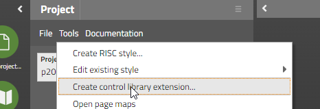
You have to define the prefix of your library (in our case “tpbc”, please do not use “t*” or “cc*”) and the package in which component implementations are stored.
In the component package you need to create two classes for your component:
The component class
The component tag class
The naming of the class is: “<Uppercase name of component>Component/ComponentTag”. Both of them are just “stupid” extensions of existing classes – in the tag class you need to reference the name of the PageBeanComponent class that you embed:
package org.eclnt.ccaddons.pbc.ccpbc;
import org.eclnt.jsfserver.elements.BaseComponentPageBeanWrapper;
public class DATAGRIDVIEW2Component extends BaseComponentPageBeanWrapper
{
}
...and...
package org.eclnt.ccaddons.pbc.ccpbc;
import org.eclnt.ccaddons.pbc.datagridview2.CCDataGridView2;
import org.eclnt.jsfserver.elements.BaseComponentTagPageBeanWrapper;
public class DATAGRIDVIEW2ComponentTag
extends BaseComponentTagPageBeanWrapper
{
@Override
protected String getPageBeanClassName() { return CCDataGridView2.class.getName(); }
}
Now you have to setup the component in the control library file “cccontrollibrary.xml” which was generated before:
<taglib prefix="tpbc"
clientprefix="tpbc"
packagename="org.eclnt.ccaddons.pbc.ccpbc">
...
<tag>
<name>datagridview2</name>
<attribute><name>id</name></attribute>
<attribute><name>rendered</name></attribute>
<attribute><name>pagebeanbinding</name></attribute>
<attribute><name>shownullcontent</name></attribute>
<!-- attributes -->
<attribute><name>sbvisibleamount</name></attribute>
<attribute><name>gridStyleVariant</name></attribute>
<attribute><name>labelStyleVariant</name></attribute>
<attribute><name>filterImage</name></attribute>
<attribute><name>withPopupMenu</name></attribute>
<attribute><name>persistId</name></attribute>
<attribute><name>selectorColumn</name></attribute>
</tag>
...
</taglib>
Threr are some mandatory attributes:
id, rendered, pagebeanbinding and shownullcontent
The other attributes are “your” attributes that are transferred later on into the “Map<String,String>” that is implemented in the PageBeanComponent's method:
@Override
public void initializePageBean(Map<String, String> initData)
{
...
}
Last but not least you register in the file “controlsarrangement.xml” that controls the hierarchy of components that you can set up in the Layout Editor:
<controlsarrangement>
...
<tag name="t:row" below="tpbc:datagridview2"/>
<tag name="tpbc:datagridview2" folder="Grids"/>
...
</controlsarrangement>
That's it. All the steps that you do are “normal” steps when extending the CaptainCasa component library. The only difference to the normal procedure is that you have to implement the two component classes by extending different base classes.
We will come up with some more extended documentation on this in near future...! Please contact us directly in case there are questions/ problems in the meantime.
After having internally separated the util functions from the “eclntjsfserver” functions, the Jakarat version was built without the util-functions being included...
For certain controls (e.g. LABEL) we override the normal double click text selection because the selection result is not really matching the user's expectations (e.g. text is selected in a grid that spans into the next line of the grid). For text fields this type of selection is not required and the default selection (double-click: selection of words, triple-click: selection of whole content) is much more appropriate.
The CaptainCasa toolset now provides a “Refactoring tool” which is dedicated to refactor the name of:
Page bean classes (.java)
Layout definitions (.jsp / .xml)
Resources (.png / .svg / ...)
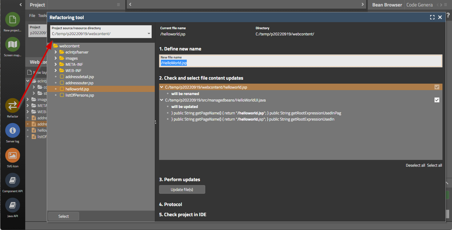
The tool is started from the icon bar on the left. You then select in the top combo box one of the resource directories of you project. When double-clicking a file then the corresponding usage-reference will be shown on the right. You see where the file is used and which occurrences are refactored. You can select by checkbox per item if you want to apply the refactoring.
After updating you receive a protocol of refactoring activities.
Please note: Java code which is refactored needs to be checked in your development environment (Eclipse, IntelliJ, ...) afterwards. We do not update e.g. package imports of referencing classes, this needs to be done through the IDE.
Up to now you the initial sorting of a grid had to be done in a quite complex way:
public class MyGridDemo
{
// ------------------------------------------------------------------
// inner classes
// ------------------------------------------------------------------
...
public class MyFIXGRIDListBinding extends FIXGRIDListBinding<GridItem>
{
public void initialize()
{
super.initialize();
// // this is how to sort by one column
// {
// sort("firstName",true);
// }
// this shows how to sort by multiple columns
{
getSortInfo().clear();
FIXGRIDSortInfo fsi;
fsi = getSortInfoForReference("lastName");
fsi.setSortSequence(0);
fsi.setSortStatus(SORT_ASCENDING);
fsi = getSortInfoForReference("firstName");
fsi.setSortSequence(1);
fsi.setSortStatus(SORT_ASCENDING);
resort();
}
}
}
...
MyFIXGRIDListBinding m_grid = new MyFIXGRIDListBinding();
You had to extend an own grid class and you had to override the method “initialize”, which is called during the rendering phase – when the gird gets accessed by the layout definition.
Now things have changed and are much simpler:
public class MyGridDemo
{
...
FIXGRIDListBinding<GridItem> m_grid = new FIXGRIDListBinding<GridItem>();
public MyGridDemo()
{
...
// // this is how to sort by one column
// {
// sort("firstName",true);
// }
// this shows how to sort by multiple columns
{
m_grid.getSortInfo().clear();
FIXGRIDSortInfo fsi;
fsi = m_grid.getSortInfoForReference("lastName");
fsi.setSortSequence(0);
fsi.setSortStatus(SORT_ASCENDING);
fsi = m_grid.getSortInfoForReference("firstName");
fsi.setSortSequence(1);
fsi.setSortStatus(SORT_ASCENDING);
m_grid.resort();
}
...
}
This means:
You do not have to sub-class anymore.
You can execute the sorting “immediately” and do not have to wait for the grid instance to be accessed by its component during the render-phase.
You can easily scenarios like “I want to initially sort the grid and then select the first item”.
When using the default sorting (DefaultFIXGRIDPersistence) then you can also initiate the initial sorting on your own – the only data that you have to pass is the PERSISTID of the corresponding grid:
privat void sortGridByPersistId()
{
Object fixgridPersistence = FIXGRIDPersistenceMgr.getFIXGRIDPersistence();
if (fixgridPersistence instanceof DefaultFIXGRIDPersistence)
{
DefaultFIXGRIDPersistence dfp = (DefaultFIXGRIDPersistence)fixgridPersistence;
GridInfo gridInfo = dfp.readGridInfoForGrid(this,"TEST");
dfp.applySortInfoFromGridInfo(m_grid,gridInfo);
}
else
{
throw new Error(“Only possible with default persistence.”);
}
}
There is a new switch in the project definition's XML:
<project
...
propertyFilesUTF8="true"
>
...
</project>
If setting “propertyFilesUTF8” to “true” then the tools within the CaptainCasa tool set, that write “.properties” files will not used the escaped version (“\uxxxx”) for “strange” characters but will use UTF-8 directly.
Pay attention: the direct support of Unicode was added at Java 9! So only use this feature if you are sure that Java 9 is used as runtime version everywhere in your environment!
There was a bug in the resource loading when using hot deployment. This bug was introduced with 20220912 and is solved with this update. Due to this bug we decided to roll out an updated version immediately.
Dependent on the FORMAT of FORMATTEDFIELD instances we now pass two different input types into the HTML elements: “numeric” for integer numbers (int, long, BigInteger) and “decimal” for decimals (float, double, BigDecimal). Two different touch keyboards may be shown on mobile devices – one e.g. without the other one with decimal separator.
20220912 contains a bug in the hot deployment management. Do not use this update – but use 20220913!
The server side execution of the maximize-method not always properly maximized the client side popup dialog. The popup sometimes did e.g. keep its x,y position. We now made sure that the server-side execution calls exactly the functions on client-side that are internally called, when using the “native” maximize-icon of the popup dialog.
The minimum size calculation of the ADAPTIVESPLITAREA was only considering the “main” content area. It now also considers the “left” area which is – dependent on the screen sizing – sometimes positioned at the side or on top of the main content area.
The localization for the countries “Ukraine” and “Russia” was adapter. The “thousands”/grouping-separator was changed from “.” to “ “ (blank space),
Commonly used attributes (FONT, BACKGROUND, FOREGROUND, BORDER) are now directly edit-able by a corresponding tool bar:

The toolbar can be switched off via the “Configuration...” menu in the Layout Editor.
The toolbar is available as Page Bean Component as well – the class name is “CCToolbarCombi”, which internally manages instances of “CCToolbarColor/ Border/ Font” components.
The components TABBEDPANETAB, TABBEDLINETAB, TABBEDLINECONTAINERTAB now provide an attribute CLOSEICON – with which you can directly set the close icon to be used.
CaptainCasa's core server library “eclntjsfserver.jar” (Maven artifact “org/eclnt/eclntjsfserverRISC”) contains quite a lot of utility functions that sometimes are used also in a context that does not include the CaptainCasa UI framework – e.g. the logic/DB- layer of your processing.
Typical util functions are:
ValueManager
FileManager
ClassloaderReader
etc.
We now separated these functions into an own “eclnutil.jar” (Maven artifact “org/eclnt/eclntutil”) that you can embed into your dependency list. For compatibility reasons the “eclntjsfserver.jar “ still contains the “eclnutil.jar” classes as well. Existing projects (e.g. not using Maven) as consequence do not have to update their internal class path definitions and do not have to include a new .jar-file.
There is a bug in the video-element processing within MS Edge: when moving the mouse over the component and then moving the mouse out of the component, then an “ACCESS_VIOLATION” error is shown – and the current page is reloaded... See: https://www.captaincasademo.com/forum/posts/list/3387.page
We found a workaround for this bug by arranging an invisible pane in front of the video-element which catches all mouse-over/out processing... The disadvantage: now you can of course not reach anymore the buttons within the video-element to start/pause the video. So, for MS Edge we arrange own buttons in front of the element to do this.
The error does NOT occur within the Chrome browser or other browsers.
The video-element is used within two CaptainCasa controls:
The VIDEO control for playing movies.
The CAMERA control for rendering camera streams from you locally attached web cams.
When defining an INVOKEEVENT with a component (e.g. PANE-INVOKEEVENT=”click”) then corresponding events are sent to the server side when the user clicks the component. When at same point of time, with the same component instance, you also defined to send drag-start events (PANE-DRAGSTARTEVENT=”true”) then this was not sent due to the component's internal invoke processing.
When selecting a range in a PAINTAREA then there is now an event sent to the server-side, which tells the exact range of the selection.
Please remember: in order to activate “range selection” you have to set PAINTAREA-RANGESELECTION to “true”. By default the range is selected by pressing the ctrl- or shift-key and selecting the range with the mouse pointer.
iOS browsers (Safari on iPod or iPhone devices) do not provide straight forward way to copy server side data into the client side clipboard. We not streamlined the client behavior of the CLIPBOARDSET component so that the copying to clipboard is much nicer than before.
Up to now the client's internal processing did wait 2 seconds for the fonts being loaded within the browser. This duration was extended to 4 seconds.
When creating the project directly (not using Maven/Gradle-project creation + with using /webcontentcc-directory) then the libraries in WEB-INF/lib of the project are maintained by CaptainCasa.
Here we updated
jsoup.jar to version 1.15.3
commons-beanutils.jar to version 1.9.3
When having introduced the attribute LABELTEXT for all form components (FIELD, LABEL, CHECKBOX, RADIOBUTTON, COMBOBOX/FIELD, …) we also added the sizing behavior that the LABELTEXT value is defining the size of the component if not explicitly set. This did not work for these components which internally use a field component but wrap some additional behavior around: COMBOFIELD, COMBOBOX, CALENDARFIELD, LONGTEXTFIELD, COLORFIELD. Now the sizing is also adapter for these components.
When not defining an explicit size for these components, then the width was set to 10 pixels – which means the component was not really use-able – so there are no compatibility issues to be expected.
CaptainCasa writes a performance log reporting about the processing of each request. The performance log is written to the servlet temp directory (Tomcat: tomcat/work/Catalina/localhost/<webappName>). We now added a couple of parameters that we record per request:
2022:08:30 06:38:57:728 | 35 | INFO | CLIENT : ClientId: BRANIMIR, Session: EA45C032E50846D2D2A48830E3295C2F, ResponseReceived: 06:38:54:131, RoundtripDuration: 26ms, ClientUpdate: 8 ms
2022:08:30 06:38:57:734 | 35 | INFO | REQUEST : ClientId: BRANIMIR, Session: EA45C032E50846D2D2A48830E3295C2F, Total: 6ms, Invoke: 0ms, Expression: #{d.d_1.workpageContainer.functionsManager.trees[3].ftree.onGridAction}, ClientStart: 06:38:57:726, ServerStart: 06:38:57:728
Please pay attention when looking into the log: the client information about a request processing is always transferred “with the next request”! So the sequence of reading of the log is: the client processing information is always arranged behind the server information!
We fine tuned style “default202206” (our default style from June 2022 on): buttons gained a little bit height (2 pixels). We introduced a certain sizing tolerance (control-able by RISC-style-values) so that typical button images of size 16x16 do not influence the button's height – buttons with 16x16 image have now the same height as buttons with just some text content.
The changes are only made to “default202206” - other styles are not affected for compatibility reasons.
The component node classes that we generated for each component (e.g. LABELNode, FIELDNode, …) and that are used for creation of dynamic page areas (ROWDYNAMICCONTENT, DYNAMICCONTENT) now provide a bind-method for the attribute ADAPTERBINDING as well. You now can directly bind the adapter binding (implementation of IComponentAdapterBinding) to the dynamically created component by calling the method “bindAdapterbinding(...)” of the corresponding Node-class. The instance of the adapter binding can be directly passed.
A lot of (“nearly all”) controls that provide a TEXT attribute now also provide a TEXTTRANSFORM attribute. The TEXTTRANSFORM can be set to “uppercase” or “lowercase”.
Reason: we saw that in some projects e.g. button texts were defines in uppercase characters directly (i.e. through the TEXT attribute) – sometimes even in corresponding resource files in which multi language translations are contained. The problem: if you want to switch to “normal” display of text due to changing your design, there is no way back: text are defined in uppercase already, so you have to edit all your literals and convert them to non-uppercase.
...so: whenever you define a text in uppercase (or lowercase) and you do it for styling reasons, then we strongly recommend to define the text as normal text and to switch TEXTTRANSFORM to “uppercase” (or “lowercase”).
If sub-classing style class “riscshiftcontainerwithnavigation” then the contained RISC-values (e.g. “_pointsize” and “_pointdistance”) were sometimes not correctly taken over into the actual rendering of the component.
When defining a CALENDARFIELD then the default format is “date”. When the counter part of the CALENDARFIELD-VALUE is a java.util.Date or a long-value then you can enforce the value to be passed not as e.g. “01.01.2022. 00:00:00:000” but as a dedicated point of time e.g. “01.01.2022 12:00:00:000” or “01.01.2022 23:59:59:999” by defining a corresponding value in the attribute EXACTDATEHHMMSSMMM.
This attribute was only used for format “date” up to now.
We now embedded this function when using the format “datetime”: when the user e.g. keys in a value “01.01.2022” and tabs out of the field then the time that is automatically defined is following the EXACTDATEHHMMSSMMM definition – so it may e.g. be extended to “01.01.2022 23:59:59” automatically. Of course: once the user keys in a concrete time then the user input is the one that matters.
The CAMERA component shows the current picture of a camera and allows to take photos from the camera. In case there are multiple camera devices available (e.g. in a phone there is a front- and a back-camera) you can now sort the cameras so that the one that is shown first reflects your requirements.
By setting attribute CAMERA-DEVICESORTING to “user” the front-cameras are shown first, by setting the attribute to “environment” the back-cameras are shown first.
Of course all camera devices are still reach-able – it's just the matter of what is shown first.
There are a couple of new annotation parameters to fine-tune the data access within the DOFW-framework:
On entity level (“@doentity”) there is the annotion parameter “tenantIsNumeric”: if set to “true” then the tenant column that is implicitly filled is passed to the database as numeric value – and not as String as by default.
On property level (“@doproperty”) there are two new mapping rules: with setting parameter “date2longYYYYMMDD” you can define that a “java.util.Date” value is mapped to a numeric value which is built in the way “YYYYMMDD”. Please do not get confused: there is an already existing parameter “datetolong” which stores a “java.util.Date” value as long value, but which stores the “milliseconds from 1970 on”-representation.
...and there is a corresponding “localDate2longYYYYMMDD” parameter to do the same with “java.time.LocalDate”-values.
All the literals that are used within the client itself (e.g. the literals of the file-selection dialog) are loaded from the server side at runtime. For building up the literals there is a certain modeul (“ClientI18NReader”) - and this module allows to override the default internationalization values and e.g. add own ones. The module calls two interfaces “IClientI18NLiteralsUpdate” and “IClientI18NCountriesUpdate”, which you can define in system.xml.
...now: up to now these interface were called at a quite early point of time in the startup process of the application. Now they are called after having called the “IStartUp” interface that allows to initialize your application. - Why? There was the case that certain applications initializations which were executed during “IStartUp”-processing were required to properly process “IClientI18NLiteralsUpdate” and “IClientI18NCountriesUpdate”.
To be honest: these interfaces are seldomly implemented - so for nearly all users this message is not relevant...
In a component definition within a grid column you can either define expressions directly within component attribute values (“<t:field … text=”.{someText}”.../>”) or you can “soft-code” the attributes by using “Component Adapter Binding” (“<t:field … adapterbinding=”.{someAdapter}”.../>”).
The sorting and exporting by default was only possible, when using the directy assignment of expressions to attribute values. Now it is also available when using the adapter binding.
If one of the value items of the combo boxes exceeded the width of the combo box popup then there was not only a horizontal scroll bar shown, but also a vertical one. The user had to explicitly scroll in order to get to the last item of the popup.
This bug was “introduced” with update 20220620.
There is a possibility to add extensions into the CaptainCasa toolset by adding directories into the editor's webapp folder “editor/tools”. Inside the directory that you may add there is a configuration file “tool.xml” (e.g. “editor/tools/mynewtool/tool.xml”).
The additional directories were not recognized anymore and tool extensions were not started as consequence.
The grid''s main style (attribute STYLESEQ) is defining the style of the scroll container that is built around the actual grid processing. The default style is “riscscrollcontainer”.
We now made the vertical scroll bar “on the right” part of the style definition of this scroll container. This means, that you can define individual scroll bar styles as part of the scroll container definition.
Example: despite working in a “light” style you may have some dark areas in which the scroll bar should be dark as well. In this case there is a standard style definition...
<class n="riscscrollcontainer_dark" extends="riscscrollcontainer">
<var n="@scrollbarBackground@" v="#606060"/>
<var n="@scrollbarMoverBackground@" v="#808080"/>
<var n="@flatImageColor@" v="_C0C0C0"/>
</class>
...in which the variables that are used inside the scroll bar definition are overridden.
By setting the style in FIXGRID-STYLESEQ...
<t:row id="g_14">
<t:fixgrid id="g_15" height="100%" objectbinding="#{d.DemoGridStyle.grid}"
styleseq="riscscrollcontainer_dark" width="100%">
<t:gridcol id="g_16" text="First name" width="100%">
<t:label id="g_17" text=".{firstName}" />
</t:gridcol>
<t:gridcol id="g_18" text="First name" width="100%">
<t:label id="g_19" text=".{lastName}" />
</t:gridcol>
</t:fixgrid>
</t:row>
...the scroll bar now looks like:
Of course you can set up own style classes in your style definition in addition to “riscscrollcontainer” and “riscscrollcontainer_dark”.
Up to now it was only allowed to use straight relative expressions “.{xxx.yyy}” inside FIXGRID and REPEAT definitions. Now you can use “complex” relative expressions – but with clear limits!
The limits are the same as with normal expressions (“#{d.xxx.yyy}”) and are defined in the demo workplace's page “General > General Issues > Complex Expressions”. Short summary of what is possible:
“.{xxx}, .{yyy}” - concatenation of strings (here with comma in between), either one ore several expressions
“.{zzz == 0}” or “.{zzz != 0}” - comparisons using “==” and “!=” against some constant string expression. Comparisons like “>”, “<”, … are NOT supported
The popup dialog for selecting files was “nice” but “quite big”, so that in mobile scenarios using small phone displays it was cut on the right. Now it adapts to the devices width if no sufficient space is available.
Since 20220711 invalid expressions caused a stack trace – while they were ignored (with log output) before. Please note: invalid expressions are NOT expressions, that do not match a server-side object – but invalid expressions are expressions containing invalid characters, e.g. “(“ and “)”.
The function “saveTempFileCrossSession(...)” produces a URL which is explicitly use-able for cross-session access. Changes that were introduced with update 20220411 (general security manager) exactly try to avoid this – and there was no exception made for these use-cases. Now the URLs created by “saveTempFileCrossSession(...)” are correctly handled.
Since 20220711 the corresponding functions did not correctly work anymore. The data way shown in uppercase/lowercase but the value behind was not updated, but still was mixed case.
All actions that belong to a grid (e.g. line selection, line execute, scrolling, …) are processed by a central method “FIXGRIDBinding.onGridAction(ActionEvent)”. Within this method so far all errors and runtime exceptions were caught – and logged as information messages into the CaptainCasa log.
Now you can configure if you really want that all errors are caught by a corresponding definition in system.xml:
<system>
...
<fixgrid
...
catchgridactionerrors="always"/”never”
...
/>
...
</system>
“always” is the default (which we did not change for compatibility reasons) – so all errors are caught
“never” means, that errors are processed using the normal error management: the current expression of the actionListener is “walked up” to check if one of the objects is implementing interface “IErrorAware”. If there is an implementation then the error is delegated to this object – if there is no implementation then the error is returned to the top processing level – i.e. the application will respond a corresponding server error to the client side.
In the control you can place components into surrounding HTML text. The control up to now did not resized if one of the components changed its size. Now it does.
The “Shift” key of the virtual keyboard now provides a “triple click” function:
The first click switches to “Shift” mode: i.e. the next character that is pressed is changed to uppercase – and the next characters are lowercase.
If clicking the “Shift” key two times, then the seconds click starts the “Caps” mode – this means, that now all characters are input as uppercase characters until the “Caps” mode is ended (by again pressing the “Shift” key).
(This behavior is default on e.g. Android and iOS virtual keyboards.)
When placing a FIELD component into a TREENODE and when using the left/right cursor keys then it could happened that these keys were also transferred into the TREENODE processing – where Cursor-left moves up to the parent node and Cursor-right unfolds the current node.
Now only key strokes are registered if they really are original key strokes of the TREENODE – not of contained components.
You now can explicitly pass the HTML “type” for the INPUT-element that is created within the DOM tree when creating a FIELD. Use attribute FIELD-HTMLFIELDTYPE and pass one of the values that is documented behind the field (e.g. “email”, “color”, …).
This attribute is designed to be used for mobile scenarios, so that the touch keyboard receives some hint, which variant to show up. (E.g. in case of “email” the keyboard contains a “@”-character.)
Up to now you had to place an explicit SESSIONCLOSER element in the outest page of your application. This controls automatically made the client sending a last event to the server-side when it was closed by the user (or: when the user navigated to a new URL).
We now by default and implicitly add a SESSIONCLOSER into the outest page. So you do not have to pay attention.
If you do not want the SESSIONCLOSE to be added by default you can switch this behavior off in system.xml:
<system>
...
<sessionmanagement
...
autoclose="false"
...
/>
...
</system>
We optimized some server areas (components and expressions) in order to descrease the memory that is kept by session.
The default dialog for exporting grid data now contains the new export variant “HTML export”.
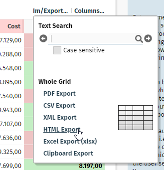
The HTML export creates a plain HTML table out of the contained grid data.
The export is done internally by calling an implementation of interface “IFIXGRIDHtmlExporter”. The default implementation is done by class “FIXGRIDHtmlExporter”. The class is built in a way that allows to override its internal processing in a simple way.
Tree nodes are now exported together with there status (opened/ closed/ end node) and with their indent (by prepending a corresponding number of non-breakable spaces).
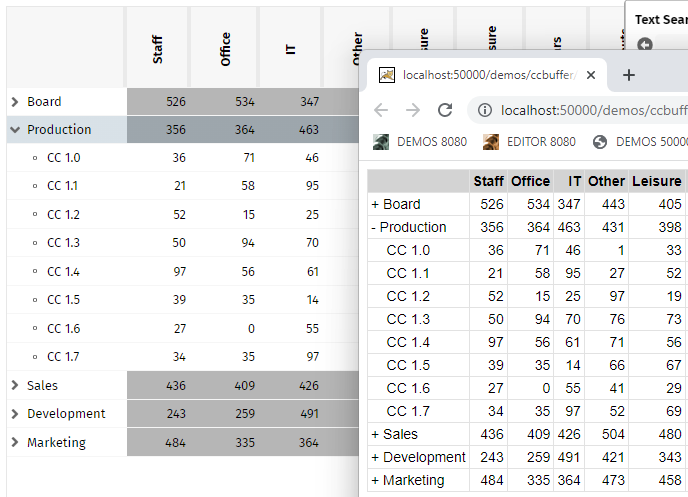
When using the feature to hide/show columns (FIXGRIDBinding.setColumnsequence(...)) then columns that show up did not take over the selection coloring – but were rendered as “normal” columns – without selection.
When using iOS browsers (all are internally using the Safari rendering kit...) then CaptainCasa uses an own scrolling within scroll-able areas. ...stupid reason: in cases of nested scroll-able areas we experienced Safari crashing and re-starting the contained HTML content.
We now provide a URL parameter “cciostouchscrolling=false” which you can append to the “.risc”-URL so that the special scrolling is switched off and the default scrolling is applied. For pages that are not complex this scrolling can be applied.
The bug of update 20220627 is solved. Please update to this version if having installied 20220627!
We now deliver the module https://github.com/kensnyder/quill-image-resize-module as part of our quill sub-directory - which means: you now can resize embedded images:
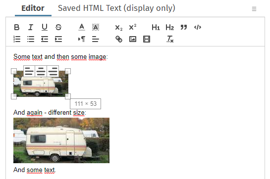
Please note: images are by default removed from HTML text that is passed into the editor due to HTML-sanitizing-functions!
More information: https://www.captaincasademo.com/forum/posts/list/3359.page
Up to now you could only assign style classes (attribute FIXGRID-STYLESEQ) to the outmost component level of the grid. Now you can pass explicit style classes for the grid-content are (STYLESEQGRID, default is “riscflexgrid”) and for the content rows (STYLESEQROW, default is “riscflexgridrow”).
You may use this if you want to achieve e.g. rollover rendering or e.g. selectiong rendering for different types of grids.
You can define some individual shake-animation and pass the iterations and the movement of the animation. Please check the demo:
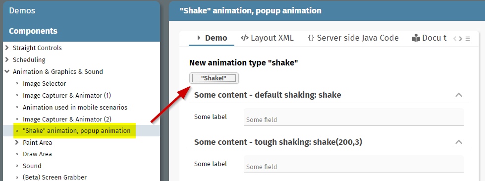
...the files werer not passed anymore. Please do not use this update for production usage!
The MULTILABEL component was improved in the following ways:
The background of the whole component now is rendered as “real background” - before it was painted in front of the text components and it was only possible to use background colors containing transparency definitions
Rollover and selection effects in the grid are now working the same way as with normal controls.
Direct text selections (with pressing ctrl-alt while moving the mouse) are possible
Font settings “weight:”, “posture:”, “size:”, “family:” are supported
The dark style was adapted to the style settings of “default202206risc”-style. The name of the dark style is now “default202206darkrisc”.
When using asynchronous file upload components then the most efficient way of managing the uploaded content is to directly access the upload stream. The stream that is sent from the client is a string in the format “FILENAME0=...name...?CONTENT0=...hexEncodedContent...?FILENAME1=...name...?CONTENT1=...hexEncodedContent...?...”
The parsing of this character stream is not totally simple.
We now added a parser for this type of stream which hides the complexity, so that the upload management of streams can be managed in the following way:
public class MyUploadStreamContentComfortable extends DefaultUploadStreamContentBySeparateOutputStreams
{
@Override
public void beginPassing()
{
}
@Override
public OutputStream passingFileStarted(String fileName)
{
...return here your byte-stream, e.g. FileOutpuStream...
}
@Override
public void passingFileFinished(String fileName)
{
...
}
@Override
public void endPassing() { }
}
For each file that is part of the upload the method “passingFileStarted” is called. You need to pass back an output stream into which the uploaded file content is written.
The style “default202206risc” was fine-tuned so that popup dialogs are shown with some rounded edges. Examples:
Combo box
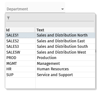
Combo field
Calendar field
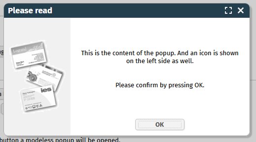
There is a different rounding definition for “light weight dialogs” (un-decorated dialogs) and for “popup dialogs” (decorated dialogs).
Due to this change we had to clean up the management of the border-settings of a popup dialog. Up to now, dialogs were opened without own border so that the border was expected from the content. - Now the border is defined by the dialog itself.
After applying update 20220620 you may see “double border definitions” (one border from the popup, one border for the content) in the case of un-decorated popup dialogs. We ask you to check these dialogs within your application and to – if required – remove the border from the content of the dialog.
These ones of you who have defined own dialogs styles: please check the styling of your dialogs. The style definition of popup dialogs is now exactly the same than the one that you are used for normal components – you now may use “inset” and “border” definitions correspondingly. (Before: only “inset” was used – assuming that there was no border by the popup itself...).
We added corresponding details to the technical documentation “Styling Issues”. Please check page https://www.captaincasa.com/docu/techdoc_styling/all.html#stylingofpopupdialogs.
What is the background of this change?
When defining a rounding of edges then the rounding definition must be done exactly on this level on which the border is defined. If the rounding is defined within popup dialog style and the border comes from the content of the dialog, then the result looks like:
The red border coming from the content is “overruled” by the border coming from the popup dialog. The edges are not visible as consequence anymore.
It's a quite reasonable strategy in general to expect some content to be “border-neutral” - because the content itself (e.g. a page bean instance) does not know, if it included within a certain area of the screen or if it is opened within a popup dialog.
If there are any questions related to the popup dialog border, especially if you have updated the corresponding style settings: please directly contact us – best by using the forum! ;-)
You now can also use “..” within the directory definition for the webcontent-deploy-directory. Before this was not allowed due to a general restriction within the internal file management to not write files into file names containing directory navigation (“..”).
Within a TABBEDLINECONTAINER you define tabs together with their content:
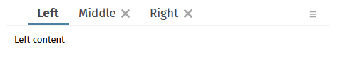
Tab-items may be defined to be close-able – as result a corresponding close-icon will be drawn and a corresponding event will be thrown to the server-side. Up to now, when the user closes a tab then always the actionListener of the tab was called which is currently opened – and not the one of the tab which was selected to be closed.
We added some fine-tuning to the style updates that were part of 20220608. Gray-colors have been harmonized. And the vertical text arrangement of fields, checboxes, radio buttons was checked so that all text is exactly positioned at the same vertical position.

The Maven artifacts of CaptainCasa now were switched to “opendpdf” library, too – and are not pointing to the “lowage”-iText library anymore.
When entering a date then the CALENDARFIELD of FORMATTEDFIELD components directly show if the input is correct or not. This did not happen when entering e.g. 5 or 6 digit year numbers. Now it is not possible anymore to define a year with more than 4 digits.
When using “.xml” layouts (and not “.jsp” layouts) then the editor's checking of the XML layout did not properly work but always showed the message “parsing error”. Now it correctly works:
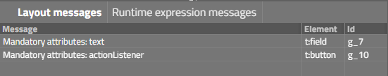
When using a LABEL to display a boolean value (FORMAT=”boolean”) then the false-value was rendered as “empty string”. Now it is rendered as false-value (same as in RISC client).

We updated the default style to “default202206risc”. This is the style that is now proposed when creating new projects. - The main differences to the previous style are, that design elements of the “material design” were taken over. Examples:
Fields now have a light background color:
Buttons now have a mini shadow:
The toggle component now uses a different default icon:
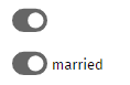
Grids are in general offering more space for each row – there are light lines between the rows:
Please take a look into the demo workplace that now comes with the updated design – your feedback is appreciated.
Are there any changes to existing styles. In principal not... - but: when applying or updating new style features we in general introduce new style variables so that the core style logic always is part of the “defaultrisc”-style (which is the base of any style). For these ones having defined own styles: please contact us if you find differences in your style after the installation of the new update. Thanks!
We now by default use the “openpdf” library for PDF processing – instead of the “old” iText-library.
If you want to update your Maven dependencies, then use the following:
<dependency>
<groupId>com.github.librepdf</groupId>
<artifactId>openpdf</artifactId>
<version>1.3.27</version>
</dependency>
The ARRAYGRID can be used with option ARRAYGRID-USEMULTILABEL – in this case the rendering speed is significantly improved. Up to now only text information was output – now also images are drawn. Please note: images are always drawn with a default size of 16x16.
The client now sends a new http-header attribute containing a list of media devices. You may access by using the new API of HttpSessionAccess:
List<ClientDeviceInfo> getClientDeviceInfos(HttpServletRequest postRequest)
public class ClientDeviceInfo
{
String m_deviceId;
String m_label;
String m_kind;
public ClientDeviceInfo(String deviceId, String label, String kind)
{
super();
m_deviceId = deviceId;
m_label = label;
m_kind = kind;
}
public String getDeviceId() { return m_deviceId; }
public String getLabel() { return m_label; }
public String getKind() { return m_kind; }
}
The list itself is sent as JSON string – the parsing is done inside HttpSessionAccess.
You now have the possibility to apply general updates on component attributes when they are internally created on server side.
A typical use case is:
You want to internally set the CLIENTNAME attribute (this is the one that is the stable reference of a component in order to connect to testing frameworks) out of existing attributes – example: if a FIELD has a reference to TEXT “#{d.XyzUI.firstName}” then the CLIENTNAME-value should be set to “firstName” (or “XyzUI.firstName” or …).
...same with other attributes like HELPID, TOOLTIP, ...
For this reason you now can define a default Java macro. Default Java macros are processed without being explicitly assigned. Each macro is the implementation of a Java interface “IMacro” - as part of the interface you read and write all component attributes. Macros are processed both for static layout definitions (.jsp/.xml files) and for dynamically created pages using the (ROW)DYNAMICCONTENTBINDING component.
Please read more details in chapter “Working with Macros” of the Developer's Guide.
When setting FIXGRID-FOCUSABLE to “false” then it could have happened that the focus was moved into some grid cell after using the grid vertical scrollbar's scroll icons. If the cell which received the focus was in an horizontal area “on the very right side” then the applying of the focus automatically scrolled the grid horizontally “to the right”.
Up to now the CaptainCasa toolset automatically derived the place to store its configuration data (including the project-definitions files):
The toolset checks if it is running in “original installation” mode (i.e. own tomcat server which runs in parallel to the application tomcat server) – then the location of the own config-directory is ../tomcattools/webapps/editor/config
If not runnining in this mode then the toolset stored its data in the temp directory of the current user
Now you can explicitly pass the config directory when calling the editor-application in its Spring Boot version:
java -jar eclnteditor_springboot.war configDir=<directory>
e.g.
configDir=toolsetConfig => local directory
configDir=c:/toolset/config ==> absolutely referenced directory
Up to now the reload in the editor was executed against the manager application of Tomcat – without any authentication. This means: inside the manager-application you had to switch off security constraints within the web.xml file. (If using the default installation then this was automatically done for you.)
Now the toolset is reloaded using basic authentication: default user and password are “cctoolset” and “cctoolset”. You can set up own definition in the tool configuration. You do not have to removes security issues from manager/WEB-INF/web.xml anymore – but yo <role rolename="manager-gui"/>
<role rolename="manager-script"/>
<user username="cctoolset" password="cctoolset" roles="manager-gui,manager-script"/>
You may also set up an own user, but have to register the user in the tool configuration:
<config>
...
<!--
Configuration of reload
When reloading the server is requested to reload a web application.
Tomcat provides corresponding functions that are available by calling
certain URLs to the /manager-application.
-->
<reload
username = "<ownuser>"
password = "<password>"
/>
</config>
Please pay attention: the password is stored unencrypted currently!
The scanning of QR codes is now done through a new bridge page (these are the pages that are embedded into the corresponding IFRAME holding the jsqr-processing). The page is now supported in iOS devices as well.
The old bridge pages are still part of the delievery!
A couple of attributes, including the ones mentioned in the headline, were not correctly passed into the internally generated FIXGRID / GRDICOL components – and as consequence were not considered by the processing.
When exporting the grids to “.csv”, “.xml” and to the clipboard (tab-separated string) then the merged headline columns were output with a “.%.” placeholder. Now we output with “” - so that the internal placeholder does not show up.
When the browser writes text into a DIV element then it may happen that some pixels of the text are exceeding the DIV-area. We now added a possibility to fine-control the overflow-management within the style settings.
For style-insiders:
<class n="risclabel_contentoverflowvisible" extends="risclabel">
<risc n="_contentOverflow" v="visible"/>
</class>
There was a bug when passing a “true” value as configuration parameter introduced with 20220502.
In the CALENDAR component you can pass a “factory calendar” that defines which dates are select-able and which may add comments and colors to the calendar rendering. Since 20220411 this part of the calendar was not working anymore.
Scrolling with the keyboard inside grids was not possible anymore! (Forum: https://www.captaincasademo.com/forum/posts/list/3335.page).
All TABBED*-controls now provide the possibility to add components before and after the tab-sequence on the top:
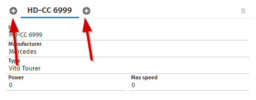
The layout definition for the TABBEDPANE is:
<t:tabbedpane id="g_59" value="#{d.DemoTabbedArea.tabValue}" width="100%">
<t:tabbedareabegin id="g_82">
<t:icon id="g_75"
actionListener="#{d.DemoTabbedArea.onAddNewCarBeforeAction}"
image="/images/iconssvg/add_16x16.svg"/>
</t:tabbedareabegin>
<t:tabbedareaend id="g_6">
<t:icon id="g_83"
actionListener="#{d.DemoTabbedArea.onAddNewCarAction}"
image="/images/iconssvg/add_16x16.svg"/>
</t:tabbedareaend>
<t:tabbedpanetab … />
<t:tabbedpanetab … />
</t:tabbedpane>
Inside the TABBEDAREABEGIN and TABBEDAREAEND you can exactly place one component. Of coure this can be a PANE component, internally providing any number of child components.
Take a look into the demo workplace (“News” section).
By using the attribute CODEEDITORPARAMS you can directly configure the ACE editor instance using its JavaScript API. Up to now you could only set properties in the editor itself and in its session. Now you can access the editor's options, the editor's rendere and the editor's renderer options as well. Please take a look into the corresponding example wihtin the demo workplace.
You now may pass images into the MULTILABEL component as well. There is a corresponding property when adding MULTILABELBinding.TextInfo instances.
(The MULTILABEL component represents a sequence of text labels that are output as one block of HTML elements rather than rendering each text individually.)
This is “beta”-status still – but we want to share now: as with any application that you build with CaptainCasa the toolset itself can be deployed as Spring Boot application – and that's what we now do.
We provide the Spring Boot version as self-execute-able “.war” file – i.e. you can either directly run it by calling “java -jar eclnteditor_springboot-xxxxxxxx.war” or you can embed into a tomcat or other servlet container of your choice.
The delivery is done by Maven, so from now on, there is a corresponding artifact in our Maven repository that is from now on provided for each version:
group: org.eclnt
artifact: eclnteditor_springboot
version: 20220425
If directly running the .war file, then the settings are:
port: 51000
start-URL: http://localhost:51000/editor
You may include the download of the toolset into you Maven build file in the following way:
<plugin>
<groupId>org.apache.maven.plugins</groupId>
<artifactId>maven-dependency-plugin</artifactId>
<executions>
<execution>
<id>cctoolset-copy</id>
<phase>initialize</phase>
<goals>
<goal>copy</goal>
</goals>
<configuration>
<artifactItems>
<artifactItem>
<groupId>org.eclnt</groupId>
<artifactId>eclnteditor_springboot</artifactId>
<version>${cc.version}</version>
<type>war</type>
<overWrite>true</overWrite>
<outputDirectory>${project.basedir}/cctoolset</outputDirectory>
<destFileName>eclnteditor_springboot.war</destFileName>
</artifactItem>
</artifactItems>
</configuration>
</execution>
</executions>
</plugin>
By this definition the plugin is downloaded into the “/cctoolset” directory of your project as part of you build process.
Why do we do this?
...because we see that in “grown projects” the toolset is often not used – because the effort for regularly keeping up to date with the setup.exe-installation of the tools is too high. Now you can download the toolset as directly start-able application – using our Maven repository as installation source. Per CaptainCasa version there now will be a corresponding toolset version.
Two last comments:
Why is it “beta” - not because the toolset is behaving in a different way...! (it is the same toolset that is used “always”.
In the toolset we do not want to support the direct creation of projects anymore – but want to only go through Maven or Gradle. This is the reason, why you might miss the corresponding menu item in the project's menu...!
Of course: any feedback is appreciated!
The resetting of filters only worked when resetting “all filters” - it did not work when only removing “this filter”.
With 20220411 we added the function to directly create Maven projects from the CaptainCasa tool set.
Now we extended this function by also being able to create Gradle projects:
The dialog that shows up after selecting “New Gradle-project” is the same as the one that is used for creating Maven projects, but now providing the selection of the build environment:
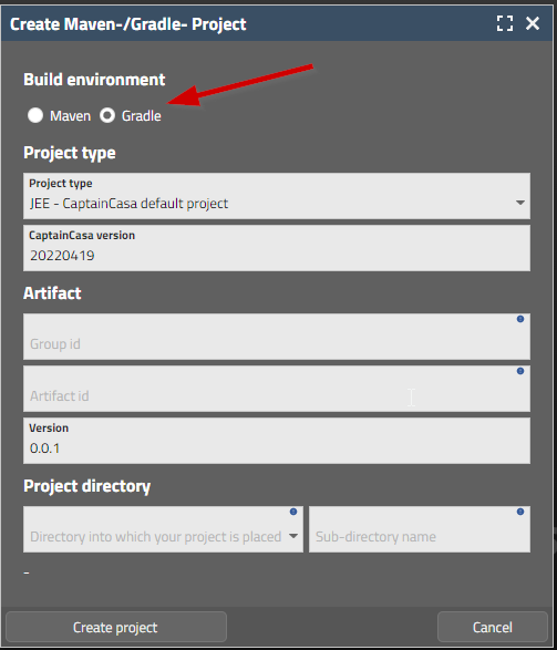
After creating the project you need to follow the same steps as with Maven-projects:
Import the project into you development environment
Build the project with Gradle
Reload the project in the CaptainCasa tool set
When starting a grid export by invoking one of the links in the default export dialogs of the gird, then you now can receive a notification on server-side about. To do so, override method “FIXGRIDBinding.notifyDownloadWasTriggered(...)” in your FIXGRIDIList/TreeBinding instance.
The MULTILABEL component renders a series of text labels by not individually creating DOM elements but by applying some mass processing for all contained labels.
Up to now the component internally used the HTML-canvas element for rendering. This caused some inaccurate rendering of texts in some situations – because at the end texts are not passed as text into the browser rendering but are rendered as pixel. The inaccurate rendering especially occurred when using different zoom factors than “100%” - but also sometimes occurred with default zoom factor.
We now changed the inner processing of the component to plain DIV and text processing: but the DIVs are not generated by DOM operations but are rendered as one HTML statement into the area which is opened up by the MULTILABEL component. The performance of the component (which is the main reason for having introduced it!) does not differ according to our measuring – and the rendering is always crisp and clear, regardless of any zoom factor.
The MULTILABEL component is internally used within the ARRAYGRID component and is applied by setting attribute ARRAGRID-USEMULTILABEL to “true”.
This is for “Swing client” users only! - We now also provide a way to use the Swing-Client with Cookie-based session management. Please contact us directly if you want to get more details on this. - We do not want to encourage existing Swing scenarios to change, because a change from URL- to COOKIE-based session management requires some deep checking of server-side session access! - We have some scenarios in which authentication protocols on server-side require a COOKIE-based session management – this is the reason for touching the client at all.
Some of our pom.xml files contained the information that their version was “6.0.0” - and not “4.0.0”...
There was a problem (here: the work “challenge” is maybe really more adequate!...) when including a CaptainCasa page as an IFRAME into another page: if both pages were not loaded from the same origin, then a security error was shown. Reason: in this case the cookies of the inner page (the CaptainCasa page) are ignored by the browser, if they are not marked with http-header-parameter “sameSite” to be “None”. Well, this parameter is only accepted in secure scenarios, i.e. it is only accepted when using “https” as protocol.
Consequences of all this:
The security-cookie is sent with “secure=true” and with “sameSite=None” in https-scenarios. For these scenarios the embedding then is properly working (if working with the default browser security configuration).
The security-cookie is NOT sent with http-scenarios – because here cookies of IFRAME-embedded-pages are not treated at all.
One exception: the cookie is sent with “http-localhost” scenarios, because here the browser processes cookies in a lax way. By CaptainCasa sending the security cookie also here, we ensure that your application is tested during devlopment in “with-security-cookie-mode”. Otherwise the security-cookie management would only be applied during runtime, where you typically have “https”-scenarios.
Up to now the creation of Maven projects was done directly in the IDE of your choice (Eclipse, IntelliJ, …) by using Maven-project-archetypes that were (and still are!) provided by CaptainCasa.
Now we also provide the option to directly create these projects from our tool set – after having seen, that the creation through IDE is not really straight forward with all IDEs...
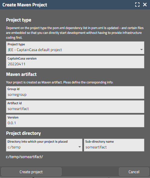
Just call “File > New Maven project...” from the menu of the tool set.
We added a filter (class “SecurityFilterURLCheck”) that checks the URL-data of certain requests for occurrences of “../” (and “..\” and “/..” and “\..”).
The corresponding configuration in “CCInitializeServlets” (the programmed version of the former web.xml) is:
initializeFilter(servletContext, SecurityFilterURLCheck.class,
"/faces/*",
"*.ccbuffer",
"/ccbuffer/*",
"*.ccupload",
"/cctempfileaccess/*"
);
Why did we do this? We got the message that if using the reference-implementation of JSF it was possible to access e.g. web.xml by corresponding “../” definitions. (There was no problem when using the CaptainCasa-mini-implementation.)
We now use our component TEXTAREAWITHCOMMENTS to show line numbers, so that error messages (e.g. XML parsing messages) with reference to line numbers can be easier resolved.
There is a new page bean component which allows the user to edit one string-value within separated fields:
Please check the demo in the demo workplace (section “News”) - there are a couple of configuration options.
The editor's war file can be also loaded from Maven:
JEE version (already existing):
<dependency>
<groupId>org.eclnt</groupId>
<artifactId>eclnteditor</artifactId>
</dependency>
Jakarta version (new):
<dependency>
<groupId>org.eclnt</groupId>
<artifactId>eclnteditor_jakarta</artifactId>
</dependency>
When zooming the browser then so far the width of the vertical FIXGRID-scroll-bars was also zoomed. Now the size is kept stable (as with other scroll bars e.g. of SCROLLPANE).
Since update 20220314 the popup icons (right top corner icons) were not following the style definition anymore. Instead, default icons were used.
In case of a double click the “onRowSelect” event was executed twice on server-side. One time is enough...
When embedding a CaptainCasa page (.risc) into an IFRAM of another page, then there is some configuration that decides if this allowed. The configuration can be made either “for all pages” or for “individual pages”. When using the “individual pages” then there was some bugging – corresponding pages that by configuration should be embed-able were not embed-able in reality.
<system>
<riscstarter
…
embedableasiframe="sameorigin" <== for all pages
“sameorigin”/”false”
…
>
<allowiframeembedding page="/aaa/*"/> <== individual
</riscstarter>
</system>
The browser console showed some JavaScript errors with 20220321. Due to this errors the execution of some events was not properly done.
We recommend to upgrade 20220328 due to this reason!
We added some general security cookie that prevents access to session related data from outside the client that originated the session. Means: the server-side http session is associated with an internal id (created via secure random algorithm) that is passed to the client browser. All requests entering servlets on server-side that access session-related information are checked, if the cookie-id is available and if it is the one that is associated with the session.
Please find more details in the Developer's Guide: https://www.captaincasa.com/docu/eclnt_risc_developersguide/all.html#usageofhttpsismandatoryforproductionsystems
We introduced some general way of checking which pages can be directly called.
Please check: https://www.captaincasa.com/docu/eclnt_risc_developersguide/all.html#definethepagesthatyouwanttobedirectlystartable
The check is only applied for non-localhost scenarios – which means: during development you are not affected, but at runtime the checks are performed.
The general settings are defined in a way that all pages are open to be accessed – in order to be compatible with existing scenarios. The definition of pages is done in the system.xml configuration file. Example:
<system>
<riscstarter>
<allowstart page="/*/index.*"/>
<allowstart page="/*/outest.*"/>
</riscstarter>
</system>
Definitions can be either done in a positive way (“allow!”) and in a negative way (“exclude!”).
The class SBApplication that contains the information how to start up within a Spring Boot environment was updated:
@SpringBootApplication
public class SBApplication extends SpringBootServletInitializer
{
public static void main(String[] args)
{
SpringApplication.run(SBApplication.class, args);
}
@Override
protected SpringApplicationBuilder configure(SpringApplicationBuilder application)
{
return application.sources(SBApplication.class);
}
As result it is now better deploy-able within external servlet containers with all Spring Boot environment functions.
This class is generated when setting up a Spring Boot project with the corresponding Maven project-archetype. We recommend to update the class for already existing projects correspondingly.
20220321 cause some JavaScript error log output in the browser console – due to runtime errors during the processing of some client events. We recommend not to use 2022031 in productions scenarios!
Usually a popup menu is opened by the user clicking the right mouse button. For touch devices there is no obvious equivalent – and the strategy to use a long-touch event is not really intuitive for users.
The component BUTTONPOPUMENU is a just normal button, that opens up its popup menu when it is clicked. All the internal handling of functions is exactly the same as with the normal popup menu handling – but now available on direct click/touch.
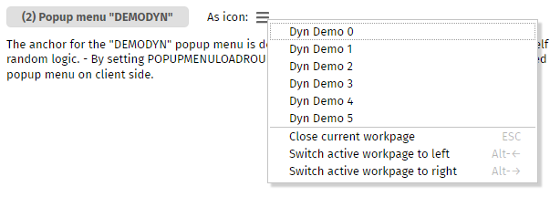
When adding an own style class for the slider, then style parameters were not correctly applied.
We last week did a workaround for crashed on iPhone/iPad devices. This workaround means that internal scrolling of SCROLLPANE instances is taken over by own functions. Now the scrolling of nested SCROLLPANE instances was improved: when scrolling to an end of an inner area and continuing to scroll, then the next outer area is scrolled.
For connecting to external “big” JavaScript frameworks (e.g. open street map, JChart, …) we use HTML-pages (“bridge pages”) that are contained in the local web application (e.g. in “eclnt/risc/ext_jchart”).
These bridge pages so far passed back “sameorigin” as “X-frame-option”. This did not cause any problem at all if directly working with a CaptainCasa page. - If now embedding a CaptainCasa page into another page by IFRAME, then the “sameorigin” policy is not correct anymore, because the browser compares the original URL (from the outest page) with the “nested-nested” URL of the bridge-page to check for the same origin.
Now the “same-origin” management that is controlled in system.xml is also applied for the inner bridge pages.
As reminder: the place where to configure this aspect in system.xml is:
<system>
<!--
*************************************************************************
...
embedableasiframe: default "sameorigin"; completely switch off by value
"deny" or "false"; allow embedding by value "true".
...
*************************************************************************
-->
<riscstarter
...
embedableasiframe="true"
...
>
</riscstarter>
</system>
In short words: if you define CaptainCasa pages to be include-able as IFRAME, then the inner bridge-pages inside CaptainCasa pages are shown as well!
So far you could set the general style of the outest layer of a popup – now you can also set the decoration style:
Modal/ModelessPopup.setStyleseq(...) <== existing method for “outest layer”
Modal/ModelessPopup.setStyleseqdecoration(...) <== new method
The style class that you pass must extend the existing style class “riscdialogdecorationall”.
When using a FIXGRID instance inside a REPEAT instance then expressions that were defined directly on GRIDCOL-level were not correctly handled.
Means:
REPEAT
ROW
FIXGRID
GRIDCOL text=”.{someText}” <== was NOT correctly handled
LABEL text=”.{someName}” <== was correctly handled
Now all levels are managed properly.
It's unbelievable...: in cascading scenarios of arranging SCROLLPANE instances one inside another, it could happen that the browser crashed and restarted the page from the scratch. The level of log information that is available by the Safari-browser is very poor... - so it was a gambling-type of “research” that we had to do. - Result: Safari-browser on iPad/iPhone do not like scroll-able DIV elements inside a page. With a certain level of nesting the browser reacts significantly slower – and suddenly crashes. It seems to follow Apple's wording, that they prefer pages to be scroll-able on top level only (body-level)...
OK – what we now added: SCROLPANE instances (which are srcoll-able DIV elements on technical level) are rendered with “overflow=hidden” internally and the touch-scrolling is taken over by a CaptainCasa function (SCROLPANE-TOUCHSCROLLSUPPORT is switched on by default for these devices).
We have to emphasize that his “behavior” is only present on iPhone/iPad devices. It is not present on Apple-desktops, any other desktops, Android devices. - Please also note: switching from iPad-Safari to iPad-Chrome (or Firefox) will not help in any way: for these devices all browser use (better: have to use) the Safari-rendering-kit internally.
When creating dynamic content by using the (ROW)DYNAMICCONTENT component, then you now can bind the components that you create directly to lambda expressions.
Example for a dynamic get-implementation: “width” and “align” are directly set – the text is bound to a lambda expression.
LABELNode l = new LABELNode()
.setWidth("100%")
.setAlign("center")
.bindText(new StringDelegationLambda(() -> {return m_result;}));
This would be the equivalent to the “tradtional” implementation using expressions:
public String getResult() { return m_result; }
LABELNode l = new LABELNode()
.setWidth("100%")
.setAlign("center")
.bindText(pbx(“result”));
For attributes that are used into both directions (set and get), you need to pass two lambda expressions:
FIELDNode fn = new FIELDNode()
.setWidth(300)
.setAlign("center")
.bindText(new StringDelegationLambda
(
() -> {return m_name;}, // get
(value) -> {m_name = value;} // set
));
There are corresponding *DelegationLamda classes available for all simple data types (StringDelegationLambda, IntegerDelegationLambda, etc.).
Action listeners can also be implemented using lambdas:
BUTTONNode bu = new BUTTONNode()
.setText("Say hello!")
.setWidth("200")
.bindActionListener((event) ->
{
if (m_name == null)
m_result = "No name defined.";
else
m_result = "Hello world, " + m_name;
}
);
Please take a look into the demos within the demo workplace:
General =>
Dynamic Layout =>
Direct binding of objects
Hello world – with expressions
Hello world – with inner classes
Hello world – with lambdas
The RISC client requires a certain set of literals and country definitions. Example: for rendering the CALENDAR component it requires the name of the week days and the name of the months – and it requires the country settings for the date format.
These definitions are kept in XML-files that are part of the elcnt/risc/i18n directory within the eclntjsfserver.jar library.
We now have added to interfaces that you can implement in order to update the literal and country settings before they are passed to the client side:
package org.eclnt.jsfserver.util;
public interface IClientI18NLiteralsUpdate
{
public void updateLiteralInfo(Map<String, LanguageInfo> data);
}
AND:
package org.eclnt.jsfserver.util;
public interface IClientI18NCountriesUpdate
{
public void updateCountryInfo(Map<String, CountryInfo> data);
}
Implementations of both interfaces are registered in the system.xml file:
…
<clienti18n
clientliteralsupdateclass="...class implementing IClient18NLiteralsUpdate..."
clientcountriesupdateclass="...class implementing IClient18NCountriesUpdate..."
/>
…
When drawing arrows in the PAINTAREA component then you use the PAINTAREALINEITEM component. This component provides an arrow type definition for the “from” and the “to”-side of the line. Each arrow type has a certain number.
For certain arrows there are now two variants:
What's the difference? All lines are defined with a length of 100 pixels. But: you see that with new arrow types (15,16,17,18,19) the “dot” is positioned with the starting/ending point in its center. Whereas with the existing ones (5,6,7,10,11,12) the “dot” is positioned as part of the line.
The PAINTAREALINEITEM so fart could only be positioned in an absolute way:
<t:paintarealineitem … bounds=”10;10;100;100” … />
Now it is possible to apply the same sizing rules that you may use for the BOUNDS of PAINTAREA – including percentage sizing and including offsets:
<t:paintarealineitem … bounds=”10%;100%-90;0;90” … />
The component that renders some simple type of Gantt diagram now is rendered with using stable component ids internally. A redrawing of existing content as consequence does not flicker anymore as consequence.
If – on server side – calling “Statsusbar.alert(...)” and afterwards opening a ModalPopup for the application, then the sequence of calls defined the sequence of popups on the client side – and the status bar popup was opened behind the application popup.
Now the status bar popup internally always is opened as last – and does as consequence always open in front of other dialogs.
The MULTILABEL is a component rendering a couple of label texts “in one chunk”. For performance reasons it does not use DOM elements on client side but directly draws out texts using the HTML-Canvas component.
In some situations the component was not properly cleared when the text was updated – the bottom part of the previous text was preserved.
When an error occurs on client side then an error screen occurs. The content of this screen currently was only customize-able by using a JavaScript exit.
Now you can properly define the error information that shows up – and embed into some own HTML-text. You can define both a text for “normal” error situations and a special text for “session-timeout” errors. And: for session time-outs you may immediately route the processing to some new URL, that you may prepare before to take over as much as possible context information.
Please check the information in the Developer's Guide:
(just to add: existing definitions that you may have done via the JavaScript plugin are still valid, of course!)
We added an interface “ILayoutXMLModifierAfterRead” that allows to you to update a layout definition's XML just after it has been read:
package org.eclnt.jsfserver.util;
public interface ILayoutXMLModifierAfterRead
{
public String updateLayoutXML(String fullPageName, String xml);
}
The interface implementation is registerd in system.xml
<system>
...
<layoutxmlmodifierafterread name="...classNameOfImplementation..."/>
...
</system>
Typical use case: you may as consequence resolve any type of abbreviations that you might do during layout definition.
If the user defines filter values on top of the columns...
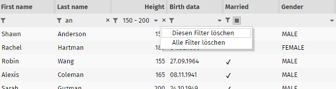
...then a small “delete”-icon is shown. When pressing the icon a menu pops up from which the user can either remove the corresponding filter – or all filter values.
@screenshot: the texts are translated to English as well...
We know – the “.risc”-extension is fantastic, but some of you are afraid that end users might mix “risc” with “risk”... So we now provide to use some alternative extension.
<system>
...
<riscstarter
...
alternativeextension=".start"
...
/>
...
</system>
Please pay attention:
The definition must start with a “.”
All URLs with this extensions are now routed to the “RISC”-processing! So define some extension which is not in competition with other extensions!
We now deliver an explicit “dark style”:
“default202201darkrisc” is based on “default202201risc” and is based on some dark-gray colorset. We also updated the style of the add-on-components to fit both to “normal” and to “dark” style (eclnt_pbc.jar).
When double-tapping on a browser page in iOS-environment then the dialogs is zoomed at the point where you double-tap. This should not happen to CatainCasa dialogs (same as two finger zooming)
If using the little icons for scrolling up/down, then the corresponding FIXGIRD began to scroll infinitely...
During the FIXGRID export, header and footer columns were treated as “String-only” columns so far – so that data values (e.g. float, BigDecimal, …) were not passed as numeric values into the Excel processing.
Please pay attention: if having implemented interface “IFixgridInfoProvider”: there are two new methods, that were added. If inheriting your implementation from “DefaultFixgridInfoProvder”, then there are default functions thar are implementd.
If having defined an own style and having registered this as default style (sessiondefaults.xml) then an error might have shown up when trying to select a valid value behind the STYLESEQ attribute.
When using “.xml” for stroing layout definitions (see 20220131) then the refresh within the preview are of the layout editor was not working sometimes – so you had to execute twice.
It's now possible to easily define hover effects, by which the component is resized or moved. Please check the demo in the “News” section:

The base is some style definition via “RISC-values”. Example:
<class n="riscbutton_withhoverresizetopmedium" extends="riscbutton">
<risc n="_hoverEffectResizeInsets" v="10 10 10 10"/>
</class>
The definition defines the extra space that is defined around the control – and that is used in case of hovering. There is also the possibility do define the insets in which the components is transformed to:
<class n="riscbutton_withhoverflymedium" extends="riscbutton">
<risc n="_hoverEffectResizeInsets" v="10 0 0 0"/>
<risc n="_hoverEffectResizeInsetsTo" v="0 0 10 0"/>
</class>
The result of this definition is:

CaptainCasa provides some default style variants for the BUTTON and the PANE component. Please check the demo for details.
Up to now there is the GRIDCOL-SORTREFERENCE, which is used for all purposes, in which the grid processing wants to access item values and in which it cannot access the value by analyzing the cell's content.
This SORTREFERENCE was used for two purposes:
For sorting
For exporting data
Now there is an additional GRIDCOL-EXPORTREFERENCE which is only for the purpose of exporting data. You only need to define it, if the binding that you assigne is not the same as the one that assign with GRIDCOL-SORTREFERENCE.
Please check the demo “Grid > Grids and Trees > Sorting > Explicit sor- and export-value”.
In the CCEE-library there is a central class “Config.java” which reads the properties defined in e.g. the “ccee_config.properties” file.
Now you can outsource the reading of properties to some own logic using interface:
package org.eclnt.ccee.config;
public interface IConfigProvider
{
public String getConfigValue(String contextName, String key);
}
The configuartion to use this interface is done – how else...? - in the “ccee_config.properties” file itself. Example:
# configuration
config_configproviderclassname=test.ConfigProviderImpl
# database access
db_url=jdbc:postgresql://localhost/testjobs
db_driver=org.postgresql.Driver
When reading a certain property, then the Configuration-logic (Config.java) first asks the IconfigProvider-implementation (if defined at all). If receiving no response (null) then it checks in the normal configuration files.
The “pom.xml” definition for the articat “eclntjsfserverRISC” was missing the “provided” defintion withn the dependency to the ESAPI-library.
The attribute LINK-ALIGN was not working when using the value “center”. It stayed “left”-aligned.
There are situations in which you want to “get out of your current dialog” to some other dialog. Example: an error occurred, which only can be handled by sending an “oops-screen” to the user.
In this case you can used the components:
CLIENTREDIRECTURL for navigating to any URL
CLIENTREDIRECPAGE for navigating to a CaptainCasa dialog
Both component are now included as default components in any page automatically. You can call the corresponding processing by some API:
Client.redirectDialogToURL(String url)
Client.redirectDialogToPage(String page, boolean keepSession)
Please note: this is NOT a way to do page navigation! This is some way, which is only serving the purpose “get out!”.
The change that we applied to our demo workplace style last week is now applied as new default style “default202201risc”. The new style inherits the previous one (“default 202006risc”) and is used for all new projects that you create – either by using the CaptainCasa tool-set or by using the Maven project archetypes.
Main difference to previous style: the font.
Just for info: the “old” font “Open Sans” is still delivered! And of course you do not have to update existing projects – they keep their style as you have assigned it!
The following change is part of CaptainCasa since 3 months already – and is already used in the demo workplace (maybe some of you have found out...). Now it is applied to all new projects that you create (either by tool-set or by Maven):
Layout definitions used to have by tradition the extension “.jsp”. This was more and more misleading: from the beginning on the layout definitions were pure XML only – no kind of scripting was allowed! - In the meantime “.jsp” is some synonym for a server-side scripting technology which CaptainCasa definitely is NOT... - so we always have to explain that our “.jsp” is some special usage and has nothing to do with traditional “.jsp”.
In the project definition file (“.ccproject”) there is a new attribute...
<project
...
layoutdefinintionssavedasxml="true"
... >
...
...
</project>
When setting to “true” then in the layout editor “.xml” is proposed as extension for new layout definitions:
You still can use “.jsp” (by selecting the combo box holding the file extension value), of course. And still any usage of “.jsp” is still valid and allowed.
The XML layout content is identical, in the .jsp file it is surrounded by the typical JSP tag library management...
<%@page contentType="text/html"%>
<%@page pageEncoding="UTF-8"%>
<%@taglib prefix="f" uri="http://java.sun.com/jsf/core"%>
<%@taglib prefix="h" uri="http://java.sun.com/jsf/html"%>
<%@taglib prefix="t" uri="/WEB-INF/eclnt"%>
<f:view>
<h:form>
<f:subview id="testAsJspg_sv">
<t:beanprocessing id="g_1" />
<t:rowtitlebar id="g_2" text="Test" />
<t:rowheader id="g_3">
<t:button id="g_6" text="Some button" />
</t:rowheader>
<t:rowbodypane id="g_4" />
<t:pageaddons id="g_pa" />
</f:subview>
</h:form>
</f:view>
...whereas in the XML representation it is surrounded by corresponding name space definitions:
<?xml version="1.0" encoding="utf-8"?>
<t:layoutdefinition
xmlns:t="http://www.CaptainCasa.com/controllibrary/t">
<t:beanprocessing id="g_1" />
<t:rowtitlebar id="g_2" text="Test" />
<t:rowheader id="g_3">
<t:button id="g_6" text="Some button" />
</t:rowheader>
<t:rowbodypane id="g_4" />
</t:layoutdefinition>
Please do not change name space tag prefixes!
We extended the list of files that are by default compressed when being communicated between client and server so that the list now inclues:
*.css
*.js
*.ttf
When defining a FIXGRID with height “100%” and NOT defining a SBVISIBLEAMOUNT, then by default a value of “40” was selected. Now this value is not fix anymore but also takes the screen pixel size into consideration so that the value is increased for larger deskto screens.
In the Swing client it could happen that a popup was not opened on the right screen when working with two screens. The situation only rarely occurred.
We fell in love with the “Fira Sans” font from Google – and start to use it in out demo workplace as default font:
We plan to use this font as default font for new CaptainCasa projects from next update on - replacing the Google font “Open Sans”. Of course: existing styles will not be touched, so this change will only be applied for new projects.
Shame on us! The “doubling of characters” during touch input still occurred! We hope this issue is now fixed forever.
What is the background of these errors, after having had the touch components working for years...? We updated the behavior in October, so that the characters are not only activated by a normal click/touch (which means: activation is done on mouse-up), but also is done if the user is clicking/touching the screen for some longer time – i.e. without sending a mouse-up event. There was a bug in the processing of corresponding timer functions.
If a user keys in some wrong value into a field (e.g. FORMATTEDFIELD: “sdsdh” where an int-value is expected), then the value is reset, a message is output and a roundtrip that is potentially triggered is vetoed – and not executed as consequence.
Reason: imagine you input a form, key in wrong data and press “Save”. In this case the client resets the field to its previous valid value and does not trigger the “Save”-processing, so that the saving is not executed with data which was reset by the client.
Now you can override this behavior by setting the attribute IGNOREROUNDTRIPVETOS to “true”. The attribute is available for the components BUTTON, ICON and MENUITEM at the moment. - And there is a new method “Modeless/ModalPopup.ignoreRoundtripVetosOnClose”.
Please:
Check The corresponding demo in the demo workplace: General => Arranging Content => Popup Dialogs => Close popup with inconsistent client data
Use this flag with great care. It is intended to better support situations in which you want to e.g. close a popup dialog without forcing the user to input valid data.
Up to now we used one factor per font for calculating the height of e.g. a label component. The font size “12” was multiplied with this factor and rounded afterwards. The factor was calculated dynamically per font that is used.
This led to inaccuracies with some fonts and some font sizes. We now dynamically find the correct height by obtaining the height per font size from the HTML functions.
For a container component (e.g. PANE) you can define attribute FLUSHAREA to “true”. If doing this, then any data change that happens inside the container leads to a flush on container level after some duration.
The duration up to now was hard-coded to 1000ms. Now you can influence by using attribute FLUSHAREATIMER, in which you may define the number of milliseconds on your own.
The filter dialogs that pop up when pressing the filter-icon in the grid headline always showed the filter for String-values. Now they (again) show dialogs that are in sync with the data type of the corresponding property of the column.
There are pre-configured style variants for the SCHEDULEITEM and SCHEDULTITEMAREA components:
The style variants point to some style class definition which for example is:
<class n="riscscheduleitem_gantt1" extends="riscscheduleitem_gantt">
<risc n="inset" v="0 0 5 0"/>
<style n="clip-path" v="polygon(0px 0px, 100% 0px, 100% 100%, calc(100% - 5px) calc(100% - 5px), 5px calc(100% - 5px), 0px 100%, 0px 0px)"/>
</class>
You see that you may define the CSS attribute “clip-path” to select by a polygon which part of the component is rendered. This “clip-path” definition can be applied to any style, of course. And of course you can define own style variants with own polygons, too.
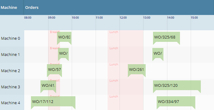
This is something interesting...: so for you could define one FORMATMASK with a FORMATTEFIELD, e.g. by defining FORMAT=”bigdecimal” and FORMATMASK=”dec2” you enforced the output and input of a field to he formatted with two decimal digits.
Now you can define a FORMATMASKDURINGINPUT in addition. Example: you may define a normal FORMATMASK=”dec2” and a FORMATMASKDURINGINPUT=”dec8”. The consequence: when the field is not focused then the formatting is done by “dec2”:

When the user focuses the field then the processing internally switches to “dec8” and shows the full number with its full precision:
The internal value is always kept with the definition of “dec8”.
The hovering was up to now showing that each item consisted out of different internal elements – now it's one hover-effect for the whole item.
We updated the version of CKEditor (optionally used with component SIMPLEHTMLEDITOR) to version 4.17.1. The request originated from a security audit.
You can now hide the maximize button of decorated popup dialogs – the same way as you can hide the close-button:
Modeless/MadalPopup p;
...
p.hideMaximizeIcon();
p.hideCloseIcon();
When pressing the icon for isolating the current workpage into an own popup dialog, then it could happen that the wrong page was opened up. The bug only occurred in situations with multiple workpage containers.
There were situations in which popups that you opene up by “tooltipstarted”-event (BaseActionEventTooltipStarted) are immediately closed after being started. Reason: these dialogs were closed (event BaseActionEventTooltipEnded) when the corresponding client component received a “mouseout” signal. Unfortunately this signal was also sent when the whole screen is overlayed by the waiting-cursor/shading that appears when the client does not receive server-response within 250 ms... We now bypass this situation, so popups are not immediately closed anymore.
When using FORMAT “date” and FORMATMASK “short”, then the format advice (the gray text that is shown if the field is empty) was set to e.g. “mm/dd/yyyy” instead of “mm/dd/yy”. The input of the component was correctly managed – the bug only affected the text.
When using the TOUCHSIGNATURE component to record a user's signature on a touch device, then only lines were recognized so far. Simple “dots” were not recognized.
When assigning a PERSISTID to a FIXGRID then the sequence of columns and the sort status is persisted. The default persistence is using class “DefaultFIXGRIDPersistence”.
In this class there is a new static configuration parameter:
DefaultFIXGRIDPersistence.initAppendNewColumnsToTheEnd(boolean value)
When you add new FIXGRID-columns during your development, then these columns are automatically appended to the end of the grid, so that the user recognizes them. If setting the parameter to “false” then the new columns are not automatically appended – but just not visible.
We updated to version 3.6.0. - Just for info: the CaptainCasa client processing itself does not require JQuery – it is just used as part of external libraries that we utilize for special tasks (here: in the TEXTEDITOR component: managing the caret position.
The color value that is passed with “.ccsvg” image definitions is now checked to be a correct color definition (“#rrggbb” or “#rrggbbtt”). Before it was not checked and there was the risk of JavaScript injection. - Actually this could only happen if image definitions are defined by the user, so the risk was low – but it existed.
The pom.xml of the artifacts “org.eclnt.eclntjsfserver” and “org.eclnt.eclntjsfserverRISC” still contained references to “log4j.jar”. We updated the pom.xml correspondingly.
Just to make sure: the references were defined with scope “provided”, so there was no automatic loading of libraries. And: the pom.xml of the project archetypes were already correctly updated.
In addition we cleaned up non-used references to “commons*” libraries within the pom.xml definitions.
There is an updated version of the data grid view, that makes the rendering of a grid of Pojo-beans very simple. The updated page beans class now is “CCDataGridView2”. It is “nearly” compatible with the previous version (which of course is still supported!) “CCDataGridView”.
Main features of the new version: a much more sophisticated management of filters – including the ability to add own column filters by implementing a certain interface.
Please check the demos in the Demo Workplace:
The new page bean component “CCTreeByTiles” renders a normal tree definition (FIXGRIDTreeBinding) into a tile layout:
In the top line the currently opened tree hierarchy is shown from the left to the right. In the body area below the children of the currently opened node are shown.
You may now directly access the country/language definition of the client by the method HttpSessionAccess.getCurrentClientLocale().
Please remember: there is a localization of the server application and a localization of the client renderer. The client localization e.g. is responsible for converting dates and number values into properly readable strings. In most cases both localizations are in sync – but you can explicitly define scenarios, in which e.g. the user sees an English application with a Swiss conversion of numbers and dates.
Update 20211217 contained a bug when using component PAGEBEANINCLUDE (not: ROWPAGEBEANINCLUDE!). An additional ROW-component was added on top of the content.
This is a severe bug that we introduced with last update 20211213! When opening a layout definition containg the component PAGEBEANCOMPONENT (in XML “t:pagebeancomponent”) then this was excluded during the parsing and loading of the XML. Even worse: because it was included during loading, it was also not saved when saving the layout.
The “good news”: you immediately find out, because the page does not work anymore after the first saving – and you have to roll back to the previous version of your layout definition (that you hopefully have stored in some GIT/ SVN or whatever repository).
The style class of the TABBEDPANE that is opened as popup for COLORFIELD and COLORICON is now part of the style of “risccolorfield” and “risccoloricon”. By default it is the normal “risctabbedpane” style – but you can modify on your own.
The interface “IConfigurationObjectLoader” was not invoked in all cases when configuration objects are loaded. Example: when loading the “IStartUp” implementation that can be defined in system.xml it was not called.
...as information: by default configuration objects are loaded through the class loader. This means: if you e.g. in system.xml define a startup class “xxx.yyy.Startup”, then this class is picked and a corresponding instance is created. The IConfigurationObjectLoader allows you to create the instances on your own – so that you e.g. can use Spring or other services for creating them.
There was a bug when hiding / showing columns within a grid using component FIXGRIDWITHGROUPING: the grid columns were rendered “messy” in the header area of the grid.
In addition the default popup for arranging columns was updated to fit to the special conditions of grouped columns: in the popup you now cannot arrange the columns sequence anymore because this column sequence is heavily influenced by the grouping of columns. In the popup you can still decide about visibility of columns, of course.
The dynamic generation of SVG-icons based on typical flat SVG-icons contained an error when applying the color variants. In addition the algorithm for adapting the SVG content to certain colors and sizes is now more flexible – and adapters to more SVG icon definitions.
The popup was adapter to again contain the column headers. Reason: in some scenarios you may want to sort the columns on the left:
The MULTILABEL component is a special component for rendering many texts in one row with high speed. It does not create corresponding HTML elements, but uses the HTML-Canvas element for drawing. It is implicitly used in certain components (ARRAGRD) or Page Bean Component implementations (Simple Pivot).
Up to now the Canvas size internally was set to exactly fit the available space within a certain dialog. Now: we internally double the Canvas size – without increasing the component size – which results in a higher resolution.
In short: when using the browser zoom, the rastering now begins to start at a scale of 100%, where it started before with any size > 100%.
If a layout was containing the following...
FIXGRID rwodragsend=”A:A” ...
GRIDCOL ...
LABEL text=”...” dragsend=”B:B”
...and when starting a drag drop operation from the label, then only the label's DRAGSEND-value was treated in the drop-calculation. Now the DRAGSEND value is accumulated to the grid row level. In the concrete example, the DRAGSEND value is “B:B;A:A” instead of just “A:A”.
(This feature was partially taken over from our good old Java Swing-Client – in which the accumulation was done for all elements on top of the clicked one...)
If the width of a SMARTLABEL is too small to show all the text content, then a tool tip is shown. Sepcial HTML characters (e.g. “&”) were not translated to plain text when internally setting the tool tip text.
When creating actionListener methods in the Code Generator, then the code that was generated still referred back to the “Java EE” version – and not to the “Jakarta EE” version.
In addition we added information about the usage of the “Jakarta EE” version into the Developer's Guidie.
The SCANFIELD now better separates between a FLUSH event (user input, then leaving the field) and explicit scan input (user having input a value with matching prefix and postfix, or: scan-hot-key activated).
The demo “DemoScanField” was updated accordingly:
public void onScannedValueAction(javax.faces.event.ActionEvent event)
{
if (event instanceof BaseActionEventScan)
{
BaseActionEventScan e = (BaseActionEventScan)event;
Statusbar.outputSuccess("Value was scanned: " + m_scannedValue + "/" + e.getScannedValue());
}
else if (event instanceof BaseActionEventFlush)
{
Statusbar.outputSuccess("Value was flushed: " + m_scannedValue);
}
}
Inside the server there is a servlet processing that automatically transfers an existing flat SVGicon definition into a certain color and size variant.
The servlet is addressed in the following way up to now:
Normal image access: /images/abc/def.svg
Image with assigning new size:
/images.abc.def.16x16.svg
Image with assigning newcolor and new size:
/images.abc.def.#FF0000.16x16.svg
Image with assigning explicit background color and a new color and a new size:
/images.abc.def.#FFFFFF.#FF0000.16x16.svg
There is the problem, that the character “#” needs to be translated into “%23” if accessing the image by normal URL (e.g. from the browser). So you sometimes have to write “%23” (e.g. in CSS-style-values) in some cases you have to write “#” (e.g. in attribute IMAGE of components).
To harmonize you can use the alternative “_” from now on:
Normal image access: /images/abc/def.svg
Image with assigning new size:
/images.abc.def.16x16.svg
Image with assigning newcolor and new size:
/images.abc.def_FF0000.16x16.svg
Image with assigning explicit background color and a new color and a new size:
/images.abc.def._FFFFFF._FF0000.16x16.svg
Now you everywhere can use the same path and do not have to take care about “#” of “%23” anymore.
In update 20211104 we announced that files were not written anymore with option “acces for any” but with “access for owner only”. This change was not considered internally properly, with the result that files were still written with old “access for any” right.
CaptainCasa embeds external frameworks into html bridge pages, that are accessed by <iframe>. Example: chart.js, HTML-editors.
So far we did not explicitly set http-parameters for the requests that load these pages, because the default security policy is “sameorigin” - which is exactly the right one to reach these pages.
In some scenarios we now see that internal proxies within the network of users automatically set the security-policy to “deny” for all pages that do not explicitly set the “X-Frame-Otions” http-repsonse-header-attribute. The filter we added is “SameOriginFilterForHTML” and by default is mapped to URLs to “/eclnt/risc/*”. The filter internally makes sure it only adds the http header parameter for “.html” URLs.
As any filter and/or servlet you can switch off this filter in system.xml.
The SCANFIELD is an extended FIELD – with special functions for being used as field for receiving input of a scanner, that is bound by emulating a keyboard. The special functions are:
The focus is regularly moved into the SCANFIELD so that in “most cases” the scanner input is sent into the right field.
You may define a prefix and postfix, that are sent by the scanner and that are cut from the scanned value before sending it to the server processing.
You may define an explicit hotkey as signal from the scanner that scan input has ended.
Please check the corresponding demo in the demo workplace (“News” section).
Using the BGPAINT-attribute you can define certain background coloring commands, e.g. drawing a plain color, a mixture of colors and/or images at certain positions. These commands can be combined with conditions so that they are only executed if the condition matches. Example: you may define certain commands to be bound to the condition that the current component is focused.
Please check the corresponding demo page in the demo workplace (“News” section).
When a popup is opened by a COMBOFIELD then in very seldom constellations it could happen that it was not positioned below the COMBOFIELD – but below the dialog in which the COMBOFIELD is located.
Touching a component without ending the touch causes a “long-touch” internally, which is handled as equivalent to the double-click in the desktop world. This long-touch was not properly detected in some use cases.
Due to the change in 20211122 “Style variables for Sort-up/down icons in the grid” we added a bug: the sort icons do not change anymore when toggling the sort direction.
So far you could only add components to the GRIDLAYOUTROW that really come with some visible control, that is embedded into the row. When adding other components (e.g. POPUPMENU) the client ran into exceptions.
Now you can also add components that do not provide a direct control to be embedded.
The number of XML files you need to edit was reduced significantly. A special function in the Toolset creates all the required files. When selecting...
...then a dialog will show up...
...in which you just need to specify the prefix of your library and the package in which the implementation resides. All required files will be generated correspondingly – including JavaScript and CSS files for doing the client file implementation.
The central configuration file is now “cccomponentlibrary.xml” which is located in the root package of your source. By packaging your project as .jar library and applying it into another project the internal registration of the control library is done automatically.
We currently update the Developer's Guide – please take a look there. And: of course the “up to now” way of defining control libraries is and will be still supported!
You now can disable the function that a grid column is move-able by drag/drop operations in its column header. Set the new attribute GRIDCOL-COLUMNMOVINGENABLED to “false”.
For DOF users: the property was taken over into the DOFPropertyType: please use property set/getMoveableInGrid
In the style definition, icons for a grid column's sort indicator were defined by RISC-style-values “_sortimageup” and “_sortimagedown”. Unfortunately we always used the icons in the opposite way they were named...
So we now corrected this. In order to keep compatibility (maybe someone of you already did own definitions...) we renamed the RISC-style-values to “_sortimageascending” and”_sortimagedescending”. We still read the old values if they are defined, so compatibility is kept.

You now can set the selected are in the AREASELECTOR by the server-side. Please check the updated demo in the demo workplace.
In the multi language dialog now long-text-input is supported when using the TextArea-vairant.
When using Oracle as database and when using the case-sensitive variant (dialect “oracle_casesensitive”), then tables with schema were accessed in the way “SCHEMA.tableName” - and not in the way “SCHEMA”.”tableName”.
All configuration objects that were referenced in system.xml by their class name were so far directly created by using the current classloader. Now there is an explicit interface:
package org.eclnt.jsfserver.util;
public interface IConfigurationObjectLoader
{
public Object loadInstance(String className, boolean withError);
}
You can override the class implementing this interface and add your own configuration loader - which e.g resolves some of the object by using a context manager (Spring, Weld, ...).
For Chrome browsers we now set the “autocomplete” attribute of normal fields to some generated value (actually it is the counted id of the element) – which seems to be the most reliable way to switch off auto-completion. Auto-completion unfortunately is not standardized throughout the browsers, the value “on”/”off” are interpreted in different ways by the browser.
For password fields we continue to set “autocomplete” to “new-password”.
For configuring the “Dispatcher” (the “#{d}”-object) you may define a series of packages and concrete name definitions, for resolving a class name behind a name within an expression. There are two possibilities:
Traditional: define a “dispatcherinfo.xml” inside the package of the dispatcher
New (since > 6 months): define a “ccdispatcherinfo.xml” in the root package
Advantage of the new way: when merging a project out of diversew .jar-libraries, then all occurrences of all “ccdispatcherinfo.xml” are merged as well – you do not have to take over XML-definitions into the central “dispatcherinfo.xml” as before.
We now updated the tooling and the documentation to only follow the “new” way. The “traditional” way of course is and will be still supported.
When dragging/dropping components in the component tree on the left, then sometimes drag/drop operations with pressing the ctrl-key (“drop copy”) were not executed.
The show-stopper bug of 20211102 is solved with this update.
When using a FIXGRID and when using lazy loading, then it could happen that a NullPointerException occurred when opening the column detail popup.
When CaptainCasa writes file into the file system at runtime, then this was so far done in a way, that the file was change-able by any user. We now write the files in a way that change rights are only granted to the user that started the servlet engine.
20211102 contained a sever bug: when clicking onto the scroll-up/down icon of a FIXGRID's scroll bar, then the grid continued to scroll infinitely. Please use 20211104.
When clicking a column header of a FIXGRID instance, then the grid content is sorted. When continuing to click, then the sort state toggles between “ascending” and “descending”. - Now, there is the possibilities to toggle between the states “ascending”, “descending” and “original sequence”.
Please check the corresponding demo in the demo workplace (“News” section).
The SCHEDULEITEM by default comes with a high number of features that is only required in “sophisticated” cases – especially the feature to resize the schedule on the left and/or right is only used in certain scenarios.
We now introduced a slim version – which is SCHEDULEITEMAREA. It is just representing a scheduled item inside a SCHEDULE – without text, without resizing. You can put any component inside just as with SCHEDULEITEM. The number of internal components that is required in the SCHEDULEITEMAREA is much lower – so we recommend to use this in scenarios of hundreds of schedule items.
The grid export was up to now using Apache POI 3.* versions. Now it also is compatible with Apache POI 5.* releases. - The compatibility is managed internally by outsourcing certain functions that are depending on the POI version.
Just to make sure: this message does NOT mean, that you have to upgrade your POI libraries – but just means, that you might now also user POI 5.*.
When clicking/touching two virtual keyboard quickly one after the other, than it could happen that one of the keys was registered twice. Example: a quick input of “1”, “2”, “1”, “2”, ... could end up with a text “12112”.
To make sure: the error occurred with the special JavaScript-based keyboard that comes with components if attribute TOUCHINPUT is set to “true”. - We are not talking about the normal touch input on touch devices.
The DOFW-Mapping functions now support Enumeration values. The id of the corresponding Enumeration-value is stored as String value inside the database.
By calling “FIXGRIDBinding.resetPersistentData()” you can reset the current column sequence and width definitions to the default that is defined in the layout definition. This sometimes did not correclty work when the user resized/rearranged the grid columns – and with the same roundtrip called the “resetPersistentData” method.
Same happened when calling the contained methods “setColumnsequence” and “setModcolumnwidths” and passing null.
In addition the method “clearSortInfo()” now also updates/resets the persistent sort data.
By using shift/control-click you can sort grid data by multiple columns. On top of each column a number of icons is rendered, representing the sort sequence. - When the user started a sorting of a grid with immediately pressing the shift/control key, then the sort sequence started with “2 icons” - instead of “1 icon”. - The sorting itself was correctly done.
When storing the persistent information of a grid that is part of a page bean component, then there was an error when saving the information to the default file-based stream store: the file name contained a “:”, which is not allowed in file systems.
If writing several status bar messages within one roundtrip and when immediately opening a message dialog (e.g. as part of outputAlert(...)-method), then the message popup contained a concatenation of all messages.
By calling the static method...
Statusbar.setAvoidConcatenationOfMessagesInPopup(true);
...in the initialization of your system you can avoid this. Only the last message is part of the message dialog as result.
There is a new method „ModalPopup/ModelessPopup.hideCloseIcon()“.
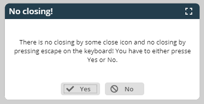
After calling, the dialog will both not show a close icon anymore and it will not react to ther user pressing escape on the keyboard (which be default closes modal dialogs).
In the workplace function search you can now update the result list. In the default workplace framework this is done by implementing the following interface:
/**
* Extension to workplace function search that allows to add/update
* the items found in the list of results.
* <br><br>
* Please extend your implementation from {@link WorkplaceDefaultFunctionSearchExtension}
* in order to stay compatible in case of interface extensions.
* <br><br>
* The class needs to be registered in the system.xml configuration file. (element "workplace"
* attribute "workplacefunctionsearchextension".
*/
public interface IWorkplaceFunctionSearchExtension
{
/**
* @param searchText
*
* @param functionTreeHits
* The hits that were found by the normal function search - searching through the
* information of the function trees.
*
* @return
*/
public List<Hit> searchWorkplaceFunctions(String searchText, List<Hit> functionTreeHits);
}
Please use class “WorkplaceDefaultFunctionSearchExtension” as base of your implementation in order to stay compatible in case of extensions of this interface.
Example implementation , in which a “Hello Hello!” item is added to the list of “normal” hits:
package demostartup;
import java.util.ArrayList;
import java.util.List;
import org.eclnt.workplace.WorkplaceDefaultFunctionSearchExtension;
import org.eclnt.workplace.WorkplaceFunctionSearchUI.Hit;
public class DemoWorkplaceFunctionSearchExtension extends WorkplaceDefaultFunctionSearchExtension
{
@Override
public List<Hit> searchWorkplaceFunctions(String searchText, List<Hit> functionTreeHits)
{
List<Hit> result = new ArrayList<Hit>(functionTreeHits);
// always add HelloWorld
{
WorkpageStartInfo wpsi = new WorkpageStartInfo();
wpsi.setPageBeanName("DemoHelloWorld");
wpsi.setText("Hello Hello!");
wpsi.setOpenMultipleInstances(true);
Hit h = new Hit();
h.setHierarchyText("Some nice text");
h.setWpsi(wpsi);
result.add(h);
}
return result;
}
}
Your class needs to be registered in system.xml:
<system>
...
<workplace
...
workplacefunctionsearchextension=
"demostartup.DemoWorkplaceFunctionSearchExtension"
...
/>
...
</system>
For these ones using the explicit page bean Components “CCWorkplaceSearch” and/or “CCWorkplaceSearchViaPopup”: there is a new IListener-method...
/**
* Called during a search. By default the list of items is found by searching
* the function tree for contained texts. But: you can take over the search
* completely on your own.
*
* @return
* null: the list of hits is produced in the default way. Otherwise: the list
* of hits to display.
*/
public List<Hit> reactOnSearch(String searchText);
...by which you can take over the search completely on your own.
When explicitly reloading the client content (HttpSessionAcces.reloadClient()) then popup dialogs that are currently opened were re-positioned.
The PASSWORD component now indicates to the user if the CapsLock key is pressed:
The dialog showing an HTML based dialog now adapts its size to the tooltip's text content. By default it tries to keep a certain width/height-ration (default: 1.414), which can be modified in the style. You can also pass an explicit with definition as part of the tooltip data.
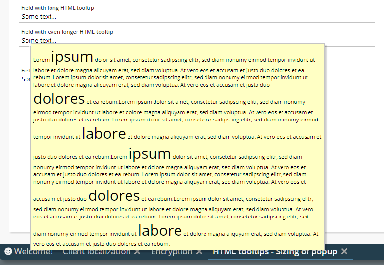
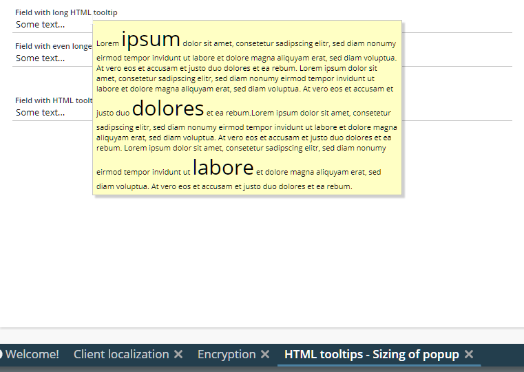
We moderately updated the styling of the default dialog for arranging grid columns, which now looks as follows:
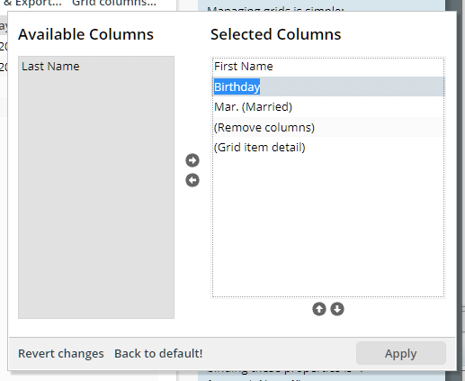
By using this method, you can create a String that converts a value into a display-String – following the format-parameters you pass:
LocalDate ld = LocalDate.of(2000,6,6);
String s =
ValueManager.convertObject2DisplayString(ld,"date",”medium”,"LOCAL",true);
We now updated the method so that it creates exactly these Strings which are also created on client side, in the client's JavaScript processing. Before the values were created by using default Java formatting.
The method is internally used in CaptainCasa e.g. when exporting grid information to PDF.
If you want to switch back to the old behavior you may do by updating system.xml in the following way:
<system>
...
<valuemanager
...
usejavaclientformatter="false"
...
/>
...
</system>
When the client talks to the server, then by default an invisible glass pane is arranged in front of the client's area, which catches all mouse/touch events. The duration that the client wait's for arranging this glass pane is now configure-able by the CLIENTCONFIG component, attribute DURATIONGLASSPANEBLOCKER. It's default is set to 250ms.
You can directly update this duration by using class “Client.java”:
Client.setDurationglasspaneblocker(Integer durationglasspaneblocker)
If an expression is a concatenated one (e.g. “Hello #{d.Xxxxx.name}!”) then the value “null” was added, if the referenced expression was resolved to null (“Hello null!”). Now an empty string is output (“Hello !”).
When the client requests style information (e.g. the .css file) then this is done by a corresponding URL which is sent to the server-side. This URL by default does not have any session reference.
By setting CLIENTCONFIG-LOADSTYLEWITHSESSIONREFERENCE to “true”, the client will add session information to the requests reading the style information.
Please pay attention:
The session information is only added when the session is established! It is NOT added for the first style that is read by the client. - This means: this feature is mainly use-able when the user changed the style within a session!
Why did we add this feature? There is a use case, in which a user-dependent style is read from the stream store, which itself has an own implementation – which reads the style from a database which depends on the current session...
When passing a date with non-”000”-milliseconds and when opening the calendar field's calendar popup, then it could happen that the client automatically “rightsized” the milliseconds to “000”. The same happened when pressing “OK” in the calendar popup without having changed the date.
We now fixed the issue and only make “OK” enabled when the user really did some change within the calendar popup.
When it comes to controlling if a page of an application can be embedded as IFRAME into other pages then so far you could only control on whole application level. Now you can control on page level in system.xml. Example:
<system>
...
<riscstarter
...
embedableasiframe="sameorigin"
...>
...
<allowiframeembedding page="/workplace/demohelloworld.jsp"/>
<allowiframeembedding page="/aaa/bbb.jsp"/>
...
<riscstarter/>
...
</system>
In the example all pages can only be included based on same-origin-policy – but the two pages that are explicitly mentioned can be embedded in any case.
In the FIELD-INPUTMASK you may define a pattern like “____:____”. There were problems if a non-”_” character occurred twice, e.g. “____::____”.
In case of inheriting one style from another it could happen that in the area of “control variants” definitions were not correctly taken over.
Example:
Style: styleA
Control: t:button
Variant: default => extends parent tag
Attributes: -
Variant: special => extends default
Attribtues: border “#000000”
Style: styleB extends styleA
Variant: default => extends parent tag
Attributes: background “#FF0000”
Variant: special => extends parent
Attribtues: -
If using “styleB” and variant “special”, then the background-definition of the “default” definition of “styleB” was not taken over – but the “default” variant of “styleA” was referenced.
...if the style variant was defined as part of a IComponentAdapter-implementation.
If for a certain attribute there was a style definition and an adapter binding definition, then the style definition was selected – which was wrong! Now the adapter binding definition is selected.
By defining a FORMATMASK “decmax3”, a decimal number will be output with three digits behind the decimal separator maximum. If the number does not have 3 digits then there is no filling with “0” at the end. - This mechanism did only work with US-localization.
When the client cannot reach the server because of communication problems then it retries. It could happen that during such retry the client was reload from the beginning (e.g. resulting in an application to be reset to the first screen) – instead of staying at the current navigation step.s
The feature “db_autotrim” so far could be configured by using property files (ccee_config.properties). Now it also can be set by implement interface IDBConnectionProvider_autotrim (which is an extension of IDBConnectionProvider).
When using the feature POPUPMENULOADTRIP then the server can dynamically assemble a popup menu on right mouse click which is then shown after the processing of the corresponding round trip. This happens when releasing the right mouse button.
In some scenarios there is a first round trip is started when the right mouse key is pressed (i.e. on mouse down), e.g. when using focus sensitive areas (the focus is moved on mouse-down activities). Now it could happen that the showing of the popup menu happened with the response processing of the first round trip – not with the one of the second round trip (which actually belongs to the popup menu processing). Result: no popup was shown or some outdated popup menu was shown.
When using adapter binding with FIXGRID and when setting the attribute STYLEVARIANT by using the adapter binding, then this was not recognized.
If a popup dialog contained a component that immediately caused the dialog to communicate back to the server (e.g. TIMER, CALLSERVERONTRIGGER, component with focus-sensitivity) and if this communication happened at a point of time when the size of the popup still was animated, then the current animation size was transferred as the current size of the popup dialog to the server side. As result, the server returned a wrong size to the popup dialog, causing this one to resize.
Result: the popup opened up and immediately was resized.
We updated the behavior of the virtual touch keyboard (FIELD-TOUCHSUPPORT=”true”) for touch devices. Before the field was internally set to disabled (in order to avoid the original OS-keyboard to show up), now we use the HTML attribute “inputtype” and set to “none”. This means:
The cursor position of where the current input is executed is visible.
The cursor position can be set by user-touch
It sometimes happened that the cursor jumped to the beginning of the field component – which is now avoided.
Up to now the format of links that you placed into the component need to exactly follow the format “<a href='....'>...</a>”. Any further e.g. style definition was not handled properly. Now the parsing of the link is more sophisticated and you can define any additional attribute (e.g. “<a href='...' style='...'>...</a>”).
You now define the COMBOBOX as follows:
Set COMBOBOX-WITHVALUECOMMENT to “false”
Pass value comments in the list of items (ValidValuesBinding)
The result: the value comments are not directly rendered but are shown as tooltip for the COMBOBOX items.
It was not possible up to now to use the concept of adapter binding for the attribute STYLEVARIANT. Not it is possible.
The conversion of boolean values “true” and “false” within the LABEL component can now be customized by the CLIENTCONFIG component – using the new attributes “truestring” and “falsestring”.
There is a default CLIENTCONFIG component which is automatically sent to the client, which refers to the definition in the class “Client” - and the corresponding properties “truestring” and “falsestring”. By default the values are taken from the configuration file “system.xml” with the corresponding definitions in the “valuemanager” section.
<!--
*************************************************************************
Value manager.
truestring - the string value that represents a boolean "true"
falsestring - the string value that represents a boolean "false"
truestringexport - the string value that represents a boolean "true" during
PDF/Excel-export
falsestringexport - the string value that represents a boolean "false" during
PDF/Excel-export
*************************************************************************
-->
<!--
<valuemanager
truestring="✔"
falsestring="✖"
truestringexport="[X]"
falsestringexport=""
/>
-->
The system.xml configuration already did exist, but only was used for server-side conversions of boolean values into String-representations. Now it is also used to influence the client side processing.
You can trigger the hot deployment by updating a file “eclnthotdeploy/.cctrigger” in the deployed system. By changing the content CaptainCasa will find out for new sessions that the hot deployment classloader needs to be restarted. - This mechanism did not correctly work when restarting the hot deployment directly after starting the whole web application – without any user-session in between.
CaptainCasa provides the capability to open virtual keyboards either as dialogs that are opened on top of the control (e.g. FIELD) or as stable keyboard within some area of the screen. When clicking/touching a long time onto a button of this keyboard then the focus of the currently focused component was moved into another component.
When removing the “FileUploadServlet” items from web.xml in the phase of cleaning up the content of web.xml, then the automatic configuration of CaptainCasa via servlet-API was automatically adding the SecurityFilter (preventing session-id high-jacking) for file uploads as well (URL-extension “.ccupload”). This is fine for the RISC-HTML-client because here corresponding security information is sent from the client side – but not fine for the Swing-Client, which is not sending this information. As consequence we updated the SecurityFilter to not search for corresponding content of uploads in case the request is coming from a Swing client.
The WEBSOCKETPOLLING component tries to set up a corresponding connection to the server side in order to receive server-side notifications. If the component fails to do so then it used to try to re-establish a connection after one second.
Typically this is not a problem if the WEBSOCKETPOLLING component is “actively used”. But in scenarios in which the WEBSOCKETPOLLING component only provides some optional function and in which the network configuration of the environment does not allow web socket connections at all this leads to some massive number of attempts to build-up we socket connections. - Imaging 100 clients to send one web socket connection attempt per second...
We now changes the timing of trying to re-establish the connection so that the duration between the attempts is increase with every failed attempt – and so that there is a stop after 10 failed attempts.
This improvement is especially important because the CaptainCasa client from being of 2021 on automatically builds up one web socket connection for receiving so called blocker-info-messages (please check update Update 20201221 for more information). So far you had to switch off this optional functionality in order to prevent stress scenarios in case of failing web socket connections. Now there is no trouble situation anymore.
(By the way: the same, updated behavior is available with the LONGPOLLING component which does internally opens up a classical http-connection.)
In the workplace certain work page container areas are managed, each one typically having one work page selector area below (or on top):

You now can create the selection are completely on your own by implementing a page bean implementing a new interface “IWorkpageSelector” and by registering this page bean in system.xml. Example:
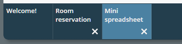
Please check the Developer's Guide, chapter “Developing an own work page selector” for detailed information.
When using virtual touch keyboards then long touch events were interpreted as popup menu requests – causing the focus to move from the touch keyboard input area into the popup menu. Now, there is no popup-menu shown on top of touch keyboards anymore.
In the demo workplace the pretty-printed layout definitions (tab “Layout XML”) contained xml elements always containing a blank space at their end. E.g.:
<f:view >
<h:form >
...
<t:coldistance width=”10” >
When copying and pasting this XML, then you may have stumbled upon the fact that the parsing for content of the layout editor only checks for content by searching for “<f:view>” (withou blank).
We now updated the pretty printing of the layout XML so that the unnecessary blank spaces are suppressed...
Browsers have added a not-yet standardized and sometimes strange way to support the user when keying in fields: they try to keep certain values and offer the user to auto-fill during input. Everyone knows this from user/password-fields with some password-manager being involved – but this also applies for other fields...
CaptainCasa in general tries to switch this behavior off (exception: password fields) and/or to control this behavior by setting corresponding attributes with the HTML-input component. There is a an attribute FIELD-BROWSERAUTOFILL that you can use for fine-controlling the behavior – but due to the missing standardization in this area, we cannot really guarantee that reaction is as you expect. (There are many corresponding discussions e.g. in “stack overflow” on this.
What we now added as attempt to react on certain scenarios...: a global switch to tell CaptainCasa that CaptainCasa by default does “nothing!”. This means: we leave the input-elements of the page (that are internally used for FIELD, PASSWORD, ...) as they are without pre-configuring them in a certain way. To do so CLIENTCONFIG has a new attribute “inputusedefaultbrowserautofill”.
<t:clientconfig ... inputusedefaultbrowserautofill=”true” .../>
The value “true” means: use the default (i.e. CaptainCasa does NOT pre-configure), the value “false” means: CaptainCasa does pre-configure. The default value is “false”.
Thanks for first feed back on last week's introduction of multi-screen workplace. We now extended it in the following way:
The “dependent” workplace that is started from some “first” workplace receives a certain name under which it is addressed (e.g. “DETAIL”). From the “dependent” workplace you now can talk to the “first” workplace using the name “ccstarter” (please use constant “MultiWorkplaceConnector.CCSTARTER”!)
The workplace eventing was enhanced so that it is now possible to send workplace events across workplace instances which are started from one another. As result the workplace that is e.g. started in the second screen can talk back to functions of the first screen. Typical scenario: the “first” screen contains a list of items, the “second” screen is showing/editing some item detail. Once saving the item on the second screen, then the list on the first screen should refresh accordingly.
Splitting up functions on multiple browser instances – so that you can position one on your “first” screen and one on your “second” screen: there are bundle of new APIs to do so. For these ones who are interested: we now provide rather technical demos... The more marketing-related demos will follow after.
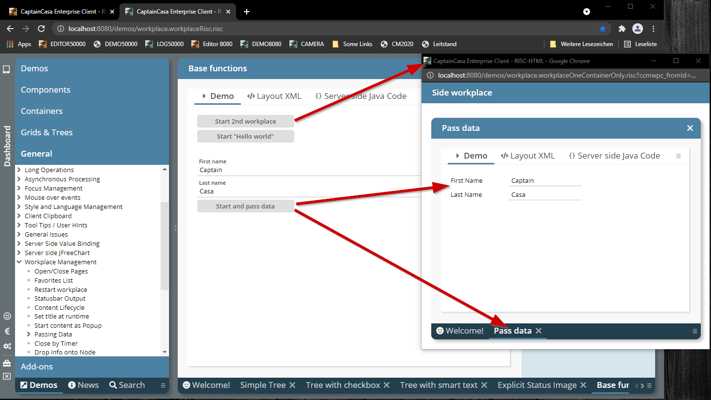
The basics behind are documented in the Developer's Guide (chapter “Workplace Framework => Multi-screen workplaces”).
The API is very simple and basically is a smart extension of the existing Workplace API.
The method “getGrid” was returning a FIXGRIDListBinding-instance but now returns a more generic FIXGRIDBinding-instance. As result you can also use FIXGRIDTREEBinding and other extensions.
If passing an object to be inserted into the database, then we now pass back the actually generated key for columns with the “autoIncrement”-annotation.
PLEASE: check the log output of your system – reading the generated value as part of the inset-operation is not really standardized on JDBC-level. In case of errors we continue with the processing without updating the corresponding object property – but with doing quite some log output...
When using polling (LONGPOLLING, WEBSOCKETPOLLING) then the corresponding connection is always used when calling a corresponding “wakeup”-method.
We already introduced a “keepAlive” method which allows you to use the connection without sending meaningful data – in order to prevent network timeouts between the browser and your server.
Now we introduced some default mechanism to automatically call the “keepAlive” method internally so that you do not have to do this on your own. The “LongPollingMgr” internally starts an observation thread that checks all long polling connections for the timestamp of their last usage. If the duration of not being used exceeds a defined number of seconds, then the “keepAlive” method will be called for the corresponding long polling connection.
You invoke this default function by system.xml. Example:
<system>
...
<longpolling keepaliveduration="180"/>
...
</system>
In this case connections that are not used for 180 seconds are receiving a “keepAlive”.
The automated “keelAlive” function is only activated if having added the configuration and if having assigned a value higher than “0”.
The BROWSER component embeds one page via its URL into a CaptainCasa dialog by internally using the an HTML-IFRAME-element.
You now can talk to the contained page by sending messages and by receiving messages. The messages are sent by Browser-message-events (JavaScript: “window.postMessage(...)”.
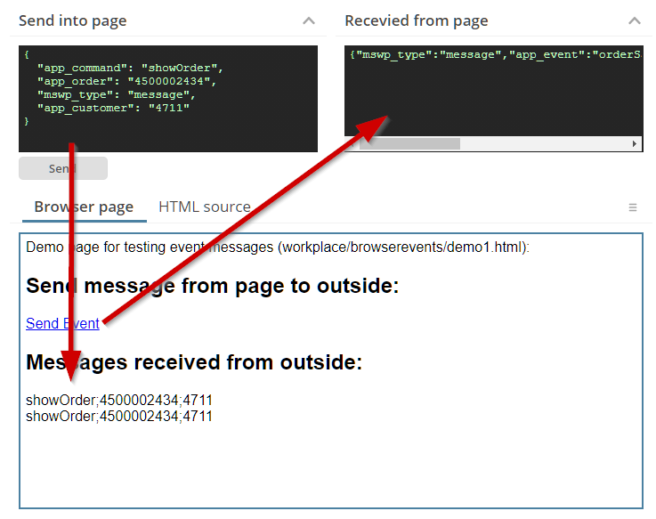
Please check the example in the demo workplace (“News” section).
You can define (via CLIENTCONFIG) that there is always a popup menu available showing the current hotkeys and showing an option to copy the text of the current component to the clipboard. This popup menu did not show up anymore, or more precise: the menu items were only shown in 20210802 if there was a surrounding popup menu anyway.
Up to now you had to take care about not sending too many callback messages one after the next from some processing inside an include HTML page. Now you can fire callback messages “without limitations”... The messages are properly queued on client side and then communicated to the server message by message.
So far a POPUPMENULAODROUNDTRIP was only recognized if defined on the lowest level of cascaded popup menus. Now the attribute is recognized for the whole chain of menus.
The hotkey information is directly shown now inside the menu item – before it was only available as tooltip.
Popup menus are now able to cascade. This means: by default this popup menu shown which is defined on the lowest component level for which a popup menu is defined:
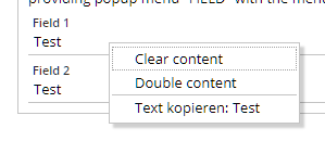
By defining POPUPMENU-CASCADEPARENTMENU as “true” the popup menu will also include the popup menu assignment that is defined on top of the component:
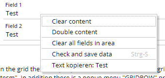
This is especially useful in grids, where the item menu now can always include the complete grid menu – without any extra coding required:
Please check the demo in the demo workplace, section “News”.
The quick navigation buttons in the SPLITPANE did not work properly anymore.
For both components you can now set the size of the buttons by style definition.
Currently we deliver the ESAPI library of version 2.1. When upgrading on your side to some newer library (e.g. 2.3) then you will experience some incompatibility in the library: the configuration of ESAP needs to be adapted.
CaptainCasa now comes with two configurations (package “/esapi/v21” and package “/esapi/v23”) and selects the right configuration path dependent from the version.
In addition you now can configure the ESAPI-resource-directory via system.xml:
<!--
**************************************************************************
ESAPI configuration
By default the configuration is loaded from the resource esapi/ESAPI.properties
file. You can override so that ESAPI uses some different file direactory
to look for resources.
**************************************************************************
-->
<!--
<esapi resourcedirectory="...file path..."/>
→
As path you either can define an absolute file path or you can define a resource path for class loading.
In the Style Editor there was some bug when extending a default-style-variant of a component: in this case all existing attributes were immediately treated as self-defined attributed – not only the ones that you actually update.
If the LONGPOLLING was part of a workpage and if this workpage was hidden by the user and then again shown, then it could happen that the LONGPOLLING did stop.
(Just to make sure: the bug did NOT occur with WEBSOCKETPOLLING.)
The automatically generated popup menu item for copying the text of the current component into the clipboard now better checks when to convert HTML text into plain text. E.g. text is transferred into plain text within a TEXTPANE component that is rendering HTML text.
We now provide pre-configured installation packages for Windows on our download page.
When implementing dynamic download or upload processing then you typically use one of these APIs in order to provide a corresponding URL. In each of the managers you register content (e.g. “BufferedContentMgr.add(...)”), which you also have to de-register, if not required anymore.
If content is not explicitly de-registered then so far the content was automatically removed at the end of an http-session. When using Cookies for session-tracking then the duration of an http-session may be quite long, because it may span multiple browser tabs. - So we now remove the content at the end of a dialog session, which represents one browser instance.
When adding the Apache POI libraries to the server runtime, then there is an export function available, that transfers the data of a grid into an xlsx-file.
For grids with grouped columns the grouping so far was not transferred – now the corresponding column header are transferred into merged cells of the Excel-sheet.
When hitting some key on the keyboard, then the COMBOBOX will jump to a corresponding item starting with the key. When hitting the key a second time then the COMBOBOX now will jump to the next items starting with the key.
We now provide default style variants to use blur effects:
The style variants are:
PANE: “ccblur”
ROWBODYPANE: “ccblur”
And there is a new style class for the background of popup dialogs: “riscdialog_popup_blur”.
The corresponding style classes are part of riscstyle.xml. The definitions is quite simple – the following XML shows the definition for the style class of PANE-”ccblur”:
<var n="@blurStyle@" v="blur(5px)"/>
<var n="@blurBackground@" v="rgba(0,0,0,0.2)"/>
<class n="riscflextable_blur">
<risc n="background" v="@blurBackground@"/>
<style n="backdrop-filter" v="@blurStyle@"/>
<style n="background" v="@blurBackground@"/>
</class>
You see that CSS backdrop-filters are used together with some shading color.
Please note: backdrop-filters are not yet supported with Firefox – so it is always a good idea to combine them with transparent color definitions, so that there is some at least similar effect with Firefox.
CaptainCasa now is available for Jakarta EE 9 – the successor of Java EE (formerly known as J2EE). These ones of you who followed the debates a year ago know that Jakarta EE 9 comes with a dramatic change and incompatibility: core package names of the Enterprise Edition have change from “javax.*” to “jakarta.*”. In the CaptainCasa environment these are the packages:
javax.servlet => servlet processing
javax.xml.bind => JAXB
javax.faces => Java Server Faces
javax.el => Expression language
We start providing the beta-version of our Jakarta EE 9 version by having additional Maven artifacts:
org.eclnt.eclntjsfserverRISC_jakarta => elcntjsfserver.jar”
org.eclnt.eclntpbc_jakarta => page bean component addons
org.eclnt.eclntccee_jakarta => server utilities
We took the change and from Jakarta EE 9 on only use our own mini-JSF implementation anymore – and are as consequence now independent from the default Jakarta Server faces.
What does this mean for you?
When transferring your code to Jakarta EE 9 then you have to do the following replacements within your code:
javax.servlet => jakarta.servlet
javax.xml.bind => Jakarta.xml.bind
javax.el => jakarta.el
javax.faces => org.eclnt.jsfserver.base.faces
And: you will soon experience that this replacement needs also to be done within your libraries that you use. And this means: you need to use the newest versions of the libraries, the ones that are implemented to run with Jakarta EE.
All this is some hell of effort – unfortunately. The change to Jakarta EE 9 is something which is really demanding. Please setup contact to us in case of transferring to Jakarta EE 9.
The COLLINE did not provide attribute STYLEVARIANT yet.
Both components now provide the attribute STYLESEQ to explicitly define a background styling. There are two corresponding default styles “risccolline” and “riscrowline”. The default styles are empty (transparent).
We now check the runtime when starting if two different versions of CaptainCasa are active. This might happen if you have two eclntjsfserver*.jar files within your WEB-INF/lib runtime directory.
In case of finding two versions corresponding error is thrown and detailed information is logged in the CaptainCasa server log.
This attribute was missing on TABBEDPANE level – it did exist for TABBEDLINE and TABBEDLINECONTAINER...
The eclntpbc-artifact of the last version did not contain the .class files, but the .java files...
Up to now the demos and the API documentation for CaptainCasa components were located at different locations – the demo workplace on the one hand and the tools on the other. In addition the demo workplace was missing a “by-component-index”.
Now there is a central place to go – the “Component Reference”: you can start it both from the demo workplace...
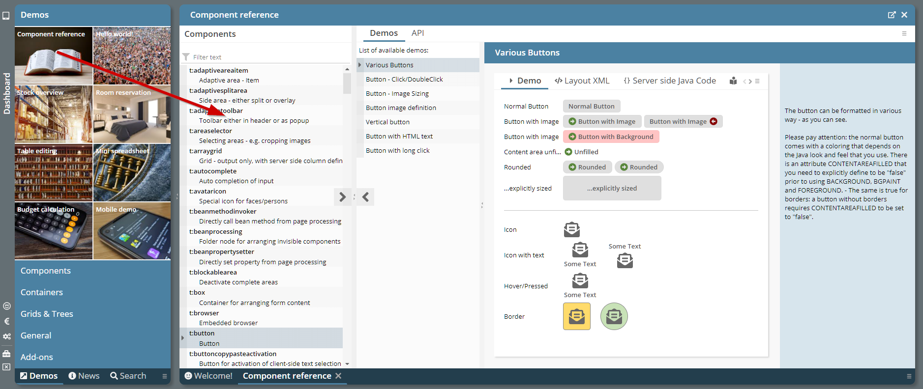
...and from various locations within the tools...
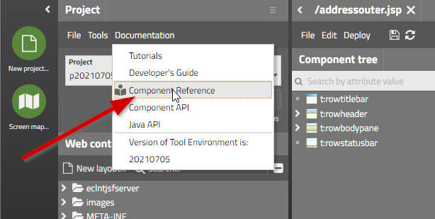
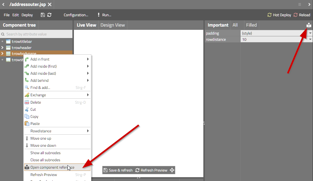
The “Component Reference” is shwoing the list of components on the left. When selecting a component then the available demos of the demo workplace are listed and invoked on the right side – and you may open the component API documentation as well.
In a TABBEDPANE you can controls by attribute VALUE which tab is currently shown to the user. When adding/removing items then the value was not respected anymore but “any” item was shown.
The method was not working anymore when using function “COUNT” and column name “*”.
By calling “Modal/ModelessPopup.setWidthHeightToSizeOfReference()” you can define that the width/height of a dialog popup is taken from some are of the screen. This function was not working anymore.
From this update on pages returned by a .risc-URL are returned with http-header parameter “X-Frame-Options” being set to “sameorigin” by default.
This means: .risc-pages are embed-able within an IFRAME by another page, if the embedding page resides in the same domain as the .risc-page. They are NOT embed-able if the other page originates from some different domain.
Background: there is the security risk that someone places a valid page inside an IFRAME of another page, and overlays own invisible components on top of the embedded page. The user may have the impression to e.g. input some password into the embedded page – but actually is doing the input into the page that is layered on top.
You can explicitly control the iframe-policy within system.xml:
<system>
...
...
<!--
*************************************************************************
Configuration of RISCStarter - the servlet that is responding on .risc
request.
...
...
embedableasiframe: default "sameorigin"; completely switch off by value
"deny" or "false"; allow embedding by value "true".
...
...
*************************************************************************
-->
<riscstarter
...
embedableasiframe="sameorigin"
...
/>
...
...
</system>
Up to now pages that were opened in the editor were opened with a query parameter “cc_preview=true”, which notifies the server processing of the application that it is called in the preview mode of the layout editor.
In order to better protect your application for not being called in preview-mode by outside-the-editor URLs, we added some more checks. In particular the editor always calls the page within the context of a generated page (“zz_cceditoraround.jsp”) - which is only generated into the application when the application is running inside the layout editor – and which is not part of your project files.
If this check finds out that the “cc_preview=true” parameter was set without being called from the editor, then the page will return with some error screen.
Up to now you had to make sure that the directory for logging CaptainCasa's log messages really did exist. Now it is created automatically.
When using download components (FILEDOWNLOAD*) then you can set attribute WITHCALLBACK to “true”: in this case you receive a notification that the client really started the download.
This notification now is sent with some delay (1.000 ms) because it sometimes was arriving at server side before the actual download URL was opened.
The default Excel Export (FIXGRIDExcelExporter) was internally restructured and now allows many more defined exit points for applying modifications.
You now can define your own PDF/Excel-Exportere in system.xml – and do not have to override the exporter instances directly in the grid instance.
The configuration is:
<system>
...
<fixgrid
...
...
pdfexport="org.eclnt.jsfserver.elements.util.FIXGRIDPDFExporter"
excelexport="org.eclnt.jsfserver.elements.util.FIXGRIDExcelExporter"
...
...
/>
...
</system>
Still you can directly set the instances by calling:
FIXGRIDList/TreeBinding.setPDFExporter(...)
FIXGRIDList/TreeBinding.setExcelExporter(...)
There is a new attribute SIZETOCONTENTINPOPUP which is available for SCROLLPANE and ROWBODYPANE (which internally contains some SCROLLPANE). If the attribute is set to “true” then the minimum size of the SCROLLPANE will be calculated by the minimum size of its contained content, when being positioned inside a popup dialog.
This makes it much easier to use SCROLLPANEs inside a popup dialog together with automatic sizing. Please check the demo in the “News” section of the demo workplace:
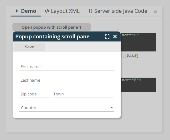
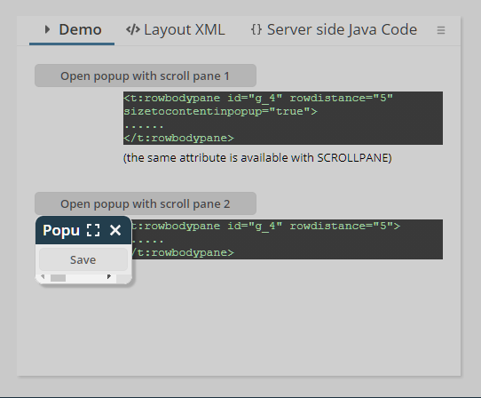
So far you could only open up new browser pages as browser tab. Now you can explicitly open pages within a new browser instance. Please either pass “popup” as JSHOWURL-TARGET and/or pass a corresponding definition into the JSHOWURL-WINDOWFEATURES attribute.
There is a demo “General => Client integration => Start Browser” inside the demo workplace.
When passing an explicit selector title for a workpage using “WorkpageStartInfo”, then this selector title was not taken over.
This bug only occurred for popup menus which were loaded by some explicit round trip (attribute POPUPMENULOAD=”true” on the corresponding eleement).
The Layout Editor now contains a new function – the observation of expressions at runtime:
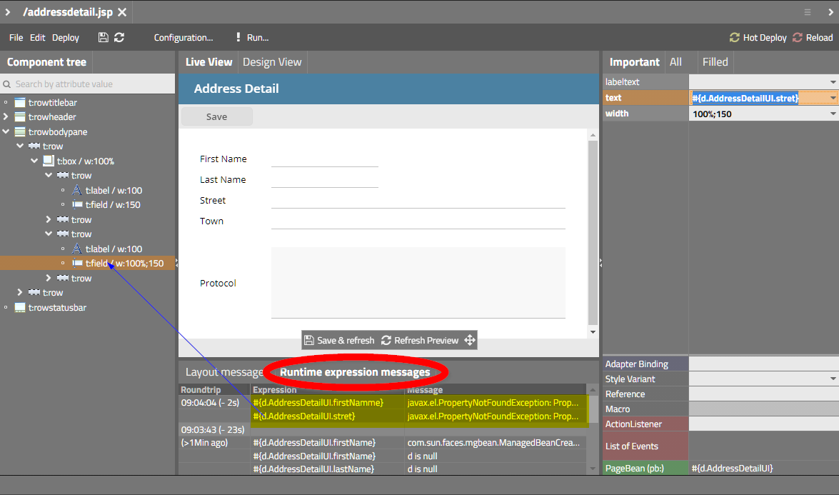
When opening a page in preview mode then a special expression monitoring is activated. Any time some expression cannot be resolved properly a corresponding log message is recorded. In the Layout Editor you see the recorded messages per request for the last round trips.
In the concrete example of the screenshot you see that two expression could not be resolved. By double clicking onto the expression details are shown in a popup...
...and the component that uses the expression is searched and highlighted in the tree of components on the left.
The monitoring both observes expressions for getting/setting properties and expressions for invoking methods.
In the runtime system the expressions are written into some special logs, which are located in the work directory that is defined per application by the servlet engine. In Tomcat this is “tomcar/work/Catalina/localhost/<nameOfApp>”. Inside there is a new director “log_devlog”. The logged data is automatically truncated when getting too large.
The SCROLLPANE now is able to send events to the server-side processing when reaching/leaving its top and/or its bottom position.
Concrete use case 1: when scrolling down, some header area should be shrinked to some minimum.
Concrete use case 2: when reaching the end of scrolled content, then additional data should be loaded.
Please check the example in the demo workplace (“News”-section).
For special tasks you can tell the client with certain components (e.g. FIELD) that the client processing should not be blocked when a round trip to the server is triggered. This “non-blocking” needs to be handled with greatest care because it potentially can break the consistency of data between client and server processing.
You now can define with popups that the request for closing the popup does not block the client. Use API:
ModalPopup.setSkipBlockingOnClose(true/false)
ModelessPopup.setSkipBlockingOnClose(true/false)
Concrete use case: then define a COMBOFIELD that serves as auto-completing field, then the request to close the popup (which is triggered when continuing to key in data) may be executed without blocking the client, so that the user input is not “disturbed” by the round trip processing.
There was a bug introduced with update 20210503: if a FIXGRID is using the default persistence management then when showing up, all columns are shown in the grid – also these ones which the user decided to not see. The sequence of the columns was correct, but the non-visible columns were appended at the end of the columns.
The page bean component was extended and now allows a many more configuration options. Including the definition if selected items should be sorted to the top of the list.
The content based animations of the CAPTUREANIMATOR are now based on CSS-transformations – making them more fluent and faster.
There are a couple new features within the AREASELECTOR components:
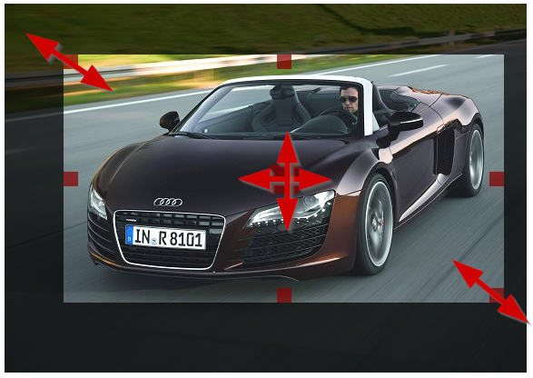
The features are:
Possibility to move the selected are by providing a corresponding move area in the middle of the component
Possibility to resized the area keeping the ratio of the s elected area
Possibility to individually define which resizing / moving areas are available
Possibility to define a pre-defined ratio for the selected area
Two issues:
You now can define an explicit interface IConnectionPasswordProvider for passing back the password when building up a database connection. In this case the password is not part of the configuration files (e.g. ccee_config.properties) but can be derived by your code from any other location.
Please pay attention: after importing the updated ccee-library into your project you need to make sure that your project classes are re-compiled. In case of being not sure, if your development environment really performed a recompile, use “clean project” to enforce the recompilation.
You now can define via attribute “withcallbackonfinishedrendering” that the component triggers an action on server side once it is really rendered.
Background: the components are running in some own processing (using 3rd party frameworks). Some of you want to make screenshots of the graphics automatically – and were faced with the problem, that the screen shots were done at an too early point of time.
When setting “withcallbackonfinishedrendering” to “true” then an action event of type “BaseActionEventFinishedRendering” is thrown on server side.
Maybe some not really important change, but a visible one: we fell in love with a certain font of Google (“Titillium Web”) and changed the editor to use this font. (Actually, we “stole” this font from one customer project where we saw it the first time...)
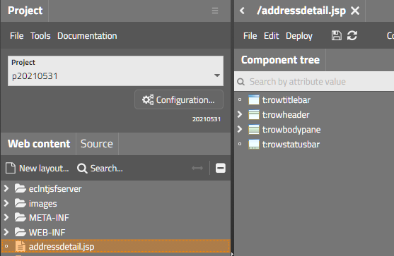
This is something internal, but may be interesting for you:
It is not really simple in the browser client processing to calculate the vertical size a certain text requires as height... Well, basically you create the text with a certain size (“e.g. 20px”) in a e.g. DIV, then ask the height of the DIV and then you know the factor between “20px” and the actual height, which you can re-use for fast calculation afterwards. - Now the “but”s: if you do this calculation right after starting the client, then the font might not be loaded – so the browser does not respond the height of the font that you desire, but the one of a replacement-font... Yes, there is a font-loader-API in JavaScript, but this is not supported by MS Internet Explorer (which we support from IE 10 on...).
As consequence the “font factor calculation” was done in the past by having predefined font factors for each font family. CaptainCasa did a proper calculation and added them to the client for many commonly used fonts. Fonts, that were not included in the list were assumed to have some default factor – resulting in inaccurate font height calculation. Typical result: text (e.g. in buttons) were not correctly centered vertically.
To make the long story short: we now found a way to check the proper font loading and to calculate the “font factor” accurately within the client, so that any font that you include is correctly sized. The need of predefined “font factors” is obsolete.
When passing either height or width of a popup as “0”, then the size of the popup dialog is calculated automatically.
Up to now there was a problem, when the popup content included components which are sized in a more complex way than “normal” components. “Normal” components (e.g. LABEL, FIELD, BUTTON, nearly all CaptainCasa components...) directly know their minimum width and their minimum height. “Complex” components (e.g. TEXTPANE, adaptive components) cannot tell you about their minimum height, if the do not know their width. Imagine a TEXTPANE with some long text, which is sized to a width of “100%”: only at this point of time, when the layout management really tells the actual width, it knows how to arrange the contained text – and as consequence knows about the actual height it requires.
Dialog popups which contain “complex” components, have not been correctly automatically sized so far. You needed to pass an adequate size of the popup explicitly.
Now, the automatic sizing of popup dialogs also considers these “complex” components.
Please check the corresponding demo in the demo workplace (“News” section).
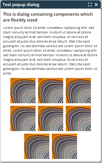
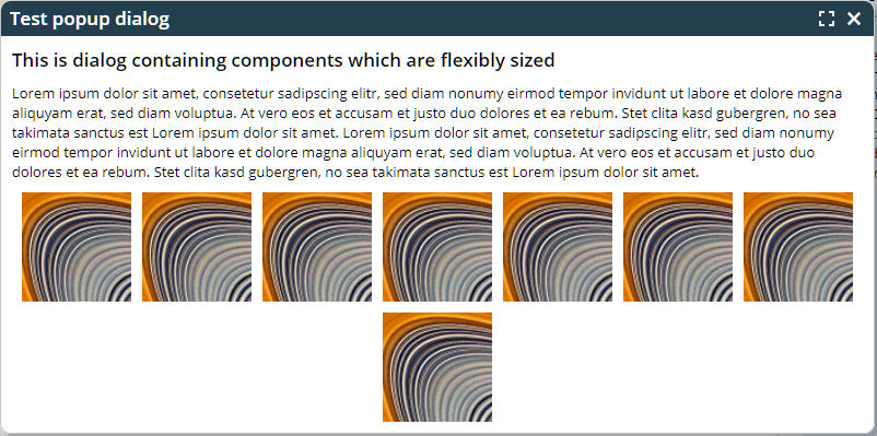
Last week we introduced the size animation for popup dialogs – and immediately you gave the feed back: “in addition to the pre-configured scenarios we want to control the size animation directly on our owns...”
You now can do so the calling Modal/ModelessPopup.setSizeAnimationtype(...).
Please check the corresponding example in the demo workplace (“News” section).
Up to now the ResourceManager (that you might directly access for reading literals) passed back some generated text if the corresponding literal was not defined.
Now there are extended interfaces with an additional parameter “withError”: if set to true, then the RersourceManager will throw some error instead of passing back some generated text.
The default focus sequence of components arranged in a GRIDLAYOUTPANE was not really perfect for certain scenarios – because it was based on the actual x/y-position of the components. Now it is based on the logical grid position.
The popup of the COMBOBOX now properly shows up on top of the component if there is no sufficient space below. And: the animation direction is inverted as well.
This is something internal: the upload of data is done through a corresponding servlet processing (“UploadContentServlet”). In order to prevent session-id-highjacking we now also applied the mechanism of an additional session security id to this servlet processing. Meaning: even if someone is able to “steel” your session-id and the upload-id, then there is no chance to get into the upload mechanism from outside, because the invisible session security id is not provided. (The security id is an extra generated id per session, that is always part of the post-data of a request. The post-data is the one which is encrypted when using https. More details are available in the Developer's Guide.)
We now use CSS transformations for animating the showing up of a popup dialog. Please check the popup demo (top of the “News”-section) within the demo workplace.
You can fine-control, which type of animation should be used with which kind of dialog – by adding corresponding definitions to the style management. Please find more information in the document “Styling Issues”.
There is some general switches in the style management when it comes to rendering a focused component: you can use additional, typically dashed line elements on top of the component (RISC value: “_focusmgmtAdditionalElements” set to “true”) and/or you can use a background color modifier (RISC value: “_focusmgmtBackgroundModifier” set to “true”).
Up to now you could only define the values on global level (style class: “riscinternal_riscglobal”). Now you can define them on any component level, so that the type of focus drawing can be individually defined.
The drag/drop was not correctly working within the last level of grouped columns.
The component that was introduced last week showed some “strange” behavior when using “<p>...</p>” in the template text: a line break was done before the first child component. - Background: HTML defines “p”-elements as “floating elements” and defines “div”-elements as “block elements”. Once a block element is added into a floating element, then the floating element automatically gets closed, which means: a “</p>” is immediately added in front of the block element.
CaptainCasa elements are DIV-elements, which are block elements – so the behavior exactly matches the HTML definition.
We no replace “p”-elements by “div”-elements. Which works fine in all our examples (including the ones that come from first users).
There was a problem if the grid column sequence of a grid was saved – and if the column's sort reference occurred twice in the grid.
The component TEXTWITHCONTROLS allows you to position CaptainCasa components inside free style HTML text. Take a look onto the following example:
There are 5 components that are arranged inside an HTML text. The way to define is:
<t:row id="g_6">
<t:textwithcontrols id="g_2" height="100%" popupmenu="TEXT"
text="<h1>Hello World!</h1><h2>Step 1</h2>Please first input your <b>first name</b> @@firstname@@ then input your <b>last name</b> @@lastname@@.<h2>Step 2</h2>Then press this button: @@hello@@.<h2>Step 3</h2>The result then is output into this label: @@result@@.<br><br>If you want to clear the content of the fields: press this button @@clear@@."
width="100%">
<t:field id="firstname" labeltext="First name"
text="#{d.DemoTextWithControls.firstName}" width="150" />
<t:field id="lastname" labeltext="Last name"
text="#{d.DemoTextWithControls.lastName}" width="150" />
<t:button id="hello"
actionListener="#{d.DemoTextWithControls.onHelloAction}"
image="/images/iconssvg/ztest_16x16.svg" text="Say Hello" />
<t:label id="result" background="#00000030" labeltext="Result"
text="#{d.DemoTextWithControls.result}" />
<t:button id="clear"
actionListener="#{d.DemoTextWithControls.onClearAction}"
text="Clear fields" />
</t:textwithcontrols>
</t:row>
You see:
The HTML text around the components is defines in TEXTWITHCONTROLS-TEXT.
For each component that is embedded into the text there is a corresponding placeholder “@@...@@”. The content of the placeholder is pointing to the id of a component that is contained inside the TEXTWITHCONTROLS instance.
At runtime the placeholders will be replaced by the corresponding component.
Please pay attention:
Typically you do not have to take care about the id of a component – now you have, because the child component is referenced within the HTML text via its id.
You must not use percentage-based sizing both for the width and for the height of the contained components.
...if the function is not supported by the underlying browser. There are e.g. iOS versions in which the functions is not supported.
The BROWSER component by default URL-encodes “strange” characters by escaping them (“%xx”). Now, if you pass a URL which already is encoded, then there is some double-encoding.
You now can switch off the URL-encoding of the component by setting BROWSER-AVOIDURLENCODING to “true”. In this case the URL is taken over into the components exactly as is.
A new page bean component was added to the “eclnt_pbc” addon-library. This allows to arrange additional elements in the title bar of a work page:
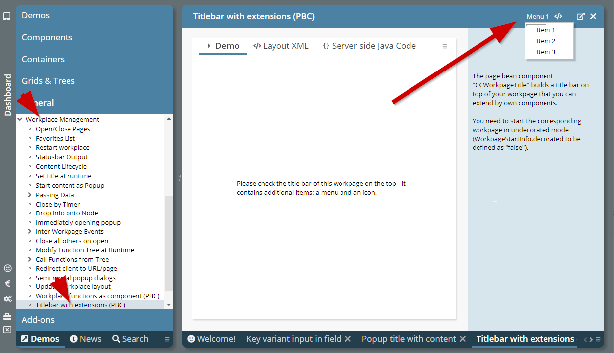
The title bar and its extensions are kept when isolating the work page as popup:
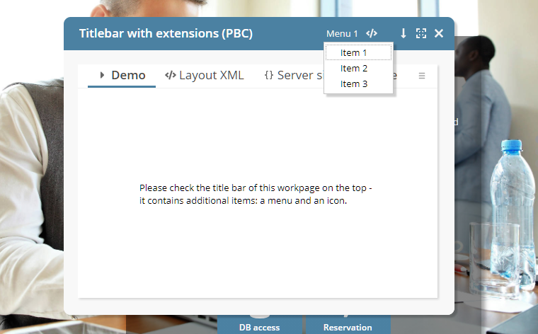
Please check the corresponding demo in the demo workplace (General => Workplace Management => Title bar with extensions”).
Up to now Page Bean Component classes could be registered to be visible in the Layout Editor by implementing interface “IPageBeanComponentInfoService” and registering a service in “META-INF/services”.
Now it's much easier: you just need to define an XML file “ccpagebeancomponentinfo.xml” in your resources:
<?xml version="1.0" encoding="UTF-8" standalone="yes"?>
<pageBeanComponents>
<pageBeanComponent
className="org.eclnt.ccaddons.pbc.CCAdaptiveSideContentArea"/>
<pageBeanComponent
className="org.eclnt.ccaddons.pbc.CCAdaptiveSideContentAreaButton"/>
<pageBeanComponent
className="org.eclnt.ccaddons.pbc.CCAttachments"/>
...
...
</pageBeanComponents>
The layout tools of CaptainCasa will scan all .jar files that are part of the project for this file and will make the corresponding page bean components available in the Layout Editor.
The cross reference did not show occurrences of global variables (“@...@”) within the attribute value definitions of style variants.
There are certain situations in which CaptainCasa requires to create a String representation of a true/false value. In system.xml you could influence this String by the definition:
<valuemanager
truestring="\u2714"
falsestring="\u2716"
/>
You now can fine-tune this definition by defining different characters that are used for export activities (e.g. PDF export):
<valuemanager
truestring="\u2714"
falsestring="\u2716"
truestringexport="[X]"
falsestringexport=""
/>
Background: if using a “nice” UTF-8 symbol-character then this may not properly rendered in the PDF that is created as result of exporting the grid to PDF.
By default you may click into the preview of the Layout Editor – and the corresponding component will be selected in the tree of components on the left. This did not work for included components (PAGEBEANCOMPONENT, ROWPAGEBEANINCLUDE, PAGEBEANINCLUDE). - Now this is supported, too.
A component references a popup menu by defining its ID-value in the attribute POPUPMENU. Example:
<t:field ... popupmenu=”FIELDPOPUP” .../>
<t:popupmenu id=”FIELDPOPUP”>
<t:menuitem .../>
<t:menuitem .../>
<t:menuitem .../>
</t:popupmenu>
You now can define a semicolon separated sequence of popup-menu-ids. The whole popup menu consists out of all contained menus, separated by a line-separator.
<t:field ... popupmenu=”FIELDPOPUP;GENERAL” .../>
<t:popupmenu id=”GENERAL”>
<t:menuitem .../>
<t:menuitem .../>
<t:menuitem .../>
</t:popupmenu>
<t:popupmenu id=”FIELDPOPUP”>
<t:menuitem .../>
<t:menuitem .../>
<t:menuitem .../>
</t:popupmenu>
This is a quite significant improvement. Example: in the grid processing you as consequence can easily combine the popup menu for the grid-item (FIXGRID-ROWPOPUPMENU) with the menu items of the whole grid (FIXGRID-POPUPMENU).
The component SYSTEMICON is able to call dedicated client system functions directly. Functions currently include:
Minimizing / maximizing of whole browser (“full screen mode”)
Minimizing / maximizing current popup dialog
Please check the corresponding demo in the demo workplace (“News” area).
The default title bar for a popup dialog provides some text, an icon to minimize/maximize the dialog and an icon to close the dialog. It is bot possible to add additional content.
We now included a new page bean component “CCPopupDialogTitle” into the ccaddons-package (eclnt_pbc.jar) that renders a title bar which looks and behaves identically to the normal title bar but which allows to place additional components inside.
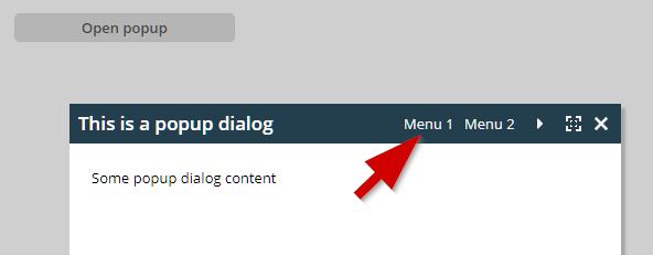
Please check the demo in the demo workplace (“News” area.
We continue step by step to integrate Page Bean Components into the Layout Editor as a “first class” type of components.
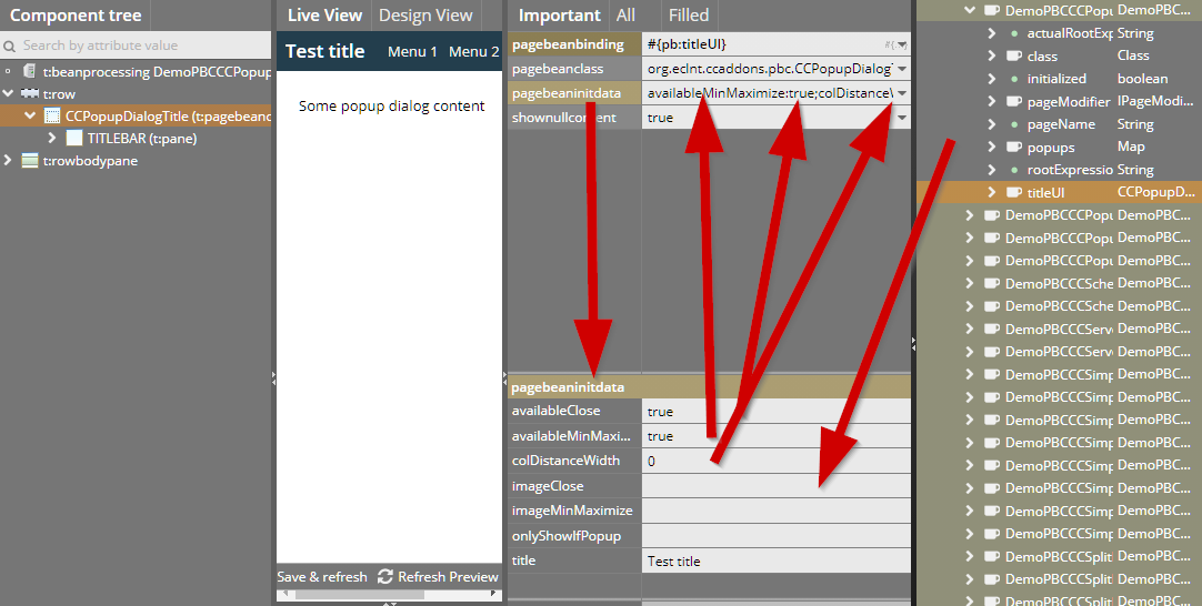
When clicking a page bean component (with assigned attribute PAGEBEANCLASS), then the attribute PAGEBEANINITDATA which holds a complex string value of type “name:value;name:value;...” is shown in a separated area, in which you can see the individual names and in which you can define the values behind.
You now can also drag/drop expressions from the right into the value area.
When defining a PERSISTID with a FIXGRID instance then there is an automated function to persist changes to the column sequence, column widths and column visibility. The function behind was improved to now much better handle situations in which a columns does not provide some own SORTREFERENCE and/or PERSISTID. - We now not only store the visible columns but also the non-visible columns, so that we can better mix in new columns which you might add to the grid during development.
This was a quite “strange” problem: in the application the value behind a RENDERED attribute did change during the render-phase of the request processing. Because components are arrange a tree, the render phase internally is separated into three steps: “renderBegin”, “renderChildren”, ”renderEnd”. If the RENDERED value (that points to some application expression) was “true” during “renderBegin” and “false” during “renderEnd”, then a problem was output as stack trace on server side.
The style class “rischeaderlabel” was improved by certain RISC-values, so that you now can influence:
The background of the sizer-area
The position of the sort icons
The font factor for “Titillium Web” was added to the default.
When changing the TIMEZONE value then the CALENDARFIELD content was not properly updated. In only did update when the concrete date value behind was changed.
When defining the height as percentage size with some minimum size in addition, then the proposed default SBVISIBLEAMOUNT value was not set to the default, that is normally used for percentage-sized grids (40).
When using the Firefox Password Manager then values that were auto-filled by the password manager into e.g. password fields sometimes were not registered.
CaptainCasa by default replaces a value in the PASSWORDFIELD by some anonymous value “as fast as possible”. This sometimes is a problem for password managers.
Some password managers check if to update their content at this point of time when the password component disappears. If then the value of a user-input in the meantime was exchanged by an anonymous value, then the anonymous value is the one that is stored in the password manager.
To prevent you can use the new attribute PASSWORD-KEEPCHANGEVALUE and set the value to “true”: in this case a user-changed password will not be anonymized, but the user user-input stays within the password component.
We so far had some built-in timer function which observed the mouse-wheel events and which accumulated several wheel events to one event (“+1”, “+1”, “+1” ==> “+3”). This function was reducing the traffic between client and server – but on the other side was not very smart from usability point of view.
We now changed and do not accumulate scrolling events anymore by timer. The only accumulation takes place when the server is busy while the user is scrolling.
Result: a much smarter scrolling experience! This is especially true when using two finger mouse-pad scrolling.
You now can add additional footer and header rows to the FIXGRIDEWITHGROUPING component.
In the CCEE persistence management you always could query database views in the same way that you query database tables. Now there is an additional flag in the “@doentity” annotation, by which you can define the class to represent a view. As consequence any attempt to start update operations are causing some error.
When having defined more than one CLIENTCOOKIE component in one page, then only the last CLIENTCOOKIE actually was active.
The SCREENGRABBER component did not follow contained IFRAME definitions, which are implicitly used when using the BROWSER, CHARTJS, OSMVIEWER and other components. Background: this feature was not available anymore after having upgraded to the newest html2canvas-version internally. We now rolled back to the previously used version.
In general we still treat the SCREENGRABBER component as a “beta-component”: expectations towards this component are high (well: you just want to do some screen shot...) and the way to get there (html2canvas-library) is complex (DOM hierarchy is rendered by Canvas-commands). It is “magic” that it works on its current quality level...! But still you will find situations in which the result will not be a 1:1 representation of the screen, so you need to test your scenario prior to using this component.
The feature to group header columns is now also available for the PDF generation – and other output formats.
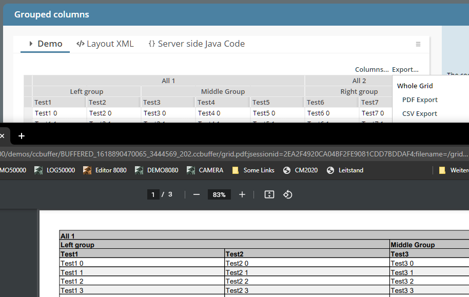
For other output formats (XML, csv, ...) grouped columns are indicated with the String “.%.”. Example:
"All 1";".%.";".%.";".%.";".%.";"All 2";".%."
"Left group";".%.";"Middle Group";".%.";".%.";"Right group";".%."
"Test1";"Test2";"Test3";"Test4";"Test5";"Test6";"Test7"
"Test1 0";"Test2 0";"Test3 0";"Test4 0";"Test5 0";"Test6 0";"Test7 0"
"Test1 1";"Test2 1";"Test3 1";"Test4 1";"Test5 1";"Test6 1";"Test7 1"
The export follows the current display of the grid: if the user has re-arranged/resized columns then the export follows correspondingly.
The CCEE-addon-library now has a new dialect definition: DIALECT_ORACLE_CASESENSITIVE.
Why? By default Oracle transfers any table and column name into uppercase characters. The statements...
SELECT * from TestTable
SELECT * from TESTTABLE
SELECT * from testtable
...all are automatically transferred into:
SELECT * from TESTTABLE
But: you may have done all table definitions with explicitly defining case sensitive names, by explicitly using the “-character. In this case you need to strictly keep the “-character also when e.g. selecting:
SELECT * from “TestTable”
When using dialog ORACLE_CASESENSITIVE then all table and column names are put into corresponding “-characters.
A Page Bean Component may define initialization parameters within its
*.config file. These parameters can be defined within the layout definition by setting the attribute PAGEBEANINITDATA. The value is a semicolon separated list: “name:value;name:value;...”.
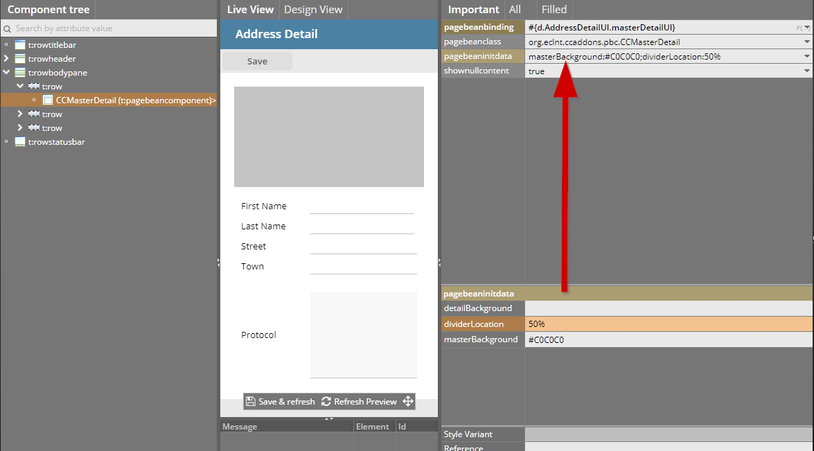
In the Layout Editor the attribute now is shown in more detail when selecting a page bean component, so that you can directly view and edit the parameters.
At runtime the parameters are passed into the method...
public void initializePageBean(Map<String, String> initData)
{
super.initializePageBean(initData);
...
...
}
When opening a popup dialog directly as first activity of starting an application then it could happen that the dialog was sometimes not correctly positioned (e.g. in the center of the screen). Background: there is a certain latency for reacting on screen size changes – if the response from the server was faster than this latency, then the base sizing was not yet done executed...
You now can define that the application that you develop directly runs using https at development point of time. There is a corresponding configuration inside the project-definition:
Default is http, of course...
In the style editor the use of variables is a fundament of defining styles in a flexible, adapt-able way. You now can select variable names directly from any field input:
The new feature that was introduced one week ago now supports the input of “strange” characters via keyboard: below each character-button there is a number – after keying in the number, the character will be added to the field text:
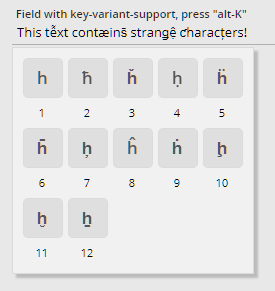
If a page bean components defines exit areas (in which the user can place own layout) then the exit areas are directly define-able via the right mouse button popup within the tree of controls:
Just to remember: inside a Page Bean (Component) you can define PARENTEXIT-areas – which allow the using dialog to place own content into the corresponding area. Each area has a certain id (EXITID) – which needs to be referenced by the using dialog.
When placing a SCALEPANE inside a SCROLLPANE then operations inside the SCALEPANE sometimes caused some “unmotivated” scrolling of the SCROLLPANE content.
The FIELD component now provides the possibility to open up a dialog popup, in which the user can select key variants:
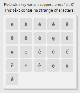
The dialog is sensitive to the character that is currently input in the field. The configuration is done by a server side XML definition that can be updated by your own definition.
The definition of the Cookie-settings for the client-id were updated. You now may define in system.xml:
<system>
...
<clientidmanagement
...
cookiesecure="auto"
...
/>
...
</system>
In this case the secure flag will be set to “true” if running in an https-environment. And it will be set to “false” otherwise.
The facade-class HttpSessionAccess was extended as part of this development and now provides the following method:
HttpSessionAccess.checkIfCurrentSessionWasStartedByHttps();
The expiration time for the Cookie was calculated in a wrong way, so that the Cookie typically expired after some days. Now the default expiration time is calculated correctly as 10.000 days.
Every time a request from the client is processed on serve side, a ThreadData instance is attached to the thread processing the request. This ThreadData instance now provides a new method:
public String getCurrentlyProcessedExpression() {...}
This method return the expression that is currently “executed” by the CC-environment when setting, getting properties or when invoking methods.
The passing of expressions into the ThreadData instance needs to be explicitly switched on in the system.xml configuration file:
<system>
...
<threadcontext storecurrentexpression="true"/>
...
</system>
There is a minimal performance overhead for passing the expressions (one map-get per expression).
Tabbing through the radio button items of a RADIOBUTTONGROUP was not possible...
When dynamically assigning a value to both of the attributes via expressions, then a null-value was not transferred, once a non-null value was passed.
By setting the new attribute you can avoid the rendering of the header line. This may be useful in situations in which only one tab is left and you do not want to show the headline tab area for this tab.
We are just working on improvements in the area of page bean components. Some longer description will follow on short term. Short info on issues contained in this update:
In the editor you now can reach the PageBeanComponent-components directly via right mouse button:
Components may now have conifguration sub-items. Example:
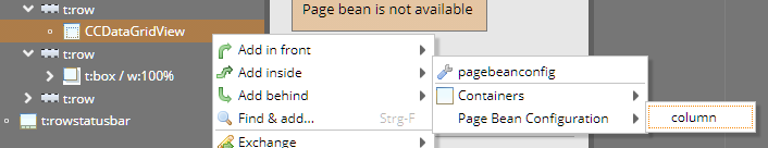
The page bean component may implement the correponding initialization method:
@Override
public void initializePageBean(Map<String, String> initData)
{
super.initializePageBean(initData);
...
}
@Override
public void initializePageBeanConfigItems(List<PageBeanConfigItem> configItems)
{
super.initializePageBeanConfigItems(configItems);
for (PageBeanConfigItem ci: configItems)
{
...
}
}
This configuration items are reflected in the component's configuration file:
<?xml version="1.0" encoding="UTF-8" standalone="yes"?>
<pageBeanConfig>
<columnComponent>true</columnComponent>
<paramClass>org.eclnt.ccaddons.pbc.util.datagridview.Configuration</paramClass>
<subItem>
<configtype>column</configtype>
<paramClass>org.eclnt.ccaddons.pbc.util.datagridview.ConfigurationColumn</paramClass>
</subItem>
</pageBeanConfig>
In the configuration file you now can reference Java classes that hold the configuration both on whole component level and on sub-item level.
When positioning a SCALEPANE within a SCROLLPANE then by default the scroll position changes when updating the scale. You now can define the SCALEPANE to be re-positioned within the SCROLLPANE after scale operations, so that the center of the visible area is kept stable.
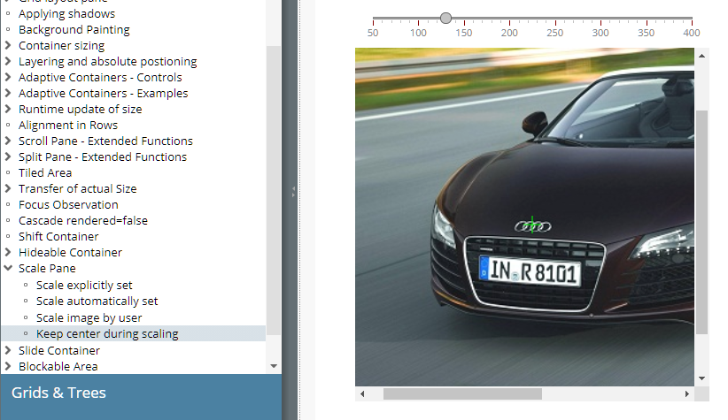
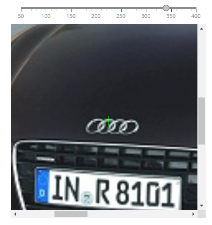
Up to now the attribute LABELTEXT was only available for FIELD* components. Now it is available for a couple of additional components, too:
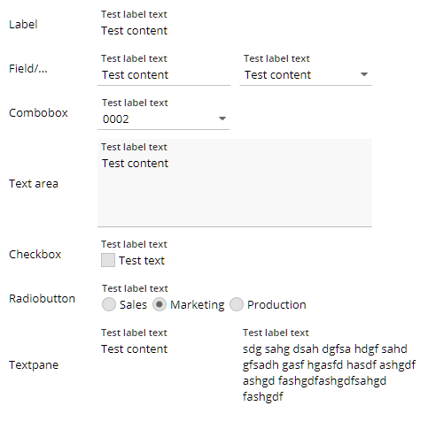
So far, each RADIOBUTTON was an individual component – several RADIOBUTTON instances were “linked” by defining a GROUP-value which was shared.
Now there is an addition a component RADIOBUTTONGROUPD which is based on the normal RADIOBUTTON, of course. The component receives valid values (same as COMBOBOX) and renders one RADIOBUTTON per value.
The CODEEDITOR component is internally based on the ACE-editor (https://github.com/ajaxorg/ace). The ACE-editor provides a couple of properties, directly on editor-level and on editor-session level. You now can define how to set these parameter by using the attribute EDITORPARAMS.
Example: by setting EDITORPARAMS to...
session/useWrapMode:true;theme:ace-builds-master/theme/tomorrow_night.css
...you define, that:
in the client processing the function “editor.getSession().setUseWrapMode(“true”)” is called
and the function “editor.setTheme(“ace-builds-master/theme/tomorrow_night.css”)” is called
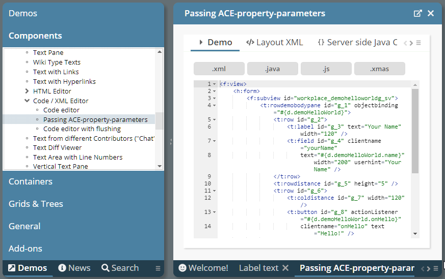
Please pay attention: blank spaces in the parameter-string are meaningful!
The flushing did not work for the CODEEDITOR component – now it does. Please take care: the flushing is (as with SIMPLEHTMLEDITOR) always based on a timer-based flushing.
The LONGTEXTFIELD can be loaded with some “short text” at the beginning. Once the opens the long text dialog popup, then the text is lazily loaded from the server. Please check the example in the demo workplace (Components > Straight Controls > Field Control > Long Text Popup – lazy loading).
If connecting to FIXGRID instances and calling the “getItems().clear()” method with one o the grids, then the selected items were not correctly reset. Or better: they were only reset correctly on one of the grid instances – but not in both instances.
The adapter binding still is in the focus of current developments! It is just a smart way to efficiently implement typical form scenarios, in which data input and data validation plays a major role.
IComponentAdapterBinding2
The interface “IComponentAdapterBinding” was extended to interface “IComponentAdapterBinding2”. The new method that was added is:
public interface IComponentAdapterBinding2
extends IComponentAdapterBinding
{
/**
* This method is called when the component processing first time "touches"
* the component adapter binding instance. By passing the component, the
* adapter binding can directly react and adapt its behavior.
* <br><br>
* Example the edit-able value behind a component is kept in different
* attributes, dependent on the control (FIELD-TEXT, COMBOFIELD-VALUE,
* CHECKBOX-SELECTED).
*/
public void initComponent(IBaseComponent component);
}
This is a quite significant improvement because now the using component is registering in the adapter binding, so that this knows if it is e.g. used in a FIELD-component or a COMBOBOX-component.
Pay attention: the registration of the component is done during the render-phase of the request-processing - because this is the point of time when the component-world is built up.
LazyLoadingMap<...>
Adapter instances can – as any other instances – be arranged in Maps. Expressions can access the Map-instance so that a “.”-navigation in the Map-instance is resolved by a “get/put”-call. Example: “#{d.TestUI.adapters.firstName}” - where “adapters” is a Map-instance internally holding adapter-instances.
In many scenarios it is useful to create the data in the map at this point of time, when it is requested – and not earlier. This makes extreme sense when dealing with adapters.
You could implement such “lazy-loading-map” on your own by just extending e.g. HashMap and overriding the get-method. - We now added a default implementation:
public class LazyLoadingMap<VALUECLASS extends Object>
extends HashMap<String,VALUECLASS>
{
public interface ILazyLoader<BEANCLASS>
{
public BEANCLASS lazyLoad(String key);
}
public LazyLoadingMap()
{
...
}
public LazyLoadingMap(ILazyLoader<VALUECLASS> loader)
{
...
}
public void setLoader(ILazyLoader<VALUECLASS> loader) { m_loader = loader; }
public ILazyLoader<VALUECLASS> getLoader() { return m_loader; }
...
}
A typical use-case in the are of adapters looks like:
LazyLoadingMap<PropertyAdapter> m_adapters = new
LazyLoadingMap<PropertyAdapter>();
public Democabreflection4(IWorkpageDispatcher workpageDispatcher)
{
m_adapters.setLoader(new ILazyLoader<PropertyAdapter>()
{
@Override
public PropertyAdapter lazyLoad(String key)
{
return new PropertyAdapter(Democabreflection4.this,key);
}
});
...
Adapter Binding in Layout Editor
The adapter binding issues are now positioned in a more prominent way within the Layout Editor:
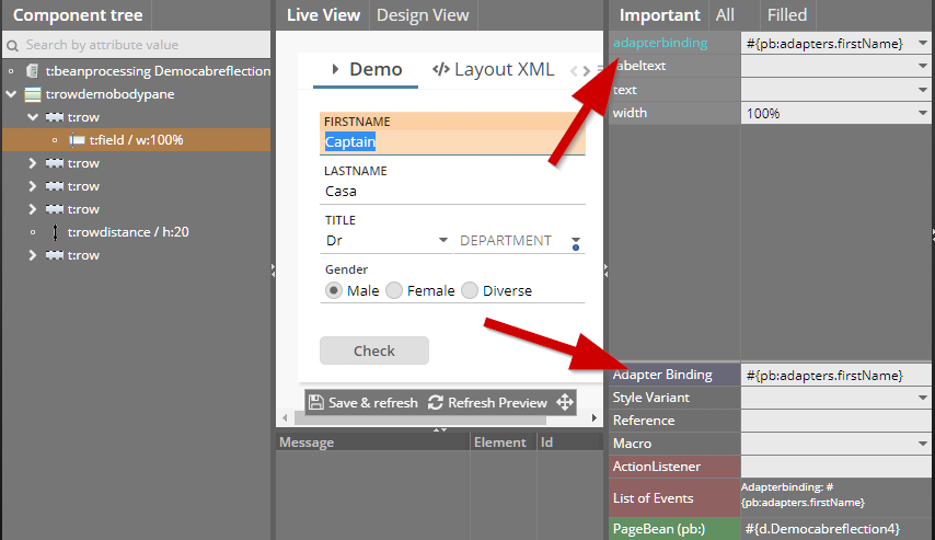
They are not hidden in the “All”-attributes section but have moved to the “Important”-section.
The style variants “ccinfolabel*” are now available for TEXTPANE components as well:
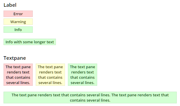
Touch keyboards can now be opened up by defining some TOUCHOPENHOTKEY definition with FIELD and FORMATTEDFIELD components.
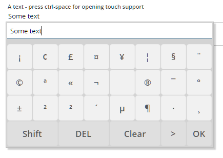
You can use touch popups for providing the user special keys that are rarely required and that are not reach-able via normal, “real” keyboards.
Instead of implementing component attribute's “one by one” and binding each attribute individually to some expression you may use the “Adapter Binding” concept. In this case the whole component (e.g. a FIELD) binds to a Java-object implement interface “IComponentAdapterBinding” - which then tells which component attributes are implemented and which delivers the values correspondingly.
There are now two nice implementations of “IComponentAdapterBinding” that use annotations for indicating how attributes are implemented.
Please take a look into the Demo Workplace (“News”) in order to see how this concept is used to simplify form processing:
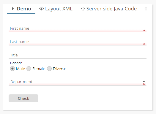
We believe taking a look into this aspect is a “must!”. ;-) At least for these ones of you that operate with data input forms.
Due to the “big” height of fields with floating title text, the error/mandatory indicator – which was positioned on the top right before – now was updated:
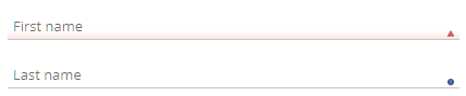
Both indicators were moved to the bottom right so that they have a clear context to the input line. The error indicator comes with some red-shaded background.
The style changes were done in style “default202006risc” only, so that all the previous styles are not affected. Of course you can overrule the definitions within your own style!
...did not work but produced mal-formed XML which was sent to the client component.
We cleaned up some inner parts so that adding own header-, footer-, column-components in your own extension is easily possible.
If calling “setWithMarkingOpenedNodes(true)” then the nodes that are currently opened as work-pages are marked with bold font.
Once upon a time it was required that “@...@” variables in the CSS section of the style editor also needed to be available as “Style Values” in the style-variant section. Well, the runtime does not need this anymore since a couple of months, but the editor was still doing it – up to now.
In the Style Editor you now immediately see color values of variables, risc-values and style-values:
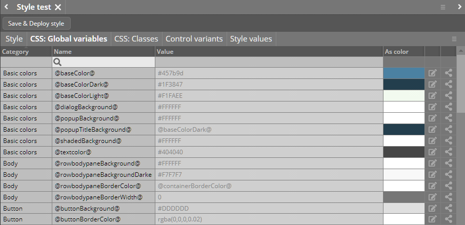
In addition you see in the CSS area a new icon “cross reference”: 
When clicking the icon then a dialog shows up showing the usage of the corresponding element within the current style definition:
...and: control variants can now be filtered – both by control name and by variant name:
You now can explicitly set HTML-attributes for the iframe that is implicitly built up within the IFRAMEINCLUDE and the SUBPAGE component.
<t:iframeinclude iframeattributes="sandbox:allow-popups;allow:camera\x3Bmicrophone" width="100%" />
The value is a string following the format “name1:value1;name2:value2”. Use “\x3B” for semicolons inside a value definition.
There is a new method with FIXGRIDBinding:
FIXGRIDBinding.resetPersistentData()
This method removes the persisted data (column sequence, column widths) and resets the grid rendering to its original status.
When scrolling the grid content via the scroll at the top or the bottom of the grid, then the focus moved from the grid to the button and from the button to the grid with each click. Now the focus is kept stable within the grid.
When updating a text in a TABBEDLINECONTAINERTAB, then all images were removed inside the corresponding TABBEDLINECONTAINER.
When writing a streams with content null then the stream was not properly managed. Result: errors when updating the stream. - The error only occurred with the JDBC variant of the stream store.
If having defined the PASSWORD component with FLUSH=”true” then a flush-event was triggered with every second key that was pressed by the user. The bug was added with version 20201207. If using the PASSWORD field with encryption then this of course is a blocker!
You now can “officially” react on mouse-over and mouse-out events. Before you could do so “in-officially” by implementing a serer side tooltip. The client can tell your component (e.g. PANE) that the user has moved the mouse cursor on top of the component – so there is a certain latency involved in order to send too many events to the server-side. Once the “mouse-over” was sent then the component also sends a “mouse-out” when the user moves the cursor to some different component.
Please check the demo in the demo-workplace (“News” section).
The SIZETRANSFER component can be added to e.g PANEs and transfers the actual size of the PANE to the server side. If you define FLUSH=”true” then the component waits for a certain duration to check if the size is not changing anymore – and then flushes the size. In certain scenarios – especially when using size-categories – it makes sense to fine-control this latency, e.g. by setting it to “0”.
We added an example to the demo workplace (“News”-section), which demonstrates the flexible use of the SIZETRANSFER: dependent on the current size, icons are drawn with different width/height.
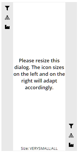
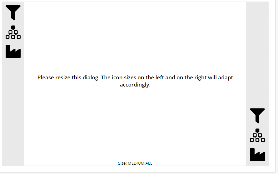
It is now possible to position and stick popups to the top/right/bottom/left side of the browser content area.
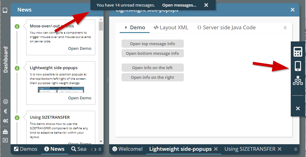
This can be done with any popup dialog, but the intention is to use this positioning for light weight toolbar and/or info popups. Please check the demo in the demo workplace (“News” section).
In certain client localizations the automatic update of e.g. decimal numbers was not working properly and produced numbers which afterwards were not accepted.
With 20210201 we changed the new status bar so that it is rendered more light weight and so that it shrinks after a certain while. The feed back on this is: the light weight rendering is nice... - ...the shrinking is “too much” and causes too much noise in the bottom area of the screen.
So we kept the light-weight rendering and updated this to be even a bit more light-weight – but removed the automated shrinking:

The status bar is now animated when it is show – it is sliding into the screen from the bottom side.
Thanks a lot to all of you who did send feed back to us!
The page bean component that renders a grid of data with possibility to filter the content in the head line was extended and now provides many more configuration options and many more “IListeners-exits” so that you can directly influence the filtering.
You now can position dialog at the top/bottom/left/right of the screen. Use methods:
Modal/ModelessPopup.setLeftTopReferenceScreenLeft(...)
Modal/ModelessPopup.setLeftTopReferenceScreenRight(...);
Modal/ModelessPopup.setLeftTopReferenceScreenBottom(...);
Modal/ModelessPopup.setLeftTopReferenceScreenTop(...);
There's one boolean parameter “sticky”: if defining “true” then the dialog will stick to its position when the user resizes the screen. Example: calling “setLeftTopReferenceScreenRight(true)” will open the dialog on the right side and then automatically move when the user updates the browser size.
What we showed with “big dialogs” in this example can also be done with small ones, which e.g. only are “mini-info-areas” that are shown at a certain side of the screen.
The lightweight Pivot Page Bean Component “CCSimplePivot” was functionally extended and now offers many more APIs to influence the rendering and to react on events.
Please check the demo in the “News” section of the demo workplace:
When using the “${latest}” feature in the definition of hot deployment directories, then it could happen that a NullPointerException was thrown if no directory that is referenced existed.
The CLOCK component has some new features:
By defining the attribute EMBEDDINGTEXT you can place the clock output into some surrounding text. The attribute is a plain text definition in which the clock value is indicated by the place holder “${value}”.
There are two new clock formats (actually doing the same text rendering currently): “stopwatch” and “countdown”. Main difference to “time”: instead of e.g. rendering “00:01:09”, the text “1:09” will be rendered. So “0”s on the left will not be rendered.
There was one part of the start up procedure (the initialization of the “WebAppDirectoryManager”) which cost quite some time (around 10 seconds) in certain scenarios. It used to read the whole file structure of the web application via interfaces of the ServletContext. Now the directories are only read step by step and only if required.
There is a new parameter “slf4jplaintext” in logging.xml by which you can define that logging output that is sent to the SLF4J processing is HTML-decoded. By default log output is encoded for security reasons.
...was only working if having set “.setCloseonclickoutside(...)” was called in addition.
The component now moves the status bar to the very bottom of the screen:
After a defined time (default 2500 ms) the status bar will shrink to some reduced size:
The duration until a shrinking is executed can be customized either by style or by directly assigning the value through the attribute STATUSBARASPOPUP-AUTOSHRINKDURATION.
By defining the new attribute TREENODE-WITHLINEDRAWING as “true”, the tree will render vertical lines at the left of the nodes:
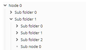
The addons-package now contains a new Page Bean Component “CCSimpleWizard” - which provides some simple Wizard processing around certain Wizard-steps:
When defining a FIXGRID to provide multiple selections (MULTSELECT “true”) and to do selections click by click (MULTISELECTMODE “1”), then the behavior when doing shift-select was different than the behavior with normal grids. Now the shift-select behavior is the same.
You now can explicitly define in which direction a menu/popup will open:
The definition is done by using the new attribute MENUPOSITION, the values are “bottom” (default), “top” and “side”.
If a dialog does not have an explicit status bar (i.e. ROWSTATUSBAR or STATUSBARPOPUP is explicit part of layout definitions) then a STATUSBARASPOPUP instance is automatically created for the dialog.
You now can switch off this behavior in the system.xml:
<system>
...
<statusbar autoadd="true"/>
...
</system>
When using the mini JSF implementation of CaptainCasa then the RENDERED attribute was sometimes not properly supported if used inside the cell component of a GRIDCOL of a grid.
Uuuh – some “<meta...>”-definitions were not properly closed...
In some debugging situations it is useful to see the complete layout XML of the dialog that is currently displayed. This is done by pressing “ctrl-alt-z”: then the dump will be output to the JavaScript log.
(If you have defined “ctrl-alt-z” as hotkey of your application: the dump function is executed in parallel and will not disturb your own processing.)
By using attribute WITHFOCUSEVENT you can notify the server about the user having focused a certain component. The value “focusgained” was not properly supported up to now.
(If you do not know this attribute yet: the notification of being focused is not immediately if the user moves the focus into the corresponding component – but only is done if the user stays inside the component for a certain while.)
When using MAXLENGTH with a FORMATTEDFIELD which is defined with a number format, then the separators of the number are not counted. Example: if defining “4” as MAXLENGTH with an integer field, then the user can input “1234” but also “1.234”.
At same time you can define that the tab is automatically moved into the next component when having reached the maximum length. This mechanism did not consider the separator characters up to now - and the automatic tab-execution was triggered too early.
For analysis purposes there is a function to record all http-traffic between client and server – in order to replay it afterwards without using an actual application server.
So far you had to activate this function by some system.xml (and before: web.xml) configuration. Now you can directly invoke by a Java system parameter.
set JAVA_OPTS= ... -Dcc.responseLoggerActive=true ...
catalina ... run
The facade class “HttpSessionAccess” now contains a method to directly set the client-id of the current client:
public static void setCurrentClientId(String clientId) ...
The client-id is an id that can be assigned to a client instance. The life-cycle of the id is longer than the life-cycle of the current session. It is internally stored as cookie.
The attribute “actionListener” was not available when editing a SIMPLEHTMLEDITOR instance in the Layout Editor.
The translation files were kept with a wrong language id. Now it is “sv”.
When invalidating an http-session via “session.invalidate()” during the invoke-phase of the request-processing then there were CaptainCasa functions which directly requested a new session from the servlet container. This was no problem at all, because the new session was the one that was immediately used afterwards, but caused problems when using Tomcat parallel deployment – in which the new session was immediately bound to the current server's version context. The new session was not associated with a new context.
Expressions are checked if they contain invalid characters. By default CaptainCasa does not allow expressions containing brackets - “(“ and “)” - because expressions can also invoke methods – which is not allowed both because it is not properly supported and because it may mean some risk from security point of view.
The characters that are indicators for invalid expressions can now be explicitly defined in elcntjsfserver/system.xml:
...
<invalidexpressiondetection invalidcharacters="()"/>
...
Example: if you want to explicitly allow brackets then define:
...
<invalidexpressiondetection invalidcharacters=""/>
...
In the ccee-Spring-addon package we simplified the management of Spring contexts that use annotation based configuration. The documentation was updated as well. - Thanks to a friendly Austrian community member who triggered and supported us here!
There is a simple administration tool for managing the Tomcat status of a project's web application:
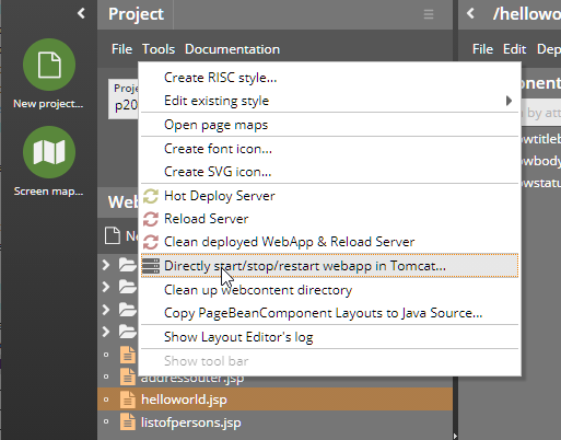
The tool shows the current started/stopped status and allows to explicitly start/ stop/ restart the web application inside Tomcat.
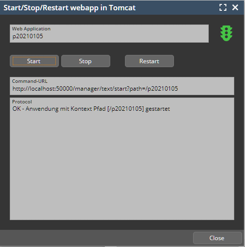
In addition there was a problem so far during “Reload”: if the web application was not started so far, then the reload's internal triggering of a restart of a web application did fail. Now the “Start” is automatically triggered.
All areas that typically contain whole dialogs are not drawn with rounded corners:
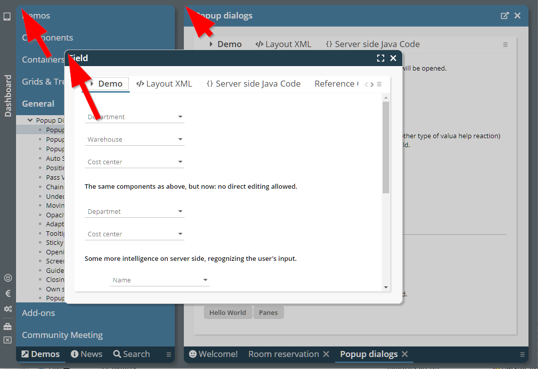
These areas are:
Workpage container area
Popup-pages with decoration
Due to the change in the COMBOFIELD-icon with 20201228, COMBOBOX instances did not show their value popup anymore when clicking onto the icon of the COMBOBOX. Because this is a severe bug, we published 20201229. Please do not use 20201228 anymore!
We already reported in the forum about a problem with Chrome – in which SUBPAGE content was not rendered: the DOM tree was built up correctly, elements are positioned, even the mouse-over effects and the events (e.g. mouse-clicks, keyboard input) are correctly processed – but the result is not rendered. After resizing the screen the rendering immediately started.
The problem was visible in the Layout Editor in which the SUBPAGE component is used.
We now found a way to bypass this problem (basically we cause a resizing after setting the content URL...) and things seem to be OK with this bypass.
From 2007 on there is a ROWHEADER component – in which you e.g. place buttons or menus. There never has been a footer component, which e.g. is useful for arranging buttons in a popup dialog. Now there is the ROWFOOTER component – technically the same as the ROWHEADER, but using different style classes, so that the footer can be style in a different way than the header.
If a COMBOFIELD's width was bigger than the scroll area into which a COMBOFIELD was placed, then clicking the COMBOFIELD's icon causes the scroll area to move to the begin of the COMBOFIELD – so that the click was not received on the icon anymore. Consequence: clicking the icon did not open the corresponding valid-values-dialog.
(The situation occurred very rarely - because having COMBOFIELD instances, which are wider than e.g. the current screen size, is not very typical...)
When implementing some own http-session listener and when running CaptainCasa with COOKIE-based session tracking then it could happen that the cleaning up of the http session in the http-session listener was still going on while new usages of the session within the same http-session were built up. Consequence: the new usages were referencing an http-session which was invalidated already – and the user received some message about a session timeout.
There were two scenarios, in which such timeouts were registered:
In the layout editor, when refreshing a page and when using the page inside the preview
In normal usage scenarios, when pressing F5/Refresh in the browser.
The result of our “research” is, that our approach to invalidate the http-session after all CaptainCasa usages are removed is/was not correct. We must not invalidate the session on our owns, but need to wait for the http-session-timeout of the servlet container. We made sure that each usage of the http-session properly is removed the session when the usage is closed.
It is now “super-simple” to ouput progress information during the processing of long-lasting server-side operations:
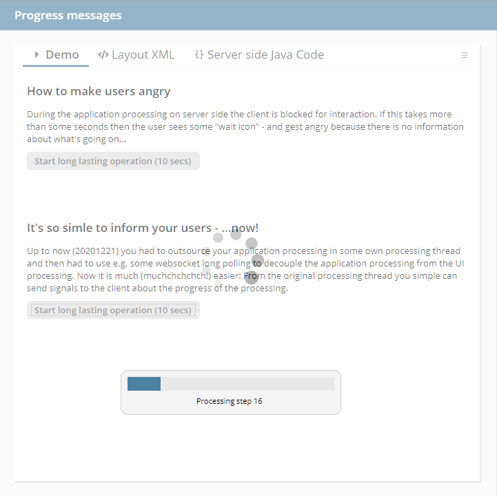
The only thing you have to do is: call a Java-API – the progress information will be forwarded to the client screen:
BlockerInfo.sendProgressToClient(text,percentage);
Internally a web socket connection is built up by the client to the server which is internally used to transfer the information. This connection is built up automatically – you do not have to do anything.
This drastically reduces the effort for passing messages to the client: before you had to outsource the application processing in some own thread to free up the UI-request-response-thread as fast as possible.
Please check the demo in the “News” section of the demo workplace.
(In the system.xml you can switch off this creation of a web socket connection, please check the section “blockerinfo” in the system.xml_template. Of course then the API will not be functional anymore.)
We added the ACE-editor (https://ace.c9.io/) to our control set: there is the new component CODEEDITOR which is able to edit structured text (XML, Java, Javascript and many, many more formats).
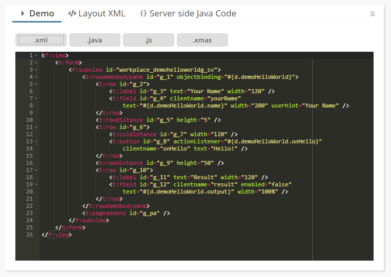
Please check the demo in the “News” section of the demo workplace.
Hmmm – where is it?
...join today's community session at 3pm (German time) and you will find out! ;-)
In the web.xml the registration of the Spring context listener was not contained:
<!-- Spring startup -->
<context-param>
<param-name>contextConfigLocation</param-name>
<param-value>classpath:spring_context_webapplication.xml</param-value>
</context-param>
<listener>
<listener-class>org.springframework.web.context.ContextLoaderListener</listener-class>
</listener>
...seldomly used (because an icon has transparent background anyway), but: the definition was wrong...
The analysis of project classes now directly works with the directories that are defined in the project. It is now possible to have the “Dispatcher”-class being in a completely different project than the managed bean classes. (At runtime this was always possible, of course – this is/was just a tool issue.)
The editor “always” updated the text when it was passed in and passed out... This meant: without the user having changed any text, the text was sent as updated. We now check if there was really was a user update before sending changes.
...ordering is now: selected items are added to the end of the selection!
We did some clean up in the area of session listeners:
Adding / removing of session listeners through HttpSessionAccess
Listeners both on http-session and on Dialog-session
Clear separation between global listeners (one time per system) and session-related listeners (one time in session)
The corresponding functions in HttpSessionAccess are:
addGlobalHttpSessionListener(...)
removeGlobalHttpSessionListener(...)
addHttpSessionCloseReactorForCurrentSession(...)
removeHttpSessionCloseReactorForCurrentSession(...)
addGlobalDialogSessionListener(...)
removeGlobalDialogSessionListener(...)
addDialogSessionClosedReactorForCurrentSession(...)
removeDialogSessionClosedReactorForCurrentSession(...)
The existing functions (e.g. through HttpListenerDelegator) still exist and still are useable – of course we recommend to switch to the new ones.
Page beans can open up parent areas using the tag PARENTEXIT. So far the using page bean had to define corresponding areas – the sequence of the areas in the using page bean had to exactly match the sequence of areas in the providing page bean.
Now each page bean exit area that is provided has an explicit id, which is defined in the attribute PARENTEXIT-EXITID. The using page bean must define the mapping id in the PANE component that provides the content.
So the sequence-based management was replaces with an EXITID-based management, which makes things much clearer when it comes to adding additional areas.
The concept of parent exit areas is used within a nice page bean component (addon-package) which provides the management of a master-detail area. Please check the demo (Addons => Page Bean Components => Master Detail).
Based on information we found in some GIT projets (date format by country) and Wikipedia (decimal format by country) we now provide the client localization definitions for 80 additional countries...
The extension of page beans by defining a “.mod.xml” file is now available both for normal page beans and for page bean components. Before it was only available for page bean components.
The page bean component CCFilteredPickList now can keep the selection order. Set the corresponding property “itemOrderingBySelection” to true. In addition there is a new property to control if to render a filter field or not (“withFilterField”).
The image reduction for JPEG files was internally converting to PNG files – resulting in much bigger images then you were used to. This bug was introduced with 20200817.
We want to make sure that all issues shown during today's Community Meeting are available for download – that's the reason for providing some “official interim update”...
When passing some HTML text into the SIMPLEHTMLEDITOR, then the text was “always” sent back to the server with changes – because the HTML that you pass into the editors is always converted to HTML elements within the editors and then converted back to HTML – which is very like to create some mini-change...
Now we detect, if the text really was changed in the editor - and do not pass back some changed text, if there was no user action.
So far you could create own styles, extending existing styles. In the own styles all inherited artifacts were taken over – and you could create own artifacts (e.g. own style classes) in addition.
Now you can “enrich” exisiting styles by adding style extensions into the resources, that are loaded by classloader.
Example: you can enrich the “defaultrisc” and “defaultlightbluerisc” style by adding the following resources into your code:
eclntjsfser
styleextensions
defaultrisc
riscstyle.xml
style.xml
defaullightbluerisc
riscstyle_defaultlightblue.xml
style.xml
Please pay attention:
File names must exactly match the file names of the original style definition.
And: yes, the files are defined in the “Source” area, NOT in the web content area!
Each file contains a fragment of definitions to be added to the style. Example:
eclntjsfserver.stylextensions.defaultrisc.riscstyle.xml:
<stylesheet>
<var c="Demo" n="@demoValue1@" v="Value 1"/>
<var c="Demo" n="@demoValue2@" v="Value 2"/>
<class n="demobutton" extends="riscbutton">
<var n="@buttonBackground@" v="#FFE9E9"/>
<var n="@buttonInsets@" v="10 10 10 10"/>
</class>
</stylesheet>
eclntjsfserver.stylextensions.defaultrisc.style.xml:
<style>
<tag name="button" variant="demobutton">
<set attribute="styleseq" value="demobutton"/>
</tag>
</style>
When reading a style then CaptainCasa will check in the current classloader for style extensions – and will concatenate these extension to form one merged style.
What is the advantage? If splitting up your project into several CaptainCasa projects, then now each project can throw in its own xml-extensions. Each project only defines these style extensions that are required for the components/page beans of this project.
This page bean component (pbc-addons) demonstrates how to build page beans with contained areas – in order to build “pattern components”.
You now can directly edit the class path that is used within the Bean Browser of the toolset:
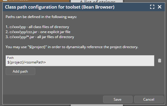
Thanks to a community member for having sent the translation of client literals into the Italian language to us! Language “it” and country “IT” are now part of the default.
It is possible to place configuration files (/eclntjsfserver/config/*.xml) into the “Source” part of your project. In this case they are read at runtime by class loader - and are not expected to be part of the web content.
There was a bug when accessing these files through class loader – the files were only accessed if there was a corresponding file in the web content as well...
Passwords that are already set are NEVER sent from the server to the client. Instead some dummy password is transferred – and rendered as “***********” in the password field. Whenever this dummy password is shown and the user starts keying a new password, the dummy password now is cleared – so that the user never e.g. can append characters to the dummy password.
For managing a fix id that is identifying a client, you may use the function “HttpSessionAccess.getCurrentClientId()”. This one checks if there is already a Cookie that was sent from the client side containing the id, if not, it generates a UUID and sends this one back to the client.
This function already did exist, the new isse is, that you can set security parameters for this cookie. You either can use the API in HttpSessionAccess...
public static void initClientIdCookieParamHttpOnly(boolean httpOnly) ...
public static void initClientIdCookieParamSecure(boolean secure) ...
public static void initClientIdCookieParamSameSite(String sameSite) ...
...or you may configure in system.xml:
...
<clientidmanagement
cookiesecure="false"
cookiehttponly="true"
cookiesamesite="Strict"/>
...
When updating a chart for the CHARTJS component, it sometimes could happen that the content was not updated. This bug was “introduced” with 20201116.
It is now possible to “officially” define the border color of an element which is focused. The border color overrides the current border color (if set through style or directly set) and then is switching back to the original color when moving the focus to the next component.
The definition is done by defining a “risc-value” with the name “_borderColorFocus” in the corresponding style class definition. Example:
...
<class n="riscfieldcontainer">
...
<risc n="_borderColorFocus" v="#800000"/>
...
</class>
...
(Do not do this style change in the XML, but better use the style editor...!)
When concatenating strings via complex expressions (“#{d.xxx.yyy} Harry #{d.xxx.zzz}”) then it could happen that the expression delivered “true” as value when using the CaptainCasa mini-JSF implementation.
Please note: only certain “complex” expressions are supported! Check the demo workplace “General => General issues => Complex expressions” for details.
By default you use the ROWSTATUSBAR component – rendering a status bar, typically at the bottom of the out-most page of your application.
There is now competition! ;-) A new component STATUSBARASPOPUP can be used instead:
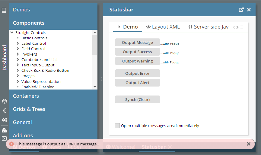
The new component (because it is not occupying any space in the layout...) is positioned in the top BEANPROCESSING component of the layout. When activated it opens up a message area at the bottom of the screen, that overlays any other component (including popup dialogs).
As with the ROWSTATUSBAR it can render multiple messages:
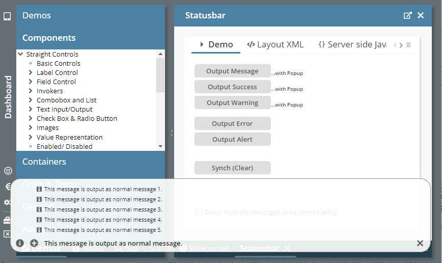
What are the advantages:
The status message is always on top of everything – it is never hidden by any e.g. popup dialog. As consequence you can call it from popup processing as well. (With the ROWSTATUSBAR, the status bar area was e.g. below modal dialogs – and there was some dark overlay on top of it.)
The status message does not occupy any vertical space – when not being required.
The status message is much more visible for the user.
We also introduced, that the status bar message will be present for some minimum time (1.5 seconds). There are cases, in which a status bar message is shown – and immediately removed with the next round trip (e.g. status bar message on click – and a round trip initiated by a double-click). There is no flickering of the message anymore.
If defining OVERLAYAREA components, you typically have one area item which forms the “base layer” - occupying the whole space of the OVERLAYAREA and being positioned as area item behind all the other area items.
This area can now be defined by using the component OVERLAYAREABASEITEM:
OVERLAYAREA
OVERLAYAREABASEITEM
PANE
...
...
OVERLAYAREAITEM X=20 Y=20
BUTTON
OVERLAYAREAITEM X=20 Y=40
...
When a hot deployment is triggered by a trigger file (“/eclnthotdeploy/.cctrigger”) then the buffers are now reset as well. Background: because layouts may be kept in the code, they need to be reloaded after hot deployment.
In addition to the “naked XML editor” for editing the project configuration there are now also helper dialogs. One helper dialog shows the directory and deploy configuration...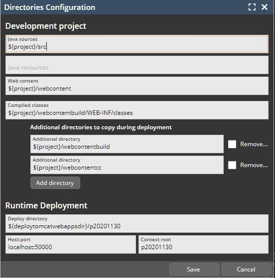
...another dialog shows the selection between “Web content” and “Source”-based resrouces:
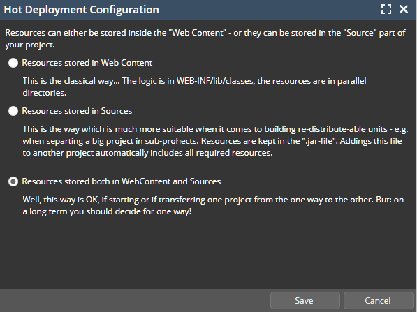
With ModelessPopup-instances you now can set property “alawayOnTop” to true. As consequence the popup will always be shown on top of “everything”.
Some of the resources within the Quill-HTML-Editor were referenced from outside URLs – as consequence the editor was only use-able in scenarios in which the client was connected into the Internet.
You now can define input masks for FIELD components:
Use the new attribute INPUTMASK to define a mask, e.g. “__/__/____”. There is a demo in the “News”-section of the demo workplace.
The input of numbers with automatic adjustment of separators was improved:
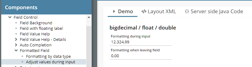
The user cannot input more decimal digits than defined in the FORMATMASK definition.
The adjustment is not only done when the cursor is at the end of the input – but always.
Small popups – like the ones being shown for menus, combo boxes, undecorated application popups, message boxes – are now animated.
We added some comment sections to the UI for defining own styles. You can add comments for:
the style definition itself
each style class
each control variant
The treatment of the SCANPOSTFIX was not correct, if the character of SCANPOSTFIX already occurred in the scanned value.
There is a new attribute SCANONLYONPREPOSTFIX. If set to “true” then a scanned value will only be accepted if the pre- and post-fix match.
The own JSF implementation (we always repeat: this is not a general JSF implementation but one which is taylored to these aspects which are required by CaptainCasa!) now can also be used by the Swing and the FX client.
In the deployment configuration there is the possibility to automatically choose the newest version of a directory by using “${latest}” - which do no fully work...
The sizer line on the top of the pivot grid was not in sync with the actual columns below when not building totals for certain levels.
Well, this is something we did not do for the last 13 years... - because its is not totally simple: allowing the definition of individual content row heights within the FIXGRID processing. The FIXGRID's inner processing is based on server-side data being scrolled through controls in the frontend – rather than scrolling the UI-area of the corresponding component. Reason: 100% flexibility of cell components and ...performance, both when it comes to exchanging data between the server and the client and when it comes to rendering the grid components.
Now we changed this... and size the components either to a defined row height (getRowHeight() in FIXGRIDItem) or to the actual size that the components require on client-side.
Please check the two demos in the demo workplace: “Grids & Trees => Flexible row heights => Row heights by content” and “... => For content rows – by server definition”.
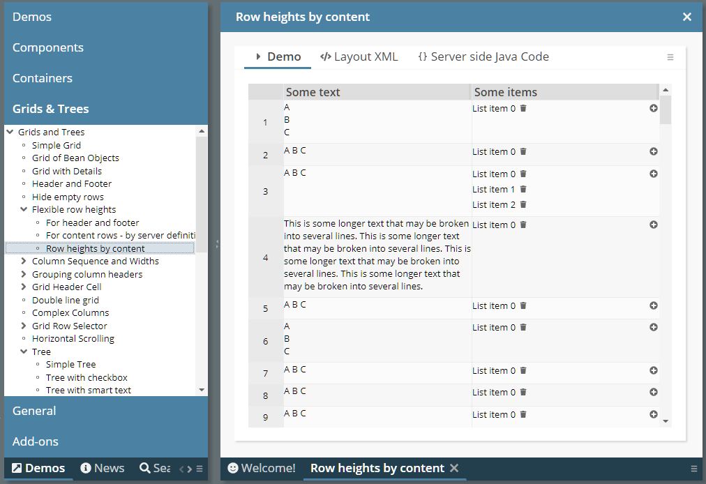
When using the new features: please stay in contact with us in case of questions and/or problems.
We added the following attributes to the CLIENTCOOKIE component:
SECURE
HTTPSONLY
SAMESITE
The attributes are directly transferred into the corresponding cookie attributes.
To enable these functions we changed the CLIENTCOOKIE management internally: before it was as client-side component (accessing the cookie from JavaScript), not it is a pure server-side component (accessing the cookie through the servlet-API).
We ourselves do not require jQuery, but some function which we import in the area of text-area-caret management do. We updated from 3.4.1 to 3.5.1 in order to pass security audits requiring the newest version to be in place.
The toolset of CaptainCasa accesses the server side classes in order to build the class hierarchy shown in the “Bean Browser”. For loading these classes it builds up an own classloader in which .class and .jar-files are collected following the project definition.
Sometimes it is unclear why a certain managed-bean-class is not shown in the Bean Browser – typically because a .jar file that is required for reflecting this class is not available. To help in these cases there are two dialogs that were added to the Bean Browser:
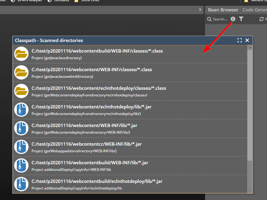
The one dialog shows in which way the directories of the project are scanned for *.class and *.jar files. The other one shows all the .class-directories and all the .jar files that are currently part of the class loader that is used for accessing the project's classes.
The filter dialog was showing the wrong inner components when using non-String data types.
In the valid-values-selection of fields the current value is now pre-selected and focused.
The size of the first column was not properly calculated when n top-totals were shown.
You now can define an alignment for attributes that is used in the field-mode in the left hierarchy part of the pivot table.
When setting the control to disabled then it was still possible to select items by double-clicking.
Browsers have functions to automatically propose value which the user already had input. This is especially used in the are of user name and password input. Unfortunately there are no standards to control this, so each browser implementation has its own strategy to check where and how to propose values.
We introduced for the PASSWORD a new attribute BROWSERAUTOFILL – and at least do our best to convince the browser to NOT automatically fill values into empty PASSWORD fields. In case of switching this attribute to “true”, the normal browser auto-fill of values is available.
When using the CaptainCasa minimal JSF implementation then the switching of styles at runtime was not working. The concrete API that did not work was:
HttpSessionAccess.setCurrentStyle(“...<styleName>...”);
(Setting the style via “?ccstyle=...” in the URL always worked.)
Setting the TEXT attribute in PAINTARAREALINEITEM was not supported so far – now it is:
There are a couple of XML files that build a default workplace configuration. These files were part of the project when creating it through the CaptainCasa toolset – but they were not included in the project when going through Maven.
Now the files can be created in the configuration view of the CaptainCasa toolset:
When scrolling multiple lines by keeping the mouse pressed on top of a scroll icon...
...then it sometimes happened that the scrolling jumped over several lines instead of scrolling line by line.
When using the Spring Boot project archetype and starting the application via Spring Boot then a stack trace appeared in the console, stating that websocket management is not available. We needed to adapt the SBApplication.java to overcome this problem and we had to add the websocket management to the dependencies of the pom.xml.
Existing projects: check the newest archetype's SBApplication.java and pom.xml – and adapt your project.
New projects: just use the up to date project archetype.
The .war file of the editor is now available as Maven-artifact as well (war-packaged):
<dependency>
<groupId>org.eclnt</groupId>
<artifactId>eclntjsfserverRISC</artifactId>
<version>${cc.version}</version>
</dependency>
The number of the version is the same as everywhere, e.g. “20201110”.
This is the “raw” grid as defined in the layout definition:
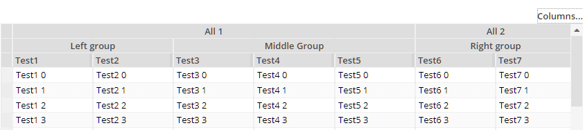
After removing “Test1”, “Test4”, “Test6” the grid looks like:
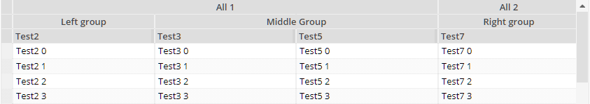
You see: the column grouping structure was updated correspondingly. If in addition removing “Test7”, then the corresponding grouping will be removed as well:
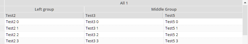
There is nothing you have to do, the functions come automatically. The interface for e.g. storing columns the sequence and selection of columns is the same as currently used in the normal FIXGRID processing.
Check the following demo...
...in order to see how to define a ROWPOPUPMENU that is dynamically created per cell – without having to define an individual POPUPMENU on cell component level.
You now can configure the hot deployment to also access other directories than “/eclnthotdeploy/” during runtime. The configuration includes some simple definition of versions, so that you can exchange logic at runtime in a structured way (one directory per version).
Please check the Developer's Guide, chapter “Embedding “other” classes/libraries for Hot Deployment”.
We updated the demo...
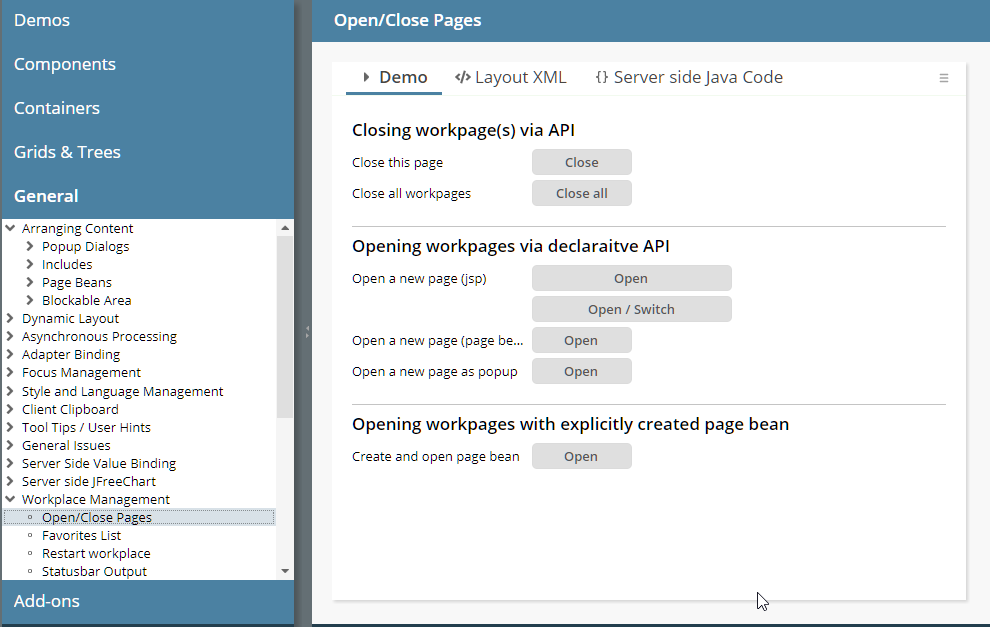
...so that there are clearer examples.
Example: a grid with 10 columns, but a header of the grid only had 8 controls. This caused some bug before, now there are two empty columns in the header. Same with defining wrong COLSPAN definitions.
We updated the management of format advises in the FORMATTEDFIELD (these are the little texts shown in the background, e.g. “##” for an integer field) with update 20200907: before they were always shown, now they were shown if the user focuses the field.
Unfortunately IE 10/11 are not able to show placeholder-values when being focused... So we updated the behavior for IE 10/11 – which is now the same as it was before 20200907. For all other browsers the behavior is not rolled back, but the new behavior is active – so that format advises are only shown when focusing a component.
In the project definition there are two new optional attributes:
<project
...
resourcesinwebcontent=”true/false”
resourcesinsource=”true/false”
...>
...
...
</project>
Dependent on the setting of “true” or “false” the corresponding tab-folders in the tools are visible or invisible. The default is:
When setting...
resourcesinwebcontent=”false”
resourcesinsource=”true”
...then the project overview looks like:
There were still some bugs: all the grid columns were resized when explicitly resizing one grid column...
Up to now there was some central security “feature” which internally restricts our file access to file paths containing a “..”. As result you could not define directories in the project definition containing a “..”-term.
The “..”-term is quite useful when setting up Maven projects with several contained modules. In this case the main directory is holding one sub-directory per module. In one module there might be the CaptainCasa web application, in the other one implementation of pages and page logic...
With 20201012_3 we started to deliver the CaptainCasa web resources as part of the eclntjsfserver.jar file – instead of delivering them in parallel as web content resources. What popped up in some of your scenarios: it is now much more difficult (which is good!) to change some CaptainCasa files: before, you just could change them directly on the file system (after installation you could do something in the “webcontentcc” directory...), now these files are “hidden” in a .jar file...
We now allow you to still update some CaptainCasa files – but now “force” you to do this explicitly and to do this clearly in front of CaptainCasa's deliverd resources. (Please never ever unzip the eclntjsfserver.jar and re-build it...!!!)
The way to go is:
Place the resources into your webcontent directory of your application.
Define in eclntjsfserver/config/system.xml the resources that you want to load from the web content instead of loading them from the eclntjsfserver.jar file from CaptainCasa. Example:
<system>
...
<resourceclassloaderaccess
...
<webcontentfirst path="/eclnt/lib/*.jar"/>
<webcontentfirst path="/eclnt/risc/ext_ckeditor/*"/>
...
/>
...
</system>
In the example you define that all libs (Swing-client...) below “/eclnt/lib/” are loaded from the web content – because you may have signed them with your own signature. - And you define that the whole ext_ckeditor sub-directory is managed by you.
We now internally interpret two-fingers-gestures and make them available as mouse wheel events. You may use this behavior inside the SCALENPANE (if switching WITHUSERSCALING to “true”). We added an example in the demo workplace:
You now can define the minimum/maximum of scaling. Before it was hard coded to “0.25” (min) and “2.0” (max).
This is some big improvement!... Up to now page beans always were defined as “last level” of a layout definition. Now you can define page beans also as “interim level” of UI processing, so that the content of a page beans is managed explicitly by the using dialog.
Sounds complex – but isn't. Take a look onto the following example:
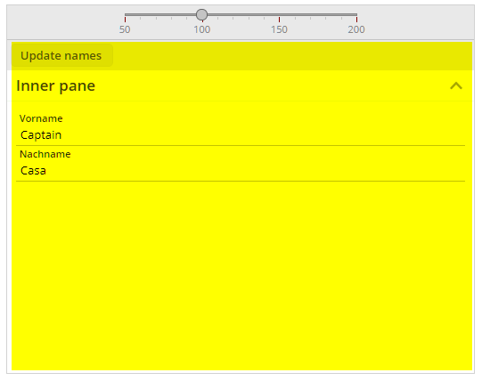
There is a page bean that opens up a scale-able area – and provides some slider to scale. This page bean is used in a dialog in the following way:
<t:rowdemobodypane id="g_2" objectbinding="#{d.DemoPBWithExitUser}">
<t:rowpagebeaninclude id="g_3"
pagebeanbinding="#{d.DemoPBWithExitUser.content}"
shownullcontent="true">
<t:pane id="g_4" padding="0">
<t:rowheader id="g_5">
<t:button id="g_6"
actionListener="#{d.DemoPBWithExitUser.onAction}"
text="Update names" />
</t:rowheader>
<t:row id="g_7">
<t:foldablepane id="g_8" text="Inner pane" width="100%">
<t:row id="g_9">
<t:field id="g_10" labeltext="Vorname"
text="#{d.DemoPBWithExitUser.firstName}" width="100%" />
</t:row>
<t:row id="g_11">
<t:field id="g_12" labeltext="Nachname"
text="#{d.DemoPBWithExitUser.lastName}" width="100%" />
</t:row>
</t:foldablepane>
</t:row>
</t:pane>
</t:rowpagebeaninclude>
</t:rowdemobodypane>
You see: there are component definitions below the ROWPAGEBEANINCLUDE! The components that are placed into the page bean are running in the full context of the surrounding page.
You may compare to using a FOLDABLEPANE – there it is clear that the content is managed by the layout of the using dialog - and the FOLDABLEPANE is only responsible for some interim layer. The same thinking now can be applied to page beans as well – they are open to be used as interim layout levels as well.
Please check the updated documentation “Developer's Guide”, chapter “Page Beans with contained Areas” for more information.
When updating the value of the STYLESEQ attribute and when working with style definitions pointing to multiple style classes, then the update was not processed if the first class definition did not change.
You now can pass some DROPRECEIVE into all tree nodes of a function tree – and you can listen to events (e.g. drag-drop events...) more easily:
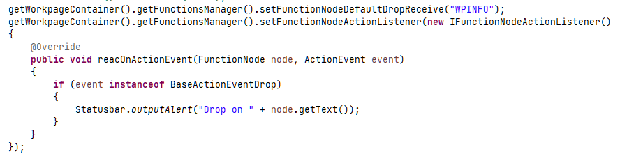
Bug is solved...
When having defined multiple grid columns with GRIDCOL-DYNAMICWIDTHSIZING set to “true” then changing the width of one column did reset the width of all corresponding columns.
...from 20201012_3 on – we did not include the corresponding js-library in the delievery...
For each component there is a corresponding component node class which is used for dynamically assembling the layout content. E.g. there is FIELDNode class for the FIELD-component. Some of the new attributes were missing (the ones that were added after our change to GIT...).
The FIXGRIDWITHGROUPING is a grid, in which the column headers can be grouped:
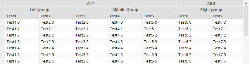
The definition is:
FIXGRIDWITHGROUPING
GRIDCOLGROUP
GRIDCOLGROUP
GRIDCOL
GRIDCOL
GRIDCOLGROUP
GRIDCOL
GRIDCOL
GRIDCOL
GRIDCOLGROUP
GRIDCOLGROUP
GRIDCOL
GRIDCOL
It internally bases on the possibility to define columns with COLSPAN definition – but all the management of COLSPAN is now internally done. You can drag and drop columns to arrange the column sequence, but a column can never leave its group.
Please pay attention:
All GRIDCOL definitions need be on the same hierarchy level!
The processing was not tested yet for dynamically removing columns! But we will do so in the next days...
The hover-behavior and focus-behavior of the LaunchPad tiles is nicer now (before some inner components were updating their color when hovering in addition to the main area). The page bean components are “CCLaunchPad” and “CCLaunchPadInfoTile”.
Why ever we did this once upon a time...: when setting the TEXT of a TREENODE, then the value was passed into the TOOLTIP as well – if you want or not. We took back this behavior, because the TOOLTIP is under your control anyway, and because no other control is doing this.
We updated the tech paper “Model View Controller” and based the internal processing on Component Adapters.
We added a new tech paper “Separation of projects by .jar” into the documentation area of http://captaincasa.org/documentation.
The FIXGRID so far did not support the attribute ADAPTERBINDING. Now it does.
Please note: the adapter binding on server side needs to implement interface “IFIXGRIDComponentAdapterBinding”. This interface is automatically implemented with the default adapter binding classes coming from CaptainCasa.
If defining a size of “xxx+” within a row of a GRIDLAYOUTPANE then the corresponding column was sometimes not correctly sized but received 100% of the available space.
In the BEANPROCESSING component of a dialog (which is a folder for arranging components without visual representation below) there is a binding to the page bean that belongs to the page (e.g. “#{d.MyPageBean}”). When using the dialog inside the workplace then a second instance of the “MyPageBean” was created because the expression of the BEANPROCESSING was not correctly processed.
If passing commands ending with a semicolon (“<command1>;<command2>;”) then the command was sometimes not drawn.
When changing the LABELTEXT value of a FIELD (same with “all” FIELD-variants) then the corresponding component was not updated properly – the LABELTEXT kept its initial value.
When defining a JSP page in the root package then an error was shown in the Layout Editor.
Layout definitions that you stored in the “Source” (and not in “Web content”) were not read by the “Checker”. The “Checker” is the module that checks JSP-definitions for missing attributes and for other error information – the output of the “Checker” is the list of texts below the preview area.
This update contains some significant inner improvement which is described below. If upgrading an already existing project to this version, we ask you to not use this version for production use without contacting CaptainCasa. - There is no change in the inner logic of CaptainCasa, but there is a restructuring of content that comes with CaptainCasa and that's the reason why we are careful.
Please note: when upgrading to 20201012, then you also have to upgrade the tool side of CaptainCasa! (if you use the tools...)
There were two types of CaptainCasa artifacts that were added to a project up to now:
The “eclntjsfserver.jar” library and the other jar-libraries that were required
Some directories of resources that were added to the web-content. These resources contained:
The JavaScript client
Default popups and default include-dialogs, together with their images/htmls/pdfs
The artifacts were part of the directory “webcontentcc” within the default project layout:
<project>
/webcontent
/webcontentbuild
/webcontentcc
/eclnt
/risc
*.js
...
/eclntjsfserver
/popups
/includes
/WEB-INF
/lib
eclntjsfserver.jar
*.jar
From this update on all CaptainCasa artifacts that formerly were part of the web-content are part of the “eclntjsfserver.jar” library. As consequence the /webcontentcc directory is cleaned up significantly:
<project>
/webcontent
/webcontentbuild
/webcontentcc
/WEB-INF
/eclntjsfserver/includes/ccaround.jsp
/lib
eclntjsfserver.jar
*.jar
There is only one resource left which is outside the eclntjsfserver.jar file: the “ccaround.jsp” dialog definition, which is required as starting page by JSF.
All the other resources were moved into the “eclntjsfserver.jar” library. At runtime they are automatically accessed by a resource loading which uses the classloader to read the resources.
Why did we do this? There are two reasons:
It is now much easier to bring CaptainCasa into Maven-based projects. The whole CaptainCasa-environment comes with one .jar file – there is no mix out of a library-dependency and some additional copying of web resources.
It is much easier to integrate into Spring Boot projects, in which the whole CaptainCasa-environment is completely separated from the project's artifacts.
What does this mean for you?
In general...: nothing! ;-) - Everything is compatible to the previous version. In case of CaptainCasa-resources being available both in the web-content (e.g. left over from previous versions) and in the classloader content, the classloader content is always used first.
In the default CaptainCasa project layout, the content of the “webcontentcc”-folder is cleared by the installation and by the project-“Update” function automatically.
In the Maven project layout of existing projects you now can streamline the “pom.xml” - and especially remove the two extra-plugins which were used to download the web-content-resources and to add them to the web archive. Please check details in the Maven installation.
At the very beginning of CaptainCasa the web content inside a project was not separated into the content added by your development and the content coming from CaptainCasa. Since 10 years (or longer?) the default project layout does the separate clearly these aspects, by providing three different project directories:
“webcontent” - where you place your artifacts
“webcontentbuild” - where compilation results are placed
“wecontentcc” - where the CaptainCasa framework content is placed
Still there are a couple of “old” project layouts alive...! ;-) And it gets more and more important to clean up the project in order to reduce the amount of old and unused fileds in your application.
We now added a tool “Webcontent clean-up” to the CaptainCasa toolset. This removes from a webcontent directory all content that was – once upon a time.... - inserted by CaptainCasa – so that only your application content remains.
Before removing the content the tool creates a safety copy of the cleaned directory.
When using the independent touch keyboard (component TOUCHVIRTUALKEYBOARD), then the flushing that is based on duration of non-input (FLUSHTIMER attribute) was not triggered correctly.
In a FIXGRID you can reload items during scrolling, so that the list grows when scrolling down. When scrolling by dragging and dropping the scroll bar, then the scroll bar was not correctly sized to the updated number of grid items.
We switched from an internal SVN repository to a GIT repository, that is hosted by a public provider. All participation license owners can now request a user id, so that you can directly view the sources. Please contact us!
When placing a FOLDABLEPANEHEADERROW into a FOLDABLEPANE then you can additional components into the header area of the FOLDABLEPANE. By default they are sized into the very right area of the header area and do not receive any width from outside.
By setting FOLDABLEPANE-HEADERFULLWIDTH to “true”, the header area that is made available for the additional components gets assigned a width of 100% - so you internally can also full percentage sizing for the components contained in FOLDABLEPANEHEADERROW.
The “.risc” requests that internally start a page are not cached by the browser anymore. When being cached then there were problems with the browser's back button, when navigating from one “.risc”-page to another page, and then back to the “.risc”-page.
There was some looping when you used the “normal” keyboard to do some input into the virtual keyboard (touch keyboard).
The Quill Editor (https://quilljs.com) is an open source project providing a flexible to use HTML editor. It is free to use. Please check license conditions directly on the Quill-page.
You can use the editor as alternative to the CKEditor that is embedded by default, but which has certain license issues to pay attention to.
Check the following demo in the demo workplace:
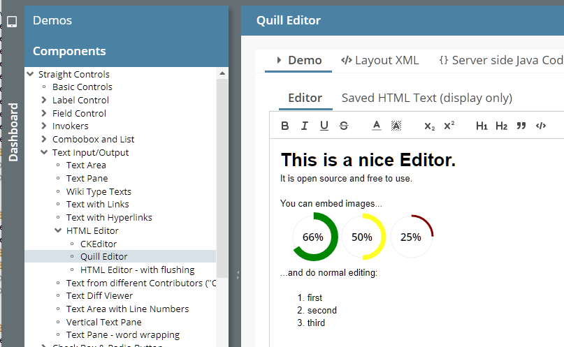
You now can receive the “mini-JSF-implementation” of CaptainCasa by the following dependency definition:
<dependency>
<groupId>org.eclnt</groupId>
<artifactId>eclntjsfserver_jsfimpl</artifactId>
<version>20200928</version>
</dependency>
We added the new Maven project archetype “eclntwebapparchetype_springboot” to our catalog of webapp archetypes. It simplifies the creation of Spring Boot projects significantly.
We updated the sizing management of the application to better accommodate to tablet / phone scenarios.
Whenever a virtual keyboard of iOS/Android is coming up, then the application was resized by the browser. This sometimes had the consequence, that the e.g. field, which was selected to be edited was not shown anymore after the screen was resized.
Now the whole application does not change its size when a keyboard comes up, so that the applications is shifted (if required) as whole by the height of the virtual keyboard.
This makes input through the keyboard much nicer than before.
Due to this change we also fixed the problem that the virtual keyboard was sometimes not shown when editing a field, that was contained in a grid.
Tablet/phone users: please test your application with this newest update – Thanks!
This style was incorrectly defined during the last updates – actually it showed the style “defaultbluerisc”... We cleaned up.
There is a new configuration in class BasePopup. When calling...
BasePopup.initializeHeightDeltaDecorated(20);
This adds 20 pixels to any absolute height definition that you define for a popup dialog. Background: the styling of a popup dialog's title is done in Swing by the operating system. Due to a change in the OS, the title bar might grow, so that some content now is to be scrolled, which was shown without scroll bars before.
This function clearly is a “repair-function” - and must not be used “strategically”...!
(just FYI: in the RISC-client the decoration of a popup is completely defined by styling and does not depend on the operating system.)
All servlet and filter definitions were removed and added to the dynamic configuration that uses the Java-API for registering servlets and filters.
Does this mean you have to update your web.xml of existing projects? - No! The existing web.xml definitions are “stronger” than the API definitions. And the web.xml can still be used to add own servlet/filter definitions.
Why did we do this?
Since 2 years we use the Java-API internally for new servlets / filters, which were added to the runtime without requiring you to update your web.xml. As consequence we had a mix of web.xml-registration and API-registration which we always wanted to clean up...
In certain scenarios (Spring, Spring Boot) it is much easier if all registration is done dynamically.
Some details:
The central class for registering the servlets/filters is “CCInitialize”. This is called via its method “initializeCCEnvironment(ServletContext servletContext)” during the startup process of the runtime.
This method then calls “CCInitializeServlets.initialize(ServletContext servletContext)”, which is registering the servlets/filters.
From CaptainCasa's perspective the web.xml that is required for RISC-projects is quite “thin” now:
<?xml version="1.0" encoding="UTF-8"?>
<web-app xmlns:xsi="http://www.w3.org/2001/XMLSchema-instance"
xmlns="http://java.sun.com/xml/ns/javaee"
xmlns:web="http://java.sun.com/xml/ns/javaee/web-app_3_0.xsd"
xsi:schemaLocation="http://java.sun.com/xml/ns/javaee http://java.sun.com/xml/ns/javaee/web-app_3_0.xsd"
id="WebApp_ID"
version="3.0">
<display-name>CaptainCasa based application</display-name>
<welcome-file-list>
<welcome-file>index.html</welcome-file>
<welcome-file>index.htm</welcome-file>
<welcome-file>index.jsp</welcome-file>
<welcome-file>default.html</welcome-file>
<welcome-file>default.htm</welcome-file>
<welcome-file>default.jsp</welcome-file>
</welcome-file-list>
<listener>
<listener-class>org.eclnt.jsfserver.util.CCServletContextListener</listener-class>
</listener>
<!-- ********** SESSION MANAGEMENT *************************************** -->
<session-config>
<session-timeout>60</session-timeout>
<tracking-mode>URL</tracking-mode>
</session-config>
</web-app>
We updated the “web.xml_template” file correspondingly.
IMPORTANT INFORMATION: existing projects which use the Swing and/or the FX-client must not change their web.xml! It contains some servlet definitions which are only required for these environments and which are not part of the API-based registration.
Sometimes you want to store certain information on client side which should stay there “forever” (or, at least much longer than a session...).
Example: you want to store a unique Id of the client so that the client identifies itself when communicating to the server.
Up to now we provided a component CLIENTCOOKIE to do so. This component used the possibility of storing data inside a cookie. Now there is the component CLIENTLOCALSTORAGE which does the same, but uses the client side JavaScipt API to the local storage of the client.
The BUTTONPOPUP component is a button that opens up a popup area when being clicked. Up to now the focus stayed in the button, the user had to explicitly move the focus with the mouse. Now the focus moves into the popup - and is moved back into the button when the popup is closed.
The size of images which were dynamically passed was sometimes not correctly calculated – and the default size of “16x16” was taken as fall back.
The page bean component provides a simple way to build up lists with a filter function on top of the columns:
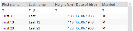
You just need to pass a list of Pojo-objects and a configuration-object (sequence of columns with some parameters) – the rest is done automatically.
The page bean component is build in a way that you can easily extend own, special versions. Please check the code, which is a nice example for “How to write page bean components”. The page bean is part of the page-bean-addon that comes within the resources of a CaptainCasa installation.
Please check the demo workplace (“News” section).
All components providing a LABELTEXT attribute (FIELD, ...) now provide an additional attribute LABELTEXTALIGN by which you can define the placement of the text. In addition the LABELCONTAINER provides an attribute ALIGN as well.
When defining a FORMAT (e.g. “bigdecimal”) within a FORMATTEDFIELD component, then a “format advice” was arranged as placeholder automatically. This placeholder now only shows up, if the user moves the focus into the component – otherwise it stays empty.
Screens with a lot of empty FORMATTEDFIELD components look much nicer as consequence.
Before...
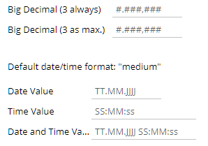
...now:
Creation of Page Bean Components: the popup for creating the class now proposes a proper class name (same name as layout name) and a correct package.
You now can explicitly take over control over the VIDEO component. By default it shows icons for playing or pausing a video. Now the component can be rendered without any inner icons – and you can take over control using TRIGGER-attributes for playing/pausing the video. In addition you receive event notifications about the status of the video.
Take a look into the corresponding demo of the demo workplace:
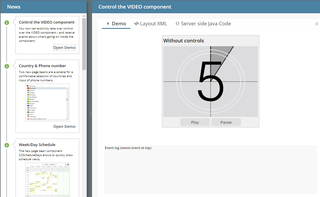
...the attribute is now automatically set to “true” when using the attribute USEMULTILABEL is set to “true”.
It was not possible to search for COBOBOX-items starting with “@”. (Same with all characters that are reachable via altgr-key.)
Please check the corresponding demo in the “News” area of the demo workplace:
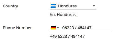
All resources like internationalized texts and flags are part of the component. The components are part of the addons-package (<installdir>/resources/addons/eclnt_pbc.zip or by Maven).
Since 20200825 resources can either be part of the web-content (“traditional” way) or can be located in the sources/classes (“new” way). Page bean components already were components loading their layout-XML from the classloader – we now adapted them, so that they are in sync with the “new” way of resource loading.
This means:
When creating page bean components you do not have to do this in the web-content part and then copy over into the sources path – but you can (and should!) directly edit the layout file in the sources.
As consequence the layout is not kept in some “.xml” file anymore, but is kept in a just normal “.jsp” file.
All other issues are the same as before. And: of course the “old” way is still supported!
We updated the documentation in the Developer's Guide accordingly. Please take a look!
Some of you know already about... - now it gets more and more official: we implemented an own “mini-JSF-implementation” that is exactly taylored for running CaptainCasa within a servlet engine. Our own JSF implementation is NOT a complete implementation of JSF APIs and must not be used as general purpose JSF engine.
What is the purpose behind?
First of all we wanted to be owner of the “full stack” on server side – at least as alternative to the standard JSF implementation that we use by default.
In the own JSF-implementation we can optimize for runtime and memory performance at these places which are heavily used within the CaptainCasa server side processing.
The own implementation is part of the delivery, after installation is is loacted in: <installdir>/resources/addons/eclnt_jsfimpl.zip – The zip file contains two .jar files:
jsf-api.jar
jsf-impl.jar
These jar files must be the ones to replace the reference implementation.
In the standard CC project, the name of the libraries exactly matches the ones coming from CaptainCasa – so you may just replace these libraries in the tomcat-runtime (webapp/<app>/WEB-INF/lib) with the ones coming from CaptainCasa.
If you are interested: try it!... and give feedback to us!...
The updated management of resource-loading had the consequence that the automated resolution of e.g. “index.html” when opening a URL which just addresses a directory level did not properly work anymore.
This bug made us publish this new version.
The combination COMBOBOX-EDITABLE “true” and COMBOBOX-ENABLED “false” did switch the combo box to enabled.
Up to now *.jsp files and other web resource files (images, ...) were stored in the web-content part of your application. Now you can place them into the Java-source part (design time) and in the classes/lib files (runtime).
Consequence: all resources are part of e.g. a .jar-library and need to be distributed separately. This makes it much more simple to work with multiple projects.
Before you had to integrate all content of several projects into one directory, i.e. you had to join the webcontent of all projects. Now you simply have to create one central project, into which all other projects are delivered as pure .jar files.
We added a corresponding chapter to the Developer's Guide: please check the new chapter “Managing Resources”.
The toolset was updated accordingly: in your project overview you now have the option to switch between the “web-content” and the “source” directory of your project:
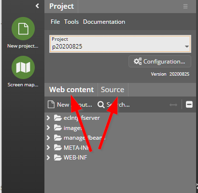
This is a quite significant extension of the server-side, so we ask you to keep contact to use in case of questions/problems. In case of problems you may switch off the new access to resources by some simple setting in system.xml-configuration file. Details are described in the Developer's Guide.
All “*content*” animation was only start-able when the CAPTUREANIMATOR was places below a PANE component. Now you can use them everywhere.
When defining some explicit value for attribute FONT, then this definition was not taken over into the component, which stayed on default font.
When having switched CLIENTCONFIG-POPUPMENUCOPYCLIPBOARD to “true” then a popup menu item is created by default for any component that is holding text. When pressing the menu item then the text of the component is copied into the client's clipboard. In the last update, sometimes two or more of the items were generated.
The new component shows schedule items in a week/day view:
The current version does not yet allow to move schedule items – but only allows to show and select items.
Inside the schedule items you may render any page bean of your choice, so you are not limited to a text display but can directly embed functions of your application.
A demo is contained in the “News”-section of the demo workplace.
If selecting a couple of items, then it could happen that the bottom item of the selection was not selected.
When clicking with the mouse onto a horizontal grid line, then currently the whole grid “of the background” was selected – because the grid line did not belong to the row but to the grid itself. This was sometimes confusing for the user, when e.g. clicking with the right mouse onto the line then the popup menu of the whole grid showed up even though being in the row area.
We updated this behavior, so that now the bottom border line of the row belongs to the row above.
The LABELTEXT value is now taken into the minimum width calculation of the field, so that it is always fully displayed.
It is now – much simple than before – to define hierarchically structured grid headers. The new features to do so are:
In a GRIDHEADER you now can define that is is positioned before the normal column header line (attribute GRIDHEADER-BEFOREDEFAULTHEADER).
In a component that is positioned below the GRIDHEADER you now can define COLSPAN.
Please pay attention: grouping of columns by default only makes sense, if re-arrangement of columns is not allowed.
Please check the demo in the demo workplace (section “News”).
In addition to the normal text you now can add an abbreviated text – which is shown on missing screen space:
Please check the demo in the demo workplace (section “News”).
The touch keyboard now changes its layout dependent on the element that is currently focused:
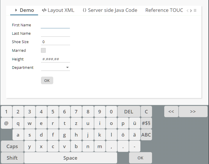
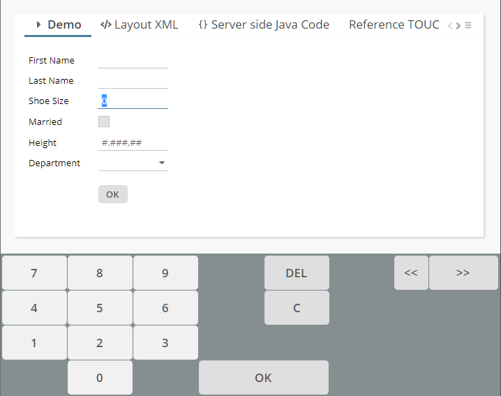
Please check demo “Components > Touch screen > Stable virtual keyboard”
Especially in the layout editor it sometimes was annoying:
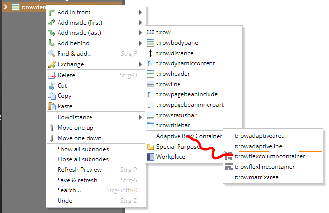
When moving the mouse to a sub-menu and only hitting another menu item “a little bit”, then the sub-menu was immediately closed. Now there is some timer that allows the user to move the mouse in a “non-exact way” - without closing the sub-menu.
Up to now the taking of a photo with the CAMERA component was only possible by using the built-in icon of the CAMERA component. Now you can configure the component to not show this icon (CAMERA-WITHSNAPICON) and instead trigger the component by using the attribute CAMERA-TRIGGER.
In a tabbed pane the active tab gets transferred to the server-side using the attribute TABBEDPANE-VALUE. The value transferred by default is an integer value (0 for first tab, 1 for second tab, ...). Now you can assign individual SELECTIONID values on TABBEDPANETAB-level. If having done so, not the index is transferred, but the explicitly defined values. This makes it much easier to work with selection within dynamically arranged tabbed panes.
We did not believe that this is possible...: when using IE and only entering “@” as input into a FIELD or TEXTAREA the input was not recognized at all. Typically there are some characters following after (e.g. in case of mail address) – so this situation “never” occurs...
What was the reason: when pressing the “AltGr”-key on the keyboard, then IE internally sends a key event in which it tells that both the “ctrl”-key and the “alt”-key are pressed. (There is no separate indicator for the “AltGr”-key.) Pressing “ctrl” and “alt” with CaptainCasa does switch the client into a selection mode, in which all eventing is disabled to let the user select with the mouse any text from the screen. So this mode was accidentally started when pressing the “AltGr”-key. The mode is switched off with any other key, so that's why the problem did not show up so far.
Some of you directly checked and gave feedback:
There was a JavaScript bug when defining more than one percentage size in one row. The layout still was rendered but with wrong sizing.
The distribution of minimum sizes and percentage sizes in case of controls that span several cells was improved – before sizes were equally distributed across the spanned cells – now the sizes of other components are taken into consideration as well.
Defining a component with e.g. width “100+” had the consequence, that the component received the full width of the cell.
The GRIDLAYOUTPANE arranges its content im some kind of matrix. The sizing of the matrix is depending on the minimum and preferred size of contained children. Content can be spanned across multiple columns – both horizontally (“colspan”) and vertically (“rowspan”).
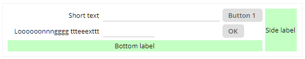
Although the content internally is managed as x,y-matrix...
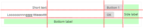
... the definition is internally done by row definitions:
<t:gridlayoutpane id="g_66" border="#00000010" coldistance="5"
padding="10" rowdistance="5" width="100%">
<t:gridlayoutrow id="g_67">
<t:label id="g_68" colalignmentx="right" text="Short text" />
<t:field id="g_69" width="100%;200" />
<t:button id="g_70" text="Button 1" />
<t:label id="g_71" align="center" background="#C0FFC0"
height="100%" rowspan="3" text="Side label" width="100" />
</t:gridlayoutrow>
<t:gridlayoutrow id="g_72">
<t:label id="g_73" colalignmentx="right"
text="Loooooonnngggg ttteeexttt" />
<t:field id="g_74" width="100" />
<t:button id="g_75" text="OK" />
</t:gridlayoutrow>
<t:gridlayoutrow id="g_76">
<t:label id="g_77" align="center" background="#C0FFC0"
colspan="3" height="50" text="Bottom label" width="100%" />
</t:gridlayoutrow>
</t:gridlayoutpane>
This makes it much easier to re-arrange the layout within the layout editor (e.g. move one row in front of another row) and it is much easier to e.g. remove one row by setting its RENDERING attribute to “false”. - All the matrix coordinates are calculated internally.
Please check the demo in the demo workplace (“News” section).
You now can set the component to disabled by calling “setEnabled(true)” but still can view its multi language content in the dialog popup.
When setting option CLIENTCONFIG-POPUPMENUCOPYCLIPBOARD to “true” then some right mouse button menu item is generated automatically for any component holding text:
Up to now this text contained HTML-formatting when it e.g. was executed on a button with a text that contains HTML. Now the text is cleaned up before being copied to the clipboard.
The TEXTAREA component internally consumed all key events having to do with the “Enter”-key. As consequence it was not possible to invoke “ctrl-Enter” from inside the component.
The items of combo boxes internally are buttons that are rendered with a certain style. Unfortunately in the base style definition (“defaultrisc”-style) the extension from the style class “riscbutton” was missing, so the configure-ability was reduced.
We now changed this and adapter our base styles accordingly.
Please check: In case you have defined own style classes for COMBOBOX-itmes (style class “risccomboboxitem”): please check the rendering of the items after having applied the update.
When using the ARRAYGRID with fast MULTILABEL rendering then the popup menu for copying the text of a cell was not properly supported anymore but showed only “MULTILABEL” as text to copy. The bug only occurred when two ARRAYGRID instances were shown at the same point of time.
...this was difficult to see, but one user saw it: when closing tree nodes then for a short point of time the “opened”-icon was rendered in the rows that are not rendered anymore.
You now can directly place pages into the content area of the functions area of a workplace:
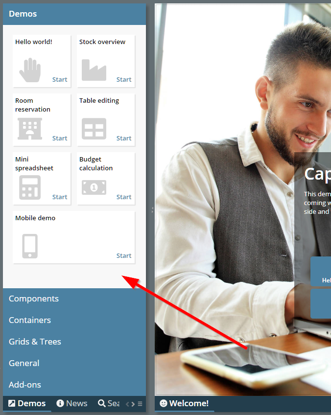
Just define a “WorkpageStartInfo”-definition within the top “WorkplaceFunctionTreeInfoNode” definitions.
The label text of slider ticks have been limited to a width of 100 pixels – now the width was increased, so that it may span the whole slider component.
When pressing F1 in touch popups (the virtual keyboard popping up on top of an e.g. field component), then the browser's general F1 help was shown. Now the proper F1 help of the component, that started the popup is shown.
Some updated to the new default style that came with update 20200706:
Fonts are a bit bigger now (default changes from 12px to 13px, small from 10px to 11px and big from 15px to 16px)
Some colors a bit lighter (id-text selection popups)
Radio buttons and check boxes with light-gray border color
There is a new attribute SLIDER-SHIFTTICKSPACING by which you can shift the slider tick numbering:
In the first slider the shift is applied so that the major ticks are properly positioned, in the second slider there is no shift defined and the major ticks are starting with the minimum value.
<t:row id="g_11" >
<t:slider id="g_12" flush="true"
majortickspacing="5" maxvalue="52" minortickspacing="1"
minvalue="33"
shifttickspacing="-3" value="#{d.demoSlider.shoeSize}"
width="200" snaptoticks="true" >
</t:slider>
</t:row>
<t:row id="g_13" >
<t:slider id="g_14" flush="true"
majortickspacing="5" maxvalue="52" minortickspacing="1"
minvalue="33" value="#{d.demoSlider.shoeSize}"
width="200" snaptoticks="true" >
</t:slider>
</t:row>
It is now much easier to extend page beans components. The layout of page bean component is kept in a corresponding “.xml” file – which by nature of XML definitions in not really extend-able. - You now can define a “.mod.xml” file in which you only describe which components of the original file you want to update for a certain reason. This makes it much easier to adapt page beans to your scenario.
Please check the updated developer's guide for more information on this.
Due to problems of 20200713 with MacOS we decided to have a second update this week.
The change we did in 20200713 for detecting the iPad-Safari-browser had negative impact on normal Safari browsers running on MacOS systems – which now were treated as mobile devices, not as desktop devices.
We now improved the detection of browsers so that MacOS is detected as desktop device and iOS is detected as mobile device.
Do not use Update 20200713 in production use! Please check information in 20200714.
When using Safari on iPad and when having upgraded to iOS version 13.1 then some surprise is waiting...: Safari now opens web pages by default in desktop mode – while having opened it in mobile mode before. This means on CaptainCasa side: instead of e.g. using long clicks for selections you have to use double clicks – which is not really nice for touch users. Well, the user may switch to mobile mode by pressing the “aA”-Icon at the beginning of the URL-input-field – but this is not really convenient for most users.
We now reacted internally and identify the iPad-Safari by some additional statements, so that we internally switch to mobile mode in any case, Safari on iPad is used.
When updating parts of the screen then – if many elements were affected – you sometimes could see a short flickering in the updated areas. During the flickering elements were first drawn at a default position and then moved to their correct position. To avoid this flickering we not keep the elements in a non-display-mode until they are correctly sized.
This change may have implications for these ones of you who use animations as part of their CSS-definitions. Animations might not be started on elements which are not displayed. In order to adapt there is a new RISC-variable “_displayImmediately” which you can assign to component style definitions that contain animations.
<class n="...">
...
<risc n="_displayImmediately" v="true"/>
...
In any case: please contact us in case of problems!
The LABELTEXT was in very rare situations not shown inside COMBOBOX-components.
The style that is used within the demo workplace and within new projects was updated and now is “default202006risc”. Main updates:
Colors did a change a bit from “light blue” to “blue gray”.
Field components are now rendered with some bottom-border only. When placing the tab into a field then there is an animation of the border line.
Existing styles are still valid, of course! You may only update your style if you like the updated look and feel.
If you want to check the style with your project then just append “ccstyle=default202006risc” as URL parameter to the .risc-URL that you use for starting your application.
The function...
getWorkpageContainer().getTileManager().importWorkplaceTileInfo(...)
...allows to update the workplace layout at runtime. This function so far closed all workpage instances that were currently started as part of switching the layout.
Now there is a second parameter, by which you can control if you want to close existing work page instances – or not. Please check the following demo (select “News” on the left bottom of the demo workplace):
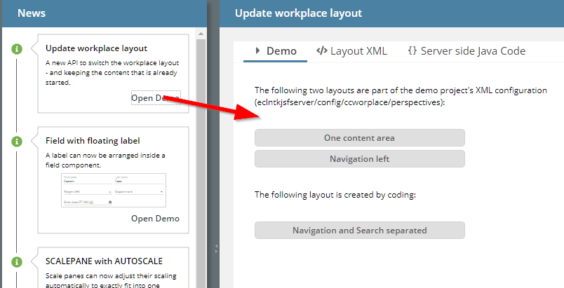
Btw.: we also added this function on the top left of the demo workplace:
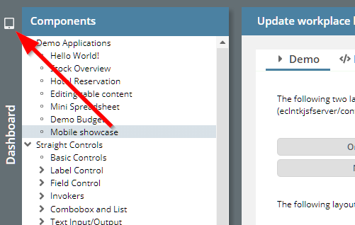
You now can toggle between two layouts – the default demo layout and a reduced one for mobile devices.
We updated the client library moment.js to the newest version available via https://github.com/moment/momentjs.com.
When pressing cursor-up-key in a grid then the selected row is moved up by one position. If the selected row was the first row of the grid and the grid did not show its full content (so there were empty grid positions though being scrolled to the bottom of the grid), then the cursor-up was not executed.
This was an attribute which was not supported yet in the RISC client. You can decide if the mouse click may be done on the whole combo box (default) or only on the icon area to open the combo box popup.
We opened up the framework to add own column filter dialogs.
Filter dialogs need to implement interface “IDOFFilterPropertyAreaUI”...
package org.eclnt.ccaddons.dof.pbc;
import org.eclnt.ccaddons.dof.DOFObjectFilter;
import org.eclnt.ccaddons.dof.DOFPropertyType;
import org.eclnt.ccaddons.dof.IDOFObjectPersistor;
import org.eclnt.jsfserver.pagebean.IPageBean;
/**
* Interface to filter dialogs for properties.
*/
public interface IDOFFilterPropertyAreaUI extends IPageBean
{
public interface IListener
{
public void reactOnFilterApplied();
}
public void prepare(DOFObjectFilter filter,
DOFPropertyType propertyType,
IDOFObjectPersistor persistorQuery,
IListener listener);
}
The are registered in the property meta data:
public class DOFPropertyType implements Comparable<DOFPropertyType>
{
public void setClassNameFilterPropertyAreaUI(String
classNameFilterPropertyAreaUI)
{
...
}
}
In the interface the current filter data is part of the DOFObjectFilter-instance that is passed as parameter.
In addition we opened up the method “executeQuery” of class “DOFJdbcPersistor”, so that you can update the creation of the SQL statement for the filtered data on your own. Each filter condition is now added to the SQL string in method “buildPropertyFilterConditionString”:
protected String buildPropertyFilterConditionString(DOFObjectType objectType,
DOFPropertyType pt,
DOFObjectFilter filter,
List<Object> queryValues)
{
...
}
Please check the JavaDoc for more information – and also take a look into the code (which is part of the addon-package).
The LABELCONTAINER now has an ENABLED attribute. If setting the attribute to “false” then the container is rendered exactly the same way as FIELD with LABELTEXT definitions are rendered, when being disabled.
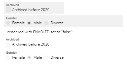
The icon is now arranged in the vertical center of the input area – and not of the whole component area:
We are updating our standard style at the moment. Main difference: field components are not rendered as gray area anymore but are rendered with some underlining:
We believe this type of rendering is some more lightweight than the up-to-now style.
The new style's name is “default202006risc”. You may test this style already within your scenarios by appending “ccstyle=default202006risc” to your start-URL and/or by extending your own style definitions from this style. We plan to make “default2020risc” our default style from July on.
Of course all existing other style definitions are kept – you only have to update your style in case you like the new style. And: of course any feed back is appreciated!
...the label-text-component within the top left corner of the field was in some cases created several times. In case the value of LABELTEXT changed, the previous label component still was rendered...
Once the label moved into the “field body”, some of you immediately requested to be able to move some other text into the “field body”...: we now provide a new attribute UNITTEXT which is a general purpose text label on the right of the text input. Example:
In the left field of the example the UNITLABEL is used with a FORMATTEFDIELD – really showing the unit of the value that is input. In the right field the UNITLABEL is used to output the text of the entity that is input via it identifier.
The color of the PLACEHOLDER was updated so some wrong value in 20200622 – and was rendered as black in many cases.
All FIELD components (FIELD, COMBOFIELD, CALENDARFIELD, COMBOBOX, ...) now provide two new attributes:
LABELTEXT and
LABELTEXTALWAYSHOWN
When setting the LABELTEXT then the text is shown as part of the FIELD component: if no component value is defined then the text will be shown as placeholder:
If a value is defined then the text will be shown on the left top within the component:
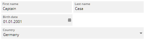
When setting LABELTEXTALWAYSSHOWN to “true” then the text is always shown in the left top area – regardless if there is a component value defined or not.
In order to harmonize the look and feel of FIELD components using the LABELTEXT attribute we introduced a new container component, in which you can e.g. arrange CHECKBOX or RADIOBUTTON components:
The sizing of the box is defined in a way that the height of the boxes (when containing CHECKBOX or RADIOBUTTON) equals to the size of a corresponding FIELD component with LABELTEXT defined.
When removing content (e.g. of a REPEAT-able area) and when using the focus management within this area, the following JavaScript message was (seldomly...) shown:
When using COMBOFIELD with attribute KEEPFOCUS defined as “true” then the keyboard focus stays in the field when opening the value help dialog:
Up to now, just clicking the Shift-key (same with Ctrl-, Alt-) closed the dialog. Now the dialog only closes if there is some “real” key following the Shift-key.
If appending “_mouseover” to the drawing commands then they only will be executed if the user moves the mouse over the DRAWAREA.
The image reduction during upload (i.e. you can shrink images to a certain width/height before they get uploaded) was invoked also on files, in which the “image-extension” was part of the file name (e.g. “xyz.png.pdf”).
The error only occurred when using the image reduction and when selecting “special” file names.
The method “add(index,item)” was not calling the “updateFinished” callback. There was no mis-behavior inside CaptainCasa due to this – but in case the listener interface was used from your side, you might miss the corresponding call-back.
When starting a page you can add a parameter to pre-define the scaling of the whole page. Example: “http://..../xyz.risc?ccscale=1.5”. You now can passe the value “ccscale=auto” in this case the scale is calculated based in the client value of “window.devicePixelRatio”. This is a value which defines in a browser environment, how many physical pixels are used to render one CSS-pixel.
We tested this on several devices and came up with the formula...
scale = 1 + (window.devicePixelRatio-1) * 0.125;
...so that one and the same screen is properly sized on different devices.
We added a new demo to the demo workplace, which either can be called directly or as part of the “big” demo workplace:
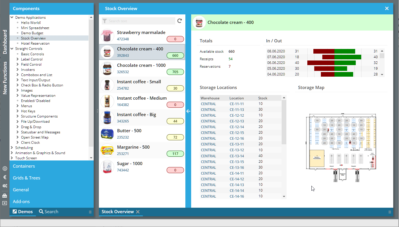
The SCALE-value of the SCALEPANE can now be automatically calculated, so that the content of the SCALEPANE automatically fits inside:
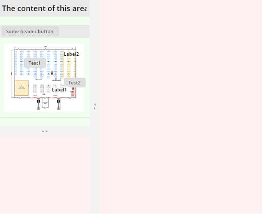
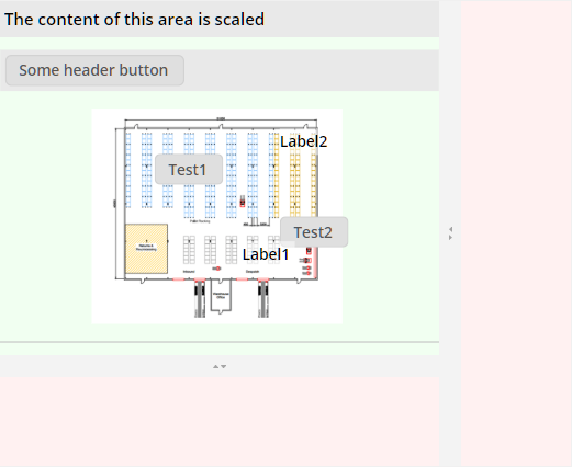
There is a new attribute by which you can define that the second split of the ADAPTIVESPLITAREA component is not visible at all. Consequence: there is no splitting at all. This is useful if the seconds split area is only shown after selections done in the first split area.
It could (to be honest: very likely) happen that pressing the scroll bar buttons of a FIXGRID within a mobile device resulted in some loop, in which the button was continuously pressed.
When using the CALENDARFIELD with FORMAT “time” then the popup for editing the hour/ minute/ second values was too small – and the values were only partially visible.
In general a COMBOFIELD blocks the focus – and e.g. avoids that the focus is moved into a popup-dialog. We now had a special situation in which the COMBOFIELD instance was removed as part of the round-trip that was initiated by the COMBOFIELD itself – and the blocking of the focus positioning (by using REQUESTFOCUS) was not un-blocked.
When using the COMBOFIELD with KEEPFOCUS=”true” and with a FLUSHTIMER to observer the user input, then user input which was done while the value-dialog was opened did not always open up some updated value-dialog.
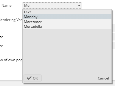
In addition the focus was not moved into the dialog when the user pressed the cursor-down-key.
By setting FOCUSSENSITIVE to “true” within a PANE, the PANE will send corresponding events to the server-side when the focus is moved inside. There was NO focus event thrown when the PANE itself was set to FOCUSABLE=”true” and the user clicked the PANE...
We added a new variant of drawing a component as focused. Up to now this was only possible by adding background modifiers – now it is possible to draw some border-like-elements on top of the existing component.
The element's position, size, insets, colors, line style can be defined flexibly as part of the style definitions.
Because it looks much nicer than the “up to now” way, we completely switched to the new way of drawing the focus. The “up to now”-way is still available, of course can can be simply switched on/off by central style parameters.
If you have set up some own styling of the focus drawing then please check the documentation at: http://www.captaincasa.com/docu/techdoc_styling/
Due to a problem that was located in the ONETOUCHEXPANDABLE feature of the SPLITPANE component, the CCSplitDashboard component did not correctly work anymore – only horizontal arrangement of areas was possible.
Transparent backgrounds were not rendered correctly, but drawn as black background.
The “Preview”-function within the Layout Editor was accelerated.
The LINK component does not show any hover shadow anymore... (it's enough to see that the text is underlined when moving the mouse over the component).
Applying the style of the ADAPTIVETOOLBAR component was not trivial, because the component internally used some “awesomefont-icon”. Now the component uses some normal button/icon and you can e.g. apply own images much easier.
When using FILEUPLOADLINKASYNCHRONOUS or FILEUPLOADBUTTONASYNCHRONOUS then the file name was passed in URL encoded format. This means blank spaces were transferred as “%20”. Now some decoding is done before passing the file name to the application processing.
When changing the GROUP assignment of a RADIOBUTTON, then it could happen that the update of the RADIOBUTTON did not properly work. Situation, in which you update the GROUP rarely occur: in the concrete case the RADIOBUTTON was part of a grid cell and the GROUP assignment was done individually by grid row.
Last week we introduced the component MULTILABEL for accelerated rendering of text grids with many columns.
Now we took over the MULTILABEL component into the ARRAYGRID component: by setting ARRAYGRID-USEMULTILABEL to “true”, the internal processing will now use the new component and is much faster as consequence.
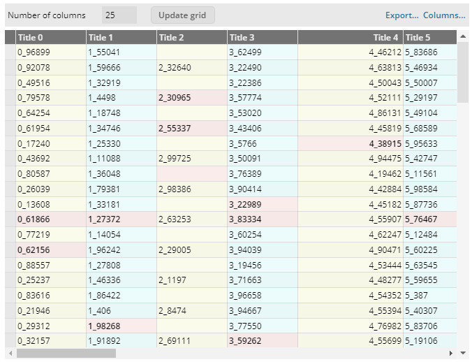
The nice things...:
All “normal” functions as grid sorting, column sizing, column arrangement are taken over automatically
Most of the text configurations are taken over into the MULTILABEL
Please pay attention:
Not all functions of the ARRAYGRID are (and will be) supported
No images can be added
No explicit selection of controls can be defined
All functions in the area of MULTILABEL are still in “beta-mode”: they are working and they are tested, but it could potentially happen that we still do changes to the interfaces that may not be compatible with following releases.
Please check the demo workplace (“New Functions”).
We added some pre-configured style classes for labels:
Please chech the demo in the “New Functions”-area of the demo workplace.
There are two new properties:
“allowSplitSizingIfDisabled” - up to now the sizing of the split areas could only be done when the page bean was switched to “edit mode”. Now you can configure to allow the sizing also in “disabled mode”.
“oneTouchExpandable” - when setting to “true” then little icons are added into the split pane divider that allow the user to minimize/maximize the corresponding area
We added the component AVATARICON which is a special icon that either displays a picture or displays a text (typically the initials of a person). The icon is rendered in rounded mode by default, but you can fine-tune of course.
We added a new component MULTILABEL. Purpose: render a series of text-labels with “high speed”. In the example that is available in the demo workplace (“New functions”), you see a big grid built with this component:
The grid contains out of rows, each one holding one MULTILABEL component. The number of columns in the example is 100. - The performance of this grid is much faster than rendering the same grid with individual components (e.g. LABELs). The internal rendering of the labels is done by using HTML-Canvas operations.
The MULTILABEL features always will be some level below the features of the normal LABEL. Example: the styling cannot be influenced by CSS-styling. Its clear intention to serve as component for “massive lists of data”.
Based on the MULTILBALE component we added as simple version of a pivot table:
The page bean component is available in the ccaddons package. Use it to see the speed of MULTILABEL-usage. Whn expanding the pivot data to the right, then all MULTILABEL components are re-rendered in order to contain new columns of data. The speed of this is dramatically faster then with the up-to-now pivot implementation that you may know from the demos as well...
When scaling images then up to now the scaled result always showed the full image – and some empty space was rendered if the image did not perfectly fit into the available space. This mode is now called “contain” - and still is the default mode when scaling.
When defining mode “cover” then the image will always cover the whole available area – and may cut some parts of the image as consequence.
We upgraded the JSF-API and JSF-implementation to version 2.3.39.
For Maven users: the dependency that we now use is:
<dependency>
<groupId>javax.faces</groupId>
<artifactId>javax.faces-api</artifactId>
<version>2.3</version>
</dependency>
<dependency>
<groupId>org.glassfish</groupId>
<artifactId>javax.faces</artifactId>
<version>2.3.9</version>
</dependency>
Up to now you could defined one style for a popup dialog (by using API ModalPopup/ ModelessPopup.setStyleSeq(...)). Now you can establish a sequence of style definitions within the style management – and the right style is chosen dependent on the positioning of the popup. Result:
The styling of the popup can be different, e.g. the popup looks the following way when being positioned below control:
And it looks the following way when being positioned on top of a control:
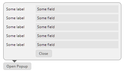
Please check the demo in the demo workplace (“New Functions”).
When starting the CCEE and immediately firing multiple DOFWSql-queries from massive-parallel threads then it could happen, that one of the threads received a NuppPointerException and as consequence an error was thrown. Subsequent requests or parallel requests were not affected.
Setting EDITABLE to “false” was not working – the component was still edit-able.
The attribute was not recognized properly – now it is.
The component RADIAL renders some percentage value as circle...
...or as ellipse:
You can define the line size, line color – and many other parameters.
Internally the RADIAL component is combined usage of the DRAWAREA component with some LABEL component on top.
This was a feature of the Swing-Client, which we hoped to “bypass” within the RISC-HTML client. Unfortunately some of you constantly reminded us that it was missing – and required.
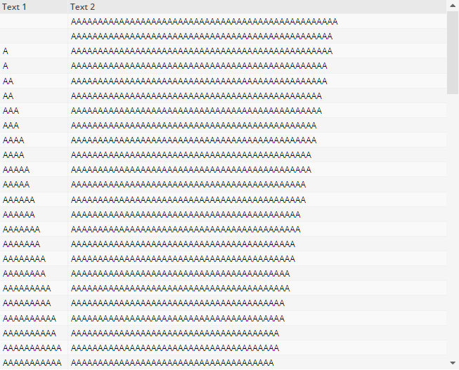
As you might see from the screenshots the size of the left column increases when scrolling down – because its contained values are occupying more an more space. This is done by setting GRIDCOL-DYNAMICWIDTHSIZING to “true”.
Pleas pay attention:
The FIXGRID processing only knows a part of the available items on client side! This is the base for calculating the width of the column!
Once the user individually sized the columns (by changing the size via drag/drop in the column header) then the individual size overrides the minimum size.
The DRAWAREA up to now could draw filled polygons – but could not draw polygon lines. The way to do now is:
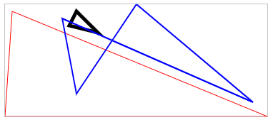
<t:drawarea id="g_66"
border="#c0c0c0"
drawcommands="polyline(10,10,100%,100%,0,100%,#FF0000,1);polyline(100,10,130,40,90,30,#000000,5);polyline(80,20,100%-20,100%-20,50%,0,100,80%,#0000FF,2)" height="160" width="100%"
/>
Each line contains a sequence of [x,y] definitions. The last two paraemters are the color of the line and the size of the line. As in other draw commands of the DRAWAREA, x and y positions can be passed in a flexible way:
absolute pixel positions (“10”)
percentage positions (“50%”)
percentage positions minus absolute position (“100%-20”)
When the content of a DRAWAREA was updated (e.g. logic changes the size of contained components), then the DRAWAREA did not pass the update to its owning layers – and did not resize as result.
We added a nice new page bean components:
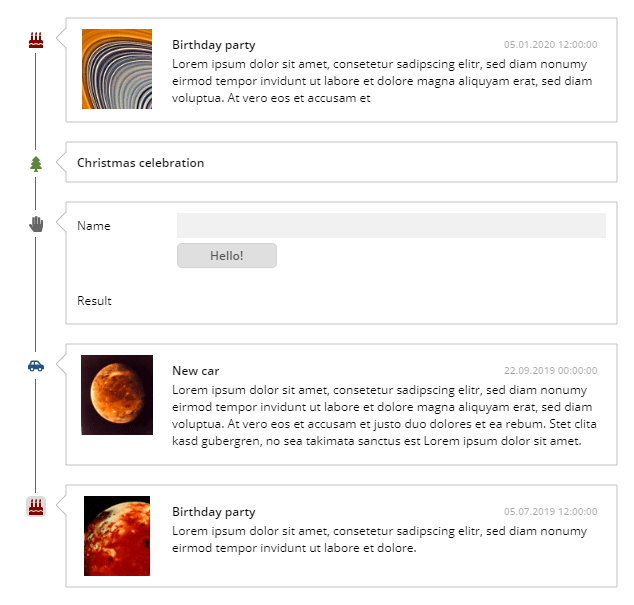
Inside the component you can add any page bean items as content, together with some image definition and some title definition. The page beans are rendered as time line, when clicking the image within the time line then the corresponding area on the right is collapsed so that only the title is shown.
Please take a look into the corresponding demo inside the demo workplace (“New Functions”).
There were two fixes:
Texts were sometimes not drawn with the correct text size.
The sizing of the component did not react on sizing changes within the component.
The ARRAYGRID is a simplified FIXGRID for output purposes. The column content is restricted by the controls that the ARRAGRID processing defines to be used. We now added the possibility to directly output images in columns. Please check the demo “Grids&Trees => Large Output Lists => Setting of Control Type”:
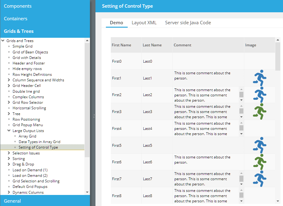
Due to a severe issue in 20200406 (Backspace key was not working anymore) we published 20200406_2. Please do not use 20200406!
When defining a HOTKEY with a component, then the hot key is automatically added to the popup menu. Same when defining a REQUESTFOCUSHOTKEY. Up to now the sequence of items was not sorted, now it is.
There are features in the browser, that we did not know so far – even though having used browser since a couple of years... - When pressing the scroll bar then the page scrolls “a bit”. (Did all of you know this? ;-)...). Result: if a button, checkbox, radio button is positioned in a scroll-able area and the user presses the control, then the page started to scroll. This behavior is switched off now.
When having added a HOTKEY definition by using POPUPMENU, and when having the positioned the corresponding MENUITEM within a sub-menu, then the hot keys was not activated.
When opening a URL with extension “.risc” then a corresponding servlet produces an HTML page for starting the web client. We now added the possibility to add additional header-meta-tags into the HTML that is generated, by adding corresponding definitions in configuration files “system.xml”.
<system>
...
<riscclientmetatag name="..." httpequiv="..." content="..."/>
<riscclientmetatag name="..." httpequiv="..." content="..."/>
...
</system>
When updating the text of the label on top of the PROGRESSBAR then the text size was sometimes not correctly calculated.
Menus and menu items now support the default cursor operations to navigate through the menu items: cursor up-down for navigating between items and cursor-left/right for opening and closing the next menu level.
Each component defines a certain series of hotkeys that are owned and solely consumed by the component itself. In case of the FIELD (and its derived components) up to now all key combinations with cursor-left/right were declared to be owned by the component. Consequence: a hotkey definition of “alt-left” was not propagated by the component to its parent layer. - We now defined the FIELD-owned keys in a more fine granular way, so that alt-left/right are usable as hotkey.
Up to now the component that caused a roundtrip top open a popup dialog also was the one which was focused when closing the popup. This is sometimes confusing e.g. when opening a popup due to some hotkey definition on a button (or other component). In this case the button was focused after closing the popup. - We now updated the strategy and check that the component that was focused at the point of time when opening the popup dialog also is the one which is again focused when closing the popup.
During the upload of client content via asynchronous upload components the parsing of the uploaded (String) content was done completely in memory. Now the parsing is done by using streams, which significantly reduces the memory load which is required for a short time during upload on server side.
The SLIDE component can now be used with diverse options to hide parts of its content:
Please check the corresponding demo in the demo workplace.
We also changed the slide style a bit, so that its grab area is round.
The searching of classes inside the Bean Browser was much improved and now really searches all classes that are reachable. Before it only searched these classes which were already opened inside the tree.
There are two new attributes with nearly any visible component:
FOCUSPREVIOUSHOTKEY
FOCUSNEXTHOTKEY
By adding hotkey definition to these attributes, you can add own keys for moving the focus to the next/previous component.
We provided some example in the demo workplace (“New Functions”) to demonstrate the possibilities you have to influence the keys to be used for moving the focus:
For a lot of components (e.g. PANE, IMAGE) you may define an INVOKE-event to allow the user to start certain operations by clicking/touching the component. The components now show a hover effect (as e.g. buttons) to indicate that they are active components.
The hover effect is defined in the style definition, please search for “backgroundModifierHover”. You can individually assign an own hover effect by using the RISC style value “_backgroundModifierHover”.
...some of you were asking this, here it is...: ;-)
Once switched to invisible you may bringt it back by using the menu “Tools => Show toolbar”.
Label and pane definitions so far included an explicit own cursor definition – the cursor was set to “default”. Now they inherit the cursor from their parent.
You will see the positive effect when e.g. defining an INVOKEEVENT with a PANE. Up to now any contained label did not switch to the “hand” cursor but stayed with their own “default” cursor. - Now they take over the cursor from the PANE.
The SPINNER component was not providing the attribute WITHREMOVEICON. In order to make the SPINNER component look similar to the e.g. COMBOFIELD component, we updated the with of the icons on the right, so that they are in sync with the width of the icons in the COMBOFIELD. The width is part of the style definition.
The API setFileName(...) was only available with DefaultBufferedContent – and not with DefaultBufferedStreamContent.
This was a serious bug in 20200309!
The value of changed fields was sometimes not transferred to the server side when invoking a function via hot key.
It could (very seldomly...) happen that a popup caused by a BUTTONMENU element was rendered on the wrong l-layer – and as consequence was not visible or only partially visible.
Due to an error found in this release (see 20200316 – Field value no transferred): please do not use this version for production environments!
Sometimes the preview-command-area did hide some content of the preview, that you wanted to use... There is now a icon on the right of the area that re-positions the area in the preview area.
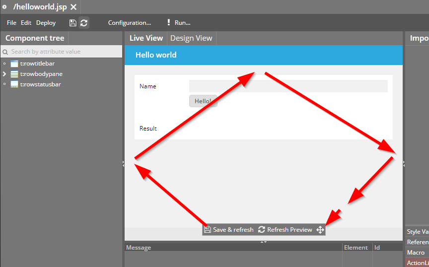
The Escape-key is used by default to close the dialog popups that are created by the components (e.g. CALENDARFIELD opens up calendar dialog). The Escape-key event for closing the popup was also delegated to the hot-key-management – so if there was some function listening to the Escape-key then this was triggered due to closing the dialog.
If a user clicks into a FIELD then the current content of the FIELD is selected by default. If the user now clicked another component, and then re-clicked the FIELD, then the selection of the content did not properly work: the selection was lost when releasing the mouse button.
The clipboard-copy was not working in new versions of Firefox and Edge.
Scenario: in a grid with multiple selection the server side logic did de-select items when being selected by the user. Result: the items on client side were still shown as selected, whereas they were not selected from application logic side.
We also added an example to the demo workplace in which this scenario is demonstrated:
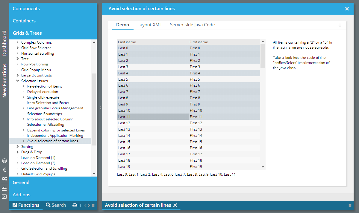
For a BUTTON (same with ICON, LINK) you may set attribute WITHLONGCLICK to “true”. In this case the button is not only activated by normal click, but also by the user clicking the mouse for some time onto the button without releasing.
On server side there is an attribute BaseActionEventInvoke.isLongClick() - if you are interested in the information if the button was clicked by a normal click or by a long click.
In addition there es an attribute WITHLONGCLICKENDEVENT. If you set this to “true” then you also get notified when the user releases the mouse button, after having done a long click.
Please check the demo in the demo workplace (section “New Functions”):
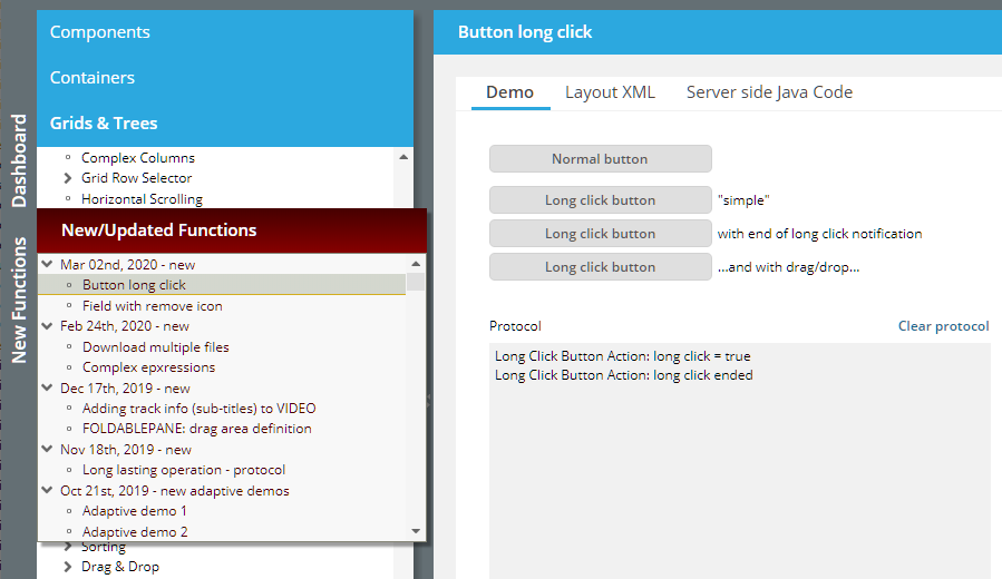
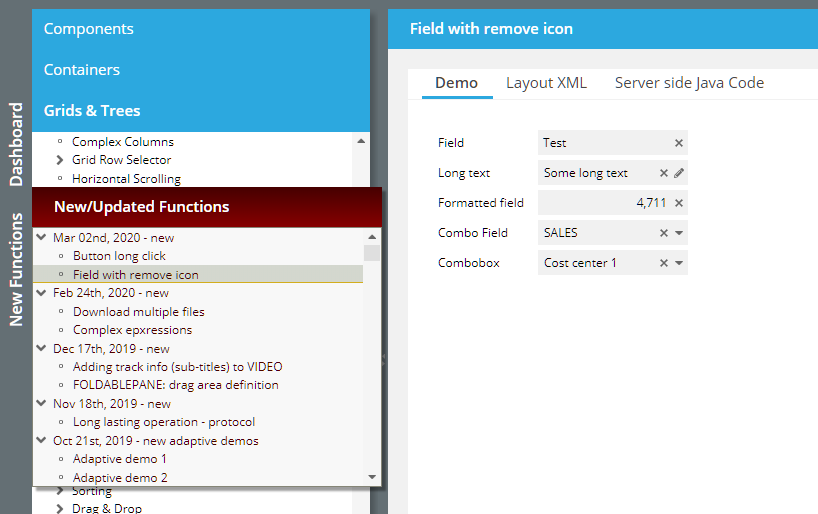
Fied controls (FIELD, COMBOFILED, COMBOBOX, …) now provide the attribute WITHREMOVEICON. If set to “true” then an icon is rendered on the right of the field area if there is some field content. When pressing the icon then the content gets removed.
The removal is doing exactly what is normally done by the user when directly working with the field content:
In case of FIELDs the text is removed to “”.
Same with FORMATTEDFIELD – where a “” is interpreted as “null” or “default data type value” (e.g. 0 for int-values).
In case of COMBOFIELDs the text is removed to “”.
In case of COMBOBOXes the text is removed to null.
Within a style definition you may define style values. The style values can be accessed via expression “#{ccstylevalue['<nameOfStyleValue>']}”.
This expression can now be easily selected by pressing the right mouse button onto an attribute value within the Layout Editor:
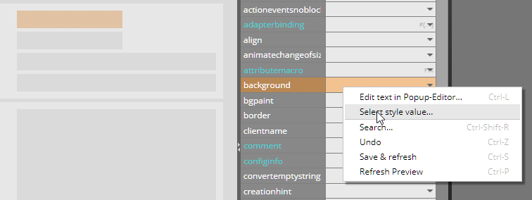
A dialog comes up in which the available style values are listed – and from which you can select the value by double-click:
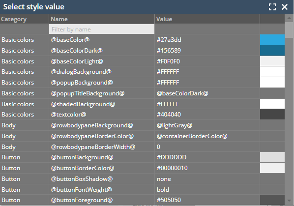
The style for the CALENDARFIELD was not correct in the default style (“default201812risc”) - it was set to white always.
When calling these methods outside the context of the processing of a request then both method internally threw a NullPointer-Exception. Now they return “null”.
With the TempFileManager you can store content as file on the server-side which is access-able from a URL. Up to now the one to resolve the URL was forced to get access into the session that created the content. This is normally a completely valid (security) feature, that internal data of the session is not access-able from outside the session.
In some situations you want to publish content which should be explicitly available to other programs – which cannot gain access into the session. For this reason there is a new method...
TempFileManager.saveTempFileCrossSession(...)
Downloading several files, one after the other is not completely trivial – because the browser is able to download one file at one point of time. Consequence: you need to program some kind of “chaining”, in which one download triggers the next one. A new demo shows how to do this (“New Functions”).
By default we advise to use straight expressions only (“#{d.xxx.yyy}”) - so that all logic stays on Java site. We now list these complex expression (e.g. “#[d.xxx.yyy == 0}”) that we officially support. - In principal we stay with the strategy “as minimum flexibility as required” - so there are no plans to open up new functions in this area...
Due to two stupid bugs we decided to publish a “during-the-week”-update...
Due to a missing style variable disabled FIELDs were always shown with white background. Any color defined by BACKGROUND was overridden.
One language file “language_ru.xm” was delivered with some characters that were not accepted during SAX parsing. Consequence: some ugly log output was generated as consequence.
The current style (default201812) was updated – a little bit! Disabled field components are not rendered with gray background anymore – but with transparent background.
This makes it easier for the user to differentiate between enabled and disabled components.
We were notified by some user (Thanks!) that we had problems when “Content Security Policy” was switched on using corresponding http-header-parameters.
The outest page, which is generated by the “.risc” URL now does not contain any inline JavaScript anymore – all JavaScript is part of the included js-libraries. Before there have been some few lines of bootstrap-JavaScript.
The same with some style statements which were directly done in the outest page – and which are now done via corresponding css classes.
This week's community heroes are located in Austria. Two language files for the client side language management were sent by developers from Egger. Thanks a lot!
Sometimes you have to upload files from a server side directory structure. Maybe this is a shared file directory, or an SFTP server.
The component “CCGenericFileSelector” shows the directory structure and lets the user select one or more files to be loaded. The interface to the directory structure is a generic interface, there are implementations for a file server and for an sftp server.
Please check the new demo in the demo workplace.
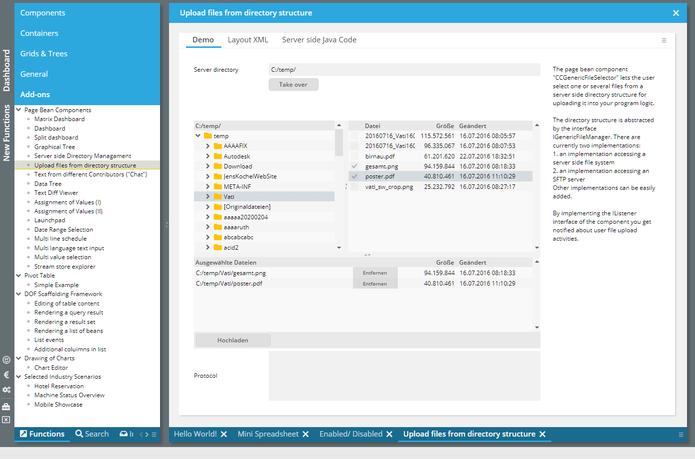
The component was open for e.g. drag-drop, but was missing the possibility to define an “actionListener” as reactor. The attribute was added accordingly.
When reloading a page from server side then it could happen that the message “Could not load style with name 'null'” was output on client side.
When working with the workplace management, then the workplace arrangement, the workplace history and the workplace function tree are loaded from some user-dependent storage.
By default the workplace management internally initializes the workplace automatically when being started, loading all user specific data start-up of the workplace. The user is accessed by interface “IUserAccess”.
In quite some situations you want to load the user-dependent data explicitly, e.g. after the user having passed a logon dialog. In this case call method...
IWorkpageContainer wpc;
wpc = getWorkpageContainer();
wpc.prepareWorkplaceForCurrentUser();
Up to now the workplace management always first started implicitly – and then could be updated by calling “ prepareWorkplaceForCurrentUser()”.
Now you can define that the workplace management does NOT start implicitly at the beginning, but starts as empty workplace – which you then can explicitly load later on.
To do so there are two possibilities:
Call:
WorkpageContainer.initImplicitLoadingForCurrentUser(false);
...e.g. at start-up point of time of the system.
or
2. Define in /eclntjsfserver/config/system.xml:
<system>
<workplace
...
implicitloadingforcurrentuser="false"
...
/>
</system>
In case of doing both definitions, the Java-API will overrule the XML definition.
By accessing an svg icon at “/xyz/abc.svg” via “/xyz.sbv.#ffc000.16x16.ccsvg” you can dynamically change the icons fill color and the icons size. This only works for flat icons, because certain string replacements are done, expecting the svg-xml-code to follow a certain structure. - Certain icons were not correctly interpreted because there was no blank space following the “<svg” start-tag.
There was a problem when e.g. selecting the 01st of Feb in the calendar popup – and immediately afterwards selecting the 31st of January. The result did not show the 31st of January but selected the 02nd of February.
When using IdTextSelection or IdAttributesSelection then the focus was not moved into the first select-able row with version 20200113 and 20200121.Improvement – Extra style ge for controls inside /eclntjsfserver/popups/griddetails.jsp
This is the popup for selecting the columns of a grid. The grid controls and the label controls now got assigned some explicit style variant so you can easier adapt. The style variants are defined as follows in the default styles:
<tag name="fixgrid" variant="CCGRIDDETAILS_AVAILABLE" extendstag="fixgrid" extendsvariant="default">
<set attribute="background" value="#E0E0E0"/>
<set attribute="bordercolor" value="#00000030"/>
<set attribute="borderheight" value="1"/>
<set attribute="borderwidth" value="1"/>
</tag>
<tag name="fixgrid" variant="CCGRIDDETAILS_SELECTED" extendstag="fixgrid" extendsvariant="default">
<set attribute="background" value="#FFFFFF"/>
<set attribute="bordercolor" value="#00000030"/>
<set attribute="borderheight" value="1"/>
<set attribute="borderwidth" value="1"/>
</tag>
<tag name="label" variant="CCGRIDDETAILS_GRIDLINE" extendstag="label" extendsvariant="default">
</tag>
When defining FLUSHAREA on a container as “true” then all the controls within the container are observed for value changes by the user. When a value is changed then a corresponding flush-event is sent to the server side. - If there is a control inside a container, that itself triggered a flush event (e.g. a FIELD with FLUSH defined as “true”), then up to now the flush-event of the control was sent in an extra roundtrip before the event of the area.
Now both events are sent in the same roundtrip.
Inside the /eclntjsfserver/config/system.xml configuration file you now can register a class supporting interface “IStartUp”. This class is started as part of the server side start-up processing.
<system>
<startupclass name="xxx.yyy.zzz.ApplicationStartUp"/>
</system>
Please pay attention: all session/request based APIs are not available during start-up! The start-up is processed directly as part of the server-start-up – without any user interaction being involved.
(Of course you can still use other ways of taking part in the start-up process that are part of the J2EE-API-specification.)
This error only occurred in 20200113.
In the PAINTAREA you may use the function that the user can select multiple items by selecting a range with the mouse. This function by default is available be pure mouse selection. You now can define in addition that this function is only available if the user presses the shift- or the control-key.
This function is used if the PAINTAREA e.g. is used within another component (e.g. SCROLLPANE), and the other component also want to react on mouse operations (e.g. due to switching SCROLLPANE-SCROLLBYDRAGDROP to “true”).
The server processing of one session can be used with a so called “profile mode”. In this mode all the interfaces between the outside server processing of CaptainCasa and the inside server processing of your application are monitored. Example: each access to a property via expression is monitored.
This monitoring can be started from the Layout Editor (internally a URL parameter “cc_profilemode=true” is appended to the “.risc”-URL).
You now can switch the profile mode on/off by corresponding APIs:
HttpSessionAccess.switchProfileModeOnForCurrentSession()
HttpSessionAccess.switchProfileModeOffForCurrentSession()
In addition you can access profile data by using the following interfaces:
ProfileLogWriter.getProfileLogDirectory()
ProfileLogWriter.getProfileLogFileNames()
ProfileLogWriter.readProfileLogMessages(fileName)
We tested our server “against” JSF 2.3.9 and added missing implementations in some classed. The runtime we deliver still is 2.2 by default.
For closing workpages in a current workplace environment you now may use two extended methods in IWorkpageContainer...
public void closeWorkpage(IWorkpage workpage,
boolean alsoCloseWorkpageWithNoCloseSupported);
public void closeWorkpageForced(IWorkpage workpage,
boolean alsoCloseWorkpageWithNoCloseSupported);
...in addition to the existing ones:
public void closeWorkpage(IWorkpage workpage);
public void closeWorkpageForced(IWorkpage workpage);
The difference is the parameter “alsoCloseWorkpageWithNoCloseSupported”. If you set it to “true” then also these workpages can be closed that are defined to no support closing.
Please note: CaptainCasa default functions will never use the “true”, i.e. they will never close a workpage that is defined to not support closing! ...so it's up to special functions on your side to use this parameter!
The IMAGE component has some nice functions which is quite useful: if the image is rendered in a shrinked way (by explicitly sizing it) and the user moves the mouse over the image then its full size version is shown as dialog. The dialog automatically disappears when moving the mouse outside the image:
This feature is invoked by setting attribute WITHHOVER to “true”. You even can define some own image to be shown on hovering (attribute HOVERIMAGE).
The positioning of the image dialog was sometimes not optimal if the screen size on the right of the base image could not show the full image dialog. Now it is shown on the left side / top side in case of missing screen space.
When scrolling a FIXGRID with the mouse wheel then now automatically the focus is moved into the grid, so that the user can continue to scroll with cursor operations without having to click inside the grid once again.
Up to now the MAILTO component opened some second browser instance together with the mail client. This second browser instance then was automatically closed after ½ a second. This on the one hand caused some flickering in front of the user, on the other hand there were problems in environments in which the mail client is not directly started but is started by confirming a dialog which pops up (and which also was closed after ½ a seconds...).
Now we use some different JavaScript API to start the client, the opening of a second browser window is not required anymore.
This parameter was ignored due to some sequencing problem in the startup of a page.
What does the parameter do? The client by default checks if it is started in a desktop environment or in tablet/phone environment. As consequence in an e.g. Android environment touch events are used as input, where as click-events are used in an e.g. Windows-desktop environment.
Especially with Window touch laptops (which can be used both as desktop and as touch tablet) we cannot find out on our owns which mode to support – so you may tell us directly by using this parameter (URL would be: “http://xxx/yyy.risc?ccdesktop=false”).
During drag-drop you may define textual information to be shown when dragging over a component. Example:
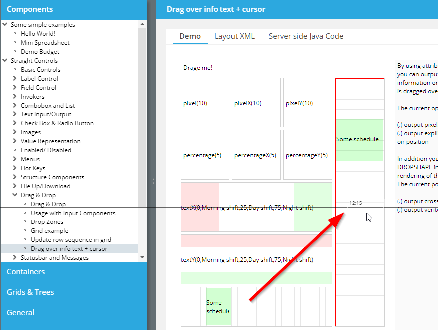
Up to now you could pass dedicated own textual information only for horizontal drag-over scenarios, now this was extended to support vertical scenarios as well – as shown in the screen shot.
Copying of text information into the client clipboard is now supported with IE, Firefox, Chrome and Safari. In case copying to the clipboard is not supported by the browser (e.g. Edge) the text to be copied is shown as a dialog from which the user then can directly copy/paste using “ctrl-c”.
When using class “WorkpageContainerRendererViaHideablePane” for rendering the workplace (this is the renderer which does not remove pages on client side but which pushes them into some hidden area), then a server-side memory leak occurred.
The CLIPBOARDSET component now works on many more browsers than the implementation before. In case a browser does not support the corresponding functions, a dialog will show up, in which the user can copy/paste the text directly.
The component was tested to directly work for: IE11, Firefox, Chrome. For MS Edge the dialog shows up as described.
The VIDEO component now provides the possibility to add TRACK definitions. A TRACK may add textual information, e.g. sub-titles, to the VIDEO.
Please check the demo in the demo workplace (“New Functions”).
When defining a DRAGSEND definition within a FOLDABLEPANE then by default the whole area of the FOLDABLEPANE is sensitive to drag operations.
By setting attribute DRAGTITLEONLY to “true” only the title area is sensitive – and not the whole content area.
Please check the demo in the demo workplace (“New Functions”).
The general definition of the time zone by using CLIENTCONFIG and/or by using “sessiondefaults.xml” was not used within the extended calendar processing. Now it is!
When using SPLITPANE-ONETOUCHEXAMPLE then little icons are shown inside the SPLITPANE-divider, by which the user can quickly open/close the SPLITPANE-areas. One of the icons (open to the right/bottom) was not correctly working when using SPLITPANE-CUTCONTENT at same point of time.
The sorting in a FOCUSSEQUENCE was done lexically – so that “A/11” was sorted in front of “A/2”. Now the sorting is done numerically...
In the Data Object Framework (DOF) there is now the possibility to add own columns into a data list. The rendering of these columns and the content of the columns is completely int the responsibility of the implementation of an extension interface. Please take a look into demo “Addons > DOF > Additional Columns in List”.
3 weeks ago we believed there was a severe bug in the date management. And we did some fixes on this. Now we found out that this bug was/is created due to missing definition of the TIMEZONE when passing date information into the controls, that have to do with dates (CALENDAR, FORMATTEDFIELD, LABEL).
The browser's JavaScript processing just behaves crazy and buggy (see: https://stackoverflow.com/questions/58817774/weird-javascript-timezone-for-early-days-e-g-01-01-1800?noredirect=1#comment103912975_58817774) – when calculating dates in old time ranges.
Luckily, when using the TIMEZONE attribute then we do not use the browser's time management but we use the one of the moment.js library. So all the problems are solved by itself. - Well, unluckily: we added some fix in 20191031 which was based on misunderstanding on our side, and this “fix” needed to be removed now!
We added some explicit chapter “Managing Date/Time Values” to the Developer's Guide in the meantime – which on the one hand points out the importance of a proper date/time strategy and on the other side shows simple ways to pass the time zone information that is required on client side into the client processing.
Please check that someone in your development team seriously takes a look into this chapter!
In order to simplify the central passing of the client TIMEZONE definition we now provide the possibility it pass this value within the configuration file “sessiondefaults.xml”:
<sessiondefaults
...
clienttimezone="..."
...
/>
Typical values are:
“LOCAL” if you use Java 8's LocalDate, LocalTime etc. classes
“UTC”/”GMT” of you use good old “Java-Date” and you do not care about time zones in your applications
“...” any other time zone
“${serverDefaultTimeZone}” if the server's time zone is the one that also should be used by default within the client side processing.
Please check the chapter “Managing Date/Time Values” within the “Developer's Guide” documentation.
When using the PASSWORDFIELD component and when using HOTKEY-based components somewhere else on the screen (e.g. BUTTON with HOTKEY definition), and when removing the content of the PASSWORDFIELD on server-side – then the removal was not reflected on client side.
There is a page bean component which blocks the screen for long lasting operations on server-side running in a separated thread:
The operation can output protocol information which is directly transferred to the client-side so that the user see what's going on. Please take a look into the corresponding demo within the demo workplace (section “New functions”).
...now it is.
The min/max-values before were the Java-values – JavaScript has some different ones...
Due to a missing definition the style variable could not be loaded in some styles.
When previewing pages you may now define query parameters (“name=value&name=value...”) which are appended to the URL that starts the previewed page. The parameters are stored within the layout editor per page.
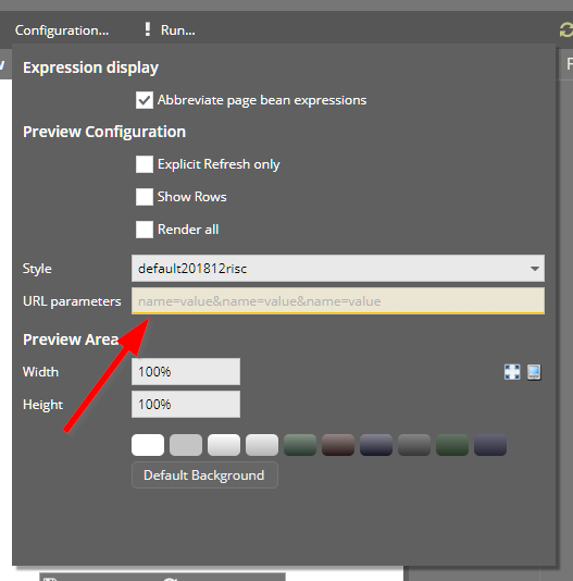
During talking to users on the problem of 20191031 we found that the important issue of dealing with date/time values quite often is not adequately reflected within quite some application implementations. We now extended the documentation (Developer's Guide) – there is a new chapter “Managing Date/Time values”.
Please check this text also when checking if the problem of 20191031 affects you – or not.
For configuring the client settings (e.g. client-country/language, time zone, scale) you can place a CLIENTCONFIG component into the screen (typically the outest screen of your application).
Now there is a central CLIENTCONFIG component added to any page that is loaded by a “.risc” URL. This CLIETNCONFIG refers to values that you can define in the class “org.eclnt.jsfserver.defaultscreens.Client”. At starting point of a session (e.g. within the dispatcher) you can call this class accordingly:
public class Dispatcher
{
...
public Dispatcher()
{
Client.setTimezone(“UTC”);
Client.setCountry(“DE”);
Client.setLanguage(“de”);
...
}
...
There is a new template available for creating adaptive pages. The images of the templates were improved...
We added some items in the area of “Managing Spring”:
There is a “ccee_spring” library which is part of the “ccee-addon” package.
There is some extended documentation available in the documentation area of the CaptainCasa page (http://captaincasa.org/documentation)
We added a Maven-project-archetype which includes the basic issues for integrating Spring.
>>20.11.2019<< In the meantime we know that the bug that was solved by this “fix” was some different issue/misunderstanding and we know that the “fix” of 20191031 comes with other side effects... See comment of update 20191120. - We do not remove the following text, though – in order to property keep the history of this document!
For explanation we use the component CALENDARFIELD – but the same applies everywhere, where date information is managed, which always means some reference to a time zone which needs to be passed.
Problem, explained for time zone “CET”:
The user enters “01.01.2019” => this value is transferred to a long-timestamp correctly and sent to the server side, so it arrives on server side as “31.12.2019 23:00:00 GMT”.
The user enters “01.06.2019” => thie value is transferred to a long-timestamp incorrectly and sent to the server side, so it arrives on server side as “31.05.2019 22:00:00 GMT”. So it is not sent as “01.06.2019 00:00:00 CET” but it is sent as “01.06.2019 00:00:00 CEST”.
The internal reason for this automated switching to the daylight-saving-time-zone is some behavior in the JavaScript library (moment.js) we use for this purpose. Even though you request for a date in the explicit time zone “CET” the library internally switches to “CEST” if the date is in the daylight-saving period of time. - We point out, that this is some behavior of this library – and do not blame this library for containing a bug! Unfortunately, we got to know about this behavior today by some customer messsage.
Are you affected by this bug?
You are affected if you use a time zone with daylight-saving – such as CET.
If you use a “technical” time zone like “UTC” or “GMT” then you are not affected, because these time zones do not support daylight-saving.
If you use LocalDate/Time/... then you use the time zone “LOCAL” in the components – and you are not affected.
What are the consequences?
If being affected, then this means that summer dates have been passed to the server side processing with a difference of typically 1 hour. The consequence on server side are dependent from your application processing. If you e.g. transfer a “01.06.2019 00:00:00 CEST” (<== wrong timestamp due to bug) which is “31.05.2019 23:00:00 CET” into a SQL-column with data type “date”, then the column contains value “31.05.” and not “01.06.”.
In any case: please re-check with CaptainCasa on detail information, if you are not sure if this bug is relevant for you or not.
With this update 20191031 we first of all fixed the bug.
In the demo workplace we demonstrate the flexibility of the component ROWFLEXLINECONTAINER when it comes to define layouts that automatically adapt to the screen size. Please check the section “New Functions”.
And: each page of the demo workplace is now adaptive as well – the text is either rendered on the right side or – if no sufficient screen space – below the example.
When performing JUnit tests then the servlet container environment typically is available. The class “UsageWihtoutSessionContext” is the one that already exists for long time: by calling...
UsageWithoutSessionContext.initUsageWithoutSessionContext
...you tell the CaptainCasa runtime that a lot of functions accessing the servlet environment are not running into some error, but switch to some “mini-mode” so that JUnit tests do not fail.
There are two new functions which you can use for defining you JUnit test environment more precisely:
UsageWithoutSessionContext.setServletTempDirectory(...)
UsageWithoutSessionContext.setWebContenxtDirecotry(...)
When defining IMAGE and IMAGETO with FOLDABLEPANEVERTICAL then the icon did not correctly update if the OPENED value was updated from server-side.
If setting up some layout like...
REPEAT
ROW RENDERED=”.{rendered}”
XXX
XXX
...then the value of the “.{rendered}” was not recognized.
We already added some issues for passing the static Veracode scan two weeks ago – but these were not yet sufficient. So with this update some more issues are applied. To give some more detail: the SAX parsing is done through a SAXParserFactory which is created in the following way:
s_factory = SAXParserFactory.newInstance();
s_factory.setFeature(XMLConstants.FEATURE_SECURE_PROCESSING,true);
s_factory.setFeature("http://xml.org/sax/features/namespaces", false);
s_factory.setFeature("http://apache.org/xml/features/disallow-doctype-decl",true);
s_factory.setFeature("http://apache.org/xml/features/nonvalidating/load-external-dtd", false);
s_factory.setFeature("http://xerces.apache.org/xerces2-j/features.html#disallow-doctype-decl",true);
s_factory.setFeature("http://xml.org/sax/features/external-general-entities", false);
s_factory.setFeature("http://xml.org/sax/features/external-parameter-entities", false);
It's always difficult to check, if the scanning is now successfully passed, because Veracode tests need to be triggered asynchronously by some other organization... So any feedback on this is appreciated.
The “Scree Map” allows you to arrange the pages of your project in maps – each page being represented by a box from which you can navigate into the different tools (e.g. Layout Editor).
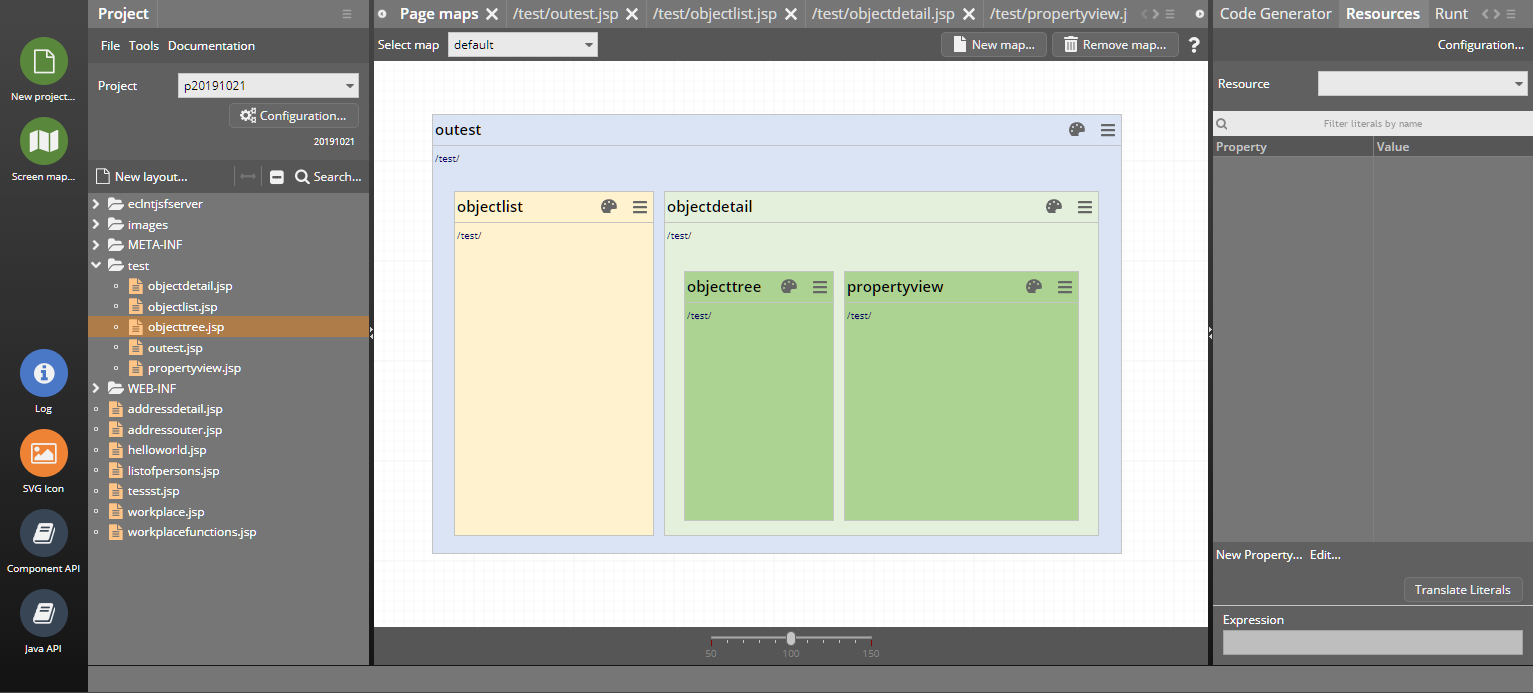
The functions are:
Drag&drop of existing layouts from the project tree on the left into the map area
Right mouse button popup menu inside map to create new layouts – which then are directly placed inside the map
From the box representing a page you can...
Open the Layout Editor
Show the page in the project tree on the left
Remove the layout
You can organize your screens in several maps. The maps are internally stored as XML files within the project directory. There is a new sub-directory “.cc/maps”.
Up to now you had to quite carefully hit the slider in order to directly set a slider value with a single mouse click / touch. Now the whole slider area is click/touch-sensitive.
When using the feature HORIZONTALSCROLLMODE “auto” / “autowithresize” then the grid was drawn with a too big height in many cases.
What's the story behind? - The grid by default always calculates a horizontal scroll bar into its height, so that it does not resize its content when the grid columns exceeds the total width of the grid (and a horizontal scroll bar is shown as consequence). This extra size for the scroll bar should not be calculated if there is no need to show a horizontal scroll bar.
The fix is especially significant if the grid does only have a low number of visible items – because then the full scroll bar height is distributed to some few items only.
Even though the files that CaptainCasa accesses itself are configuration files that are only read and not written from application layer's point of view, we protected them to pass static code checks (e.g. VeraCode).
The ServerImageManager is the server-siste instance to resolve dynamically created images (e.g. for awesomefont-icons and for text images). You can pass these images by class loader in order to speed up the generation and to prevent the problem, that the resolution of generated images depends on the server-side Java-rendering of images – e.g. Linux based systems quite often render in quite poor quality.
The access to the files within the classloader is done in two steps now: the first access is done just normal, the second is done with all characters being transformed to lowercase. This especially helps, if e.g. fonts icons were transferred into png-icons with passing a color value, which sometimes id referenced as “#FF0000” and sometimes as “#ff0000”.
...we have to add: generating png-icons out of font icons is not really an issue that we push! ;-) We recommend to use SVG icons!
The “CCEE”-library – a useful collection of functions and frameworks for developing the business logic below the user interface is now available as Maven-artifact as well. Please download via the following dependency:
<repositories>
...
<repository>
<id>org.eclnt</id>
<url>https://www.captaincasademo.com/mavenrepository</url>
</repository>
...
</repositories>
<properties>
<cc.version>20191015</cc.version>
</properties>
...
<dependencies>
...
<dependency>
<groupId>org.eclnt</groupId>
<artifactId>eclntccee</artifactId>
<version>${cc.version}</version>
</dependency>
...
</dependencies>
When hiding a GRIDHEADER and showing it again by using the GRIDHEADER-RENDERED attribute, then the GRIDHEADER was shown at the bottom of the grid.
This is some nice issue for all FIXGRID users. Please check the demo “Delayed grid execution” in the “New Functions” section:
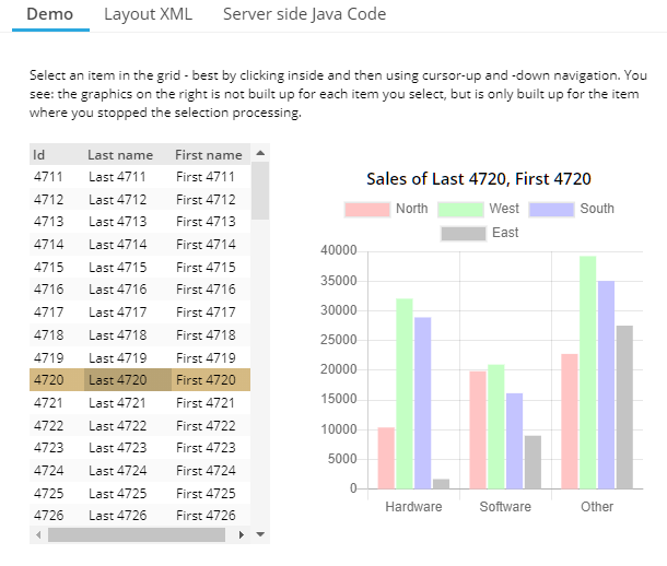
The user can quickly navigate through the grid items. Whenever the selection is not changed for some while, then a grid-execute event is automatically triggered. The graphics on the right side (representing some “heavy” reaction on selecting a grid item) is built up by the “onRowExecute” event.
Consequence: the navigation through the grid (e.g. via keyboard) is fast and still and is not burdened with building up the graphics every time the selection changes.
The DRAWAREA component allows to do simple 2D-drawing operations into its area. Drawing is done by using SVG drawing internally. While being useful in general, it is especially useful for transferring BGPAINT commands from the former Swing client into the RISC client. Within the Swing client you could pass hex-image definitions by using “heximage(...)” - which is now supported by the DRAWAREA as well.
We found the “real” reason behind the bug, that popup menus sometimes did containt several menu items, showing the same hot key definition: the hot key definitions were nor propertly removed when being part of a popup and when closing the popup.
It could happen that a GRIDFOOTER line was rendered despite the RENDERED-attribute of the GRIDFOOTER was set to “false”. Same with GRIDHEADER.
CaptainCasa styles are automatically loaded into the client processing – but sometimes you may want to insert external CSS files as well. Typical example: you want to integrate some different font. Up to now you had to place the corresponding .css file into the style directory of CaptainCasa.
Now it's simplified: you may directly list the files to be included within the system.xml configuration file:
<!--
*************************************************************************
Configuration of additional styles includes in RISC client
*************************************************************************
-->
<!--
<riscclientstyle src="xxx/yyy/zzzz.css"/>
<riscclientstyle src="aaa/bbb/ccc.css"/>
-->
<!--
*************************************************************************
Configuration of additional javascript includes in RISC client
*************************************************************************
-->
<!--
<riscclientscript src="xxx/yyy/zzzz.js" type="text/javascript" />
<riscclientscript src="aaa/bbb/ccc.js" type="text/javascript"/>
-->
When doing keyboard input and touch input in parallel then it could happen that the result keyboard input was not taken over properly. This is directly clear to the user in general with normal FIELDs – but with PASSWORD fields the user does not really see the text that is actually written.
The workplace provides a history of visited dialogs. This history can be shown to the user (see Workplace Demos in Demo Workplace). It is now possible to drag and drop items from this history into any favorite area of the workplace.
A popup menu includes a list of hot keys that are available to the user. It could happen that one hotkey definition was shown multiple times.
Up to now style definitions had to be part of the web content (“.war”-file) that was deployed at customer site. Now style definitions can also be stored in the so called “StreamStore” - where CaptainCasa stores all its persistent information at runtime.
Check the demo “General > Style & Language Management > Define runtime styles”:
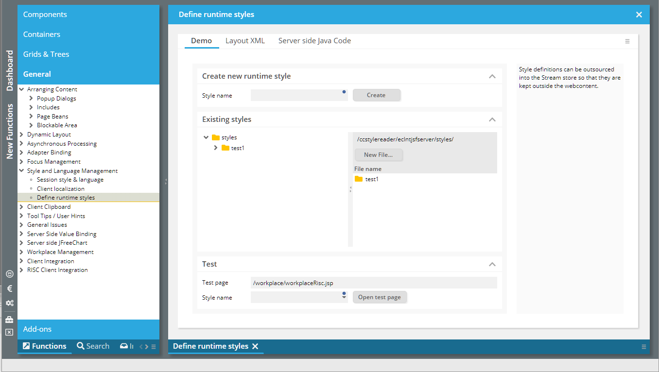
The file structure that is shown inside the stream store is exactly the one that you know from normal style management: there is one directory per style containing a style.xml and a riscstyle.xml file. You can directly edit the content of the files within the demo.
The demo internally uses the page bean component “CCRuntimeStyleEditor” which you can embed into your application, too.
In addition there is a new API-class “StyleFileAccess” which you can use to write own files into the corresponding places within the stream store.
StyleFileAccess.writeRuntimeStyleFile(styleName,fileName,content)
Please note when working with styles:
Styles are buffered in the browser, so refresh the browser cache regularly
Styles are also buffered on server side (they are internally generated from XML files), the buffer can released when appending URL parameter “ccresetbuffers=true”.
The Page Bean Component “CCStreamStoreExplorer” allows you to view and edit (if set to enabled) the stream store content.
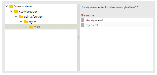
You may pass a root path as parameter which then is the maximal navigation area that the user can access.
You now enabled/disabled the AREASELECTOR.
By default the tab order follows the definition of components within the layout definition. Now you can override by using the attribute FOCUSSEQUENCE. Please check the corresponding demo within the demo workplace (“New Functions”):
The definition is simple – and you do not have to define an absolute focus numbering as with pure HTML. Basically you define focus groups by some naming “<group>/<order>”. Within one group the focus is moved according to the order definition.
There is now an attribute REQUESTFOCUSHOTKEY. If the user presses the corresponding key then the focus is moved directly into the corresponding component. Please check the demo in the demo workplace (“New Functions”):
Uuuuh: when using the PASSWORD component on touch devices then it was disabled by default. The bug was introduced with 20190626.
This is something special...: when the client starts then the first POST-request to the server is introduced by some internal ping request to a static resource of the server. Background: with this ping request, a header attribute is sent to fetch a so called “X-Csrf-Token”, which might be delivered by corresponding security frameworks.
In case of communication ending up with some failure during the runtime of the client, the client tries to re-execute the communication. We now add an explicit ping request also with this re-execution in case the previous communication ended with a 401-response from the server side.
You want to cut out (“crop”) an image from an existing image? Or do something else in which you want to select some graphical area on top of some other component?
The AREASELECTOR is the component to use...:
By drag and drop the user can select some area. The information about the selection is passed to the server side and you can there “do what you want” (e.g. cut out some image from an existing image using Java image processing).
We updated most of the value help popups to be resize-able. The negative impact:
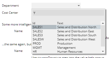
If using the dialog to show valid values without header buttons (which are actually placed at the footer...), then the scroll icon on the bottom was not click-able because it was overlayed by the edge-sizer of the popup-dialog. We now changed the size of the edge-sizer so that it is still big enough to be easily grabbed, but small enough to not cover too big parts of the dialog content.
The feature to use HIDEABLEAREA-components (see 20190902) for showing/hiding certain regions of a dialog was applied to the workplace framework.
If switching pages in the default workplace then the components of the old page are completely removed from the workpage area and the components of the new page are completely newly created within the workpage area.
Advantage: there is no massive client state if a lot of pages are shown, because only the one that is actually rendered is the one which is loaded.
Disadvantage: in case of big pages (e.g. pages with a lot of grids holding a high number of columns) the pages are constantly built up and removed when the user switches betwenn workpage dialogs.
Now we enabled the workplace to keep the pages. Switching between pages does not mean that they are taken out and in, but that they are switched on and off – keeping their client state.
Advantage: switching is (much) faster. - Disadvantage: more memory is required on client side. We observed memory with our demo workplace's pages, including the one which build up “massive dialogs” and were not yet able to get into areas where memory consumption is too high or is bringing the client into trouble situation.
The following code is the one to be used for enabling the fast switching:
getWorkpageContainer().setRendererClassName(WorkpageContainerRendererViaHideablePane.class.getName());
getWorkpageContainer().setUpdateOnInnerEventOnly(true);
IMPORTANT: the status of this development is “solid beta”. Please talk to us in case you should plan to use this feature in the near future! (!!!)
The HIDEABLEAREA is quite simple – it hides its content on client side if the boolean value behind HIDEABLEAREA-HIDDEN is set to “true”. The new feature: while normally the hiding is done by removing the content from the client side component tree, the content now can be hidden, by leaving it within the component tree and resizing it to “0,0”.
As consequence the client side status of the content is kept.
Concrete use case: within the content you keep a BROWSER component. If the user navigates within the BROWSER page, then now you can keep this navigation state.
Please check the demo (“New functions”) within the Demo Workplace.
We worked on the performance of destroying whole, big areas within the component model on client side. The removing of client side nodes was done recursively, level by level up to now – and was switched to centrally release central components on a high component tree level.
When pressing the “end”-key within a FIELD which automatically moves the cursor to the next component when reaching the MAXLENGTH definition, then the focus was moved to the next component – but should stay inside the current FIELD.
This bug is fixed.
By default one page is referring exactly one page bean class. This means: most expressions that are defined within the page are following the format: “#{d.<NameOfPageBeanClass>.<property/method>}.
Example: the name of the page bean class is “DemoExtCalendarAssignment”, so the typical attribute value is displayed in the following way:
When opening up “Configuration...” within the Layout Editor...
...there is now the possibility to “abbreviate page bean expression”. When using this function then the expression now looks the following way:
So the abbreviation “#{pb:” is used for the page bean class name. In order to be better aware of the expression behind the current page “#{pb:” there is an extra information on the bottom of the attribute section:
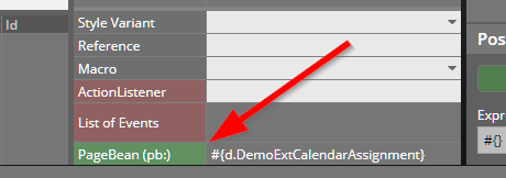
The icon now changes to a “normal size” icon when the popup is maximized.
The style sheet editor now consistently provides list of valid values during editing.
When assigning HOTKEY definitions to certain action-components (BUTTON-HOTKEY, ICON-HOTKEY, MENUITEM-HOTKEY) then the hot key information is shown in two ways:
The hot key is shown as tool tip which is automatically generated.
The hot key is shown as part of the popup menu, when the user presses the right mouse button (or invokes the popupmenu-key on the keyboard).
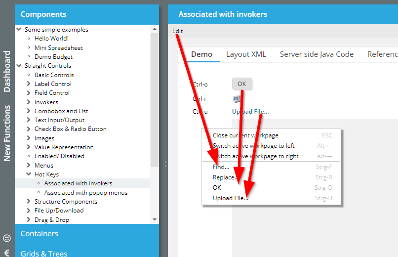
The items are added to the end of the normal popup menu, separated by some line.
In case you do not like this appending of items you can switch off by setting CLIENTCONFIG-POPUPMENUGLOBALHOTKEYS to “false”.
If a popup dialog is decorated and if it is size-able then there is a “maximize”-icon shown next to the close icon:
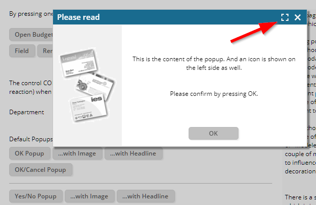
With the IMAGE component you may open up a dialog to show some big image by using IMAGE-WITHHOVER. This dialog is opened whenever the user moves with the mouse pointer over the image. With missing screen space it could happen that the hover-dialog was opened on top of the image component – internally causing some “mouseout” event, which triggered the closing of the dialog... Result: a dialog which was opened, closed, opened, closed, …
The same could happen when using the HTML-tooltip (xxx-TOOLTIP=”<html>.....</html>”).
A menu now received the focus when opening up. The user can navigate through the menu items by using cursor keys (or tab key).
When using AWESOMEFONTICON with attribute CONTENTAREAFILLED=”false” then there was a missing style class definition (e.g. the cursor was not shown as pointer, etc.).
There is a new attribute IMAGEPOSITION in the LABEL component: if the width of the LABEL is explicitly defined and if the LABEL receives more width then it requires, then by default the IMAGE of the LABEL is positioned on the very left.
(For better visibility a red background is assigned in this example.)
By setting LABEL-IMAGEPOSITION to “attext”, the image is positioned close to the text:
This feature is used within the ARRAYGRIDBinding-processing now. It was an issue of incompatibility between the Java-Swing-client and the RISC-client.
In the TREENODE you can arrange one sub-component (well, if this is a PANE then any number of components might follow within the PANE-container...). If placing a FIELD then the input of “space” was sometimes processed by the TREENODE as well – with the result of the TREENODE opening/closing its child-content.
Thanks for the input from the community here! So the content-type now is “application/vnd.openxmlformats-officedocument.spreadsheetml.sheet”.
The installation is now split into two parts:
Environment Installation (JRE/Tomcat)
CaptainCasa Installation
The reasons behind are:
The Environment Installation only needs to be executed once – when installing CaptainCasa the first time. Afterwards, when installing updates, you do not have to re-install.
We now can provide different environments. In particular we now added a Java11 based environment in parallel to the Java8 based environment.
We now also provide some pre-configured environment for Linux/Mac OS users. Installation for Linux/Mac OS is now much more similar to installation of Windows.
The JRE11 version that we use is an OpenJDK-based one. We use the JREs that are provided by https://adoptopenjdk.net/.
When using a CaptainCasa application with Java 11 you up to now had to explicitly add some .jar files to the WEB-INF/lib folder. Reason: Java 11 does not contain any JAXB implementation anymore.
We now added the following jar files to our default webcontent (“webappaddons”):
jaxb-api.jar (2.3.1)
jaxb-runtime.jar (2.3.1)
javax.activation-api.jar (1.2.0)
istack-commons-runtime.jar (3.0.7)
Please make sure that these libraries do not conflict with libraries used on your side.
In case of you using Maven, all dependencies are explicitly defined within your pom.xml definition. When using Java 11 make sure that you have added the following dependency:
<dependency>
<groupId>org.glassfish.jaxb</groupId>
<artifactId>jaxb-runtime</artifactId>
<version>2.3.1</version>
</dependency>
In quite special cases the sequence of action events was different between the Swing-Client and the RISC-Client. Concrete: a flush event within a grid cell was executed prior to a row selection event.
When using the PASSWORD fields without encryption, then it could happen that user input was not correctly transferred. The bug only occurred when editing some existing password value – it did NOT occur when editing some new password – so the bug did not show up in typical logon scenarios.
When using the MULTISELECTMODE “1” the rendering of selections was sometimes not correctly done: selected items did not show some selection background.
In certain situations (typically if the menu popup is located on the left of the caller due to missing screen space on the right) the menu item popup was rendered too big – some height was added for some potencial scroll bar. The visual impression was that the menu contained an empty item.
When executing drag/drop operations (including the drag/drop when scrolling a FIXGRID), then by default all sub-pages (i.e. pages which are embedded by using IFRAME internally) are overlayed by some transparent layer. Background: by doing so, the events for drag/drop-processing are correctly handled also on IFRAME areas. The releasing of the transparent layer was not done in special situations – resulting in the behavior that the embedded pages were not usable.
In general a double click removes any text selection. Background: by default the browser selects the text under the mouse pointer on double click – sometimes in a quite “wild” way... A typical double click processing e.g. in grids looks quite ugly as consequence, so we added the behavior to remove the text selection.
We now opened up the selection for field controls again, because here the selection is clearly rules (only the text within the field is selected), and because here it is quite convenient for the user to select text by double click.
If action methods were built in the following way...
public void onWhatEverAction(ActionEvent event)
{
try
{
…
}
catch (…)
{
}
}
...then they were not visible in the code generator anymore.
iOS-Safari does not render Canvas properly in some situations – preventing the DRAWAREA to not properly work in some iPad/iPhone scenarios. Luckily the drawing operations of DRAWAREA are very straight forward, so we transferred the HTML5-Canvas-based drawing to SVG-based drawing.
According to our tests the drawing is 100% the same now, it's just a different technology below which is used.
By the way: we did some similar things 2 years ago – when finding out that the rendering performance of HTML5-Canvas is really slow with Canvas-sizes of 10.000 x 10.000 pixels. At this point of time we changed the drawing of PAINTAREALINEITEM-components from HTML5-Canvas to SVG as well – with “perfect” performance results...
This feature was not supported in mobile scenarios up to now. You still had to execute a long touch instead of a short one for executing a grid item. Now the feature is supported.
Within a tree node you can arrange a sub-component – typically a CHECKBOX or a FIELD-component. It could happen that the reaction on the user pressing “space” on the keyboard not only was managed within the CHECKBOX/FIELD/... - but also was executed within the TREENODE component. Here a “space” opens/closes the tree node.
When setting attribute ENABLED to “false” then the user was still able to select/deselect items from the list.
We now found the “origin problem” behind the problem that was addressed within the last update 20190723 as well (problems with hover-effects and with closing tooltip popups, especially occurring with scaled screens).
When scaling the browser (e.g. by using ctrl-key and mouse wheel) then it could happen, that hover-effects “stuck”. This means: the hover effect (e.g. darkening) was applied when entering the component with the mouse cursor – but it was not removed when moving with the mouse out of the component.
The reason for this is some quite strange event behavior of browsers when components are scaled – our assumption is, that is has to do with “interlacing” two components to one pixel position in case of scaling: a component sends a “mouseover”-event, then sends a “mouseout” event and then, on the last pixel, sends a “mouseover”-event once again, without ever sending a “mouseout” afterwards. This e.g. happens when moving the mouse in an extremely slow way – pixel by pixel.
Anyway, we now help the browser with firing “mouseout” events! ;-)
The same internal problem also caused the “effect” that tooltip popups, when using HTML-tooltips, sometimes were not removed – but continued to wait for some “mouseout” event from the browser, which never was sent...
(By the way: this is/was a nice example of some strange browser processing being solved by some change in the RISC-kernel – in which the eventing is centrally managed.)
The attribute GRIDCOL-SORTENABLED attribute did not react when being updated within some existing grid instance – the enabling/disabling of sorting was following the initial value only.
By setting CLIENTCONFIG-TABONENTER to “true”, you may define, that after pressing the return-key a “tab” is initiated, i.e. the focus is moved to the next component. Of course this does not work for components for which the return-key already is used within the component (e.g. BUTTON). - The TEXTAREA is one of these components, when hitting the return-key within the TEXTAREA, then the user wants to created a new line – and does not intend to focus the next component.
The previous two version contained some problem in the grid selection management. In most cases you did not experience this problem at all, but there was the possibility that the user saw two selected rows where he/she should only see one selected row. The problem occurred especially in grids that used the AVOIDROUNDTRIPS feature – but there were also situations in which normal grids were affected.
There was some concrete reason behind the problem which we found and which was related to a change in 20190702. The problem is fixed now and we did a lot of testing. In case there is some confusion with selections in grids within your application: please contact us directly.
Due to problems in the FIXGRID-selection: please do not use this update in production scenarios!
In grids with attribute MULTISELECT set to “true” the user now can select multiple items with the keyboard as well. Before it was only possible via mouse selection. For selecting the user needs to press the shift-key and then use cursor/page-up/down keys.
The error message dialog and the file upload message dialog were beautified:
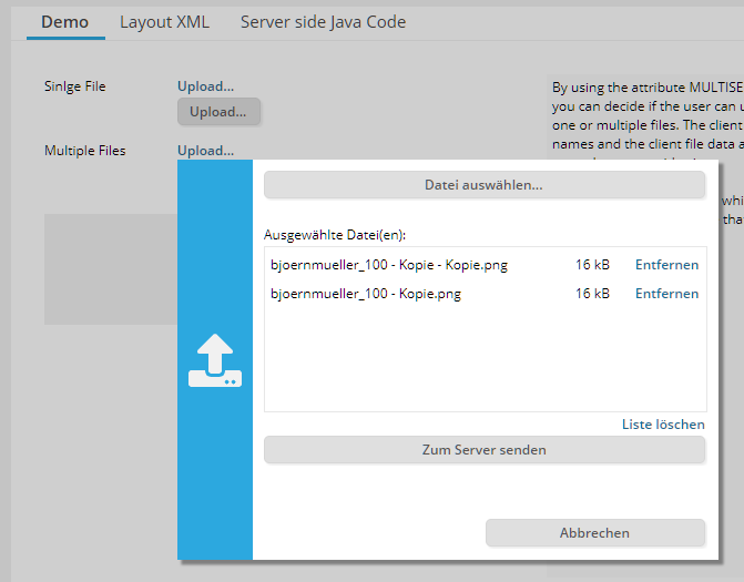
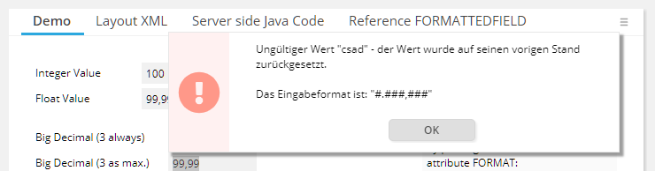
The scroll icons (both in the scroll bar of a FIXGRID component and in the right corner of the TABBEDLINE component) now continuously fire scroll events when the user presses the icon for a long time.
In some FIXGRIDs (only these ones with AVOIDROUNDTRIPS being explicitly set to “1” or “2”) it could happen that a selection was visible twice after scrolling.
The PASSWORD component did not show any touch popup dialog, though TOUCHSUPPORT being set to value “true”.
In the FIXGRID (or ARRAYGRID) you can explicitly define the coloring of selected items (attributes SELECTIONCOLOR1 and SELECTIONCOLOR2). This coloring was not shown in rare cases.
Due to problems in the FIXGRID-selection: please do not use this update in production scenarios!
When calling a popup and when setting an explicit position, then this was ignored if the popup was called from a MENUTITEM. The popup was always centered.
When the client talks to the server, then only changes are transferred in both directions. For the FIXGRID processing there was one exception – each grid row was transferred with a minimum set of data with every roundtrip. Now there is a full delta management also on this level.
It could happened that the focus sequence in a popup dialog did not jump back to the first focus-able control when reaching the end of the sequence.
Setting this scaling-value to something different than “1” did cause errors in the client.
It could happen that the PASSWORD component encrypted the anonymized representation of a password. There never has been a security risk! The server NEVER sends real password data to the PASSWORD component, but always some anonymized password (“****”).
...for disabled combo fields/ combo boxes.
CaptainCasa internally manages instances of class “DefaultScreen” - one per dialog session. When using COOKIE for session-tracking then this instances were cleaned up at the end of the “big” http-session, but they were not cleaned up at the end of the “small” dialog sessions (browser tab).
The PASSWORD component now provides an attribute WITHSHOWTEXTICON – if set to “true” then the user can view the current password in clear text by clicking an icon within the component.
The icon is only visible during password input.
In general the PASSWORD component never sends a server side password value to the client side! The value of a password is always anonymized into asterisks (“*****”) when it is sent from the server side to the client side.
A FIELD (via regular expressions, REGEX) and a FORMATTEFIELD (via FORMAT) can already check on server side, if a value that a user does input is correct. If the value is incorrect then it is reset to its former value and the user is notified by some error popup.
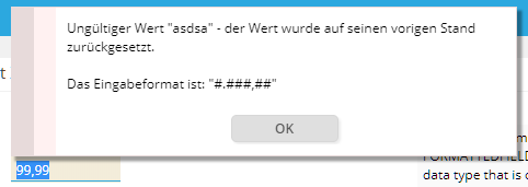
The popup typically is shown when the user leaves the field (i.e. moves the focus out of the field). - Imagine the following situation: the user defines a wrong value and directtly (with the mouse) presses a button (e.g. “Save”-button).
Up to now the wrong value was replace by its former value, the popup was opened – and the button-action was executed. In case of “Save” this means that the former value of the field is saved, whereas the user wanted to save the new value (though being incorrect). This typically is confusing for the user and might also lead into wrong data being stored on server side.
Now a wrong field input vetoes the roundtrip to the server – i.e. the action behind the button is not called until the user has acknowledged the message popup.
Some of you were waiting on certain issues, so we decided to publish them as formal update.
The SCREENGRABBER component takes some PNG screenshot from the current screen. There are now three possibilities to define the zone which is to be grabbed:
“window” - the whole window (browser window)
“dialog” (new) – the next dialog level. This is either the popup-dialog in which the SCREENSGRABBER is placed or – if no popup is around – then whole window
“pane” - the pane in which the SCREENGRABBER is placed
This only occurred if the size of the combo box popup exceeds the width of the available browser window...
When dynamically adding/removing TABBEDLINETAB components within a TABBEDLINE, then it could happen that the styling of added components was not correctly applied. This only happened if no explicit selection was done.
Last week's version “introduced” some bug, which caused JS errors in the client side processing with invisible components, that triggered serve side actions. Example: TIMER.
This bug is solved with 20190617. Please do update to 20190617 from 20190612!
When editing text in some FIELD or TEXTAREA component, then the text selection can be transferred to the server side application processing in addition to the actual text that is edited. So far the text selection contained the “cartetPosition”, “selectionEnd”- and selectionStart”-position, so that you can find out which text was selected by the user.
Now we added three additional values: the “left”, “top” position of the current caret position – and the “height” of the corresponding character. This information enables you to start a dialog popup directly at the location of the selected text or at the location of the text cursor.
In addition: you can now also set the selection from the server side so that the cursor positioning can be controlled in a fine-granular way.
Please check the corresponding demo in the “New Functions” area of the demo workplace:
Modal/ModlessPopup provide a couple of “setLeftTopReference”-methods, which enable you to opene some dialog on top, at the bottom, at the right or left side of some component.
One was missing: the possibility to open a popup at the exact x,y location of some component. This method was added, its name “setLeftTopReferenceComponentIdOver”.
The pom.xml now only contains repositories that are connected via “https”. Before the CaptainCasa repository was addressed with “http” only – and there was a second repository, addressed with “http” as well, which was not required anymore at all.
The correct list of repositories is:
<repositories>
<repository>
<id>org.eclnt</id>
<url>https://www.captaincasademo.com/mavenrepository</url>
</repository>
<repository>
<id>mvnrepository.com</id>
<url>https://mvnrepository.com/repos/central</url>
</repository>
<repository>
<id>org.outerj</id>
<url>https://maven.atlassian.com/3rdparty/</url>
</repository>
</repositories>
Please also adapt existing Maven projects correspondingly in order to avoid some “man in the middle” security attack, when Maven downloads the artifacts.
The coloring of the line item points are now outsourced in some style values.
<class n="riscinternal_riscglobal" internal="true">
...
...
<!--
paintarealineitem coloring of interim points
-->
<risc n="_paintarealineColorOther" v="#808080"/>
<risc n="_paintarealineColorMidhorizontal" v="#C0C0C0"/>
<risc n="_paintarealineColorMidvertical" v="#C0C0C0"/>
<risc n="_paintarealineColorMidfirst" v="#804040"/>
<risc n="_paintarealineColorMidlast" v="#804040"/>
<risc n="_paintarealineColorPoint" v="#808080"/>
<risc n="_paintarealineColorMid" v="#808080"/>
...
...
</class>
By default a dialog popup is opened close to the location of the component which triggered the roundtrip opening the popup. There are cases in which this component is not available anymore when the popup is opened. Typical case: one popup is closed and directly opens the next popup. So the component in the first popup is not available anymore when the second popup is built up.
Now the coordinated of the triggering component are stored in parallel and are available also if the component was removed. Result: smarter positioning of popups for these cases.
Certain images (e.g. images from text, mirrored images, etc.) are created by server side servlet processing. The URL interface of this servlet made it possible to also operate on non-image files – and this could cause error situations, in which an image was not correctly loaded.
Now the files are checked against a white list of file extensions, which include the “normal” image extensions.
There is also the possibility to configure this list of extensions by adding them into the system.xml configuration file:
<!--
*************************************************************************
Resource path security configuration
Resources that may be potencially read from outside are checked
against a list of extensions. Example: resources that are read via
"ccclresource" URL, resources in the area of image management.
There is a basic list of extensions which is managed in class
ResourceSecurity and which includes image file name exensions, and
basic html resources.
*************************************************************************
-->
<!--
<resourcesecurity additionalextensions="ext1;ext2;ext3"/>
→
A new page bean component for arranging dashboard content was added:
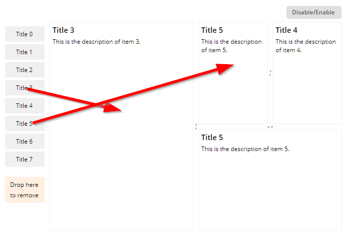
The content is arranged in some nested SPLITPANEs. Content (== page bean instances) can be easily dropped into the dashboard – and moved within the dashboard. The dashboard can be opened in an “enabled”-mode, in which the user can arrange the content – and in some “disabled”-mode, in which the user can only view the content.
The split pane can now be disabled – in this case the user cannot rearrange the divider location.
Any request from the client to the server side now provides a new http-header-parameter “eclnt-timezoneoffset”. The parameter can be accessed by API “HttpSessionAccess.getClientTimeZoneOffset()”, when being called within a request processing context.
The SCREENGRABBER so far did not work when the grabbed area contained some image that way loaded from a server which was not the origin of the dialog.
The component COLORICON renders an icon which opens up the color selection dialog. In the bottom area of the icon the currently selected color is shown as small horizontal bar.
There was a drag/drop problem which – rarely! - occurred in Firefox: when using FIXGROD-ROWDROPRECEIVE then the drop event sometimes was not delivered to the item , on top of which the drop was done, but was delivered to the time which was dragged.
When reducing the size of a FIXGRID with percentage size, it could happen that the content was flickering due to infinite resizing between two positions.
The parameter to limit the file size was not considered when also having defined the attribute FILEEXTENSIONS.
There is a new page bean component which is part of the addons package (<install>/resources/addons/eclnt_pbc.zip). The class name is “CCSplitDashboard”.
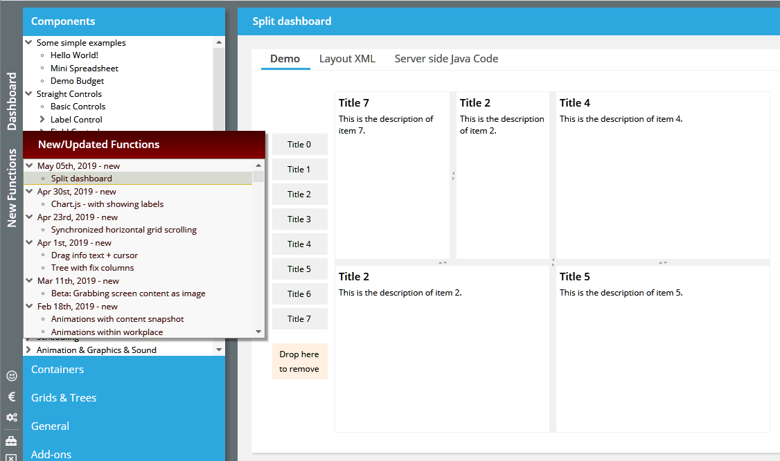
The component manages a dashboard area in which you can drag/drop content. Each content is a page bean that can be implemented without any restrictions on your side. The content is arranged in a series of split panes. The user can drag/drop existing content and by this re-arrange the split panes dynamically.
The structure of the dashboard is either saved implicitly – or the persistence is manages on your side.
So far, a long click (which is the communicated as double-click to the processing) was executed by touching with a finger – and releasing the finger after some longer duration (400ms). Now you do not have to release the finger anymore, the long click is automatically fired.
Again some improvement for showing the content in iOS browsers (iPad/iPhone).
The “Today” button did not take over today's date when the date in the CALENDARFIELD was set to null.
When setting EXACTTIME to “true” then a day selection is always passing back the start of the day (e.g. when selecting “May, 06th” then “May 06th, 00:00:00” is passed). The definition of EXACTTIME was not considered in the CALENDAR component.
If a component within a grid consumed the right click (e.g. by defining a POPUPMENU) then so far the right click was not passed into the grid processing. Now this passing is done automatically.
You now may directly show the values within a CHARTJS diagram – by just setting a dedicated BRIDGEPAGE within the component definition:
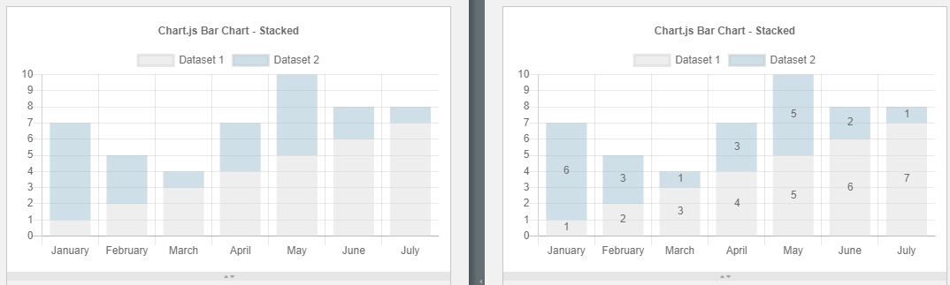
Due to the fact that the iOS browser (Safari) does not follow the default viewport settings when it comes to scaling a web page...
<meta name="viewport" content="width=device-width,height=device-height,user-scalable=no" />
...we did introduce some special reaction on scaling activities of the user. It is now ensured that – if the user scales with a two-fingers-gesture or if the user moves the whole browser window with a one-finger-gesture – the content screen is always correctly positioned and sized into the available browser window space.
To be honest: the number of use cases is not too high... - but there are some! When moving the horizontal scroll bar of one grid, then the other one is scrolled as well:
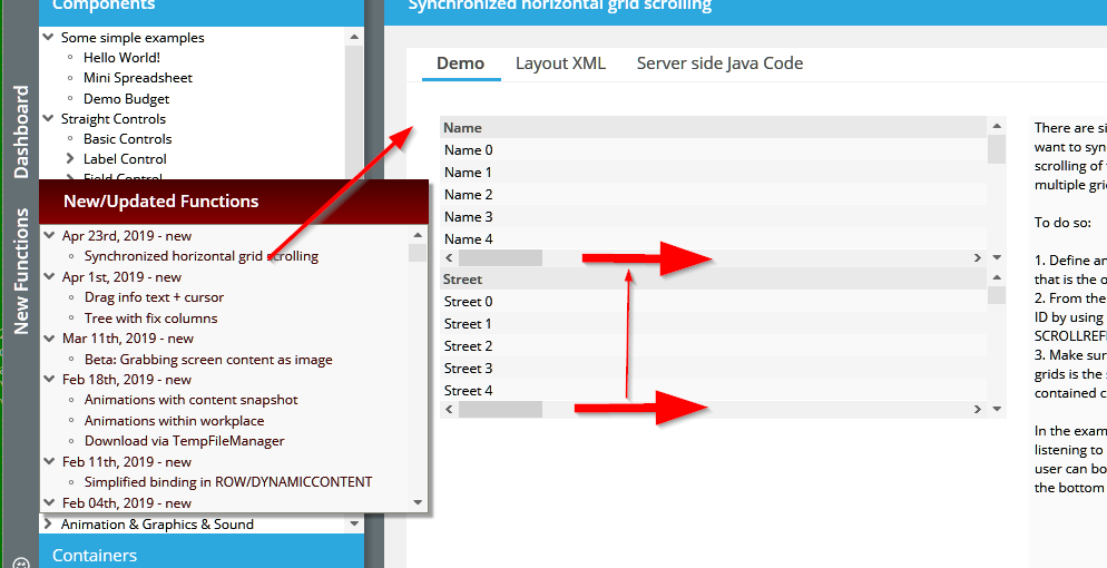
Our (customer) use case: two plans – one showing the availability of persons for a week, the other one showing the orders to be fulfilled at which point of time. When scrolling the one grid then the other one needs to be scrolled as well.
The functions was not working (especially: the “false” case).
By using CLIENTCONFIG-POPUPMENUCOPYCLIPBOARD you can automatically provide a popup menu for components containing text. From the menu you can copy the text of the component to the clipboard.
You now have three possibilities of defining the behavior:
“false” (default): no text popup menu item is added/shown
“true”: text popup menu items are added/shown
“gridOnly”: text popup menu items are added/shown for components that are shown within a grid cell.
If setting this attribute to “true” then empty input values (“”) are converted to null at server side.
If setting the TRIM attribute to “true” then automatically blank spaces at the begin and at the end of a text that the user did input are cut.
There is a new function and attribute with FIELD controls: by setting MAXLENGTHAUTOTAB to “true”, the focus will automatically move to the next field when reaching the maximum input length of the FIELD. Please note: the auto-tabbing will only be executed if the current text cursor position is at the end of the field.
When embedding a (normal) BROWSER component on the screen there may be one problem: the navigation state of the browser is lost, when e.g. hiding the browser and re-opening it or when moving it from one screen location to the next.
To overcome this there now is a new component POOLEDBROWSER. In principal this component is used like a normal BROWSER but in addition has a POOLID - which must only be used once at one point of time. The POOLEDBROWSER actually is not rendered directly in the component area of the component but is rendered centrally and is layered on top of the component's area using the z-index of component positioning.
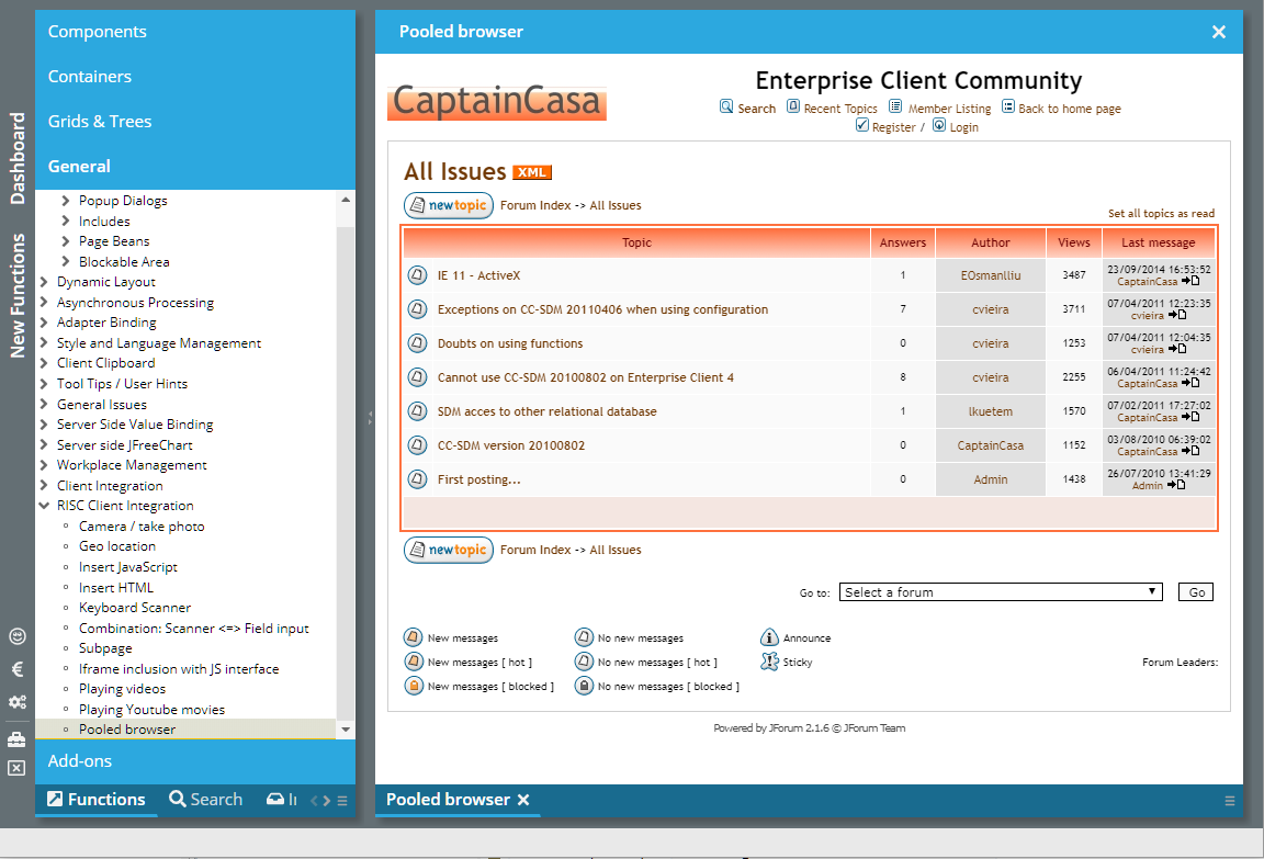
Whenever the component itself is resized or moved, then the sizing is also applied to the browser on top, so that it fits on top of the component's area. As consequence, hiding and moving the component does not mean that the pooled browser instance is closed (== taken out of the DOM tree), but it is kept alive as invisible component in the background.
When using a second component in the GRIDCOL, then this component is rendered into the headline of the grid column:
FIXGRID
GRIDCOL
LABEL <== this is the cell component
FIELD <== this component is rendered into the grid column header
When using e.g. a FIELD (e.g. for filtering the column content) then there was some blocking of key input within the FIELD component...
There was some problem with scrolling FIXGRIDs on iPad/iPhone devices: sliding an item to the top/bottom not only moved this item but also moved the whole browser screen.
It is now possible to...
...output certain text information when dragging one component over another component
...influence the shape that is drawn when dragging one component over another component
By using attribute DROPRASTERTEXT you can output text on the left top side of the shape representing the dragged component:
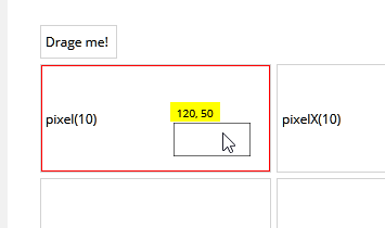
There are certain pre-defined possibilities:
You may show the pixel position as pixel or percentage value
You may define an explicit list of strings and their horizontal position. Example: the string may represent some time within a schedule:
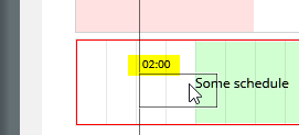
By using attribute DROPSHAPE you can add some additional shape when dragging over a component. In the previous example (“schedule”) you see, that a line is output on the left of the dragged component – in addition to the shape of the component.
Please check the demo within the demo workplace (“New Functions”).
A new demo shows how to set up a scenario in which a tree is rendered with fix columns “on the left”:
There were two inconveniences:
If having selected one file for upload and then removing the file from the list of files to be uploaded, then it was not possible to select the file a second time – you had to close the upload dialog and re-open.
The check against file extensions was too weak: if defining “xls” then also “xlsx” was select-able.
The ROUNDING attribute is now applied to the FOLDABLEPANE, too.
There is a new directory “resources/java11usage”. This directory contains the JAXB libraries which were removed from the Java SDK (and runtime) from Java 11 on. The installation guide was updated and now contains details about the installation with Java 11, too.
All deliveries (.exe, .zip) now consistently provide a resources directory in which the appropriate resources are made available.
Eclipse plugin
“webappaddon”
addons (page bean components, ccee-library)
Java 11 addons
When dragging a component from a parent which at same point of time is a component to drop onto, then you before had to move dragged component out of the area of the drop-able component and back in. Now the drop can be done immediately...
There was an implicit conversion of characters that is part of the JavaFX button, which we switched off.
The check if selected files match the extensions that are expected was case-sensitive. As result e.g. “.png” files were accepted for upload, but “.PNG” files were not.
The new component grabs the pixels of either a part of the dialog – or of the whole dialog. Please check the demo in the demo workplace (“New Functions”).
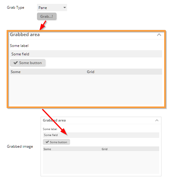
When being triggered the component uses the framework “html2canvas” (https://github.com/niklasvh/html2canvas) to transfer the browser's DOM elements into some canvas drawing. As next the canvas content is converted to a png-file on client side, and the file is sent to the server as part of an event.
It's astonishing, what “html2canvas” is doing – and it's astonishing how well it transfers the DOM tree into some drawing. However there are always lacks, so that certain elements are not transferred 100% properly. Result: check the component and the use cases that you want to use it for prior to using this component.
We tested the “convas2html” with all browsers. In Firefox the performance was quite weak for big screens.
We added the library “esapi.jar” which provides acknowledged function to write e.g. to logs and output streams in a secure way. The library is developed within the context of the OWASP group.
For those ones using Maven, the additional library needs to be embedded by adding the following dependency:
dependency>
<groupId>org.owasp.esapi</groupId>
<artifactId>esapi</artifactId>
<version>2.1.0.1</version>
</dependency>
Please note: users of the addon libraries (eclnt_pbc.jar and/or eclnt_ccee.jar):
You need to pick the newest version from the <install>/resources/addons directory. Otherwise you will see some strange message about a field “L” being not available...
We updated to the newest 2.2 JSF release. The dependency we now internally use is:
<dependency>
<groupId>com.sun.faces</groupId>
<artifactId>jsf-api</artifactId>
<version>2.2.18</version>
</dependency>
<dependency>
<groupId>org.glassfish</groupId>
<artifactId>javax.faces</artifactId>
<version>2.2.18</version>
</dependency>
You may take over into your Maven configuration – or continue to work with 2.2.14. The reason for updating was to be on the newest current version when being passed through security audits. There was no actual bug or problem that made us upgrade.
By the way: we also tested with the current 2.3 version (2.3.8) and could not find any problems with our projects.
The addons packages required some update due to the fact that CLog-Logger now refers to funtions of the ESAP-library.
The focus management was updated to better manage the situation in which a component that holds the focus is removed from the screen. Example: you toggle between two buttons, always one of them being visible (e.g. controlled by RENDER flag).
The behavior before was: when a component holding the focus was removed then the focus was automatically set to the browser scope, which is outside the scope of the components within the browser. Result: globally defined hot keys were not reachable any more.
Now the focus is moved to the first focus-able component within the browser content – which then is ready to accept and process hotkeys.
Of course...: you can set the focus on your own to a component of your choice after removing a component! So what was described is just the default behavior, if you do not do anything special.
When explicitly defining a set of extensions to be valid for the upload processing of files, then now these definitions are checked and an upload of files which do not correspond to the definition is not possible. The check is also executed when dragging/dropping files onto the upload components from the file system.
In certain scenarios the Drop-part did not properly work in Firefox – the component you dragged over was not feeding back to the user that you could drop data.
It's sometimes not easy to decide what to do in the area of text selection. On the one hand it is nice that you can select texts in the browser by double-clicking (in this case the word below the cursor is double clicked). On the other hand it is annoying and it just looks ugly if you double-click an item of a grid in order to select the iem, and then the text where you clicked is selected... We up to now followed the strategy “double-click” does not select the text. Some of you seem to prefer the selection of text. So: if we cannot decide, you are the ones: there is new configuration parameter CLIENTCONFIG-DOUBLECLICKCLEARSTEXTSELECTION. By default it is “true”, you may set to “false”...
Any PANE component can be animated by using the CAPTUREANIMATOR component inside. Up to now it was only possible to define animations in which some e.g. shadowed area was added on top of the PANE, which then was moved or faded out. Now it's possible to define animations that take some snapshot of the current screen content and move/resize this in some direction.
The CAPTUREANIMATOR component provides an attribute ANIMATIONTYPE, which now can be set to:
hidecontenttotop
hidecontenttobottom
hidecontenttoleft
hidecontenttoright
shrinkcontenttocenter
The CAPTUREANIMATOR is triggered by a server side trigger (attribute TRIGGER). The nice thing: the preserving of the PANE's content is done before changes to the PANE's content are executed on client side. This means: when updating the content of a PANE and triggering the animation, then the animation will happen on the “old” PANE content, not on the updated one. As result, the animation moves the old content out, and the new one gets visible.
Please check the following demos of the demo workplace:
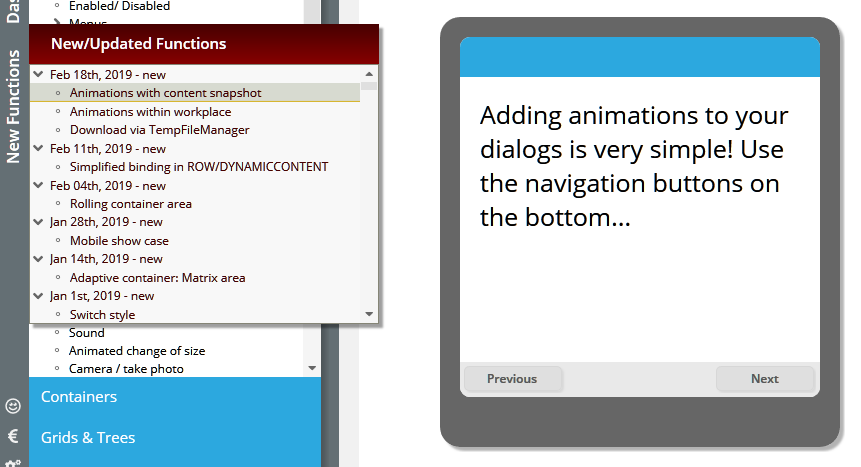
An overview about all animation types is available at: “Components => Animation & Graphic & Sounds => Image Capturer & Animator (1)”.
Finally we added the new animation feature to a workplace configuration screen, in which you can define the animation type that is used when content is updated within a workpage container.
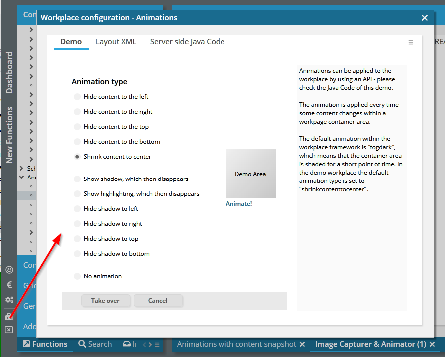
The updated animations are extremely simple to use and are extremely (but not only!) useful in mobile scenarios.
The duration between the mouse-down and the mouse-up is now transferred to the server side as property “clickDuration” of BaseActionEventInvoke. It is currently only transferred with clicks from BUTTON controls (including inherited LINK and ICON).
Providing dynamic download content (or any other content that needs to be made available by URL) is much easier with the “TempFileManager” than with “BufferedContent”. And: the content of the file to download is not kept in the memory of the server but is kept in a working directory (provided by the servlet container) within the file system. This directory is cleaned up as part of closing a session.
We now added an example demonstrating the usage:
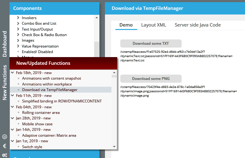
When setting CLIENTCONFIG-POPUPMENUCLIPBOARD to “true” then automatically right mouse button menus (popup menus) are available by which you can copy the text of the clicked component to the clipboard. In certain situations (modal popup and having no own POPUPMENU-definition), this popup menu was not shown.
When using the GIF-format inside dynamically created images then the calculation of the image's size was wrong. The bug affected e.g. the HEXIMAGE component – and the normal IMAGE component when using the pseudo-URL “/hex(238adc27388...)”.
The WEBSOCKETPOLLING component is some invisible component which sets up a web socket connection to the server, by which events on server side are synchronously transferred to the client side.
If the component is not able to establish a web socket connection then it will retry periodically. This re-trying was only done two times – now it is done for the whole life cycle of the component.
So far the creation of dynamic content areas was 100% the same as the direct creation of layout definitions: you define controls via ComponentNode-classes, you assemble them and you assign attribute values. When assigning attribute values you can either pass direct, fix values or you can pass expression values.
While being very straight and direct from concept point of view, the management of expressions is sometimes quite challenging when following this approach. As consequence there is now an alternative that you may use: you can now bind values and processing directly as attribute values – all expression management is done internally.
Please check the example in the demo workplace, section “New Functions”:
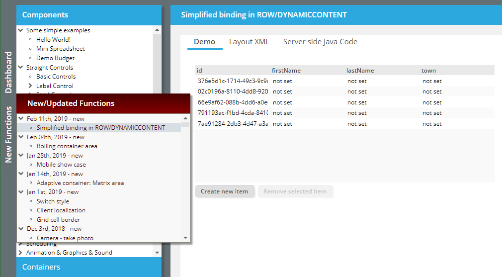
In the example you see a grid that is generated as dynamic content. When looking into the Java program you find:
m_grid = new FIXGRIDListBinding<GridItem>(); // create the object which is bound
...
FIXGRIDNode fg = new FIXGRIDNode()
.bindObjectbinding(m_grid)
.setWidth("100%")
.setSbvisibleamount(10);
Please note that the grid is NOT made available via a get-ter method (“getGrid()”) but is made available implicitly by using the bind-method.
You also find the processing of buttons being directly bound:
BUTTONNode b = new BUTTONNode()
.setText("Create new item")
.setWidth("100+")
.bindActionListener(new IActionListenerDelegation()
{
@Override
public void onAction(ActionEvent event)
{
createNewItem();
}
});
The listener is directly added – there is no necessity to create some get-able object with some “onActionXxx” method and there is no necessity of explicitly binding this method to the action listener.
How are the expressions generated internally? Basically it is quite simple: the ROWDYNAMICCONTENTBinding object now not only contains the visual layout that you create but it also holds a list of bound objects. The ROWDYNAMICCONTENTBinding object is bound by the dialog processing anyway, so it's quite simple to also make the bound objects available via some expression – which is managed internally.
There are certain possibilities to bind objects:
All complex binding objects (FIXGRIDListBinding, …, PageBean, …) can be directly bound as shown above.
Action listener objects can be bound by implementing interface IactionListenerDelegation
Simple values (String, Integer, …) can be bound by implement interface IvalueDelegation, or better by using and extending pre-configured implementations like “StringDelegation” or “StringValue”.
We believe that this direct binding is some significant simplification for implementing dynamic scenarios. - It is, of course, 100% compatible with the “trdaditional” way of creating dynamic scenarios. Both methodologies (assigning expression values to attributes and direct binding of objects) can be used in parallel.
The documentation (Developer's Guide) will be updated short term.
When using GIF images in dynamic images (HEXIMAGE, IMAGE with “/hex(...)” definition) then the client side calculation of the image size was wrong – and the image was always rendered with size 16x16.
You now can directly control the coloring of the column headers.
When passing content into the TempFileManager for making at available as URL to the client, then so far the mime type was automatically derived from the name you assigned to the content. Now you can pass the mime type directly. Example: you pass some “.pdf” content, but you want to make it available as directly download-able content via mime type “application/octet”.
Please take a look onto our new demo for mobile applications:
The application is embedded into the demo workplace, but can also be directly called. In the online demo workplace it is available here:
https://www.captaincasademo.com/ccdemos/appvisitor.index.risc
There is a new component which is typically used in the context of mobile devices: the ROLLINGCONTAINERAREA (and its contained ROLLINGCONTAINER):
When scrolling vertically then the title of the currently visible area is always kept on top position of the screen. In addition to the textual title you may add icons on the left and on the right.
The stable virtual touch keyboard which allows to enter text information into any fields comes back to life... (in Swing/FX it was already available...). Please check the following demo:
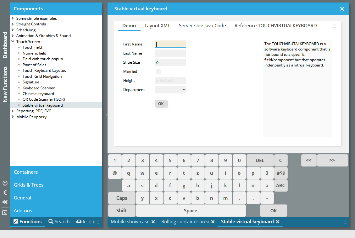
We fine-tuned the focus management when it comes to requesting the focus – so that now explicit focus requests by the application (setting the REQUESTFOCUS attribute with an new value from RequestFocusManager) are executed with higher priority than “creation”-focus requests within a dialog definition (REQUESTFOCUS=”creation”).
When using the feature "popupmenucopyclipboard=true” then the text that you can copy into the clipboard contained one carriage return at the very beginning for some components (TEXTPANE with type “text/html”, TEXTWITHLINKS).
With 20190107 we used a servlet 3.0 feature which allows to add servlets by API (and not by web.xml definition). There are certain changes in this update to ensure the compatibility for servelt 2.5 containers.
By adding the following definition to your web.xml...
<context-param>
<param-name>org.eclnt.explicitlyManageAllServletsInWebXml</param-name>
<param-value>true</param-value>
</context-param>
...all dynamic loading on CaptainCasa side using the servlet 3.0 interface will be avoided. Consequence: new servlet definitions are not added automatically but you have to explicitly apply these definitions within your web.xml. In the web.xml_template you find a section in which we add this web.xml definitions (in comments), so that you can easily activate:
<!-- ********** Servlets that are registered via API ********************* -->
<!-- When having switched context parameter "org.eclnt.explicitlyManageAllServletsInWebXml"
to true, then all servlets need to be registered in the web.xml.
The following is the list of servelts that are by default registered
vai servlet-3.0-API. Only uncomment/use if having set the context
parameter to "true". -->
<!--
<servlet id="StyleReaderServlet">
<servlet-name>StyleReaderServlet</servlet-name>
<servlet-class>org.eclnt.jsfserver.util.StyleReaderServlet</servlet-class>
<load-on-startup>1</load-on-startup>
</servlet>
<servlet-mapping>
<servlet-name>StyleReaderServlet</servlet-name>
<url-pattern>/eclntjsfserver/styles/*</url-pattern>
</servlet-mapping>
-->
<!--
<servlet id="ClientI18NReaderServlet">
<servlet-name>ClientI18NReaderServlet</servlet-name>
<servlet-class>org.eclnt.jsfserver.util.ClientI18NReaderServlet</servlet-class>
<load-on-startup>1</load-on-startup>
</servlet>
<servlet-mapping>
<servlet-name>ClientI18NReaderServlet</servlet-name>
<url-pattern>/clientlocalization.i18n</url-pattern>
</servlet-mapping>
→
The dynamic loading so far was done within the initialization of the “ThreadingFilter” which is the central filter to start up the CaptainCasa runtime. Well, this type of loading caused some problems (e.g. in JBoss environments) so that we added a Servlet-Context-Listener into out standard web.xml to explicitly initialize the CaptainCasa runtime before filters are getting initialized. We recommend to take over the following settings in your web.xml:
<listener>
...
<listener-class>org.eclnt.jsfserver.util.CCServletContextListener</listener-class>
...
</listener>
In the project definition (.ccproject-file within your project directory) there are XML-definitions that define how to copy the design time from the project into the runtime of the servlet container (Tomcat) environment. One of the XML-definitions is the “deploycopyinfo”:
<deploycopyinfo fromdir="${project}/webcontentbuild"
todir="${projectdeploy}"/>
<deploycopyinfo fromdir="${project}/webcontentcc"
todir="${projectdeploy}"
skipduringhotdeploy="true"/>
You now can add the attribute “skipduringhotdeploy” in order to indicate that the corresponding copying of a directory is NOT executed during hot deployment. In the example you see that the “webcontentcc” is NOT copied – because this is a directory which does not change, if not applying a new CaptainCasa version.
All graphical components do support drag/drop by defining a DRAGSEND on the dragging side and a DROPRECEIVE on the receiving side. Now there is a new attribute DRAGROUNDTRIP – if setting it to “true” then an event of type “BaseActionEventDragStarted” is sent to the server side. Part of the event data is the DRAGSEND value of the dragged component – as consequence you e.g. can control the DROPRECEIVE values of receiving components in a fine-granular way.
The resizing of columns with percentage size definitions is now smarter: if there are several columns with percentage size definitions then these ones which are left of the resized column are not following the percentage size anymore, but receive the actual width they currently have. Consequence: only one column is resized anymore – and not several in parallel as before.
Uuuuh – do not tell anyone...: the CAMERA component only worked on devices with two cameras installed.
The DRAWAREA allows the drawing of certain shapes. The drawing is executed using an internal HTML5 canvas component. Now the “polygon” statement is supported as well, so you can pass commands like “polygon(x,y,x,y,x,y,x,y,x,y,x,y,x,y,x,y,x,y,color1,color2,vertical/horizontal)”.
The DRAWAREA is often used when transferring complex BGPAINT statements from the former Swing client, so this is a further level of BGPAINT compatibility.
The ROWMATRIXAREA arranges its content components within a matrix:
The width of the matrix cells is defined by the smallest minimum width of the contained components. In the example above this is the 6th component, holding the “First”/”Second” tabbed pane. This width is the one that is used for all components.
In the same way the height of the components that are positioned in one row is defined by the highest minimum height – and is applied to all other components of the row.
When resizing then the matrix is re-calculated...
...and re-calculated...
… and re-calculated:
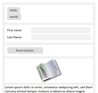
The pom.xml was missing a new dependency, which is now included.
<dependency>
<groupId>com.google.code.gson</groupId>
<artifactId>gson</artifactId>
<version>2.8.5</version>
</dependency>
The tool “Code Generator” within the “Layout Editor” up to now used some “old” Apache code parser which had problems with parsing Java >= 1.8 statements (e.g. lambdas). We now exchanged the parser and now are using “JavaParser” (http://javaparser.org/) - which supports all Java releases.
For internal purposes we use the Java-class “ImageIO” - e.g. for calculating the size of an image. What we did not know so far: this class sometimes uses the file system! The class writes certain cache information into the temp directory. If this temp directory now is not write-able then some error is thrown.
Concrete consequence: the image size is not calculated properly. - You for example see images which should be sized properly, but which are actually sized with “16x16”.
Now we explicitly set the cache-directory to the ImageIO-class. The directory we use is the temp directory which is granted by the servlet container. For Tomcat this is the “tomcat/work/Catalina/localhost/<webapp>” directory.
When defining some own style class for a COMBOFIELD then this style class was overridden when using the EDITABLE attribute. Same with COMBOBOX.
A CaptainCasa style consists out of 2 XML files – one for the CSS style class definitions and one for attribute-preset-definitions. Both were used to generate a “.css” and a “.js” file, which were the compiled results of the style definitions.
This explicit compilation is not required anymore: both the “.css” and the “.js” file are now generated dynamically. Or to be more precise: the “.js” file is not generated anymore, but an equivalent JSON-String is now generated which is accessed by the client side processing.
When changing the style (e.g. by using the CaptainCasa Style Editor) at development time then please do not forget...:
Styles are buffered within the browser, so you have to clear the browser's cache!
The dynamically generated “.css” and “.json” information is buffered on server side to improve performance. By appending “&ccresetbuffers=true” to your .risc-URL this buffer is cleared.
Based on the dynamic management of style information it is now possible to change the style at runtime. Please check the corresponding example in the demo workplace (section “New Functions”).
By default the selection only was enabled for FIELD- and TEXTAREA-components. We now opened up for LABEL and TEXTPANE as well – and added some functions to bypass the negative consequences of text selection (e.g. during drag/drop operations).
The focus management was improved in different areas. Example: when closing a popup dialog then the focus management by default moved the focus into the component which opened the dialoge. Now this only happens if no other component requested for the focus.
The I18N aspects of the client were moved out of the direct JavaScript processing into configuration files on server side. Take a look into webcontentcc/eclnt/risc/i18n and you will see the definitions of country and language settings.
In addition there is now a server side API (class ClientI18NReader) which provides functions to get all known client side locales.
By default the BORDER of a component within a grid cell is overridden by the border processing of the grid. You now can set attribute GRIDCOL-KEEPCELLBORDER to “true”: as consequence there is NO overriding of any border.
When assigning an INVOKEVENT to a component, then the component will react on mouse clicks by calling its actionListener. We now added value “mousedown” as new value. Typical usage scenario: you want the actionListener to be executed directly on mouse down, e.g. before any drag/drop operation is executed.
The Bean Browser tool introspects classes of your development project in order to show a tree of available managed bean classes. To do so it internally creates a class loader in which all the .class/.jar files are added. This class loader so far locked the corresponding .jar files on file system level. - Now the class loader does not access the original files but creates a copied version within the servlet temp directory (with Tomcat: tomcatserver/work/Catalina/localhost/editor). As consequence the original files are not locked, but the locks are applied to the files which were copied from the original files.
...when assigning a CLIENTNAME to a RADIOBUTTON then its style got completely lost.
When using FONTICONs (or there concrete implementation AWESOMEFONTICON) then some icons were shifted vertically by one pixel in Friefox browser.
When focusing a component (e.g. a FIELD) and when causing a round trip (e.g. by a function key or by TIMER event) and when changing the component enabled status from “enabled” to “disabled”, then the focus coloring in the component was kept – even if leaving the component.
The workpage life cycle listener now provides a new method, which:
/**
* The page already was shown in content area, but the user re-selected
* the page (e.g. by pressing a second time onto the workpage-selector.
*/
public void reactOnReselectedInContentArea();
Before there was no specific event thrown when the user re-selected a workpage.
The servlet processing in the area of
BufferedContentServlet
UploadContentServlet
DynamicImageServlet
TempFileAccessServlet
AutoCompleteServelt
was improved: the servlets are not usable outside some session context. In addition the servlets (e.g. UploadContentServlet) check earlier than before if they are called in some valid context. With DynamicImageServlet it is not possible anymore to create “stupid” requests (e.g. create a dynamic image representation of a text with font size 10.000...) which may block the server and communication processing for some while.
Thanks to some Austrian community heroes who gave some great feedback on this.
In case there is more than one camera component available with your device (e.g. back/front camera of mobile device), there is now a button to toggle through the cameras that are available.
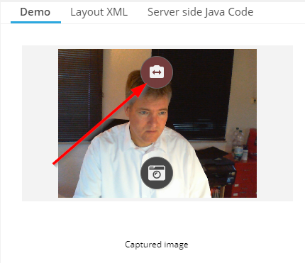
When positioning the CAMERA component within a tab component (e.g. TABBEDPANE) then it could happen that the CAMERA was not re-activated when switching between the tabs.
When actively setting the scroll position of a SCROLLPANE, then it was sometimes not correctly applied on client side, esp. if the dialog within the SCROLLPANE contained a lot of TEXTPANE elements.
Some Swiss community heroes passed the French translation of client literals to us. Thanks a lot!!!
The button now toggles between full screen and normal screen. Thanks to Roland Heinrichs for sending the code to me on this issue!!!
Up to now the default style was “defaultlightbluerisc” - now it is “default201812risc”. The updated style bases on the previous style, of course but has some core differences:
Input controls are drawn in grey when enabled and in “close to white”-grey when being disabled. There is no border anymore.
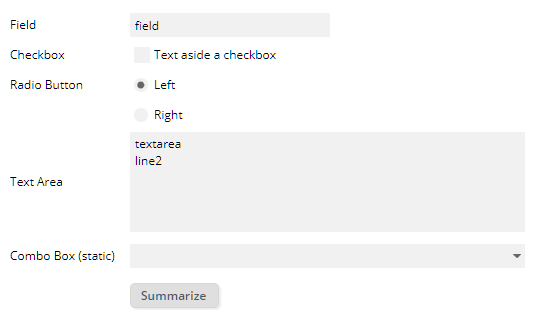
The workpage containers are separate areas, with shadowed background
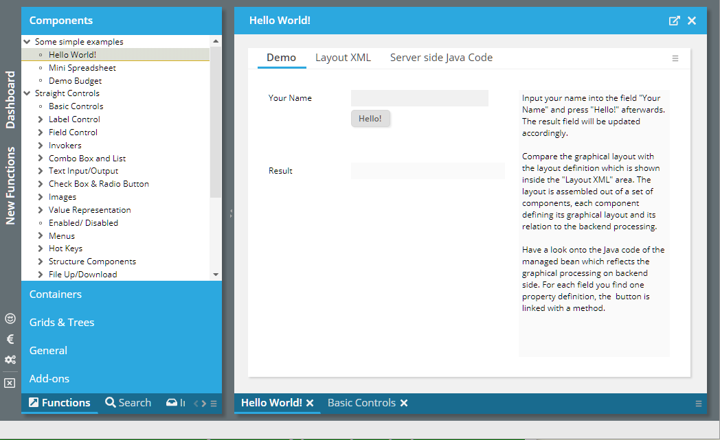
Grids are drawn without cell borders and with odd/event coloring by default.
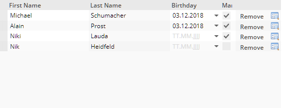
Structure containers (box, foldablepane, tabbedpane) are drawn without borders
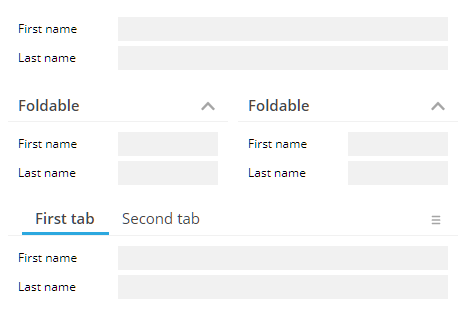
Of course the “old” style(s) are still available and supported!
The new CAMERA component allows to take a photo via the built in camera of your device. Please check the corresponding demo in the demo workplace (“New functions”).
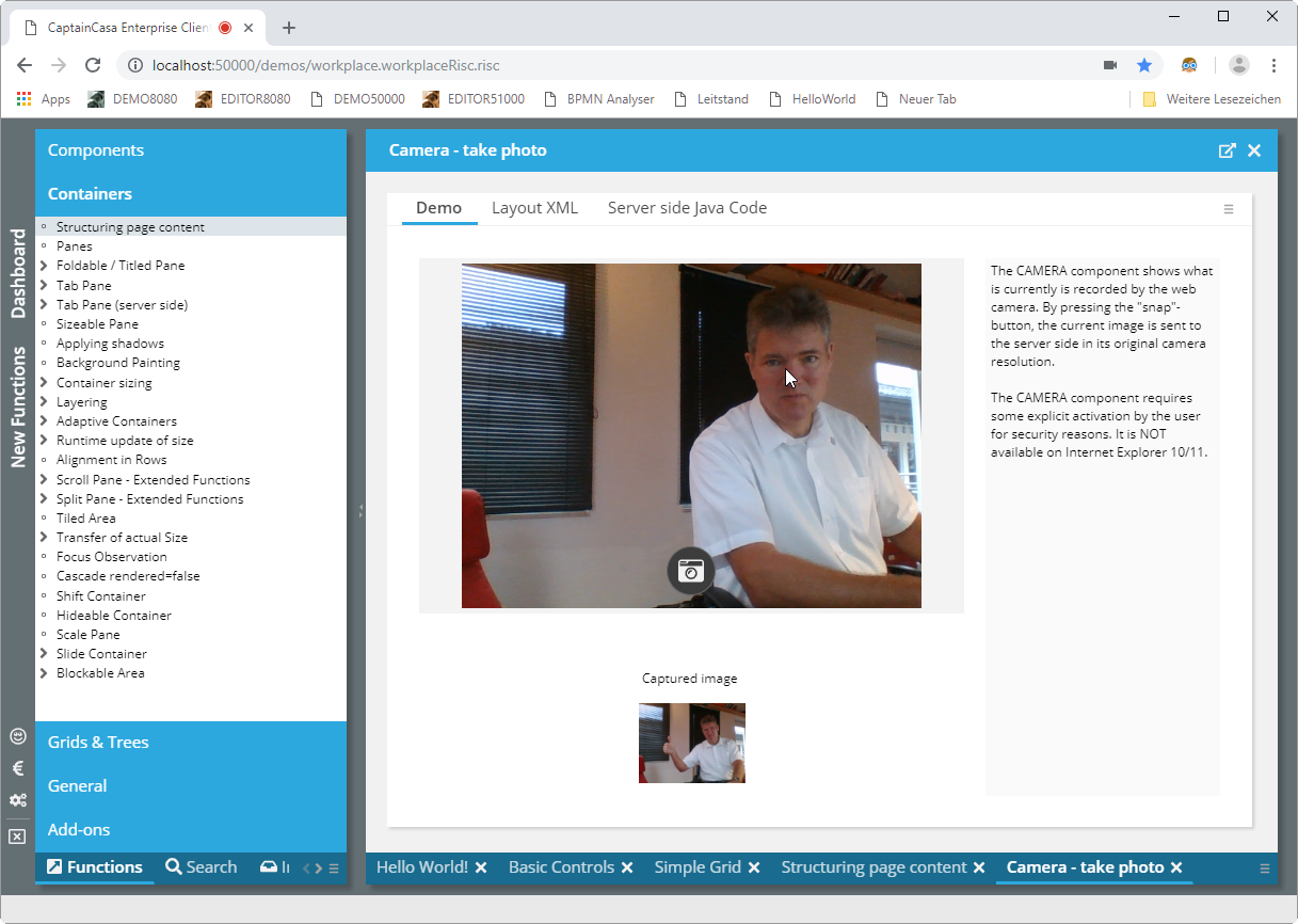
The component requires some activation approval by the user – and is not supported on IE 10/11.
The component GEOLOCATION transfers the current geo location of the browser to the server side:
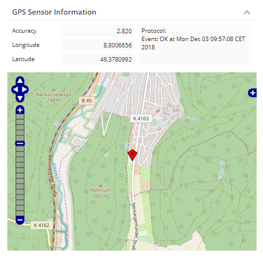
The component requires some activation approval by the user – and is not supported on IE 10/11.
The component FULLSCREENBUTTON is a button that switches the current content to be displayed in full screen mode.

This is especially useful in mobile scenarios, where the default header area of the browser does take quite some space.
When clicking into a non-focus-able area (e.g. somewhere on the screen) the focus was moved to the top component internally (the one that directly is placed into the browser window). When the user then pressed “tab” then the focus sequence started from the very beginning, typically moving the focus to the top left component.
Now the focus management keeps in mind the last click, and the component it was executed on. So the next “tab” of the user will not start at the very beginning, but close to the area of the last click.
When requesting the focus e.g. for a FIELD within a TABBEDPANETAB or within a FOLDABLEPANE, the focus-ing only worked, if the FIELD was currently visible. Now the focus request automatically opens the right tab-page in the TABBEDPANE component, and it opens up the FOLDABLEPANE it is closed and the focus is requested inside.
When clicking onto the (optional) close-icon of TABBEDLINETAB component, then always the currently selected tab was closed – not the one that was clicked. The bug e.g. occurred within the workplace processing where the TABBEDLINETAB is internally used for selecting/managing workpages.
...now the position always is correct...
The text in SCHEDULEITEM component can now be aligned vertically as well.
We embedded the JSQR framework as component into our standard component library:
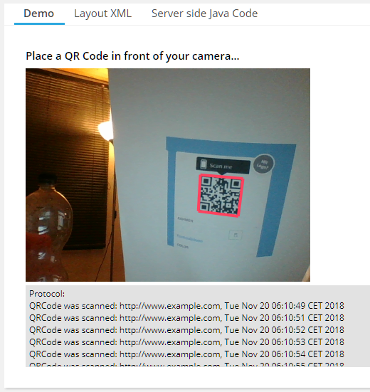
Result: you can scan QR codes as part of your application.
Information about the JSQR framework is available via https://github.com/cozmo/jsQR. The framework's license is the “Apache 2.0” license.
When the user resized one column of a grid then up to now the sizes of all grid columns were transferred into their actual pixel values. Now this only happens with the actually sized column – the other columns keep their original size. The advantage: if a column's size is defined as e.g. percentage value (“100%”), then this value is not replaced by a pixel value. This makes resizing much “smoother”.
Example: the user resized the “Region” column:
...all the percentage definitions of the other columns are kept – the grid is “filled”.
Please note: it's good practice to always define a minimum size value for a percentage column size: “100%;100” means that the column should take all remaining available size, but never should get smaller than 100 pixels.
With 2018112 we delivered some bug, in which the text of buttons – if not placed on top or below the button image was cut by some pixels.
The (ROW)DYNAMICCONTENT component allows to define dynamic dialog content within a dedicated area of a layout definition. To make it more complex, you may also nest (ROW)DYNAMICCONTENT components – so that dynamic content is created that internally again contains dynamic content. - If the result is really understand-able in an easy way, that's your choice! ;-)
When doing this nesting inside a grid cell (i.e. below some GRIDCOL definition), then the nested (ROW)DYNAMICCONTENT did not received the grid information that is required to transfer relative “.{...}”-expressions into real expressions. Result: the binding in the nested (ROW)DYNAMICCONTENT components did not properly work.
You now can dynamically switch on/off the footer line of the client. The footer line is the one showing performance information on the bottom right of the window.
We published some quick update because of update functions some of you were waiting for. There is no e.g. reason like “severe bug” that is the motivation behind!
There is a new attribute PASSWORD-DELETEONFOCUS. When switching to true then the password value is removed every time the user tabs in – e.g. by clicking the field and/or by navigating into the field.
The component now provides some type of filter. If setting propert “availableFilterBar” to true (i.e. calling the corresponding set-ter), then the component shows some search field. The items that correspond to the filter text are sorted to the top and are drawn with some darker background color.
There are two improvements:
The BUTTONMENUMODE “buttonandmenu” is not properly supported – this means: when pressing the button the action listener is called, when pressing the icon, then the menu is shown.
The rendering sometimes overlayed the text on top of the icon. This only happened when defining some explicit width and when the text's width exceed the available width of the button.
We extended the configuration of the Chinese keyboard. Please check the corresponding demo (“New Functions”). We are still pointing out that the Chinese keyboard is in “beta mode” and appreciate the feedback that some community members are passing to us!
The attribute is now supported.
In the Layout Editor the X and Y attribute were not visible anymore, due to some “too ambitious filtering” that we defined...
During some audit some flaws were detected by some static scanner. None of them was categorized as being critical. - This is the summary of reactions on your side.
The log output formatter now formats CRLF (carriage return/ line feed) in a way that indicates that the CRLF was caused by the application log content. Before it could have been possible that the applications somehow (e.g. due to tricky user input) outputs log information that looks like a logged output, but actually isn't...
Please note: we only can do this for you own log formatter. If using the logging bridges then you need to ensure the correct management CRLF in these formatters as well.
All places in the code where we up to now used “Random” now were switched to use “SecureRandom”.
The class “FileManager” which is the utility class that we internally use for accessing files was updated so that files containing a “..” are causing some error. Background: due to tricky user input a user may navigate by “../../”-file name into the server file system.
The style class “riscdialogpopup_transparent” can be assigned to some modal/modeless popup dialog. As result there is no background coloring at all within the popup.
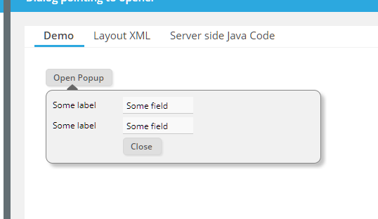
Please check the example in the demo workplace (“New Functions”).
Maybe you have noticed: a “.risc” page internally references its “.css” and “.js” files by using a URL containing a version stamp (“http://..../xyz.risc?version=20181112”). This stamp ensures that the corresponding files are reloaded when e.g. changing the server version.
We not introduced a “CacheFilter” which adds corresponding header information so that these files are cached within the browser. This especially speeds up the “preview performance” within the Layout Editor.
The CacheFileter is part of new projects automatically, you may take over into your existing project by editing web.xml and adding:
<filter>
<filter-name>org.eclnt.jsfserver.util.CacheFilter</filter-name>
<filter-class>org.eclnt.jsfserver.util.CacheFilter</filter-class>
</filter>
…
…
<filter-mapping>
<filter-name>org.eclnt.jsfserver.util.CacheFilter</filter-name>
<url-pattern>*.js</url-pattern>
</filter-mapping>
<filter-mapping>
<filter-name>org.eclnt.jsfserver.util.CacheFilter</filter-name>
<url-pattern>*.css</url-pattern>
</filter-mapping>
The interfaces were enhanced and now provide the following method:
/**
* This methods is called at the very beginning of the response processing.
* It allows to e.g. set http-header parameters within the response.
*/
public void preProcessResponse(HttpServletResponse response);
The default implementation in “DefaultBuffered(Stream)Content” is:
/**
* In the default implementation the header parameter "x-frame-options" is set
* to "sameorigin" so that the buffered content is not embed-able into pages
* coming from some different host. You may override this behavior.
*/
public void preProcessResponse(HttpServletResponse response)
{
response.setHeader("x-frame-options","sameorigin");
}
By using function “FIXGRIDList/TreeBinding.getRowDataUI().onOpenRowDataPopup” you can open a default detail dialog for grid items:
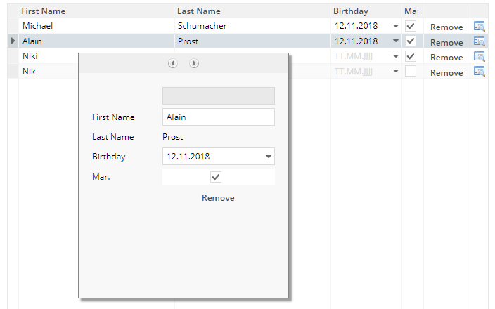
You now can fine control the width/height by accessing corresponding methods in “FIXGRIDList/TreeBinding.getRowDataUI()”.
You now can explicitly define the shadow of a component using the SHADOW attribute. Please check the corresponding demo in the demo workplace.
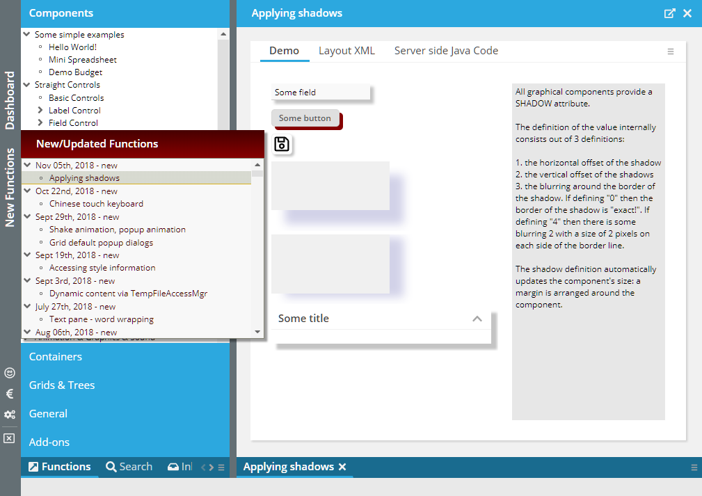
CaptainCasa provides a server side function to calculate the size of an image. This function reads the image and calculate its size. For reading the image by default the web application context is accessed, so that the image is read through a function provided by the servlet container.
You now can extend this reading of the image by some own logic, by implementing interface “IimageReader”:
package org.eclnt.util.image;
/**
* Interface to read am image within the server side image processin (which is
* e.g used when image sizes are calculated on server side).
* <br><br>
* The implementation may return null if it cannot read the image on its own - then
* the default way of reading the image is used. The implementation class should
* check the image name, if it's applicable for own read-processing and then either return
* null (if not applicable) or return the image bytes.
* <br><br>
* The class is registered in eclntjsfserver/config/system.xml.
*/
public interface IImageReader
{
/**
* @param image
* The path to the image: either a path like "/xxx/yyy/abc.png" or a
* URL like "http://...."
*
* @return
* If null is returned then the default way of reading the image is used.
*/
public byte[] readImage(String image);
}
The implementation needs to be registered in system.xml. There is a corresponding section in system.xml_template, which you can use to copy/paste from:
<!--
*************************************************************************
Server image manager.
*************************************************************************
-->
<serverimagemanager
imagereaderclassname="...implementation class of IImageReader..."
/>
When loading a .risc page then all “.js” and “.css” resources are read via a URL containing some “stamp”. This stamp by default is the version number of the CaptainCasa release. For own styles the stamp is (or better: should be) a unique number. - Unfortunately this unique number was not used for reading the “.js” file that comes with a custom style definition.
In addition you may take over the stamping completely on your own. For this purpose there is a new interface “IVersionStamp” - you may implement some own algorithm and register your implementation within system.xml configuration file. Please use the template system.xml_template to copy/paste from.
When defining a slider with explicit labels then the labels were not updated when changing their value.
Up to now you had to explicitly size external images (i.e. images that are not part of your local web application but that have some explicit URL, pointing to some other server). Now the sizing is automatically done for these images as well.
The “focused” style class that is added to components that receive the focus (introduced with the update of the previous week) was set on the wrong level for COMBO* components. (E.g. COMBOFIELD, COMBOBOX,...).
The sequence of the lines were not following the definition in the touchlayouts.xml file in IE and Edge.
The number of sockets that are opened when the Java client communicates to the server-side was up to now not customizable – the default is 5. We now had examples (with quite some usage of long polling) when this number was not sufficient. The parameter name is "httpmaxconnections”.
The style class “focused” is now added to any element that receives the focus. You can as consequence define combined style classes like “xyzcontrolclass.focused” which then update the style of the corresponding control.
We added a Chinese “cangjie”-style touch keyboard to the demo workplace. Please take a look into the corresponding definition in “/demos/eclntjsfserver/touchlayouts.xml”, where you can find the rules for translating such types of keyboards.
Please pay attention: this part of the system has a beta-status. We appreciate to receive feedback on this!
Base on the community feedback of an active user we added CLIENTNAME processing to some of the controls where it was not available right now: ROWTABBEDPANE, ROWTABBEDPANETAB, ROWTABBEDLINECONTAINER, ROWTABBEDLINECONTAINERTAB, OUTLOOKBAR, OUTLOOKBARCONTENT, OUTLOOKBARITEM.
The CLIENTNAME value is the one that is passed into the component as “independent” identification that is used for e.g. test tools, to recognize client components.
It could happen that the tooltip was not shown – if the text of the SCHEDULEITEM exceeded its available space. Instead the text was shown as tooltip.
The way points are now rendered at their 0,0-position. Before the were rendered at their center position.
Updates to the date were not passed into the application.
Since update 20180924 you can re-use “@...@” parameters of the “CSS style” in the style.xml definitions of the “component style” definition. There was a bug in the inheritance management – consequence: the style took over the value of parameters of the parent style where it should use own definitions.
The OpenLayer library that is used internally for rendering OSM maps by default renders way point images with a size of 20x20. You now can explicitly define the size by two attributes MARKERIMAGEWIDTH and MARKERIMAGEHEIGHT.
All visual controls provide a CLIENTNAME attribute which is passed to the client so that test tools have some stable name for identifying components. If using PageBeans and especially if re-using the same PageBean-class many times in a page, then it was not simple up to now to really assign different CLIENTNAMEs to the different contained components of the PageBean instances.
Now it's much easier: you can assign a CLIENTNAME to all “including” components: ROWINCLUDE, ROWPAGEBEANINCLUDE, PAGEBEANINCLUDE and PAGEBEANCOMPONENT. The value of the CLIENTNAME is prepended to all CLIENTNAME values which are contained in the page bean. So if you define ROWPAGEBEANINCLUDE-CLIENTNAME as “address” and id the page bean itself contains a FIELD with FIELD-CLIENTNAME “street”, then the whole client name which is passed to the visual component is “address.street”.
This prepending of client names also works in nested scenarios, i.e. one page bean containing another page bean, containing another page bean, etc.
Our this week's community heroes are the developers from Prologistik! They informed use about their observations that switching off the client side logging gives some significant performance increase. We ourselves knew that logging costs performance if having the developer view of the browser switched on, because then logging is really output – but we did not expect that it has some runtime aspect as well, when having the developer view switched off.
The performance increase is in a range of 15-20% in general, but there are also scenarios in which it is higher.
By default the logging is now switched off on client side (JavaScript). You can switch on in two ways:
Append query parameter “cclogactive=true” to the “.risc”-URL that you use for starting your page
Set the parameter CLIENTLOGACTIVE to “true” in the component CLIENTCONFIG.
...this is something nice! ;-) If animating an area then the area vibrates for a short duration of time. Please check by opening the corresponding demo in the demo workplace (“New Functions”).
You now can define an animation that is executed when opening a popup dialog. Use method “ModalPopup/ModelessPopup.setAnimationType(...)”. By default (style.xml in defaultrisc-style) we added animation “fogdark”. You may override or switch off by setting value “noanimation”. Please check the corresponding demo in the demo workplace:
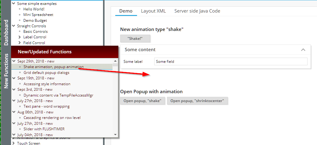
Up to now there were two default popup dialogs within the grid processing:
Re-arrangement of columns
Search & export
We now separated the “export” as additional, own popup as well:
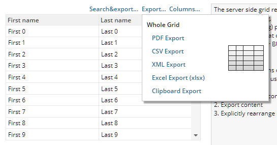
The corresponding method to bind e.g. to button's ACTIONLISTENER is “FIXGRIDList/TreeBinding.onOpenGridExportFunctions(...)”.
In certain scenarios it could happen that while doing shift-click selections in the FIXGRID-component there was a constant “beep”-sound. The sound was triggered by the blocking screen and by the shift-key periodically sending shift-keydown events.
The following client localizations were added:
“zh” for Chinese language
“CN” and “JP” for Chinese and Japanese date/time/number-formats
When doing shift-click selections (e.g. in the FIXGRID) then in IE10/11 the browser text selection was activated, so that certain parts of the screen text were marked. Now there is no text selection anymore.
If defining variables with the name “@...@” within the style processing (both in the CSS stlye definition and in the style.xml definition) then the variable can be directly used within the style.xml value definitions.
The CSS XML variables (“@xxx@”) are now both usable as normal “style.xml”-style-values as well. Please check the corresponding demo in the Demo Workplace (“New Functions”).
Grid components are multiplying out controls row by row. (Please do not mix “row” with “grid item”: the “row” is limited by the “sbsvisibleamount” value – while the number of “item”s can be unlimited!).
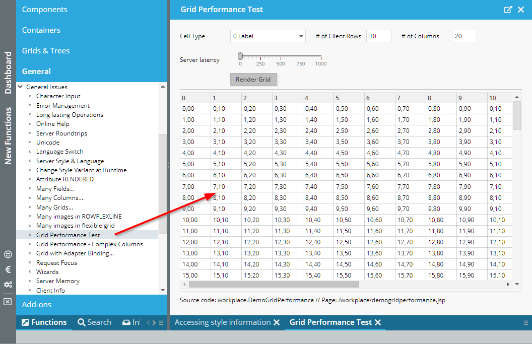
There were certain (special) situations, in which the scroll bar did not represent the actual scrolling status in the FIXGRID processing.
We received Chinese literals for the the RISC client – thanks a lot to the FORCAM development team! We also received updated Spain translations for the – thanks to the Egger development team!
The SPLITPANE now supports the attribute ONETOUCHNAVIGATION:
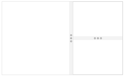
When setting to “true” then little navigation items are rendered into the divider area.
The FLUSH event was triggered when opening the AUTOCOMPLETE value selection already. Now it is triggered when the value was selected from the list of proposals and/or when the user leaves the component (and having changed the value).
The problem: you want to create content on server side (e.g. a generated HTML or PDF page) and this content should be loaded into the client via a URL.
There is a sophisticated way that is provided in CaptainCasa – the “BufferedContentMgr”... - and now there is a “cheap” variant: you just copy the data to a so called “TempFileManager” and receive back the URL. The TempFileManager internally stores the data within the temp directory of the servlet container – and ensures that you are only able to access the content within the context of your session. The files are removed from the temp directory when the session is closed.
public String getUrl() { return m_url; }
public void onCreateFileAction(javax.faces.event.ActionEvent event)
{
byte[] bytes = m_html.getBytes("UTF-8");
String path = "demo.html";
m_url = TempFileManager.saveTempFile(path,bytes);
}
Please check the demo in the demo workplace (“New Functions”).
The attribute CLIENTNAME (e.g. used by testing tools to identify content) was not passed into popup dialogs. In addition a couple of default dialogs (e.g. Combobox-popup, calendar-popup, …) received some default client name.
If you did not pass a text with a way point then it was not possible to receive the selection event of the way point because the selection was bound to the text popup showing up. Now the selection is independent from this popup.
There was a problem if the file name of the uploaded file itself contained a “&”.
Due to a bug in 20180827 we delivered update 20180827_2. With 20180827 there was a problem starting the RISC client with IE – the newly introduced start image did not disappear.
Our certificate expired on 20180824 – so we now user our new certificate, which is valid for the next 4 years... - It is again a certificate which is granted by Comodo.
For these ones of you that use some own certificate (which is the definitely recommended way): no change at all, you are doing it the right way!
For these ones of you that somehow bypassed using some own certificate and that are distributing the CatpainCasa Swing Client with CaptainCasa's version: there is the risk that old Java versions may not accept this certificate because the root authority is not registered in the corresponding Java version.
The root certificates that the CaptainCasa certifcate is based on were added to Java 8.51 (see: https://www.oracle.com/technetwork/java/javase/8u51-relnotes-2587590.html). This means: the certificate will appear as “unknown/self signed” certificate for all Java versions < Java 8.51.
Java 8.51 was published at July 14th 2015, which is three years ago – so we assume most of the users should have adapted (and should have adapted due to security vulnerabilities of previous released).
Please contact us in case of questions!
We did some beautifications...
When loading the first page then an animated waiting-icon is show.
When waiting for the server during processing there are now three phases
first 250ms: no optical feedback to the user
250ms … 1250 ms: some light overlaying
> 1250ms: some light overlaying with waiting icon
In addition, when the screen is blocked to the user due to server side processing, then there is a “beep” and some optical effect executed if the user is entering data via the keyboard or if the user is clicking with the mouse.
Buttons and other controls now show some mini-animation when they are activated either by the user pressing the mouse or by the user using the keyboard.
All issues are configured within the style. This means: please update your styles when not using the default ones.
If images were dynamically loaded via BufferedContent then there default size was not calculated properly.
If using mode “COOKIE” for session management and if a client does not support cookies, then there is a corresponding error message, that exactly tells what's going on.
Menus now show scroll bars if they contain too many items:
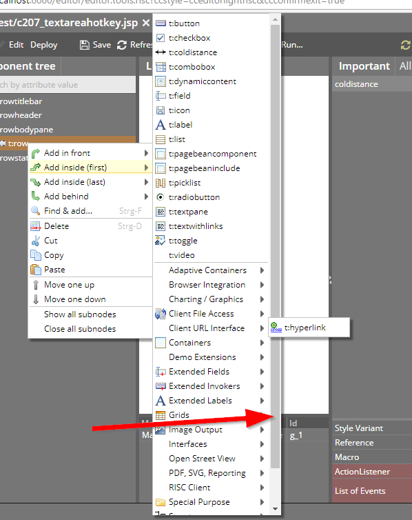
When opening the CALENDARFIELD popup and when showing both date and time, then the take over of the selected date/time now is done by double-clicking a calendar day as well. So you do not have to use th OK button all the time.
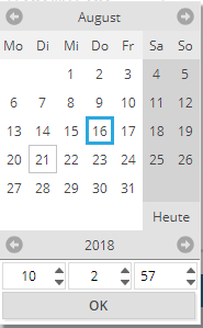
You now can assign a MINVALUE and MAXVALUE to the FORMATTEDFIELD to pass the range of numeric values that can be defined by the user. (Please note: when using data type “date” then you still have to use FROMDATE and TODATE...)
We could not believe (and could not reproduce it at the beginning...). In special constellations (browser Mozilla, scale of 130%) some bottom pixels were missing with the “g” character. Finall we found some rounding problem on our side, which caused this...
When pressing up/down in some footer line of the grid, then the scrolling of the content was triggered. Now the scrolling only is triggered if the cursor keys are pressed inside the scroll-able grid content.
There is a new attribute on TEXTPANE level: if setting WORDWRAP to “true” then long words of a text will be broken if the width for the text is not sufficient:
The user hint popup was not showing up with certain components (e.g. CALENDARFIELD).
The user hint did not update when it was shown and changed due to a server round trip.
And finally: the user hint was up to now shown below a component, now it is on top. Reason: there is no conflict with dialogs showing up with a combo box, calendar field etc.
Some components provide some animation, and allow to customize this animation via an attribute ANIMATIONTYPE. The animation type “noanimation” now is consistently supported throughout all these components.
Properties of type “java.util.Date” were mapped to “java.sql.Date” when writing data. Now the mapping is correct – “java.util.Date” is mappend to “java.sql.Timestamp”.
When tabbing into certain controls then a certain animation is started – the bottom area of the control is highlighted and the highlighting is fading out.
Is this “animation for no serious purpose”? ;-) We do not believe so: especially when quickly tabbing through dialogs or through lists, then it is now much easier to follow where the current focus is located.
The animation is part of the styling – and you can switch off or change it within your own style definition.
Please note:
You have to re-generate your own styles in order to take over this change.
You may set style variable “@backgroundAnimationFocus@” to “border0_fieldfocus” in your own style in case you want to switch off this animation.
With container components there was already the attribute CASDACDERENDEREDFALSE, which means: if all content components of a container are not rendered, then the container is not rendered as well.
This property is now also supported for the ROW component: if the row content components are not rendered then the ROW itself also will not be rendered. - Please check the corresponding demo in the demo workplace (“New Functions”).
The TIMER component sends events from the client to the server. It is configured by a DURATION and a DURATIONTYPE.
So far the following usage modes were supported:
DURATIONTYPE=”” / “regular” ==> the TIMER component calls the server every n milliseconds (n being defined by DURATION)
DURATIONTYPE=”lastroundtrip” ==> the TIMER component calls the server every n milliseconds if no round trip to the server occurs in the meantime.
DURATIONTYPE=”lastactivity” ==> the TIMER component calls the server every n milliseconds if no user activity occurs in the meantime. A user activity is either a mouse click or a keyboard activity.
Now there is a new timer mode:
DURATIONTYPE=”onetimelastavtivity” ==> the TIMER component sends one event to the server side if there is no user activity for the duration of n milliseonds. Afterwards it will NOT continue to call the server every n milliseconds but will keep quiet – again waiting for user activity.
What's a good use case for this new timer mode:
The user keys in data in a form. The form should be validated automatically on changes. - You now can define that there is exactly one TIMER event after the user was active to validate the data. ...and there is no continuous eventing from the TIMER component, triggering the validation without any user activity.
If initializing the VALUE of the SHIFTCONTAINER component to a number different than “0”, then the SHIFTCONTAINER showed the correct content, but the navigation buttons were not correctly drawn (typically: the left/top navigation button was missing).
In the Swing client there is a dialog that is showing up if the user presses the ctrl-key and the user spins the mouse wheel. In this dialog there is a slider for defining the scale of the dialog.
This dialog can now be switched off by setting the new client parameter “showsizingdialog” to “false”.
In addition the actual client scale is sent to the server side with http-header-parameter “eclnt-scale”.
After a certain time of inactivity the slider sends out its value change without the user releasing the mouse button.
You now can directly pass HTML content in the GRIDCOL component as well.
In the calendar components you can key in short versions of the date e.g. “010112” for the 1st of January 2012. The short version with 8 characters (“01011912” for 1st of January 1912) did not properly work.
The item that was selected once was shown as focused item when re-opening the menu.
The interface class “ICCEEConsants” was renamed to “ICCEEConstants”... Sorry: this will have the consequence of compilation problems on your side!
DOFWSql now supports the querying of “top n values”. But...: to properly do this we introduced a new config parameter “db_sqldialect”, because the SQL statements to select a limited number of results from the database are not harmonized throughout the various databases.
DOFWSql now supports functions like COUNT, MAX, MIN, AVG
Please check the CCEE-docu for detailed information.
By using CLIENTCONFIG-COUNTRY/LANGUAGE you can update the client internationalization settings. Up to now, it was required to trigger the client to reload its content in order to re-initialize the controls.
This is not required anymore – the update of the internationalization is immediately down – without any special action being required.
When the user moves the slider with the mouse then the current value is output next to the slider grabber. If you do not like this, then you can switch off by setting SLIDER-SHOWCURRENTVALUE to false.
During various projects we developed some simple framework for covering the most important requirements on application processing side:
DB access and Transaction Management
Logging
We saw that this framework was highly appreciated by these ones who know about – and now added it to the standard delivery - together with its code, with documentation (JavaDoc + pdf).
Please check “<installdir>/resources/eclnt_ccee.zip”.
...of course: you may use the framework, change it, copy it, whatever! The framework is an addon to CaptanCasa, so does not belong to CaptainCasa's Enterprise Client from service, support and warranty point of view.
Any feedback on CCEE is appreciated!
Thanks a lot to Nexus Group for providing the translation information!
The new components listens to server side events by setting up a web socket communication. The usage is the same as you are used to from the LONGPOLLING component: on server side you have to use an instance of “DefaultLongPollingWebSocket” and register this in the “LongPollingMgr”. The interface for waking up the client side (“ILongPolling”) is also the same.
Please check the example in the demo workplace.
JSP:
<%@page contentType="text/html"%>
<%@page pageEncoding="UTF-8"%>
<%@taglib prefix="f" uri="http://java.sun.com/jsf/core"%>
<%@taglib prefix="h" uri="http://java.sun.com/jsf/html"%>
<%@taglib prefix="t" uri="/WEB-INF/eclnt"%>
<%@taglib prefix="demo" uri="/WEB-INF/democontrols"%>
<%@taglib prefix="ccaddons" uri="/WEB-INF/ccaddons"%>
<!-- ========== CONTENT BEGIN ========== -->
<f:view>
<h:form>
<f:subview id="workplace_demowebsocketpollingg_sv">
<t:beanprocessing id="g_1">
<t:websocketpolling id="g_2"
actionListener="#{d.DemoWebSocketPolling.onWebSocketAction}"
duration="100"
websocketurl="#{d.DemoWebSocketPolling.webSocketUrl}" />
</t:beanprocessing>
<t:rowbodypane id="g_3" rowdistance="5">
<t:row id="g_4">
<t:label id="g_5" text="URL" width="100" />
<t:label id="g_6" cutwidth="true"
text="#{d.DemoWebSocketPolling.webSocketUrl}" width="100%" />
</t:row>
<t:row id="g_7">
<t:coldistance id="g_8" width="100" />
<t:button id="g_9"
actionListener="#{d.DemoWebSocketPolling.onStopAction}"
text="Stop thread processing" />
<t:coldistance id="g_10" width="5" />
<t:button id="g_11"
actionListener="#{d.DemoWebSocketPolling.onRestartAction}"
text="Restart thread processing" width="100+" />
</t:row>
<t:row id="g_12">
<t:textarea id="g_13" height="100%"
text="#{d.DemoWebSocketPolling.protocol}" width="100%" />
</t:row>
</t:rowbodypane>
<t:pageaddons id="g_pa" />
</f:subview>
</h:form>
</f:view>
<!-- ========== CONTENT END ========== -->
Code:
package workplace;
import java.io.Serializable;
import org.eclnt.editor.annotations.CCGenClass;
import org.eclnt.jsfserver.elements.util.Trigger;
import org.eclnt.jsfserver.polling.LongPollingMgr;
import org.eclnt.jsfserver.polling.websocket.DefaultLongPollingWebSocket;
import org.eclnt.workplace.IWorkpageDispatcher;
import org.eclnt.workplace.WorkpageDefaultLifecycleListener;
import org.eclnt.workplace.WorkpageDispatchedPageBean;
@CCGenClass (expressionBase="#{d.DemoWebSocketPolling}")
public class DemoWebSocketPolling
extends WorkpageDispatchedPageBean
implements Serializable
{
// ------------------------------------------------------------------------
// inner classes
// ------------------------------------------------------------------------
public class MyThread extends Thread
{
boolean i_threadStop = false;
@Override
public void run()
{
for (int i=0; i<100; i++)
{
try { Thread.sleep(500); } catch (Throwable t) {}
if (i_threadStop == true) break;
m_counter++;
m_longPollingWebSocket.wakeup(true);
}
if (m_thread == this) m_thread = null;
}
}
// ------------------------------------------------------------------------
// members
// ------------------------------------------------------------------------
DefaultLongPollingWebSocket m_longPollingWebSocket;
MyThread m_thread;
int m_counter = 0;
String m_protocol = "Protocol:\n";
// ------------------------------------------------------------------------
// constructors & initialization
// ------------------------------------------------------------------------
public DemoWebSocketPolling(IWorkpageDispatcher workpageDispatcher)
{
super(workpageDispatcher);
m_longPollingWebSocket = new DefaultLongPollingWebSocket();
LongPollingMgr.add(m_longPollingWebSocket);
getWorkpage().addLifecycleListener(new WorkpageDefaultLifecycleListener()
{
@Override
public void reactOnDestroyed()
{
if (m_thread != null)
m_thread.i_threadStop = true;
LongPollingMgr.remove(m_longPollingWebSocket);
}
});
m_thread = new MyThread();
m_thread.start();
}
public String getPageName() { return "/workplace/demowebsocketpolling.jsp"; }
public String getRootExpressionUsedInPage() { return "#{d.DemoWebSocketPolling}"; }
// ------------------------------------------------------------------------
// public usage
// ------------------------------------------------------------------------
public String getWebSocketUrl() { return m_longPollingWebSocket.getURL(); }
public String getProtocol() { return m_protocol; }
public void setProtocol(String value) { this.m_protocol = value; }
public void onWebSocketAction(javax.faces.event.ActionEvent event)
{
m_protocol += "\nCurrent counter: " + m_counter;
}
public void onStopAction(javax.faces.event.ActionEvent event)
{
if (m_thread != null)
m_thread.i_threadStop = true;
m_thread = null;
}
public void onRestartAction(javax.faces.event.ActionEvent event)
{
if (m_thread != null)
return;
m_thread = new MyThread();
m_thread.start();
}
}
...before there was some padding left to the sides.
“/awesomefont(...)”-images were not loaded correctly.
In case of a horizontal scroll bar being shown in the combo box popup, it could happen that the scroll bar did hide parts of the last item. The item still could be selected, but the visibility was poor...
It is now also possible to start the range selection on top of a PAINTAREAITEM instance. Before the user had to start the selection at some empty space within the PAINTAREA.
When using the feature PAINTAREALINEITEM-FIXINTERIMPOINTEND then the last section of the line was drawn in edged mode always.
The IFRAMEINCLUDE component now allows to also pass drag/drop operations from the CaptainCasa level down to the level of the included page. The demo page (eclnt/risc/ext_iframeinclude_example) was adapted accordingly:
/*
* Optional implementation of drag/drop interface: if DROPRECEIVE is defined then
* the following methods are called - if they are implemented.
*/
function ccNotifyDragOver(x,y,dragInfo) { document.getElementById("SOMEOUTPUT").innerHTML = "DRAGOVER: " + x + "/" + y + "/" + dragInfo; }
function ccNotifyDragLeave() { document.getElementById("SOMEOUTPUT").innerHTML = "DRAGLEAVE: -"; }
function ccNotifyDragEnd() { document.getElementById("SOMEOUTPUT").innerHTML = "DRAGEND: -"; }
function ccNotifyDrop() { document.getElementById("SOMEOUTPUT").innerHTML = "DROP: -"; }
This is an interim update and should only be used if you want to use the latest features! All functions will be included in the next official update.
When using COLSYNCHEDPANE/COLSYNCHEDROW then the COLSPAN attribute was not properly supported. Result: the components were not properly arranged/sized.
When setting FILEDOWNLOAD*-CALLBACK to “true” then the client will send some notification if the download was initiated on client side. - For Swing users: there is a difference between the RISC function and the Swing function: while in Swing the notification is sent after the download of the file, the RISC client sends the notification when triggering the download. There is no way to find out in the browser that a file was successfully downloaded.
So far you could only pass “timeShort/Medium/Long” and “dateShort/Medium/Long”. Now you can pass:
“datetimeShort/Medium/Long”
“date(...)”, “time(...)”, “datetime(...)”, the argument is some string pattern out of “y”,”M”,”d”,”H”,”m”,”s” (year, month, day, hour, minute, second)
During upload files are not uploaded in one “chunk”, but are “sliced”. The size so far has been 100kBytes and now was increased to 300kBytes in order to reduce the number of requests.
The editing of interim points is simpler now and was adapted to the way interim points can be edited e.g. in Microsoft Visio diagrams.
By using attribute FIXINTERIMPOINTSTART/END you can define that the first/last interim point can not be changed by the user. This is quite useful if having lines that always start with some distance from the shape they belong to.
By setting component-POPUPMENU to “CCBROWSER” the component will show the default browser popup menu. This is extremely useful e.g. in TEXTAREA instances because there the browser menu contains spell checking hints.
The alignment of the COMBOBOX is also taken over into the list of select-able values that is shown when the user opens the COMBOBOX.
...bug is fixed now.
In the SPLITPANE you now can decide if the contained content is cut by moving the slide – or if its minimum size always is respected:
Please check the demo in the demo workplace (“New Functions”).
For the SCHEDULE component you now can now define the padding both for the top (left) and for the bottom (right) side:
Please check the demo in the demo workplace (“New Functions”).
There is now the PageBeanComponent CCMultiValueSelection which is part of the page bean components addon.
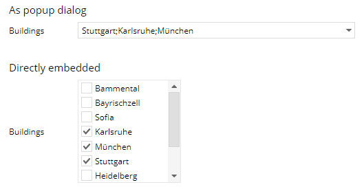
The addons are contained in the resources folder of your installation. Add “eclnt_pbc.jar” (contained in eclnt_pbc.zip) to your <webcontent>/WEB-INF/lib in order to use.
Due to the “improvements” of last week's update 20180618 there was a bug in the CLOCK processing which is now fixed.
For BUTTONs you now can suppress double click processing by setting BUTTON-DOUBLECLICKENABLED to “false”.
For FIXGRIDs the double-click processing is automatically disabled if having set FIXGRID-SINGLECLICKEXECUTE to “true”.
It took as 11 years to re-design our standard dialog popups:
the messages that can be popped up together with the statusbar
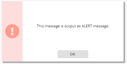
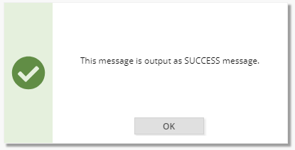
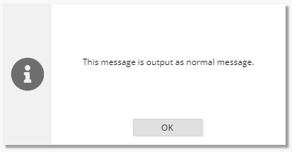
the OK popup
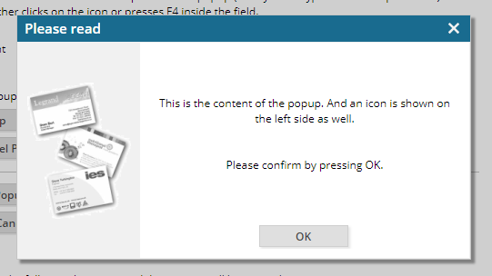
the Yes-No-Popup
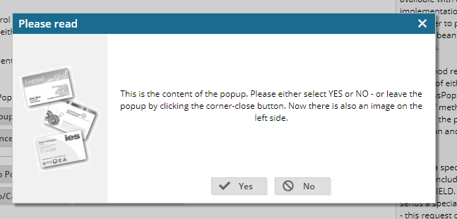
In addition we also updated the sound that comes with errors:
The sound only occurs anymore if the error is “alerted”.
The sound is much softer now.
BUTTON and LABEL now allow to directly pass HTML text.
Before any HTML was “escaped” so that it was output character by character. Now you may pass the text in the format “<html>...</html>” to trigger the interpretation as HTML text.
Before being rendered the HTML content is sanitized.
This of course takes some time – but is definitely required to avoid XSS (cross site scripting) attacks. It also means that certain attributes are sanitized, e.g. also the src-attribute of “<img src='...'>”, because it is possible to execute JavaScript in this attribute.
In general: only use “<html>...</html>” in case you really want to render HTML – otherwise continue to use plain text, which is significantly faster!
A lot of components internally are based on button and label – e.g. TABBEDLINE, TABBEDPANE, … You may use as consequence the html-format also for the text of these controls.
In order to avoid potential problems with double-click processing, it was remove for FIXGRIDs with SINGLECLICKEXECUTE being set to “true”.
The CLOCK component by default shows the current time – and refreshed its content automatically on client side. You now can pass a start value (attribute STARTAT) and a direction (attribute STARTATCOUNTDOWN) so that it e.g. counts from “0” on upwards, or e.g. from a given time downwards.
Typical use case:
count down: you want to show the user the validity time of a session.
count up: you want to show the user a duration of certain processing
Please check the corresponding example in the demo workplace:
When re-positioning the divider of a split pane, then the minimum size of the contained content was not respected.
When an OUTLOOKBAR did not fit into one screen (e.g. too many items) then it was cut. Now it calculates its minimum size correctly.
The sizing of the content pane now also follows the minimum size of the content. Example:
OUTLOOKBAR
OUTLOOKBARITEM
OUTLOOKBARITEM
OUTLOOKBARITEM
OUTLOOKBARITEM
OUTLOOKBARCONTENT
ROW
PANE height=”100%;400”
The content will be sized with 400px as minimum height.
The documentation “Developer's Guide RISC addons” now contains corresponding information.
Since last week's update the Layout Editor reads all information of a project in a much more decoupled way from its own runtime than before.
The “proof”...: in the Layout Editor the default tag library for CaptainCasa components was not ready anymore – and resulted in some error message when opening layouts.
We now fixed this bug. The good new now: you just have to upgrade the editor – and you do not have to upgrade your projects as a consequence of this! ;-)
This is something internal, but the (positive) consequences are and will be visible for you as well: when installing a new CaptainCasa version we asked you to both install the newest version of the tools – and to upgrade the versions within your project.
We now updated the tools so that there is a maximum independence between the tools and the application project, what means: you may work in the tools of version “x” and edit applications of version “y”.
Example: you now can upgrade your application project to a new CaptainCasa version – but you do not have to upgrade the tools. This makes the distribution of centrally managed CaptainCasa versions much easier.
You may wonder, where the inter-dependency between the tool and an application project has been so far. - The inter-dependency was in the area of the tag library. The tool (as it is a CaptainCasa application itself) loaded the tag library of CaptainCasa controls itself in its class loader. When the tool accessed the project's class library it loaded the project artifacts within an own classloader – which was a parent of the tool classloader. As consequence certain information (e.g. the tag library definition “eclnt.tld” was not read from the project, because it was read in the tool classloader already.
When using FIXGRID-ROWPOPUPMENU and when reacting on a menu selection by opening a dialog, then the dialog was opened below the grid – and not below the line, on top of which the user pressed the right mouse button.
The SHIFTCONTANER was improved. Main issue: the attribute ORIENTATION, that decides if the content scrolls horizontally or vertically.

In addition: the scrolling can now be executed by using the mouse wheel and there is “point navigation” that indicates the number of content pages and the active page.
The new functions are used in the demo workplace's background page, where you can now scroll between 3 different content areas:
The scrolling in the FIXGRID with high latency times is “smarter” now. Before it could happen that the scroll bar moved one additional time after releasing it – which was 100% correct from positioning point of view, but which caused some flickering scroll bar for the user.
Only a mini-issue, but some of you waited for this: the cursor in the TREENODE component now only shows a pointer (handy) on the toggle icons if it is some interim node. It is a default cursor for leaf nodes.
The performance of the OSMVIEWER component was drastically increased. Before it was a problem to render many way points – now e.g. 100 way points are no problem anymore.
Up to now the info popup showing the text information for a way point was shown immediately. Now you can hide it by setting the attribute HIDEINPUTPOPUP to “true”. This is useful in situations in which you show many way points.
You can also now update the image of the marker by using attribute MARKERIMAGE.
The FOREGROUND definition was not taken over – the text of the components always showed up with the color defined in the style.
The selection of a line item is now much nicer than before – especially for short lines the selection area was much too big before.
In addition the selection is only executed if there was not selection on PAINTARAREAITEM – before it could happen that one click of the user both selected a PAINTAREAITEM and a PAINTAREALINEITEM instance.
The text was some times cut when defining an IMAGE with the LABEL.
Before the popup was opened below the grid – now it is opened below the line which the user selected.
Internet Explorer moves complex components to their very left/top position within a scroll-able area when being focused. This is OK with e.g. field/text components, but it is not nice with graphical components such as the PAINTAREAITEM. We now make sure that the scroll position is kept when focusing PAINTAREAITEM instances (which are switched to FOCUSABLE “true”).
In case you want to use the old version: please set the attribute SIMPLEHTMLEDITOR-BRIDGEPAGE to the old bridge page “eclnt/risc/ext_ckeditor/ext_ckeditor.html”.
The HTML that is sent into the SIMPLEHTMLEDITOR was so far transferred “as defined” by your server side application. We now added the same HTML-sanitizing that we apply e.g. within the TEXTPANE processing. This means, suspicious statements (JavaScript statements and others) are removed prior to rendering the content.
This means: the text is sanitized (and this means: potentially changed) before being processed in the editor. The sanitizing is done by a Google algorithm using an HTML 4 positive list of elements/attributes.
In case you want to explicitly NOT sanitize the text then switch attribute SIMPLEHTMLEDITOR-AVOIDSANITIZING to “true”.
There were very special situations in which the columns were not correctly sized.
The server side classes Modal/ModelessPopup now provide a method “setStyleSeq(...)” with which you can define the background style sequence.
There is a corresponding demo in the demo workplace:
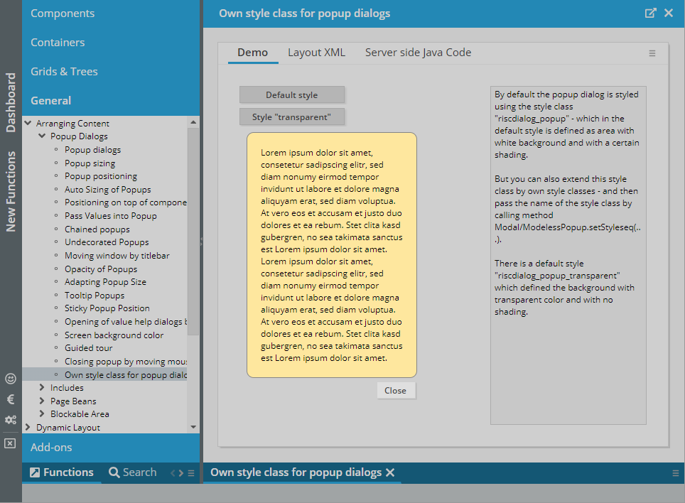
...when moving the mouse - now it does!
The MAXLENGTH is now applied to the text editor dialog that is shown when the user clicks onto the icon of the LONGTEXTFIELD component.
The SIMPLEHTMLEDITOR now supports a FLUSH/FLUSHTIMER as well. Important: the flush is only activate-able via the FLUSHTIMER – there is no flushing based on the user leaving the component.
Both parameters are now provided in the RISC client: in case of connection problems during a running session, the user may receive a popup after certain attempts of communication. The text of the popup can be influenced by the attribute CONNECTIONPROBLEMMESSAGE.
The text is both used in the popup, and it is used in the subsequent error screen:
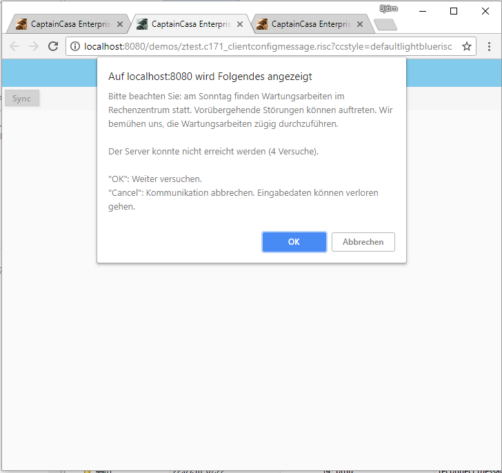
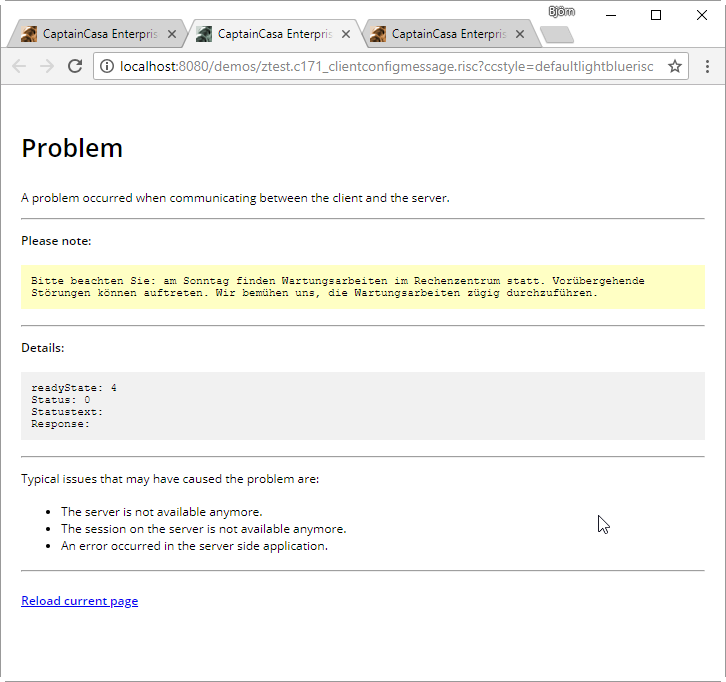
You may use the text as general purpose info message to be added to the error dialog.
The menus – POPUPMENU, MENUBAR, BUTTONMENU – are now opened if the user moves the mouse on top of the corresponding menu element.
A similar issue was added to BUTTONPOPUP. If defining the attribute ACTIVATEONMOUSEOVER as “true” then also the component's dialog is opened on mouse over.
The new feature of 20180503 was optimized:
It now allows the definition of the image quality as thid parameter of IMAGEREDUCTION (e.g. “600;400;90” - width 600, height 400, quality 90%)
The internal shrinking in several steps is executed with quality level “100%”, only the last shrinking to the final format is done with the quality defined by you (or with quality “90%” as default)
In the previous version images that were smaller than the defined width/height were enlarged, now they just keep their size – there is no up-scaling
If only defining a WIDTH (and no HEIGHT) or if only defining a HEIGHT (and no WIDTH) means that the not-defined attribute is calculated automatically – if KEEPRATION is set to “true” (which is default). - The same is done if defining IMAGEWIDTH/IMAGEHEIGHT.
There were certain problems with 404 messages sometimes showing up when:
relaoding pages
using component CLIENTREDIRECTPAGE
The problems occurred with 20180409 and were un-detected since then.
The default font Google's “Open Sans” was so far loaded without cyrillic and greek characters. We now load the font including these characters. (Of course you always can use own fonts by updating the style definitions.)
In the upload components (e.g. FILEUPLOADBUTTON) there is an attribute IMAGEREDUCTION. Here you can pass a semicolon separated information, how to shrink images before being uploaded.
Example: “200;100” means that an image is shrinked to the size of 200 pixels * 100 pixels before being uploaded.
The resizing is executed for png, jpg and gif files – itentified by the file extensions “jpg, jpeg, gif, giff, png”. The resizing is done in several steps in order to keep a certain quality level in the resized image.
By setting the attribute CLIENTCONFIG-POPUPMENUCOPYCLIPBOARD to “true” a popup menu will be shown below every component containing text information.
After invoking the menu item the text will be copied into the client clipboard. Dependent on the browser this is directly executed – or an explicit popup dialog is opened, from which the user can easily copy/paste the text.
The component TEXTPANEVERTICAL allows to render multi line text vertically. It is the vertical equivalent of the TEXTPANE component.
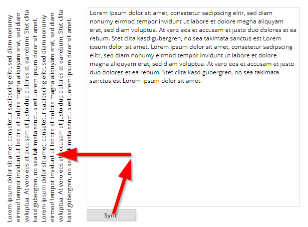
In the demo the text is defined within a TEXTEAREA on the right – and is copied into the TEXTPANEVERTICAL component on the left.
When having scaled the browser (e.g. to “125%”) and having resized columns it could happen, that the column's size was reset to “0”.
The focus coloring is now spanning the whole control's background – not only the background of the contained filed component.
The documentation “Developer's Guid – RISC add-ons” contains some information about how to integrate CaptainCasa applications into SSO environments. It's part of the central documentation page: http://captaincasa.org/documentation
Via the interface “IextCalendarMgr” you may pass additional definitions into the calendar (such as textual tooltip information). The interface now was improved to allow to add textual definitions in several languages. The inner class “ExtCalendarInfo” now contains a method “addCommentTranslation(String language, String comment)”.
There is one header parameter “eclnt-originalurl” that is sent with every http-post from the client to the server. This contains the original URL that triggered the RISC-processing. The value of the parameter did not contain any protocol/server information since 20180409 – now it does again.
This is some really important improvement – especially for these ones who integrated their CaptainCasa application with other frameworks, e.g. SSO (singel sign on) frameworks, portal frameworks, cloud frameworks:
Up to now the session management of CaptainCasa based on URL-encoding. This was the way to ensure that each browser instance (browser tab) was bound to one corresponding http session on server side.
Now we introduced an alternative solution: a cookie based session management, in which several browser instances (browser tabs) belong to one session cookie – and each instance/tab is separated by some “gateway” which is an internal part of the server side expression resolver.
The setup to switch from URL-based to COOKIE-based session management is very simple. Please find detailed information within the Developer's Guide, there is a new chapter “Session Management”.
When applying new versions of CaptainCasa then there was the problem that depending on the local browser cache configuration JavaScript and style resources were kept in the local cache – and not picked from the server side.
Now, the access to the resources is done with some appending including the CaptainCasa version number. This means: resources are reliable re-read after some change of version.
Thanks from our side to the Swiss Xpert-users for the constructive discussion on this! ...so this week's “community hero award” is directed to them! ;-)
In update 20180326 we updated the way URLs are internally built so that they are much more tolerant (“maximal tolerant”) to positioning the web application behind any routing mechanism.
The updated way took the “.risc” part of the URL and calculated the relative URL out of this. Now we had scenarios in which there were routing rules that included the “.risc” part... ;-). E.g. the name “http://host/demos/start” routed to “http://host/demos/pages.start.risc”. So the internal mechanism were extended: if there is no “.risc” file included in the page then the base directory is the one with the last occurance of “/” in the URL. Example: with “http://host/demos/start” the base URL would be “http://host/demos”.
In the archetype we updated the CCApplication sources – so that the servlet configuration is done via Spring Registration Beans. Thanks to the community contribution on this!
If moving the mouse over a certain content area, then some more content is shown:
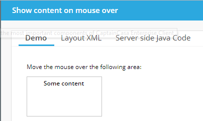
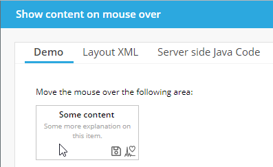
The definition is rather simple – but flexible!...:
<t:overlayarea id="g_26" background="#FFFFFF" border="#c0c0c0"
height="80" width="150">
<t:overlayareaitem id="g_27" height="100%" width="100%" x="0"
y="0" zindex="0">
<t:label id="g_28" align="center" font="weight:bold"
text="Some content" valign="top" />
</t:overlayareaitem>
<t:overlayareaitem id="g_29" height="100%"
showonareamouseoveronly="true" width="100%" x="0" y="0"
zindex="1">
<t:pane id="g_30" padding="2">
<t:rowdistance id="g_31" height="20" />
<t:row id="g_32">
<t:textpane id="g_33" align="center" font="size:10"
foreground="#A0A0A0" height="100%"
text="Some more explanation on this item." width="100%" />
</t:row>
<t:row id="g_34">
<t:coldistance id="g_35" width="100%" />
<t:icon id="g_36"
image="/images.iconssvg.save.#606060.16x16.ccsvg" />
<t:icon id="g_37"
image="/images.iconssvg.heartbeat.#606060.16x16.ccsvg" />
</t:row>
</t:pane>
</t:overlayareaitem>
</t:overlayarea>
Inside a layered area (OVERLAYAREA) you just set the flag SHOWAREAMOUSEOVERONLY to “true”. As result, this item is only shown if the user moves the mouse in top of the area.
Please take a look onto the example provided in the “New Functions” section of the demo workplace.
There was no corresponding indication right now – now the user sees some “+” icon on top of the moved component.
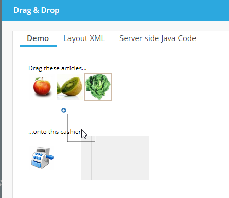
There are some components that integrated other frameworks:
OSMVIEWER
CHARTJS
RGRPAH
SIMPLEHTMLEDITOR
All these components are structured in the same way:
There is a bridging HTML page which exposes some JavaScript API to the CaptainCasa layer – and which talks to the concrete framework that is built up/used within the page.
This bridging page so far was addressed in an hard-coded way. Now you can directly set the bridging page. This means: you can set up some own bridging page, in which you may e.g. reference a different version of the framework.
...just some update of the version. If you still want to use the previous version: there is a bridging page for each of the versions. Check the directory /eclnt/risc/ext_chartjs.
Now they aren't anymore...
When arranging a CaptainCasa web application behind a proxy/router then not all name-routing-rules were supported.
What this means: imagine you have an Apache web server in front of the Tomcat to host the web application. In Apache you can set up that the url “http://apacheServer/greatapps/manufacturing/pp/startpage.risc” is routed to “http://tomcatServer:8080/productionplanning/startpage.risc”. - Up to now the options you had for defining naming rules to work with CaptainCasa were a bit limited (you basically had to follow the pattern “http://server/<webapp>/<page.risc>”) - now they are “unlimited”.
...many thanks to our this week's community heroes from Geis Logistics for passing us the corresponding information!
If defining a POPUPWIDTH and if the size of the combobox items exceeded the width that you passed, then there was no scroll bar shown – now there is one!
Well, basically the request that was added in the previous week was not really done as initial request, but as second request – which was wrong. Now it is really the first (post-) request.
There was a problem to select single characters of a text within a FIELD control when it was part of a grid.
When working with own styles then it could happen that the JS-part which is generated contained some JS-error. This happened for example when having updated parameters in the style class “riscinternal_riscglobal”.
The data formats “Int” and “long” now process a check against the lowest/highest value during input – so that the server side always receives valid int/long values.
There are certain communication scenarios in which a so called “X-Csrf-Token” token needs to be fetched and send as http header parameter to the server side. This parameter is now picked when the client started and is then sent as header part of subsequent requests.
There is now a framework available how to integrate CaptainCasa dialogs into other HTML pages and how to interact on JavaScript level between both parts. Please check the “Developer's Guide – RISC Addons” for more information.
There are new nice functions available to dynamically load SVG icons from the server side. “Dynamically” means that size and color of the images are defined through the URL so that you do not have to save one and the same icon in different colors and sizes.
Example: by defining the URL “/images.iconssvg.cake.#008000.48x48.ccsvg” the image “/images/iconssvg/cake.svg” is loaded – in color “#008000” and with a size of “48 x 48”.
Please check the demo in the “New Functions” area of the demo workplace:
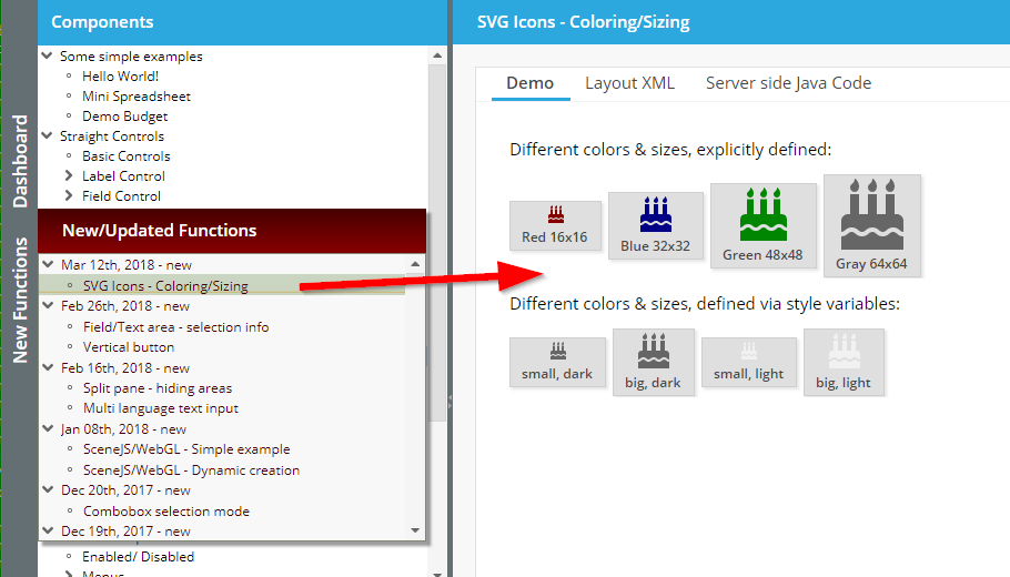
Please note: you need to update the web.xml (add servlet pattern “.ccsvg”) in order to use the new functions.
Before the TREENODE always received its minimum size.
The STATUSIMAGE sometimes was not correctly updated – when setting it explicitly from server side.
There was a rounding/accuracy problem with long decimal numbers like “12.213.231.232,00002932893”. Accuracy problems occurred when reaching the limits of double precision.
The F1 key is now only processed on CaptainCasa client side – and does not bring up the default dialog of IE anymore.
Up to now the handling of numbers (e.g. rounding) was internally managed by using the default number-representation of JavaScript: a number is represented by a 4 byte double value. As result there was a problem when the user keyed in very long numbers (“12632183612873681231287.128362187368276336723846324”), which out-ranged the precision of 4-byte-double numbers.
We now switched the number processing for FORMATTEDFIELD (and for LABEL when using LABEL-FORMAT, LABEL-FORMATMASK) to some internal representation which allows the input of any number.
Of course, the server side will now drive the precision! - If the counter part of a very long number on server-side is a float-property then of course the precision is limited by your server side application. So using FORMAT “bigdecimal”/”float”/”double” in a FORMATTEDFIELD and using object type “BigDecimal” on backend side is the only approach that guarantees infinite precision.
Well, the button by default is rendered horizontally – now there is a vertical variant with the control name BUTTONVERTICAL.
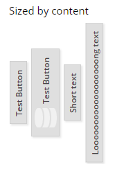
The FIELD component and the TEXTAREA component now can pass back their selection information (cursor position, begin/end of selection) to the backend processing. This function may be used in order to e.g. insert text on server side at a specific position within some text.
Please check the corresponding demo within the demo workplace, section “New Functions”.
Uuuuh: there was a quite “nice” problem that occurred under Internet Explorer 10 and 11: internal updates to the content of the FIELD (or TEXTAREA, or COMBOFIELD, …) were processed internally as changes by the user. The consequences were: FIELDs, in which the value of the server side is automatically transferred (e.g. by defining UPPERCASE to be “true”, or by rounding in a FORMATTEDFIELD), triggered some value update even though there was no user activity.
Consequences: the client did not send only data changes by the user, but also internal data changed of the components. And: in some cases this lead to scenarios in which the focus was moved automatically – without user input.
You now can use the explicit definition of the horizontal text position in an outlookbar item as well: if setting it to “left” then the icon of the item will not be rendered in front of the text, but it will be rendered behind the text.
The following fixes were applied:
When defining TREENODE-USESMARTLABEL “true” then the tooltip of the tree node contained HTML tags.
Internal references to the class “SceneBuilder” were removed.
The CaptainCasa tooling now also contains an editor for defining style sheets with reference to multiple inherited style sheets:
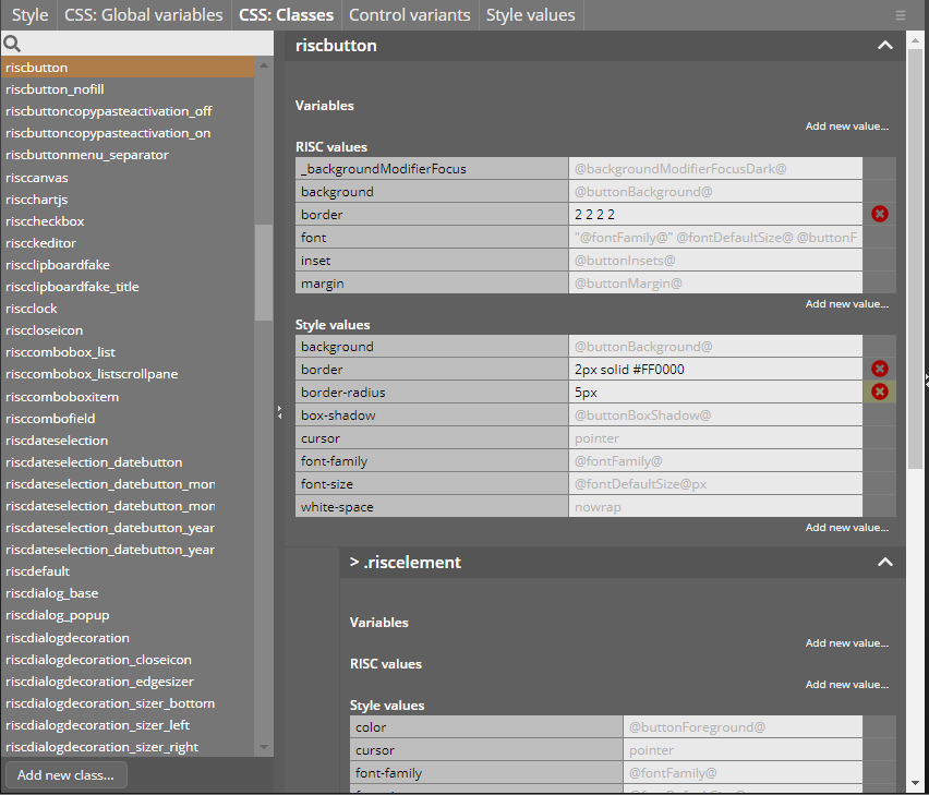
In the editor you may override existing style definitions or you may create new ones, based on existing style classes. While editing you see inherited values as gray background, and you may override them with your values. In addition you always see the complete class structure (e.g. a component uses several style classes for its inside structure).
There are a couple of improvements:
Internally the ADAPTIVEAREAITEMs are now arranged within a SCROLLPANE. Before it was possible that e.g. a small width-category was never reached because the content of the next bigger category had a minimum width that was higher than the smaller category. - Now the content is scrolled horizontally.
You can assign an explicit HEIGHT to ROWADAPTIVEAREA – which makes it possible to also define percentage-based HEIGHT definitions within the contained ADAPTIVEAREAITEMs.
On ADAPTIVEAREAITEM-level you now can define CUTWIDTH: in case of defining percentage width-definitions the width of the content is cut (and not expanded to its minimum width as by default).
It could happen, that numbers were rendered in scientific format like “0.23545345e13”. This only happened in rare cases (e.g. if operating with format definitions with e.g. 10 decimal digits).
With a SPLITPANE you now can explicitly to NOT render one of the contained areas. In case of not rendering, then also the divider between both parts will not be rendered. Please check the corresponding demo in the demo workplace (section “New Functions”).
Up to now the animation within the FOLDABLEPANE component was only triggered when the user opened/closed the component. Now it is also activated if the FOLDABLEPANE is opened/closed by the value behind the OPENED-attribute.
...the component is now using Rgraph 4.65. Please check for more information here: https://www.rgraph.net
When switching between months then it could happened that the selection a date was pointing to the wrong month.
Well, the corresponding “oninput” event is triggered in IE 10/11 also in cases in which the value of the field is changed without user interaction (which internally happened when e.g. converting a numeric number to its display format) - we found a way to bypass.
Via the new attribute you can pass so called poster images for videos: these are preview images that are shown before the user explicitly starts the video.
Sometimes “long” was not interpreted as a number display format.
The FIXGRID now also supports the direct setting of odd/even colors via FIXGRID-attributes (FIXGRID-DRAWODDEVENBACKGROUNDODD and FIXGRID- DRAWODDEVENBACKGROUNDEVEN).
If the user selected several items of a FIXGRID by ctrl-/shift-select and then pressed the right mouse button on one of the items, then all previously selected items were de-selected.
When using localization “pl/PL” then there was a problem with editing dates. Background: the Java representation of the date in short format is “dd.mm.yy”, while it is “yyyy-mm-dd” and “dd-mm-yyyy” in the long format. The internal management of “day-month-year” sequence did not properly handle situations in which the sequence is different between the different display variants.
The central PageBean class was improved by now providing a method “readPageLayoutXML()” - which returns the layout definition of the page that is assigned to the page bean.
As consequence it is possible to parse the XML and to directly interpret meta data that you may place into the page. This is a very strong feature that can be flexibly used!
Internally the reading of the XML is done through the interface of class “PageReader”, which you may access also on your own – outside the context of a page bean.
There are now more styles that are used within the default grid processing:
ARRAYGRID: a special style class is used for the content cells (e.g. “risclabel_inarraygrid”), so that you can style the cells independent from normal labels
GRIDROWSELECTOR: the background currently was not set via style, but was hard-coded; same with header column above the selector
The explicit coloring of odd and even colors (FIXGRID-DRAWODDEVENBACKGROUNDODD/EVENT) is now supported.
...is now supported.
When changing the position of a PAINTAREAITEM and when using the default animation, then there may have been some flickering during the animation.
When defining the content to be right-aligned then the content directly ended at the very right end of the component if the component was switched to disabled.
The focus in touch fields was positioned to the begin of the touch field when during touch operations.
When opening a workpage as popup and when directly requesting the focus into the popup dialog, then with a quite high probability the requesting for the focus was not successful.
There were several issues:
The value sometimes was not kept when e.g. placing the component in a TABBEDPANE and switching between pages.
The value was re-transferred to the server event though it did not change when pressing the enter-key.
The focus management caused a change in the cursor position. While entering text via the touch keyboard the focus jumped to the first position of the corresponding input field.
You can explicitly switch on the rendering of comments for the list of values. This was a switch which was available in the Java-clients and which now is also available in the RISC-client.
The text is now positioned on the left top of the component and it automatically switches to multi-line text, if the text exceed the size of the SCHEDULEITEM component.
You now can explicitly define the height of the COMBOBOX popup, containing the list of valid values.
...before it was shown in the container area of the “tab”.
Certain errors (e.g. OutOfMemory) were not transferred back to the client side properly. Now they are transferred and the user receives a corresponding message during file upload.
We now switched from PNG icons to SVG icons. Of course the scaling behavior of these icons is much better than with PNG:
100% rendering
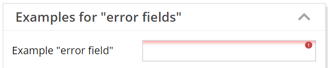
150% rendering
We kept all original icons sizes, so there is no change to any layout due to the update.
When working on SVG icons on our owns, we wrote some tool to browse existing SVG images on your local disk and to change their color and set their site. We made the tool available within the Layout Editor, press Icon “SVG Icons” within the left toolbar.
You now can pass dyamically created / loaded SVG into the client by either using the HEXIMAGE component or by using the pseudo-URL “hex(...)” for any image. Please take a look onto the demo “Components > Straight Controls > Dynamic SVG Content”.
The setting of the client CLIPBOARD did not pop up a dialog with the text content to be passed into the clipboard.
The calendar selection now indicates the today-day with a gray border. To be consistent we updated the rendering of the currently selected date: before the background was highlighted, now a border is drawn around the selected date:
...now it is!
By default the LINK component only is underlined if the user moves the mouse over the component. Now there is a style variant to always show the line below the text.
When clicking a component with the left mouse button, then there is an explicit focusing of the component. We added this behavior to the right mouse button as well.
Scene.js is a nice framework that utilizes WebGL for rendering 3D-graphs. We now built up some basic integration to this framework so that the scene graph can be built on server side (as JSON representation) and is applied to the client side rendering.
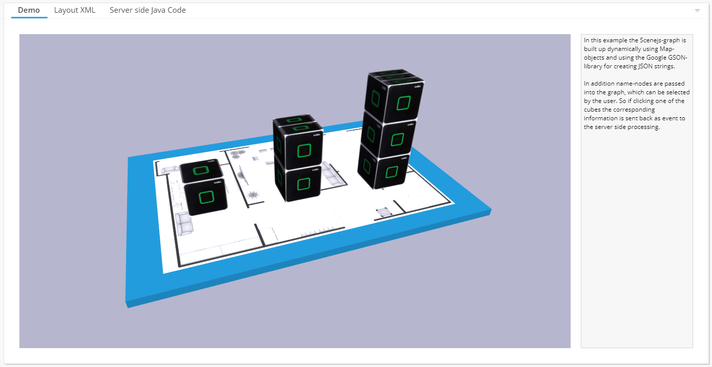
There are couple of open source WebGL-Frameworks available – we took a look at scene.js because it is a very easy one to use and it's very clear from its architecture point of view. Find more details at http://scenejs.org/
The IFRAMEINCLUDE component allows to embed a non-CaptainCasa-framework into an IFRAME – and so far only allowed passing data into this IFRAME-processing. Now you can also send events from the IFRAME-processing to the CaptainCasa server-side processing.
Please take a look at the example in: webcontentcc/eclnt/risc/ext_iframeinclude_ccexample
The BaseActionEventFlush-object now also provides the current actual size of the component that triggered the flush.
We updated the way to create a Maven project – ...significantly!
There is now an own Maven project archetype which includes all the files that are required within a project: web.xml, faces-config.xml, .ccproject, etc.
The import of the project into the CaptainCasa toolset is a one click issue, there is no need to manually adapt e.g. the .ccproject file anmore.
So the procedure of now setting up a Maven project is: create the project using the new archetype, import the project into the CaptainCasa toolset – finished! - We updated the corresponding documentation “Setting up a Maven project” correspondingly.
The selection of directories when creating a project or when importing a project now is done by a corresponding helper dialog:
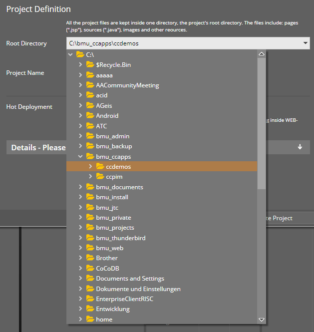
The editor internally uses two new Page Bean Components that are new parts of the addons-package:
CCServerFileSelector – which does the rendering of a file tree
CCServerFileField – which is a COMBOFIELD to either input the server file name by keyboard or to select the server file by showing a file tree.
Of course, pay attention: these components show the server side file structure. They are NOT showing the client side file structure! So only use in part of the application where the user really needs to see this structure, e.g. in administrative parts of the application! Please check security risks before using this component! (!!!)
The COMBOBOX now has a new attribute COMBOBOX-DIRECTSELECTMODE.
The default is “false” and means: when opening the value selection popup dialog then the navigation over items (key down, key up) is NOT directly transferred into the control's value, but the user has to explicitly press the “Enter” button.
You may set to “true”, in this case the navigation with the keyboard directly updates the control's value.
CaptainCasa GmbH
Hindemithweg 13
69245 Bammental
Tel +49 6223 484147