The general information about how to use styles is part of the documentation “Developer's Guide”. The purpose of this documentation is to pass detailed information about selected styling issues.
This document is a “living document” - chapters are added spontaneously and on request, of course.
Applying a proper background to a component is not trivial when using normal CSS management.
Example:
A component has some default background.
A component has some special background to represent certain information. Example: the component's background should be “red” because the contained information is critical.
The component should be marked when it is part of a grid row and the row is selected.
The component should be marked when it is focused.
The CSS way is to define all these dependencies as style classes and to assign multiple style classes to one component so that the right result is calculated and the right background color is applied.
From our perspective this leads to complicated CSS definitions where the rules are not always clearly defined and in many cases are the result of “try and error”.
This is the reason why we go some different way – the possibility to concatenate and overlay background color definitions.
Example:
linear-gradient(to bottom, rgba(0,0,0,0.1),rgba(0,0,0,0.1)), linear-gradient(to bottom, rgba(255,192,0,0.1),rgba(255,192,0,0.1)), #FF0000
You may define several background gradients and colors and concatenate with a comma (“,”) as separator. The background definitions are executed from the right to the left. Background color definitions can be done using transparent colors – so the strategy is to apply a series of transparent background colors on top of some “real” background, dependent on the situation.
The name we use for these additional colors is “background modifier”.
In the style definition there are a couple of background modifiers for different situations:
<class n="riscinternal_riscglobal" internal="true">
...
<risc n="_backgroundModifierDisabled" v="..."/>
<risc n="_backgroundModifierHover" v="..."/>
<risc n="_backgroundModifierActive" v="..."/>
<risc n="_backgroundModifierFocus" v="..."/>
<risc n="_backgroundModifierFocusDisabled" v="..."/>
<risc n="_backgroundModifierFormatMandatory" v="..."/>
<risc n="_backgroundModifierFormatError" v="..."/>
<risc n="_backgroundModifierGridSelection" v="..."/>
<risc n="_backgroundModifierGridOdd" v="l..."/>
<risc n="_backgroundModifierGridRollover" v="..."/>
...
The color of a component as result is a mixture out of the component's base color and the series of background modifiers that are placed on top.
Example:
If the user moves the mouse over a component then the background modifier “_backgroundModifierHover” is added to the background color definition of the component.
If in addition the user clicks this component and the component is sensitive for clicks, then the background modifier “_backgroundModifierActive” is added.
Background can be applied on a general level using the class “riscinternal_riscglobal”. And they can be applied on individual component level by defining the corresponding “<risc n=...” value on component level:
<class n="risccheckbox">
...
<risc n="_backgroundModifierFocus" v="..."/>
...
When a background modifier is applied to a component then by default it is drille down to the child components of this component as well.
Advantage: the child components of a parent component are optically drawn on top of the parent component. By applying a background modifier for the parent component, it is also drilled down to the child component, so that the whole parent component area is drawn accordingly.
Bu: there are situations in which the drill down does not make sense. Example:
The child component is transparent and the background modifier adds some color with transparency definition.
In this case the drill down has the effect that in the area of the child component the component background is colored twice – and the resulting color of drawing a transparent color twice is visible to the user.
You can influence the drill down by setting the following style value:
<class n=”xxx>
...
<risc n="_backgroundModifierWithDrillDown" v="false"/>
...
</class>
When a component is focused by the user then the component's style can be influenced in the following ways.
You can apply some additional background modifier.
(This way was part of CaptainCasa from the beginning on.)
You can draw additional line elements on top of the components so that some rectangular, dotted area appears on top of the component.
(This way was added with update 20200524)
You can change the border color of the focused component.
Each of the ways can be explicitly switched on and off – either for all components or on concrete component style class level.
The RISC value “_focusmgmtBackgroundModifier” defines that additional focus coloring can be added to the background of the components. You either set it on global level for all components (style class “riscinternal_riscglobal”) or you set it on component class level (e.g. style class “riscbutton”).
Samve with the RISC value “_focusmgmtAdditionalElements”.
The default that is used in the CaptainCasa styles is:
<class n="riscinternal_riscglobal" internal="true">
...
<risc n="_focusmgmtBackgroundModifier" v="false"/>
<risc n="_focusmgmtAdditionalElements" v="true"/>
...
</class>
CaptainCasa up to 20200524 used background modifiers and then switched to using additional elements. But: background modifiers are clearly continued to be supported!
The background modifier is defined in the risc-style definition “_backgroundModifierFocus”. As usual this RISC value can be applied on a glolbal level (“riscinternal_riscglobal”) or on a per-component-level (e.g. “riscbutton”).
Please check the chapter “Concept of Background Modifiers” for more information how to define and apply background modifiers.
When switched on then the client side processing will add some additional elements on top of the focused element.
Example:
On top of the button there are 4 additional elements to form the dotted rectangle – one for each line (top, right, bottom, left). The elements will be removed when moving the focus out of the component.
You now can influence the drawing of the elements in the following way:
<class n="riscinternal_riscglobal" internal="true">
...
<risc n="_focusElementSize" v="1"/>
<risc n="_focusInset" v="2 2 2 2"/>
<risc n="_focusStyleClassGroup" v="riscdrawfocus"/>
...
</class>
“_focusElementSize”: This is the height of the top and the bottom element – and the width of the left and the right element.
“_focusInset”: This is the distance that the elements keep from the control's margin. The value is a concatenation of integer values in the sequence “<top> <right> <bottom> <left>”.
“_focusStyleClassGroup”: This is the “group name” of the style classes that are applied to the four additional elements. Each element receives some individual style following the naming convention “<groupName><position>”.
Example: the value “riscdrawfocus” points to the following style classes:
<class n="riscdrawfocusbottom">
<style n="border" v="0px"/>
<style n="border-top" v="1px @focusBorderColor@ dotted"/>
</class>
<class n="riscdrawfocustop">
<style n="border" v="0px"/>
<style n="border-top" v="1px @focusBorderColor@ dotted"/>
</class>
<class n="riscdrawfocusleft">
<style n="border" v="0px"/>
<style n="border-left" v="1px @focusBorderColor@ dotted"/>
</class>
<class n="riscdrawfocusright">
<style n="border" v="0px"/>
<style n="border-left" v="1px @focusBorderColor@ dotted"/>
</class>
The definition of “risc”-values can be done globally in class “riscinternal_riscglobal” or can be done on individual component level.
Example: a button that is used in tabbed line has some different “_focusInset” definitions than normal buttons, so that the marker on the bottom is not overlayed by the additional focus elements:
This is done by the following definition:
<class n="risctabbedline">
...
<class n="_button" extends="riscbutton">
...
<risc condition="@edged@" n="_focusInset" v="2 2 5 2"/>
...
The RISC value “_borderColorFocus” can be applied to any component style class definition. Example:
<class n="risccombofield">
<risc n="_borderColorFocus" v="#000000"/>
</class>
When being focused then the component's border color is updated correspondingly – and is switched back to its normal color when the component is no longer focused.
The default styling of CaptainCasa from 20200525 is based on the “additional elements” - the background modifiers are not used. In case you have defined own style definitions for focus-styling then they will not be visible anymore as consequence.
To go back to the previous way of styling switch on the background-modifier-based styling in your style definition and switch of the additional-elements styling:
<class n="riscinternal_riscglobal" internal="true">
...
<risc n="_focusmgmtBackgroundModifier" v="true"/>
<risc n="_focusmgmtAdditionalElements" v="false"/>
...
</class>
All “risc”-values can either be defined centrally in style class “riscinternal_riscglobal” or can be defined on individual style class level.
Example: the following is the definition: in general use focus drawing with additional elements, but for the button use the background color update.
<class n="riscinternal_riscglobal" internal="true">
...
<risc n="_focusmgmtBackgroundModifier" v="false"/>
<risc n="_focusmgmtAdditionalElements" v="true"/>
...
</class>
...
<class n="riscbutton">
...
<risc n="_focusmgmtBackgroundModifier" v="true"/>
<risc n="_focusmgmtAdditionalElements" v="false"/>
...
</class>
All components that are used within a GRIDCOL as cell components are rendered without any border. So if you have the definition of...
FIXGRID
GRIDCOL
FIELD
...then the FIELD will not show any border.
Reason: by doing so the rendering of “double borders” is avoided – one border coming from the grid rendering and one from the control rendering.
In the FIXGRID definition there are three attributes to define the border lines within a grid:
FIXGRID-BORDERCOLOR => color of border
FIXGRID-BORDERWIDTH => width of vertical lines
FIXGRID-BORDERHEIGHT => height of horizontal lines
There are a couple of background modifiers which are applied for different situations:
<class n="riscinternal_riscglobal" internal="true">
...
<risc n="_backgroundModifierGridSelection" v="linear-gradient(to bottom,@gridSelectionColor@,@gridSelectionColor@)"/>
<risc n="_backgroundModifierGridOdd" v="linear-gradient(to bottom, rgba(0,0,0,0.02),rgba(0,0,0,0.02))"/>
<risc n="_backgroundModifierGridRollover" v="linear-gradient(to bottom, rgba(0,0,0,0.05),rgba(0,0,0,0.05))"/>
...
Please note: the background modifiers are applied per cell component.
Example: if the user moves with the mouse over a grid row, then all cell components of this grid row receive the background-modifier “_backgroundModifierGridRollover”. This modifier – as usual – can be defined different per component, so that the hover-style of a button may be different to the one of a field.
When sorting the grid, then little icons are shown in the top area of a grid column header to indicate the sort direction and the sort level.
The icons are defined as follows.
<class n="rischeaderlabel">
...
<risc n="_sortimageup" v="eclntjsfserver/images/iconssvg/grid_sortup.svg"/>
<risc n="_sortimagedown" v="eclntjsfserver/images/iconssvg/grid_sortdown.svg"/>
...
The values that are defined in the style are the “base-values” - and not the final images. For the actual images the level of sorting is appended to the name part of the file name.
Example: for the definition in the default style, the actual images are:
eclntjsfserver/images/iconssvg/grid_sortup1.svg
eclntjsfserver/images/iconssvg/grid_sortup2.svg
eclntjsfserver/images/iconssvg/grid_sortup3.svg
eclntjsfserver/images/iconssvg/grid_sortup4.svg
eclntjsfserver/images/iconssvg/grid_sortdown1.svg
eclntjsfserver/images/iconssvg/grid_sortdown2.svg
eclntjsfserver/images/iconssvg/grid_sortdown3.svg
eclntjsfserver/images/iconssvg/grid_sortdown4.svg
The default styling of popup dialogs was updated with CaptainCasa's update of 20220620: before popup dialogs did not provide a border on their own – but the border needed to be provided by the popup content.
From 20220620 on popup dialogs come with an own border. The content is expected to be defined without any border.
There are some central style variables in the definition of a style:
<var n="@popupRounding@" v="10"/>
<var n="@popupRoundingUndecorated@" v="5"/>
<var n="@popupBorderColor@" v="#A0A0A0"/>
<var n="@popupBorderSize@" v="1"/>
<var n="@popupBackground@" v="#FFFFFF"/>
“@popupRounding@” - General rounding of popup edges
“@popupRoundingUndecorated@” - Specific rounding of popup edges for undecorated popups
“@popupBorderColor@” - Border color
“@popupBorderSize@” - Border size
The variables are used within the central style definition (defaultrisc/riscstyle.xml) in the following way:
<class n="riscdialog_popup">
<risc n="border" v="@popupBorderSize@ @popupBorderSize@ @popupBorderSize@ @popupBorderSize@"/>
<style n="background" v="@popupBackground@"/>
<style n="box-shadow" v="4px 4px 2px rgba(@shaderBase@,0.2) "/>
<style n="border-radius" v="@popupRoundingUndecorated@px"/>
<style n="border" v="@popupBorderSize@px solid @popupBorderColor@"/>
<class n=".showUpHeight">
<style n="transition" v="height 0.2s"/>
</class>
<class n=".showUpWidth">
<style n="transition" v="width 0.2s"/>
</class>
</class>
<class n="riscdialog_popup_decorated" extends="riscdialog_popup">
<style n="border-radius" v="@popupRounding@px"/>
</class>
In addition there is an explicit style class for transparent popups:
<class n="riscdialog_popup_transparent" extends="riscdialog_popup">
<risc n="border" v="0 0 0 0"/>
<style n="background" v="transparent"/>
<style n="border" v="0px solid transparent"/>
<style n="box-shadow" v="0px 0px 0px rgba(@shaderBase@,0.2) "/>
</class>
The style of the popup dialog is by default set internally – following the type of popup dialog that is opened. It can be set explicitly set using the method:
Modal/ModelessPopup popup = openModal/ModelessPopup(...);
popup.setStyleseq(“...yourStyleClassName...”);
By default popup dialogs are started with decoration (i.e. title bar, close/maximize icon). The decoration is styled by the following definitions:
<class n="riscdialogdecoration">
<risc n="border" v="0 0 0 0"/>
<risc n="_resizeborderareasize" v="@dialogresizeborderareasize@"/>
<risc n="_resizeedgeareasize" v="@dialogresizeedgeareasize@"/>
<style n="border" v="0px"/>
</class>
<class n="riscdialogdecoration_toppane">
<risc n="inset" v="4 8 4 8"/>
<style n="background" v="@popupTitleBackground@"/>
</class>
...
...
<class n="riscdialogdecorationall" extends="riscdialogdecoration">
<class n="_toppane" extends="riscdialogdecoration_toppane">
</class>
<class n="_toplabel" extends="riscdialogdecoration_toplabel">
</class>
<class n="_closeicon" extends="riscdialogdecoration_closeicon">
</class>
<class n="_maximizeicon" extends="riscdialogdecoration_maximizeicon">
</class>
<class n="_edgesizer" extends="riscdialogdecoration_edgesizer">
</class>
<class n="_sizer_left" extends="riscdialogdecoration_sizer_left">
</class>
<class n="_sizer_right" extends="riscdialogdecoration_sizer_right">
</class>
<class n="_sizer_top" extends="riscdialogdecoration_sizer_top">
</class>
<class n="_sizer_bottom" extends="riscdialogdecoration_sizer_bottom">
</class>
</class>
You may update the classes “riscdialogdecoration_*” in your own style definition in order to change the general appearance of the decoration.
Or you may create own popup style decoration classes by extending from “riscdialogdeocrationall” and by setting the decoration style via method:
Modal/ModelessPopup popup = openModal/ModelessPopup(...);
popup.setStyleseqdecoration(“...yourStyleClassName...”);
When a dialog shows up then a certain size-animation can be applied – so that the dialog does not show up immediately with its full size.
The style management includes the possibility to define which type of animation is used for which popup dialog.
The size animations are defined by corresponding coding/definitions within the CaptainCasa client processing. The following animations are defined:
"noanimation"
"rotatehorizontally"
“rotatevertically"
"topdown"
"bottomup"
"leftright"
"rightleft"
"scalein"
The following types of popup dialogs are internally processed:
"combo"
"comboup"
"tooltip"
"lightweightpopup"
"popup"
"popupframe"
"menu"
"menulevel2"
"statusbar"
"sidebar"
The definition is done in the style class “riscinternal_riscglobal”. The name of the variable is “_dialogAnimationType_” together with the popup dialog type. The value is the size animation type that should be used.
Example: fro combo box popups the animation type “topdown” should be used:
<class n="riscinternal_riscglobal" internal="true">
...
<risc n=”_dialogAnimationType_combo” v=”topdown”/>
...
CaptainCasa provides a set of page bean components as add-on-part of its installation. Page bean components may add own styling that is added on top of the normal styling. Please check the Developer's Guide (chapter “Page Beans Components”).
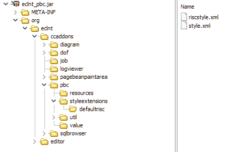
The style is located is within the eclnt_pbc.jar library:
Each component that is used in the Data Object Framework (DOF) is styled with some own style variant. By default the style variant is directly inherited from the default style – this means: a FIELD in the DOF framework is rendered with the default FIELD-style. But you can, of course, update in your own style.
Please check the content of “style.xml”:
...
...
<!-- DOF component styles -->
<tag name="fixgrid" variant="ccaddons_dofobjectlistui" extendstag="fixgrid" extendsvariant="default">
</tag>
<tag name="gridcol" variant="ccaddons_dofobjectlistui" extendstag="gridcol" extendsvariant="default">
</tag>
<tag name="label" variant="ccaddons_dofproperty_labelbefore" extendstag="label" extendsvariant="default">
</tag>
<tag name="field" variant="ccaddons_dofobjectlistui_searchfield" extendstag="field" extendsvariant="default">
</tag>
<tag name="calendarfield" variant="ccaddons_dofpropertycalendarfieldui" extendstag="calendarfield" extendsvariant="default">
</tag>
<tag name="checkbox" variant="ccaddons_dofpropertycheckboxdui" extendstag="checkbox" extendsvariant="default">
</tag>
...
...
The images that are used inside the DOF dialogs are set by style values as well:
...
...
<stylevalue name="dof_objectlisteditorui_image_create" value="/awesomefont(f016,#606060,20)"/>
<stylevalue name="dof_objectlisteditorui_image_remove" value="/awesomefont(f014,#606060,20)"/>
<stylevalue name="dof_objectlisteditorui_image_filter" value="/awesomefont(f0b0,#606060,20)"/>
<stylevalue name="dof_objectlisteditorui_image_refresh" value="/awesomefont(f021,#606060,20)"/>
<stylevalue name="dof_objectlisteditorui_image_export" value="/org.eclnt.ccaddons.dof.pbc.resources.export20.png.ccclresource"/>
<stylevalue name="dof_objectlisteditorui_image_columnconfig" value="/org.eclnt.ccaddons.dof.pbc.resources.columnconfig20.png.ccclresource"/>
...
...
You can override both the style variants and the image names within your own style definition.