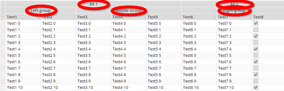
The GRIDCOLGROUP component structures the grouping of columns inside a FXIGRIDWITHGROUPING component.
Typically used attributes
All attributes are
General attributes are
Used inside: FIXGRIDWITHGROUPING, GRIDCOLGROUP
Using inside: GRIDCOL, GRIDCOLGROUP
Text that is passed as control content to the accessible support devices (e.g. screen readers).
Binding to server side method that processes the events coming from this component.
| #{methodBinding} | Method binding |
Horizontal alignment of content.
| left | left (transferred into right when starting client in right to left mode) |
| left! | left (still is left when starting client in right to left mode) |
| center | center |
| right | right (transferred into left when starting client in right to left mode) |
| right! | right! (still is right when starting client in right to left mode) |
| leading | leading |
| trailing | trailing |
Name of macro that is used for generating certain attributes of this component. Please pay attention: the value of this attribute is read one time for each control and cannot be changed afterwards.
Background color of the component. Any RGB value can be chosen using format #rrggbb.
| #FFFFFF | White |
| #000000 | Black |
| #FF0000 | Red |
| #00FF00 | Green |
| #0000FF | Blue |
| #0000FF30 | Blue with a transparency of x30. |
Background paint commands. There is a sequence of paint commands which can be executed one after the other by listing them as semicolon separated list. - By appending certain suffixes to a command you can define that the command is only executed in a certain situation. Available suffixes are: _empty (content of component is empty), _focus, _nofocus, _enabled, _disabled, _mouseover. Multiple suffixes can be used in parallel (e.g. write_empty_focus).
| ----- | ----- bgpaint commands for all clients ----- |
| error() | Component indicates error. |
| mandatory() | Component indicates mandatory input. Only is shown if component does not have any content yet. |
| bgbackground(#FF0000) | Background with one color |
| bgbackground(#FF0000,#0000FF,vertical) | Background as gradient of two colors |
| bgimage(left,/images/xyz.png) | Image at certain position |
| bgwrite(left,...text...) | Text at certain position |
| bgwrite(left,...text...,#800000,12) | Text at certain position with defined color and size |
| ----- | ----- bgpaint commands for Java clients ----- |
| rectangle(0,0,100%,100%,#FF0000) | Red rectangle |
| rectangle(20,20,100,100,#FF0000) | Red rectangle from 20,20 to 120,120 |
| rectangle(20,20,100%-40,100%-40,#FF0000) | Minus absolute values is allowed after percentage definitions |
| rectangle(0,0,100%,100%,#FF0000,#00FF00,vertical) | Rectangle with color changing from red to green in vertical direction |
| roundedrectangle(0,0,100%,100%,10,10,#FF0000,#00FF00,vertical) | Rectangle with color changing from red to green in vertical direction |
| line(0,0,100%,100%,1,#00FF00) | Green line crossing the whole rectangle, from coordinate 0,0 to coordinat 100%,100%, thickness of line is 1 |
| image(0,0,/images/xyz.png,lefttop) | Image output x,y,image,position (lefttop/centermiddle/rightbottom...) |
| image(0,0,200,100,/images/xyz.png,lefttop) | Image output x,y,width,heigh,image,position (lefttop/centermiddle/rightbottom...) |
| scaledimage(0,0,200,100,/images/xyz.png,lefttop) | Scaled image output, the width/height ration is kept while scaling : x,y,width,heigh,image,position (lefttop/centermiddle/rightbottom...) |
| heximage(0,0,08FF40324672849CDFE...,lefttop) | Image output x,y,hexadecimal image,position (lefttop/centermiddle/rightbottom...) |
| heximage(0,0,200,100,08FF40324672849CDFE...,lefttop) | Image output x,y,width,height,hexadecimal image,position (lefttop/centermiddle/rightbottom...) |
| scaledheximage(0,0,200,100,08FF40324672849CDFE...,lefttop) | Scaled image output x,y,width,height,hexadecimal image,position (lefttop/centermiddle/rightbottom...) |
| border(0,0,100%,100%,#C0C0C0,2) | Rectangular border with thickness 2 |
| roundedborder(0,0,100%,100%,10,10,#C0C0C0,2) | Rounded border with thickness 2 |
| write(0,0,Some text,lefttop) | Some text in the left top corner |
| write(50%,50%,Some text,20,#00FF00,centermiddle) | Some text in the left center, font size 20, font color green |
| write(50%,50%,Some text,20,#00FF00,bold,centermiddle) | Some text in the left center, font size 20, font color green,bold |
| write(50%,50%,Some text,20,#00FF00,italic,centermiddle) | Some text in the left center, font size 20, font color green,italic |
| write(50%,50%,Some text,20,#00FF00,normal,centermiddle) | Some text in the left center, font size 20, font color green,normal |
| write(0,100%,Some text,20,#00FF00,default,lefttop,90) | Some text in the left bottom corner, font size 20, font color green, 90 degrees rotated |
| write(20,100%,Some text,20,#00FF00,default,lefttop,90,-1,1) | Some text in the left bottom corner, font size 20, font color green, 90 degrees rotated. x scaling -1, y scaling 1 |
| write(20,100%,Some text,20,#00FF00,bold,lefttop,90,-1,1) | Some text in the left bottom corner, font size 20, font color green, 90 degrees rotated. x scaling -1, y scaling 1 |
| writeifempty(0,0,Some text,lefttop) | Same as write-command, but now only visible if component contains data |
| writeifempty(50%,50%,Some text,20,#00FF00,centermiddle) | Same as write-command, but now only visible if component contains data |
| writemultiline(0,0,100%,100%,Some text) | Some text into the defined rectangle. Only fully supported with FX client, in Swing client the text will be output as one line. |
| writemultiline(0,0,100%,100%,Some text,20,#FF0000,bold) | Some text into the defined rectangle. In additional font size, text color and text style (normal,bold,italic) are passed. Only fully supported with FX client, in Swing client the text will be output as one line. |
| oval(0,0,100%,100%,#FF0000) | Red ellipse |
| oval(0,0,100%,100%,#FF0000,#00FF00,vertical) | Red ellipse with color changing from red to green |
| ovalborder(0,0,100%,100%,#FF0000,2) | Red ellipse border, red, 2 pixels thick |
| grid(100,#00000020) | Grid with line distance 100, black line color - with transparency |
| nodisabled() | Switches off the automated shading of disabled input components |
| background(#FF0000) | Sets the background of the painted area. |
| backgroundnofocus(#FF0000) | Sets the background of the painted area - which is only drawn if the component does not hold the focus. |
| repeatimage(/images/xyz.png) | The image is repeated and drawn all over the available space. |
Name that is assigned to the component at client side: there is no specific function associated with the name - but it can be used on client side to describe the component in a clearer way. The name is e.g. used by UI test tools that replay certain user interaction sequences - and that reference components via their name.
Comment that can be asigned to any component. The comment is not operationally used.
| Any text | Any text |
Configuration information that is attached to this component. This information is not functionally used by CaptainCasa, but may be used for any application specific purpose.
Defines if the component is focusable. The default depends on the component: typical input components (field, check box, ...) are focusable by default, while typical structure components (pane, label, ...) are not focusable by default.
| true | Focusable |
| false | Not focusable |
Semicolon separated list of font attributes. Valid attributes are: faces (font family), size (integer number), weight (bold), posture (italic)
| family:Arial | family:Arial |
| family:Courier | family:Courier |
| size:12 | size:12 |
| weight:bold | weight:bold |
| size:12;weight:bold | size:12;weight:bold |
| size:12;posture:italic | size:12;posture:italic |
Foreground color of the component. Any RGB value can be chosen using format #rrggbb.
| #FFFFFF | White |
| #000000 | Black |
| #FF0000 | Red |
| #00FF00 | Green |
| #0000FF | Blue |
| #0000FF30 | Blue with a transparency of x30. |
Reference to image within your web application. The image is defined in an absolute way (e.g. /images/abc.png) - the root directory for absolute addressing is the directory of the web application.
| /images/abc.png | Image /images/abc.png |
| /images/svg/def.svg | Image /images/svg/def.svg |
If true then the border and the padding of the component is kept. Otherwise border and padding are managed by the grid.
| false | Border/padding are removed by grid processing (default) |
| true | Border/padding of component are kept. |
If set to true then the text is rendered in multiple lines if required.
| false | Single line (default) |
| true | Multi line |
Reference to the id of a POPUPMENU definition that is available either in this page or in a page that includes this page.
Reference to an outside object that is the content behind the component. E.g. a field is representing a certain field of a database table: in this case you could define the value table;column. The reference plays a siginficant role within the attributemacro management.
| ref | One reference |
| ref1;ref2 | Two references |
| ref1;ref2;ref3 | Three references |
Style class names that are applied to this component.
In CaptainCasa you can define styles definitions for components. A style definition is a definition of a set of default attribute values that are applied to the component. In case you want to differenciate between different usage types of the component you can apply multiple styles - and use the stylevariant attribute to select between.
Text that is shown and (dependent from the component type) edited inside the component. The terminator is a decimal byte value.
Abbreviated text that is shown if there is not sufficient screen space for the normal text.
Cut the text if no sufficient space available.
| true | Cut text if not enough space |
| false | Do not cut text (default) |
Width of the text label that is part of the column header. By default this is 100%, because the label spans the whole column header. But you may set an explicit value when using the possibility to explicitly arrange a component on the right of the text.
| 100 | 100 Pixels |
| 120 | 120 Pixels |
| 200 | 200 Pixels |
| 50% | 50 percents |
| 100% | Full available width |
Text that is shown as hint when the user stays with the mouse on top of the control for a while.
| ...anytext... | Text that is displayed as tooltip. |
| server:true | Indicator that tooltip for the component is managed on server side. The actionListener will be invokde with events BaseActionEventTooltipStarted and BaseActionEventTooltipEnde. On server side you may implement some modeless popup in order to show some more complex tooltip |
| server:true;opendelay:1000 | Duration in milliseconds after which a tooltip event is triggered when the user moves the mouse on top of this component |
If set to true then a SMARTLABEL is user for rendering the text. This allows you to pass smart text definitions as text.
| false | Normal label used (default) |
| true | Smart label used (single line) |
| multiline | Smart label used (multi line) |