The FORMATTEFIELD is a field component which is applying certain formatting and checking rules when the user keys in data. The rules depend on the data type (attribute FORMAT), there may be additional information in the attribute FORMATMASK.
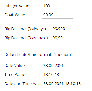
Example: you may use the FORMAT "bigdecimal" for checking the input to be a decimal number. By defining FORMATMASK "dec2" you ensure that the formatting will always render 2 decimal digits (i.e. "20,00" instead of "20") - and that user input with more than 2 digits will automatically rounded.
Typically used attributes
All attributes are
General attributes are
Used inside: ADAPTIVETILECONTAINER, ADAPTIVETOOLBAR, AREASELECTOR, BLOCKABLEAREA, COLSYNCHEDROW, DRAWAREA, FOLDABLEPANEHEADERROW, GRIDCOL, GRIDFOOTER, GRIDHEADER, GRIDHEADERLABEL, GRIDLAYOUTROW, LABELCONTAINER, OVERLAYAREABASEITEM, OVERLAYAREAITEM, PAGEBEANROOT, PAINTAREAITEM, REPEAT, ROW, ROWADAPTIVELINE, ROWFLEXCOLUMNCONTAINER, ROWFLEXLINECONTAINER, ROWFOOTER, ROWHEADER, ROWTITLEBAR, SCHEDULEITEM, SPANGRIDCOL, STABLEAREA, TEXTWITHCONTROLS, TREENODE
Text that is passed as control content to the accessible support devices (e.g. screen readers).
Binding to server side method that processes the events coming from this component.
| #{methodBinding} | Method binding |
Semicolon separated list of event types for which no screen blocking is performed in the client. This attribute has to be handled with great care because no blocking round trips are critical from application consistency point of view!
| flush | No blocking of screen for flush events |
Special binding to component adapter object instance on server side. The component adapter must be an instance of IComponentAdapterBinding. For some components (e.g. FIXGRID) there is an extended interface (e.g. IFIXGRIDComponentAdapterBinding).
| #{tobedefined} | Binding to IComponentAdapter instance |
Horizontal alignment of content.
| left | left (transferred into right when starting client in right to left mode) |
| left! | left (still is left when starting client in right to left mode) |
| center | center |
| right | right (transferred into left when starting client in right to left mode) |
| right! | right! (still is right when starting client in right to left mode) |
| leading | leading |
| trailing | trailing |
If set to true then changes of the width/height of the component are animated.
| true | With animation |
| false | Without animation (default) |
Name of macro that is used for generating certain attributes of this component. Please pay attention: the value of this attribute is read one time for each control and cannot be changed afterwards.
By default the user may use a shortcut for specifying the year - a two digit year definition will automatically be transferred into a full year. There are situations in which you do not want to allow this in order to avoid mistakes during input.
| false | Shortcut for year is active (default) |
| true | Shortcut for year is inactive |
Background color of the component. Any RGB value can be chosen using format #rrggbb.
| #FFFFFF | White |
| #000000 | Black |
| #FF0000 | Red |
| #00FF00 | Green |
| #0000FF | Blue |
| #0000FF30 | Blue with a transparency of x30. |
Background paint commands. There is a sequence of paint commands which can be executed one after the other by listing them as semicolon separated list. - By appending certain suffixes to a command you can define that the command is only executed in a certain situation. Available suffixes are: _empty (content of component is empty), _focus, _nofocus, _enabled, _disabled, _mouseover. Multiple suffixes can be used in parallel (e.g. write_empty_focus).
| ----- | ----- bgpaint commands for all clients ----- |
| error() | Component indicates error. |
| mandatory() | Component indicates mandatory input. Only is shown if component does not have any content yet. |
| bgbackground(#FF0000) | Background with one color |
| bgbackground(#FF0000,#0000FF,vertical) | Background as gradient of two colors |
| bgimage(left,/images/xyz.png) | Image at certain position |
| bgwrite(left,...text...) | Text at certain position |
| bgwrite(left,...text...,#800000,12) | Text at certain position with defined color and size |
| ----- | ----- bgpaint commands for Java clients ----- |
| rectangle(0,0,100%,100%,#FF0000) | Red rectangle |
| rectangle(20,20,100,100,#FF0000) | Red rectangle from 20,20 to 120,120 |
| rectangle(20,20,100%-40,100%-40,#FF0000) | Minus absolute values is allowed after percentage definitions |
| rectangle(0,0,100%,100%,#FF0000,#00FF00,vertical) | Rectangle with color changing from red to green in vertical direction |
| roundedrectangle(0,0,100%,100%,10,10,#FF0000,#00FF00,vertical) | Rectangle with color changing from red to green in vertical direction |
| line(0,0,100%,100%,1,#00FF00) | Green line crossing the whole rectangle, from coordinate 0,0 to coordinat 100%,100%, thickness of line is 1 |
| image(0,0,/images/xyz.png,lefttop) | Image output x,y,image,position (lefttop/centermiddle/rightbottom...) |
| image(0,0,200,100,/images/xyz.png,lefttop) | Image output x,y,width,heigh,image,position (lefttop/centermiddle/rightbottom...) |
| scaledimage(0,0,200,100,/images/xyz.png,lefttop) | Scaled image output, the width/height ration is kept while scaling : x,y,width,heigh,image,position (lefttop/centermiddle/rightbottom...) |
| heximage(0,0,08FF40324672849CDFE...,lefttop) | Image output x,y,hexadecimal image,position (lefttop/centermiddle/rightbottom...) |
| heximage(0,0,200,100,08FF40324672849CDFE...,lefttop) | Image output x,y,width,height,hexadecimal image,position (lefttop/centermiddle/rightbottom...) |
| scaledheximage(0,0,200,100,08FF40324672849CDFE...,lefttop) | Scaled image output x,y,width,height,hexadecimal image,position (lefttop/centermiddle/rightbottom...) |
| border(0,0,100%,100%,#C0C0C0,2) | Rectangular border with thickness 2 |
| roundedborder(0,0,100%,100%,10,10,#C0C0C0,2) | Rounded border with thickness 2 |
| write(0,0,Some text,lefttop) | Some text in the left top corner |
| write(50%,50%,Some text,20,#00FF00,centermiddle) | Some text in the left center, font size 20, font color green |
| write(50%,50%,Some text,20,#00FF00,bold,centermiddle) | Some text in the left center, font size 20, font color green,bold |
| write(50%,50%,Some text,20,#00FF00,italic,centermiddle) | Some text in the left center, font size 20, font color green,italic |
| write(50%,50%,Some text,20,#00FF00,normal,centermiddle) | Some text in the left center, font size 20, font color green,normal |
| write(0,100%,Some text,20,#00FF00,default,lefttop,90) | Some text in the left bottom corner, font size 20, font color green, 90 degrees rotated |
| write(20,100%,Some text,20,#00FF00,default,lefttop,90,-1,1) | Some text in the left bottom corner, font size 20, font color green, 90 degrees rotated. x scaling -1, y scaling 1 |
| write(20,100%,Some text,20,#00FF00,bold,lefttop,90,-1,1) | Some text in the left bottom corner, font size 20, font color green, 90 degrees rotated. x scaling -1, y scaling 1 |
| writeifempty(0,0,Some text,lefttop) | Same as write-command, but now only visible if component contains data |
| writeifempty(50%,50%,Some text,20,#00FF00,centermiddle) | Same as write-command, but now only visible if component contains data |
| writemultiline(0,0,100%,100%,Some text) | Some text into the defined rectangle. Only fully supported with FX client, in Swing client the text will be output as one line. |
| writemultiline(0,0,100%,100%,Some text,20,#FF0000,bold) | Some text into the defined rectangle. In additional font size, text color and text style (normal,bold,italic) are passed. Only fully supported with FX client, in Swing client the text will be output as one line. |
| oval(0,0,100%,100%,#FF0000) | Red ellipse |
| oval(0,0,100%,100%,#FF0000,#00FF00,vertical) | Red ellipse with color changing from red to green |
| ovalborder(0,0,100%,100%,#FF0000,2) | Red ellipse border, red, 2 pixels thick |
| grid(100,#00000020) | Grid with line distance 100, black line color - with transparency |
| nodisabled() | Switches off the automated shading of disabled input components |
| background(#FF0000) | Sets the background of the painted area. |
| backgroundnofocus(#FF0000) | Sets the background of the painted area - which is only drawn if the component does not hold the focus. |
| repeatimage(/images/xyz.png) | The image is repeated and drawn all over the available space. |
Defintion of border of control. Either defined as straight color value, with then having a border of 1 pixel. Or: an explicit per-side definition as comma separated list of border definition values.
| #808080 | 1 pixel border in color dark gray. |
| top:1;color:#808080 | top:1;color:#808080 : border only on top, 1 pixel height, color #808080 |
| top:1;bottom:1;left:1;right:1;color:#FF0000 | top:1;bottom:1;left:1;right:1;color:#FF0000 : red border of 1 pixel size |
| top:1;bottom:1;left:1;right:1;color:#FF0000;dashing:5,2 | top:1;bottom:1;left:1;right:1;color:#FF0000 : red border of 1 pixel size, dashed with segments of 5 pixesl and 2 pixels; dashing only supported with FX Client! |
| noborder | Defines that no border is painted - esp. in cases when empty borders are normally added (e.g. in grid cells) |
Name that is assigned to the component at client side: there is no specific function associated with the name - but it can be used on client side to describe the component in a clearer way. The name is e.g. used by UI test tools that replay certain user interaction sequences - and that reference components via their name.
In case the space provided by the container (e.g. gridlayoutcontainer) for the component is wider than the component itself: definition where to place the component
| left | Left (default) |
| center | Center |
| right | Right |
Spanning of columns if used inside a COLSYNCHEDROW or inside a GRIDLAYOUTPANE.
| 1 | Control spans one column (default) |
| 2 | 2 columns |
| 3 | 3 columns |
Comment that can be asigned to any component. The comment is not operationally used.
| Any text | Any text |
Configuration information that is attached to this component. This information is not functionally used by CaptainCasa, but may be used for any application specific purpose.
Country abbreviation - important for setting date/time/decimal format of output.
| DE | Germany |
| FR | France |
| US | United Stated |
| ... | Country ISO Codes |
Hint for creating the optical component within the client. If not using the default, then this decision should be made with exactly knowing what you do...
| default (default component is created) | |
| toggle | toggle (optimized for usage in grid, requires sizing from outside, does not define any border) |
If set to true then an event is triggered on server side when the user starts a drag operation. The event is of type BaseActionEventDragStarted.
| false | No event triggered (default) |
| true | Event triggered |
Description of object that can be dragged from this component. The description consists out of a type and and id. A component may have multiple objects that can be associated.
| article:4711 | Example: article |
| file:harry.txt;content:Hello world! | Example: Multiple object descriptions |
Text that is shown when dragging over the component. The text is only shown if a drop is possible (DROPRECEIVE definition).
| (default) No text shown | |
| pixel(5) Current drop pixel position - in steps of 5 (or any other value) | |
| pixelX(5) Current drop pixel position - only the x-position | |
| pixelY(5) Current drop pixel position - only the y-position | |
| percentage(5) Current drop pixel position as percentage number - in steps of 5 (or any other value) | |
| percentageX(5) Current drop pixel position as percentage number - only the x-position | |
| percentageY(5) Current drop pixel position as percentage number - only the y-position | |
| textX(0,left,25,middle,75,right) Text that is shown depending from percentage x-position |
Semicolon separated list of object types that can be dropped onto this component.
| article | Example: articles can be dropped |
| article;customer | Example: articles and customers can be dropped |
Indicator if component is enabled or not.
| true | Component is enabled. |
| false | Component is not enabled. |
If set to true, then all date-parts that are not in the scope of the input are set to 0. E.g. if maintaining a date then hour, minute, second and millisecond wil be set to 0.
| true | Exact date/time - set 0 |
| false | (default) - no setting to 0 |
Indicator if data changed in the component are transferred immediately to the server, causing a normal round trip processing from client to server.
| true | Flush is done on data change. |
| false | No flush. Data is transferred to server with next round trip. |
Used in addition to FLUSH attribute. Defines the number of milliseconds after which the component automatically flushs to the server. You need to set FLUSH=true in addition.
| No flush timer (default) | |
| 1000 | 1000 milliseconds |
| 2000 | 2000 milliseconds |
Addition to FLUSHTIMER: extra condition that is applied for the timer based flushing.
| No extra condition (default) | |
| emptychange | If the field is changed then only a flush is sent if the field changes from empty to filled and vice versa |
Defines if the component is focusable. The default depends on the component: typical input components (field, check box, ...) are focusable by default, while typical structure components (pane, label, ...) are not focusable by default.
| true | Focusable |
| false | Not focusable |
Hotkey definition that is used als alternative to the tab-key for moving the focus into the next component.
| No keyboard association (default) | |
| ctrl-83 | Control key + s |
| alt-83 | Alt key + s |
| shift-83 | Shift key + s |
| ctrl-shift-83 | Control key + Shift key + s |
| 10 | return |
| 32 | space |
| 37 | cursor left |
| 38 | cursor up |
| 39 | cursor right |
| 40 | cursor down |
| 33 | page up |
| 34 | page down |
| 36 | Begin |
| 35 | End |
| 27 | escape |
| 127 | Del |
| 65 | a |
| 66 | b |
| 67 | c |
| 68 | d |
| 69 | e |
| 70 | f |
| 71 | g |
| 72 | h |
| 73 | i |
| 74 | j |
| 75 | k |
| 76 | l |
| 77 | m |
| 78 | n |
| 79 | o |
| 80 | p |
| 81 | q |
| 82 | r |
| 83 | s |
| 84 | t |
| 85 | u |
| 86 | v |
| 87 | w |
| 88 | x |
| 89 | y |
| 90 | z |
| 48 | 0 |
| 49 | 1 |
| 50 | 2 |
| 51 | 3 |
| 52 | 4 |
| 53 | 5 |
| 54 | 6 |
| 55 | 7 |
| 56 | 8 |
| 57 | 9 |
| 112 | F1 |
| 113 | F2 |
| 114 | F3 |
| 115 | F4 |
| 116 | F5 |
| 117 | F6 |
| 118 | F7 |
| 119 | F8 |
| 120 | F9 |
| 121 | F10 |
| 122 | F11 |
| 123 | F12 |
Hotkey definition that is used als alternative to the tab-key for moving the focus into the previous component.
| No keyboard association (default) | |
| ctrl-83 | Control key + s |
| alt-83 | Alt key + s |
| shift-83 | Shift key + s |
| ctrl-shift-83 | Control key + Shift key + s |
| 10 | return |
| 32 | space |
| 37 | cursor left |
| 38 | cursor up |
| 39 | cursor right |
| 40 | cursor down |
| 33 | page up |
| 34 | page down |
| 36 | Begin |
| 35 | End |
| 27 | escape |
| 127 | Del |
| 65 | a |
| 66 | b |
| 67 | c |
| 68 | d |
| 69 | e |
| 70 | f |
| 71 | g |
| 72 | h |
| 73 | i |
| 74 | j |
| 75 | k |
| 76 | l |
| 77 | m |
| 78 | n |
| 79 | o |
| 80 | p |
| 81 | q |
| 82 | r |
| 83 | s |
| 84 | t |
| 85 | u |
| 86 | v |
| 87 | w |
| 88 | x |
| 89 | y |
| 90 | z |
| 48 | 0 |
| 49 | 1 |
| 50 | 2 |
| 51 | 3 |
| 52 | 4 |
| 53 | 5 |
| 54 | 6 |
| 55 | 7 |
| 56 | 8 |
| 57 | 9 |
| 112 | F1 |
| 113 | F2 |
| 114 | F3 |
| 115 | F4 |
| 116 | F5 |
| 117 | F6 |
| 118 | F7 |
| 119 | F8 |
| 120 | F9 |
| 121 | F10 |
| 122 | F11 |
| 123 | F12 |
Explicit definition of tab sequence. The format of the definition is GROUP/SEQUENCENUMBER. You can define any number of tab-groups within one page. If the user tabs into a component with a FOCUSSEQUENCE definition then the next tab will focus the next component belonging to the same GROUP and holding the next SEQUENCENUMBER. - By default the FOCUSSEQUENCE value is prefixed with some page-id before being sent to the client so that definitions of one page do not affect definitions of another page. You can explicitly avoid this prefixing by using the naming convention ccfix_GROUP/SEQUENCENUMBER.
| ----- | ----- Examples ----- |
| A/1 | Example: group A, sequence 1 |
| A/2 | Example: group A, sequence 2 |
Semicolon separated list of font attributes. Valid attributes are: faces (font family), size (integer number), weight (bold), posture (italic)
| family:Arial | family:Arial |
| family:Courier | family:Courier |
| size:12 | size:12 |
| weight:bold | weight:bold |
| size:12;weight:bold | size:12;weight:bold |
| size:12;posture:italic | size:12;posture:italic |
Foreground color of the component. Any RGB value can be chosen using format #rrggbb.
| #FFFFFF | White |
| #000000 | Black |
| #FF0000 | Red |
| #00FF00 | Green |
| #0000FF | Blue |
| #0000FF30 | Blue with a transparency of x30. |
Data type that is maintained in the component. Corresponding formatting rules are applied.
| int | int |
| long | long |
| short | short |
| float | float |
| double | double |
| date | date |
| time | time |
| datetime | date and time |
| biginteger | biginteger |
| bigdecimal | bigdecimal |
| password | Only for LABEL-usage: output as password |
| boolean | Only for LABEL-usage: output of true/false/null with corresponding zapf-dingbat characters |
Additional information that influences the text format for input/output.
| short | Short format (date/time/datetime only) |
| medium | Medium format (date/time/datetime only) |
| long | Long format (date/time/datetime only) |
| dec1 | Scale 1 (float/double/bigdecimal only), fill with 0s |
| dec2 | Scale 2 (float/double/bigdecimal only), fill with 0s |
| dec3 | Scale 3 (float/double/bigdecimal only), fill with 0s |
| decmax1 | Scale 1 (float/double/bigdecimal only), do not fill with 0s |
| decmax2 | Scale 2 (float/double/bigdecimal only), do not fill with 0s |
| decmax3 | Scale 3 (float/double/bigdecimal only), do not fill with 0s |
| ...explicit format... | Any format string in which the following replacements are done: y=Year,M=month,d=day,H=hour,m=minute,s=second |
| yyyy-MM-dd | Example for military date format |
| HH:mm | Hour with minutes |
| HH:mm:ss | Hour with minutes and seconds |
Height of the control. Either defined as absolute value or as percentage value. Pay attention when using percentage sizing: the size refers to what is given from the components above. When using percentage sizing then you may define a minimum size in addition, by appending it with a semicolon: "100%;100" means: use 100%, but always keep a minimum size of 100. If using absolute sizes you may append a "+" to define, that the size is extended if required by the component. - Please note: the sizing may be completely taken over by the parent component (e.g. if a component is used in a grid cell), in this case the size definintions on this component level are obsolete.
| 100 | 100 Pixels |
| 120 | 120 Pixels |
| 200 | 200 Pixels |
| 50% | 50 percents |
| 100% | Full available height |
Help id that is part of the online help management.
| helpid | Id pointing to a server side online help file. |
| ccnof1help | Explicitly switching off default F1 help. This is sometimes required in case you want to explicitly react on F1-key as hotkey. |
Client side event that triggers a server invoke.
| click | Mouse click (both mouse buttons) |
| leftclick | Mouse click (left mouse button) |
| rightclick | Mouse click (right mouse button) |
| doubleclick | Mouse double click |
| leftanyclick | Both click and double click are transferred, check event BaseActionEventInvoke on server side for click count |
| mousedown | Left mouse button down |
Text that is shown in the left top corner of the component. Dependent on the component the text is only shown if there is some value defined inside the component.
Alignment of label text.
| left | left (transferred into right when starting client in right to left mode) |
| left! | left (still is left when starting client in right to left mode) |
| center | center |
| right | right (transferred into left when starting client in right to left mode) |
| right! | right! (still is right when starting client in right to left mode) |
| leading | leading |
| trailing | trailing |
If set to true then the label is always shown. Otherwise the text might only be shown if a value is defined for the component.
| false | (default) Label text only shown if content value is defined |
| true | Label text is always shown |
Text color of label text.
| #FFFFFF | White |
| #000000 | Black |
| #FF0000 | Red |
| #00FF00 | Green |
| #0000FF | Blue |
| #0000FF30 | Blue with a transparency of x30. |
Language abbreviation.
| de | German |
| fr | French |
| en | English |
| ... | Language ISO Codes |
Maximum number of characters that a user can input.
| Unlimited (default) | |
| 10 | 10 characters |
| 20 | 20 characters |
If set to true, then the focus is automatically moving to the next field when reaching the maximal number of characters. Only use if defining a MAXLENGTH.
| false | No automated tab (default) |
| true | Automated tab |
Reference to the id of a POPUPMENU definition that is available either in this page or in a page that includes this page.
If set to true, then an explicit roundtrip is triggered when the user presses the right mouse button in order to open a popup menu. As result you can define the popup menu dynamically (using DYNAMICCONTENT) and prepare the popup menu at this point of time when the user want to open it.
| false | Menu is already defined in layout, no roundtrip (default) |
| true | Menu is dynamically created, roundtrip is triggered |
Reference to an outside object that is the content behind the component. E.g. a field is representing a certain field of a database table: in this case you could define the value table;column. The reference plays a siginficant role within the attributemacro management.
| ref | One reference |
| ref1;ref2 | Two references |
| ref1;ref2;ref3 | Three references |
Regular expression that is used for checking the input while the user updates the content.
| [01]+ | Only 0 and 1, any number |
| [01]{5} | Exactly 5 occurances of 0 or 1 |
Mode that controls how the field content is treated in case the user inputs wrong values.
| 0 | Component shows error, input value is kept |
| 1 | Component shows error, input value is reset to previous valid value |
Flag that indicated if this component is rendered at all. If set to false then the component is not rendered - there is no component data sent to the client.
| true | Component is rendered (default) |
| false | Component is not rendered |
Indicator, by which you can control the focus to be moved into this component.
| creation | Component requests focus when created. |
| ...int value... | Counter coming from server side. Please check Developers Guide. |
Hotkey definition that is used request the focus for this component. The hotkey is globally available within the corresponding dialog.
| No keyboard association (default) | |
| ctrl-83 | Control key + s |
| alt-83 | Alt key + s |
| shift-83 | Shift key + s |
| ctrl-shift-83 | Control key + Shift key + s |
| 10 | return |
| 32 | space |
| 37 | cursor left |
| 38 | cursor up |
| 39 | cursor right |
| 40 | cursor down |
| 33 | page up |
| 34 | page down |
| 36 | Begin |
| 35 | End |
| 27 | escape |
| 127 | Del |
| 65 | a |
| 66 | b |
| 67 | c |
| 68 | d |
| 69 | e |
| 70 | f |
| 71 | g |
| 72 | h |
| 73 | i |
| 74 | j |
| 75 | k |
| 76 | l |
| 77 | m |
| 78 | n |
| 79 | o |
| 80 | p |
| 81 | q |
| 82 | r |
| 83 | s |
| 84 | t |
| 85 | u |
| 86 | v |
| 87 | w |
| 88 | x |
| 89 | y |
| 90 | z |
| 48 | 0 |
| 49 | 1 |
| 50 | 2 |
| 51 | 3 |
| 52 | 4 |
| 53 | 5 |
| 54 | 6 |
| 55 | 7 |
| 56 | 8 |
| 57 | 9 |
| 112 | F1 |
| 113 | F2 |
| 114 | F3 |
| 115 | F4 |
| 116 | F5 |
| 117 | F6 |
| 118 | F7 |
| 119 | F8 |
| 120 | F9 |
| 121 | F10 |
| 122 | F11 |
| 123 | F12 |
Limit the input to certain keys only.
| All keys allowed | |
| 0123456789 | Only numbers can be input |
| aAbBcC | Only a,A,b,B,c,C can be input |
Rounding radius of edges of border/background. This is optical rounding - so has nothing to do with mathematical rounding...
| 0 | Straight edges |
| 5 | Rounding with radius 5 |
| 10 | Rounding with radius 10 |
If more than one component is arranged within one row, then components need to decide how they want to be aligned vertically inside the row - in case the height of the row exceeds the height of the component itself.
| top | Top |
| center | Center (default) |
| bottom | Bottom |
Spanning of rows if used inside a GRIDLAYOUTPANE.
| 1 | Control spans one row (default) |
| 2 | 2 rows |
| 3 | 3 rows |
Shadow of component. The definition is done by several inner values: hoffset, voffset, blur and color.
| hoffset:5;voffset:5;blur:5;color:#C0C0C0 | full shadow definition |
| color:#C0C0C0 | Definition only via color, rest of values is set to default values |
Style class names that are applied to this component.
In CaptainCasa you can define styles definitions for components. A style definition is a definition of a set of default attribute values that are applied to the component. In case you want to differenciate between different usage types of the component you can apply multiple styles - and use the stylevariant attribute to select between.
If enabled then the return-key will switch the focus to the next component.
| true | Switch focus on return-key |
| false | Switch focus on tab-key only (default) |
Image that is drawn in front of the text of the component.
| /images/abc.png | Image /images/abc.png |
| /images/svg/def.svg | Image /images/svg/def.svg |
Timezone that is used for transferring the date input into a time stamp. Values need to correspond to TimeZone.getAvailableIDs().
| LOCAL | To be set if using LocalDate/LocalTime on server side |
| ----- | -------------------- |
| GMT | GMT - Greenwich Mean Time (no daylight saving) |
| UTC | UTC - Coordinated Universal Time (no daylight saving) |
| ----- | -------------------- |
| CET | CET - Central European Time |
| Europe/Paris | Europe/Paris |
| Africa/Harare | Africa/Harare |
| Asia/Tel_Aviv | Asia/Tel_Aviv |
| ... | ... |
Text that is shown as hint when the user stays with the mouse on top of the control for a while.
| ...anytext... | Text that is displayed as tooltip. |
| server:true | Indicator that tooltip for the component is managed on server side. The actionListener will be invokde with events BaseActionEventTooltipStarted and BaseActionEventTooltipEnde. On server side you may implement some modeless popup in order to show some more complex tooltip |
| server:true;opendelay:1000 | Duration in milliseconds after which a tooltip event is triggered when the user moves the mouse on top of this component |
Key-layout of the touch field.
| qwert | Alphanumeric keyboard |
| abc | Alphanumeric, in alphabeetical order |
| numeric | Numeric |
| numericint | Numeric integer |
| numeric_nook | Numeric - no OK |
| numericint_nook | Numeric integer - no OK |
Hotkey definition that is used to open the touch dialog.
| No keyboard association (default) | |
| ctrl-83 | Control key + s |
| alt-83 | Alt key + s |
| shift-83 | Shift key + s |
| ctrl-shift-83 | Control key + Shift key + s |
| 10 | return |
| 32 | space |
| 37 | cursor left |
| 38 | cursor up |
| 39 | cursor right |
| 40 | cursor down |
| 33 | page up |
| 34 | page down |
| 36 | Begin |
| 35 | End |
| 27 | escape |
| 127 | Del |
| 65 | a |
| 66 | b |
| 67 | c |
| 68 | d |
| 69 | e |
| 70 | f |
| 71 | g |
| 72 | h |
| 73 | i |
| 74 | j |
| 75 | k |
| 76 | l |
| 77 | m |
| 78 | n |
| 79 | o |
| 80 | p |
| 81 | q |
| 82 | r |
| 83 | s |
| 84 | t |
| 85 | u |
| 86 | v |
| 87 | w |
| 88 | x |
| 89 | y |
| 90 | z |
| 48 | 0 |
| 49 | 1 |
| 50 | 2 |
| 51 | 3 |
| 52 | 4 |
| 53 | 5 |
| 54 | 6 |
| 55 | 7 |
| 56 | 8 |
| 57 | 9 |
| 112 | F1 |
| 113 | F2 |
| 114 | F3 |
| 115 | F4 |
| 116 | F5 |
| 117 | F6 |
| 118 | F7 |
| 119 | F8 |
| 120 | F9 |
| 121 | F10 |
| 122 | F11 |
| 123 | F12 |
Is set to true then the touch dialog opens immediately when the component is focussed.
| false | false (default) |
| true | Touch field immediately opens when being focussed. |
Component supports touchpad input: opens up a touch field popup when the user clicks onto the component.
| false | no touch field support (default) |
| true | With touch field support |
If switched to true then the text value of the component is trimmed automatically after input.
| false | No automated trim (default) |
| true | Trim |
Text that is shown at the side of the text input - tpyically used to add text text of a unit.
Text that is shown as hint below the component. The text appears when the user steps into the component, i.e. when the component is focussed. It automatically disappears when the user steps into the next component. - Please note: the user hint is only activiated by the user if the component is focusable!
Trigger for showing the user hint. The user hint is shown in the same way as if the user focused the component.
Data value that is shown and (dependent from the component type) edited inside the component.
Width of the control. Either defined as absolute value or as percentage value. Pay attention when using percentage sizing: the size refers to what is given from the components above. When using percentage sizing then you may define a minimum size in addition, by appending it with a semicolon: "100%;100" means: use 100%, but always keep a minimum size of 100. If using absolute sizes you may append a "+" to define, that the size is extended if required by the component. - Please note: the sizing may be completely taken over by the parent component (e.g. if a component is used in a grid cell), in this case the size definintions on this component level are obsolete.
| 100 | 100 Pixels |
| 120 | 120 Pixels |
| 200 | 200 Pixels |
| 50% | 50 percents |
| 100% | Full available width |
If set then corresponding focus events are triggered if the component gains/looses the focus.
| false | (default) no focus events |
| true | with focus events |
| focusgained | with focus events but only for gaining the focus |
| focuslost | with focus events but only for loosing the focus |
By defaul an adivce text is rendered into the background, if no value is specified. You can switch off this behaviour.
| true | Show advice in empty fields (default) |
| false | Do NOT show advice in empty fields |
If set to true, then a small remove-icon is shown at the right of the control. The user may delete the content by pressing the icon.
| false | Without remove icon (default) |
| true | With remove icon |
If defined to true then the input will be updated during input of the user according to the format rule.
| false | (default) No update during input |
| true | Update during input |
Definition if the component sends some additional validation event if the user leaves the field. The validation event is sent when the user changed the content of the field and leaves the field to a component that is located on the same screen. The validation event is represented by the event class BaseActionEventValidate on server side.
| false | (default) no explicit validation event |
| true | with validation event |
x-pixel-position: this attribute is only used if the component is directly placed into a PAINTAREA!
y-pixel-position: this attribute is only used if the component is directly placed into a PAINTAREA!