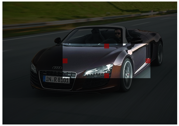
The AREASELECTOR component is able to draw some selection that the user executes via dragging and dropping. The selection information is sent to the server side, so that you can perform any kind of activity there.
Typical scenario: you want to crop an image out of some existing image.
Typically used attributes
All attributes are
General attributes are
Used inside: ADAPTIVETILECONTAINER, ADAPTIVETOOLBAR, AREASELECTOR, BLOCKABLEAREA, BUTTONPOPUP, COLSYNCHEDROW, DRAWAREA, FOLDABLEPANEHEADERROW, GRIDHEADERLABEL, GRIDLAYOUTROW, HIDEABLE, LABELCONTAINER, OVERLAYAREABASEITEM, OVERLAYAREAITEM, PAGEBEANROOT, PAINTAREAITEM, REPEAT, ROW, ROWADAPTIVELINE, ROWFLEXCOLUMNCONTAINER, ROWFLEXLINECONTAINER, ROWFOOTER, ROWHEADER, ROWMATRIXAREA, ROWTITLEBAR, SCALEPANE, SCHEDULEITEM, SHIFTCONTAINER, STABLEAREA, STABLEAREACONFIGAREA, TEXTWITHCONTROLS, TREENODE
Using inside: ACTIVEX, ADAPTIVESPLITAREA, ADAPTIVETILECONTAINER, ADAPTIVETOOLBAR, ANIMATEDPANE, ANIMATEICON, AREASELECTOR, ARRAYGRID, AUTOCOMPLETE, AVATARICON, AWESOMEFONTICON, BLOCKABLEAREA, BOX, BROWSER, BUTTON, BUTTONCOPYPASTEACTIVATION, BUTTONMENU, BUTTONPOPUP, BUTTONVERTICAL, CALENDAR, CALENDARFIELD, CAMERA, CHARTJS, CHECKBOX, CLIENTFILEEXPLORER, CLOCK, CODEEDITOR, COLDISTANCE, COLLINE, COLORFIELD, COLORICON, COLSYNCHEDPANE, COMBOBOX, COMBOFIELD, DIRECTHTMLINSERT, DRAWAREA, DYNAMICCONTENT, FIELD, FILECHOOSER, FILEDOWNLOADBUTTON, FILEDOWNLOADLINK, FILEUPLOAD, FILEUPLOADBUTTON, FILEUPLOADBUTTONASYNCHRONOUS, FILEUPLOADLINK, FILEUPLOADLINKASYNCHRONOUS, FIXGRID, FIXGRIDTOUCHBUTTON, FIXGRIDWITHGROUPING, FOLDABLEPANE, FOLDABLEPOPUPINCLUDE, FOLDABLEVERTICALPANE, FONTICON, FORMATTEDFIELD, FULLSCREENBUTTON, FXCHART, GRIDHEADERLABEL, GRIDLAYOUTPANE, HELPICON, HEXIMAGE, HEXIMAGEMAP, HIDEABLE, HYPERLINK, ICON, ICONSEPTEXT, IFRAMEINCLUDE, IMAGE, IMAGEANONYMIZER, IMAGEANONYMIZERDIRECT, IMAGEMAP, IMAGESHAKER, JRVIEWER, KEYBOARDSCANNER, KEYSELECTOR, LABEL, LABELCONTAINER, LABELMULTILINE, LABELVERTICAL, LAYEREDPANE, LINK, LINKVERTICAL, LIST, LONGTEXTFIELD, MEDIAPLAYER, MENUBAR, MULTILABEL, OSMVIEWER, OUTLOOKBAR, OVERLAYAREA, PAGEBEANCOMPONENT, PAGEBEANINCLUDE, PAINTAREA, PANE, PARENTEXIT, PARENTEXIT, PASSWORD, PDFRENDERER, PDFRENDERERVIAURL, PICKLIST, POOLEDBROWSER, PROGRESSBAR, QRCODESCANNERJSQR, RADIAL, RADIOBUTTON, RADIOBUTTONGROUP, REPEAT, REPEAT, RGRAPH, ROLLINGCONTAINERAREA, SCALEPANE, SCENEJS, SCHEDULE, SCROLLANCHOR, SCROLLBAR, SCROLLNOTIFIER, SCROLLPANE, SHIFTCONTAINER, SIMPLEHTMLEDITOR, SIZEABLEPANE, SIZEABLEPANEHORIZONTAL, SLIDECONTAINER, SLIDER, SMARTLABEL, SMARTTEXTAREA, SPANGRID, SPINNER, SPLITPANE, STABLEAREAMANAGER, STABLEAREAPLACEHOLDER, SUBPAGE, SVGVIEWER, SYSTEMICON, TABBEDLINE, TABBEDLINECONTAINER, TABBEDLINEVERTICAL, TABBEDPANE, TEXTAREA, TEXTAREAWITHCOMMENT, TEXTEDITOR, TEXTPANE, TEXTPANEVERTICAL, TEXTWITHCONTROLS, TEXTWITHLINKS, TILEDAREA, TOGGLE, TOUCHFIELD, TOUCHFIELDNUMERIC, TOUCHSELECTOR, TOUCHSIGNATURE, TOUCHVIRTUALKEYBOARD, VIDEO, WINDOWSIZER, WORKPLACEPERSPECTIVESELECTOR
Text that is passed as control content to the accessible support devices (e.g. screen readers).
Binding to server side method that processes the events coming from this component.
| #{methodBinding} | Method binding |
Special binding to component adapter object instance on server side. The component adapter must be an instance of IComponentAdapterBinding. For some components (e.g. FIXGRID) there is an extended interface (e.g. IFIXGRIDComponentAdapterBinding).
| #{tobedefined} | Binding to IComponentAdapter instance |
If set to true then changes of the width/height of the component are animated.
| true | With animation |
| false | Without animation (default) |
Width/height ration that the selected area should have.
| No ratio (default) | |
| 1.777778 | 16:9 |
| 1.333333 | 4:3 |
| 1 | 1:1 |
| ... | any other numeric value |
Name of macro that is used for generating certain attributes of this component. Please pay attention: the value of this attribute is read one time for each control and cannot be changed afterwards.
Background color of the component. Any RGB value can be chosen using format #rrggbb.
| #FFFFFF | White |
| #000000 | Black |
| #FF0000 | Red |
| #00FF00 | Green |
| #0000FF | Blue |
| #0000FF30 | Blue with a transparency of x30. |
In case the space provided by the container (e.g. gridlayoutcontainer) for the component is wider than the component itself: definition where to place the component
| left | Left (default) |
| center | Center |
| right | Right |
Spanning of columns if used inside a COLSYNCHEDROW or inside a GRIDLAYOUTPANE.
| 1 | Control spans one column (default) |
| 2 | 2 columns |
| 3 | 3 columns |
Comment that can be asigned to any component. The comment is not operationally used.
| Any text | Any text |
Configuration information that is attached to this component. This information is not functionally used by CaptainCasa, but may be used for any application specific purpose.
Indicator if component is enabled or not.
| true | Component is enabled. |
| false | Component is not enabled. |
Indicator if data changed in the component are transferred immediately to the server, causing a normal round trip processing from client to server.
| true | Flush is done on data change. |
| false | No flush. Data is transferred to server with next round trip. |
Height of the control. Either defined as absolute value or as percentage value. Pay attention when using percentage sizing: the size refers to what is given from the components above. When using percentage sizing then you may define a minimum size in addition, by appending it with a semicolon: "100%;100" means: use 100%, but always keep a minimum size of 100. If using absolute sizes you may append a "+" to define, that the size is extended if required by the component. - Please note: the sizing may be completely taken over by the parent component (e.g. if a component is used in a grid cell), in this case the size definintions on this component level are obsolete.
| 100 | 100 Pixels |
| 120 | 120 Pixels |
| 200 | 200 Pixels |
| 50% | 50 percents |
| 100% | Full available height |
Binding to server side object property that represents the component on server side. The type of the property needs to fit to the component type. Example: for FIXGRID components the server side property needs to be of type FIXGRIDListBinding or FIXGRIDTreeBinding.
| #{xyz.xyz} | Binding definition |
Reference to the id of a POPUPMENU definition that is available either in this page or in a page that includes this page.
If set to true, then an explicit roundtrip is triggered when the user presses the right mouse button in order to open a popup menu. As result you can define the popup menu dynamically (using DYNAMICCONTENT) and prepare the popup menu at this point of time when the user want to open it.
| false | Menu is already defined in layout, no roundtrip (default) |
| true | Menu is dynamically created, roundtrip is triggered |
Reference to an outside object that is the content behind the component. E.g. a field is representing a certain field of a database table: in this case you could define the value table;column. The reference plays a siginficant role within the attributemacro management.
| ref | One reference |
| ref1;ref2 | Two references |
| ref1;ref2;ref3 | Three references |
Flag that indicated if this component is rendered at all. If set to false then the component is not rendered - there is no component data sent to the client.
| true | Component is rendered (default) |
| false | Component is not rendered |
If more than one component is arranged within one row, then components need to decide how they want to be aligned vertically inside the row - in case the height of the row exceeds the height of the component itself.
| top | Top |
| center | Center (default) |
| bottom | Bottom |
Spanning of rows if used inside a GRIDLAYOUTPANE.
| 1 | Control spans one row (default) |
| 2 | 2 rows |
| 3 | 3 rows |
In CaptainCasa you can define styles definitions for components. A style definition is a definition of a set of default attribute values that are applied to the component. In case you want to differenciate between different usage types of the component you can apply multiple styles - and use the stylevariant attribute to select between.
Width of the control. Either defined as absolute value or as percentage value. Pay attention when using percentage sizing: the size refers to what is given from the components above. When using percentage sizing then you may define a minimum size in addition, by appending it with a semicolon: "100%;100" means: use 100%, but always keep a minimum size of 100. If using absolute sizes you may append a "+" to define, that the size is extended if required by the component. - Please note: the sizing may be completely taken over by the parent component (e.g. if a component is used in a grid cell), in this case the size definintions on this component level are obsolete.
| 100 | 100 Pixels |
| 120 | 120 Pixels |
| 200 | 200 Pixels |
| 50% | 50 percents |
| 100% | Full available width |
Definition if a sizer is shown at the edge of the selected area.
| true | (default) edge resizer is shown |
| false | Edge resizer is not shown |
Definition if a mover area is shown.
| true | (default) mover area is shown |
| false | Mover area is not shown |
Definition if sizers are shown at the side of the selected area.
| true | (default) side resizers are shown |
| false | Side resizers are not shown |
x-pixel-position: this attribute is only used if the component is directly placed into a PAINTAREA!
y-pixel-position: this attribute is only used if the component is directly placed into a PAINTAREA!