The IFRAMEINCLUDE component opens up an iframe within the browser and starts some URL within this iframe. It is typically used for integrating other HTML frameworks or HTML applications into the CaptainCasa-based application.
There is a simple to use JavaScript bridge by which a configuration can be passed from the surrounding CaptainCasa-page into the included page - and vice versa.
Typically used attributes
All attributes are
General attributes are
Used inside: ADAPTIVETILECONTAINER, ADAPTIVETOOLBAR, AREASELECTOR, BLOCKABLEAREA, COLSYNCHEDROW, DRAWAREA, FOLDABLEPANEHEADERROW, GRIDCOL, GRIDFOOTER, GRIDHEADER, GRIDHEADERLABEL, GRIDLAYOUTROW, LABELCONTAINER, OVERLAYAREABASEITEM, OVERLAYAREAITEM, PAGEBEANROOT, PAINTAREAITEM, REPEAT, ROW, ROWADAPTIVELINE, ROWFLEXCOLUMNCONTAINER, ROWFLEXLINECONTAINER, ROWFOOTER, ROWHEADER, ROWTITLEBAR, SCHEDULEITEM, SPANGRIDCOL, STABLEAREA, TEXTWITHCONTROLS, TREENODE
Binding to server side method that processes the events coming from this component.
| #{methodBinding} | Method binding |
If set to true then changes of the width/height of the component are animated.
| true | With animation |
| false | Without animation (default) |
In case the space provided by the container (e.g. gridlayoutcontainer) for the component is wider than the component itself: definition where to place the component
| left | Left (default) |
| center | Center |
| right | Right |
Spanning of columns if used inside a COLSYNCHEDROW or inside a GRIDLAYOUTPANE.
| 1 | Control spans one column (default) |
| 2 | 2 columns |
| 3 | 3 columns |
Comment that can be asigned to any component. The comment is not operationally used.
| Any text | Any text |
Configuration information that is attached to this component. This information is not functionally used by CaptainCasa, but may be used for any application specific purpose.
Text that is shown when dragging over the component. The text is only shown if a drop is possible (DROPRECEIVE definition).
| (default) No text shown | |
| pixel(5) Current drop pixel position - in steps of 5 (or any other value) | |
| pixelX(5) Current drop pixel position - only the x-position | |
| pixelY(5) Current drop pixel position - only the y-position | |
| percentage(5) Current drop pixel position as percentage number - in steps of 5 (or any other value) | |
| percentageX(5) Current drop pixel position as percentage number - only the x-position | |
| percentageY(5) Current drop pixel position as percentage number - only the y-position | |
| textX(0,left,25,middle,75,right) Text that is shown depending from percentage x-position |
Semicolon separated list of object types that can be dropped onto this component.
| article | Example: articles can be dropped |
| article;customer | Example: articles and customers can be dropped |
Height of the control. Either defined as absolute value or as percentage value. Pay attention when using percentage sizing: the size refers to what is given from the components above. When using percentage sizing then you may define a minimum size in addition, by appending it with a semicolon: "100%;100" means: use 100%, but always keep a minimum size of 100. If using absolute sizes you may append a "+" to define, that the size is extended if required by the component. - Please note: the sizing may be completely taken over by the parent component (e.g. if a component is used in a grid cell), in this case the size definintions on this component level are obsolete.
| 100 | 100 Pixels |
| 120 | 120 Pixels |
| 200 | 200 Pixels |
| 50% | 50 percents |
| 100% | Full available height |
Attribute values that are directly passed into attribtues of the IFRAME instance. Format: ATTNAME1:ATTVALUE1;ATTNAME2:ATTNAMEVALUE2. In the value: use \x3B for semicolons.
| sandbox:allow-popups | Example using sandbox attribute |
| sandbox:allow-popups;allow:camera\x3Bmicrophone | Example using sandbox and allow attribute, allow attribute with inner semicolon |
String representing a configuration that you send to the browser-application running on client side.
Page that is shown inside the icon page.
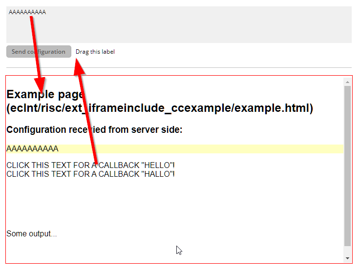
| /eclnt/risc/ext_iframeinclude_ccexample/example.html | Example page: /eclnt/risc/ext_iframeinclude_ccexample/example.html |
Reference to an outside object that is the content behind the component. E.g. a field is representing a certain field of a database table: in this case you could define the value table;column. The reference plays a siginficant role within the attributemacro management.
| ref | One reference |
| ref1;ref2 | Two references |
| ref1;ref2;ref3 | Three references |
Flag that indicated if this component is rendered at all. If set to false then the component is not rendered - there is no component data sent to the client.
| true | Component is rendered (default) |
| false | Component is not rendered |
If more than one component is arranged within one row, then components need to decide how they want to be aligned vertically inside the row - in case the height of the row exceeds the height of the component itself.
| top | Top |
| center | Center (default) |
| bottom | Bottom |
Spanning of rows if used inside a GRIDLAYOUTPANE.
| 1 | Control spans one row (default) |
| 2 | 2 rows |
| 3 | 3 rows |
Shadow of component. The definition is done by several inner values: hoffset, voffset, blur and color.
| hoffset:5;voffset:5;blur:5;color:#C0C0C0 | full shadow definition |
| color:#C0C0C0 | Definition only via color, rest of values is set to default values |
In CaptainCasa you can define styles definitions for components. A style definition is a definition of a set of default attribute values that are applied to the component. In case you want to differenciate between different usage types of the component you can apply multiple styles - and use the stylevariant attribute to select between.
Width of the control. Either defined as absolute value or as percentage value. Pay attention when using percentage sizing: the size refers to what is given from the components above. When using percentage sizing then you may define a minimum size in addition, by appending it with a semicolon: "100%;100" means: use 100%, but always keep a minimum size of 100. If using absolute sizes you may append a "+" to define, that the size is extended if required by the component. - Please note: the sizing may be completely taken over by the parent component (e.g. if a component is used in a grid cell), in this case the size definintions on this component level are obsolete.
| 100 | 100 Pixels |
| 120 | 120 Pixels |
| 200 | 200 Pixels |
| 50% | 50 percents |
| 100% | Full available width |
x-pixel-position: this attribute is only used if the component is directly placed into a PAINTAREA!
y-pixel-position: this attribute is only used if the component is directly placed into a PAINTAREA!